Brand Identity for POKÉ
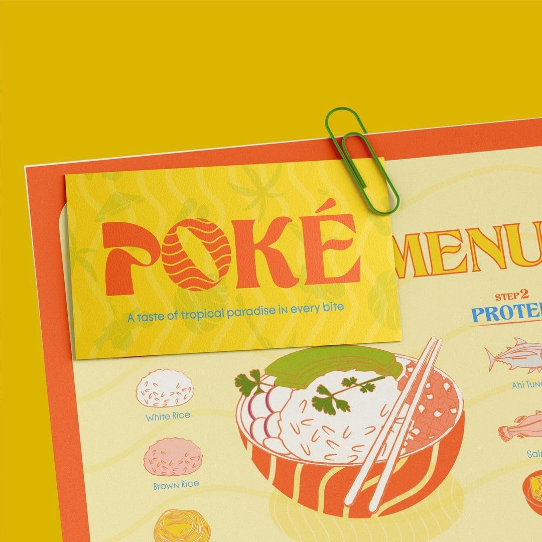
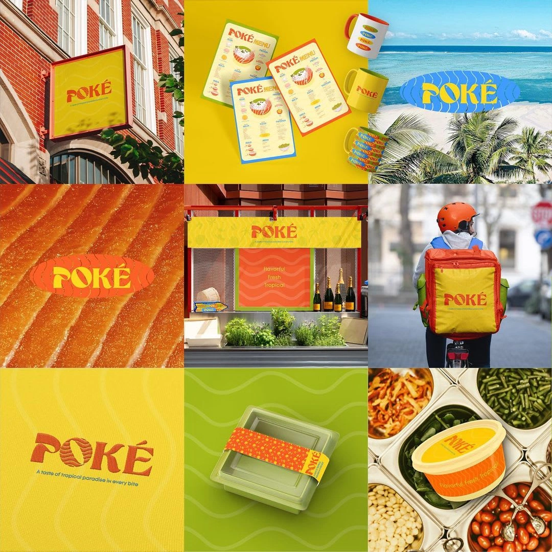
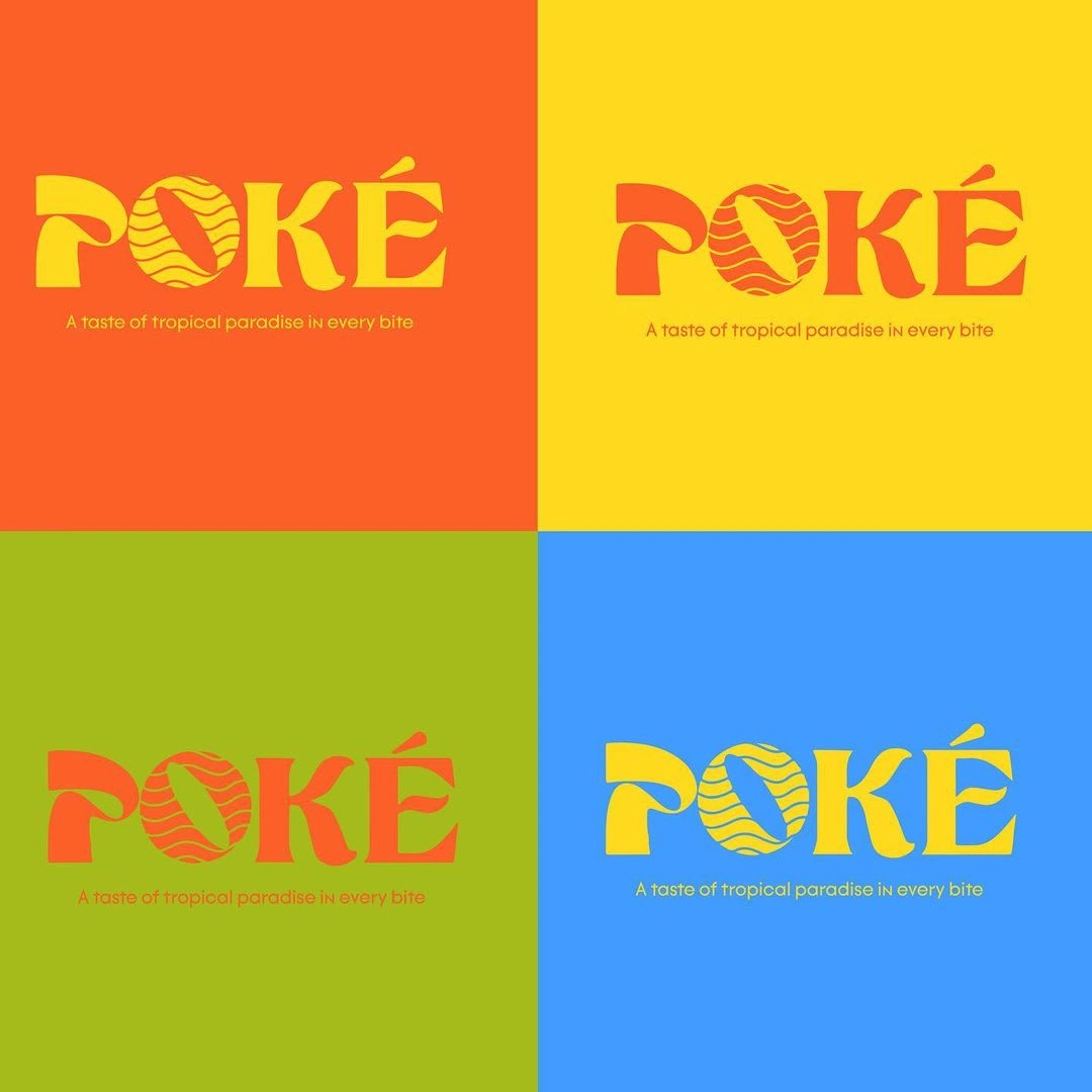
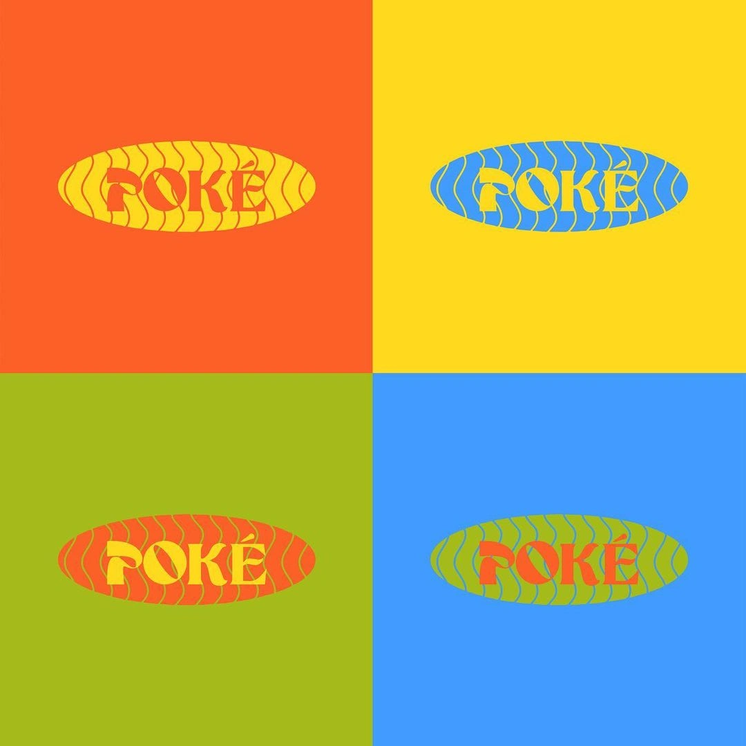
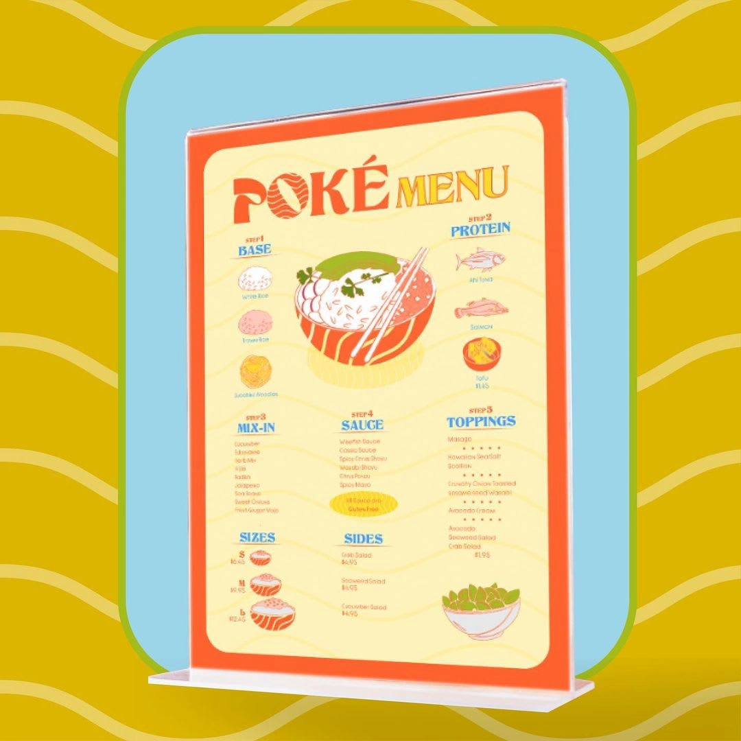
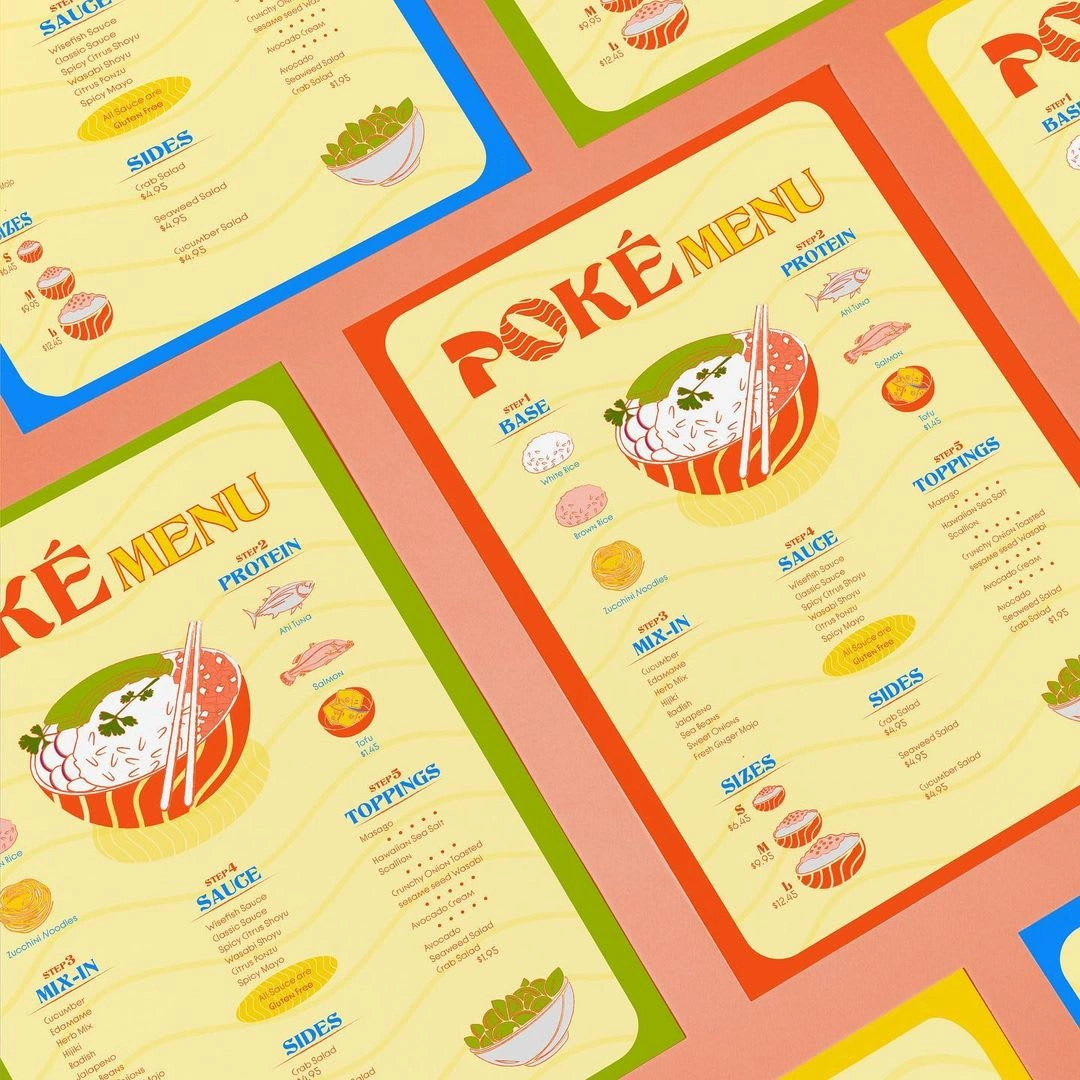
Our curvy font for "POKÉ" evokes beachy vibes, with an "O" resembling a bowl, featuring wave🌊 and salmon🍣 patterns for ocean-fresh appeal.
The secondary logo's oval shape mirrors a poke bowl's top view, emphasizing customization.
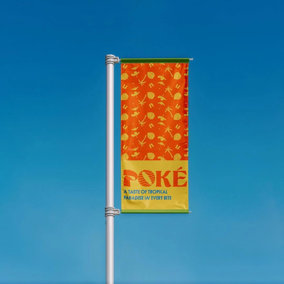
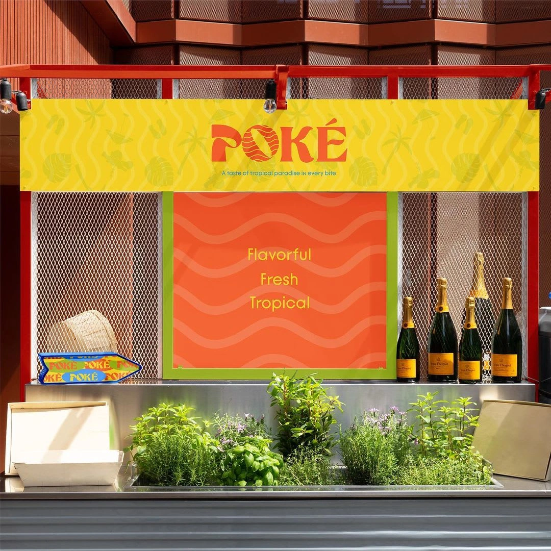
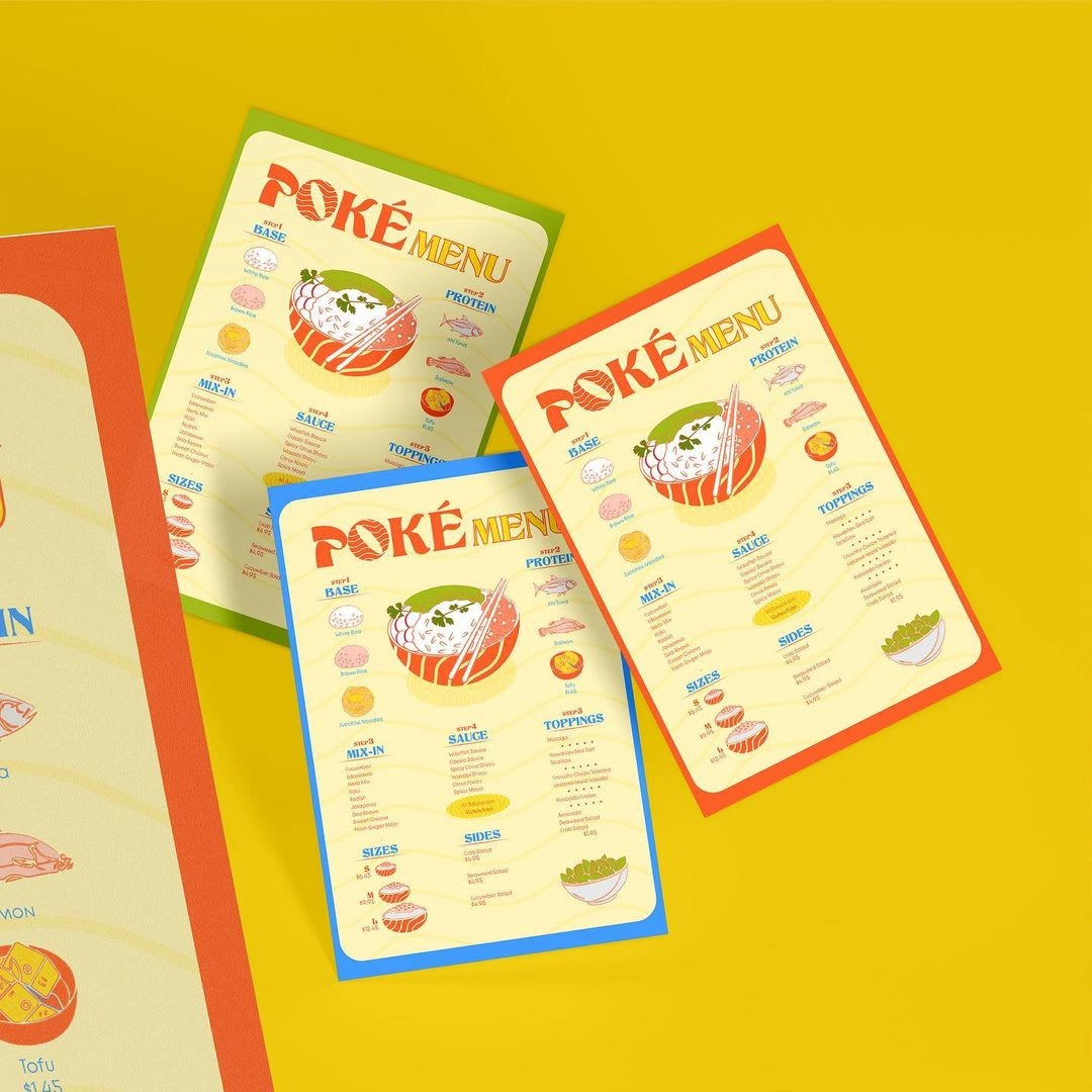
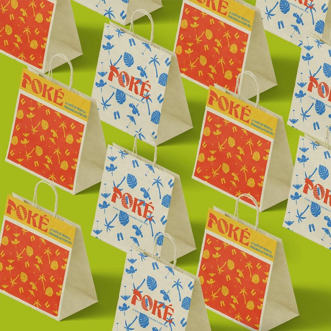
Our vibrant, tropical color palette reflects the flavorfulness and freshness of each bowl, while the versatile wave pattern can be used across restaurant elements, from packaging to interior decor, reinforcing brand identity.
🏝️Taste the Tropical Paradise in Every Bite with POKÉ! 🌊
Like this project
Posted Jun 14, 2024
We're thrilled to share our design for POKÉ, a poke bowl restaurant specializing in fresh, flavorful, and tropical Hawaiian bowls.

