Responsive Multilingual Analytics Dashboard

Pedro Welison


PROJECT OVERVIEW
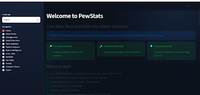
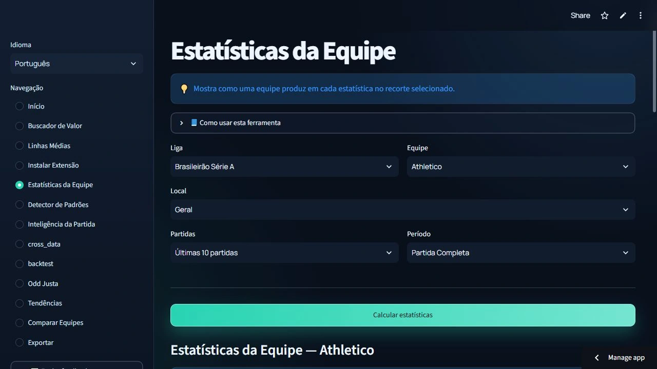
PewStats PRO is a responsive football analytics dashboard built to turn raw match records into clear, usable decisions. The application combines league filters, team statistics, comparisons, trends, conditional analysis, and multilingual navigation in one consistent interface.
THE CHALLENGE
The product needed to present dense statistical information without feeling like a spreadsheet. Users should be able to understand what a table represents, move between analysis areas, and repeat the same workflow on desktop or mobile. The interface also needed to keep labels and table content understandable when the selected language changed.
MY APPROACH
I organized the experience around real questions instead of exposing database structure. The home page explains the purpose of each area and guides users toward statistics, comparisons, trends, and the probability calculator. Filters use a predictable order so users can narrow the league, season, team, and analysis before reviewing results.
For tables, I replaced the plain default appearance with a visual hierarchy designed for scanning: dark surfaces, controlled contrast, colored headers, consistent spacing, readable numeric alignment, and clearer empty states. Important actions use a restrained accent color, while secondary controls remain visually quiet.
RESPONSIVE DESIGN
The layout was designed to adapt to smaller screens without hiding the core analysis. I reviewed navigation, filter widths, card stacking, table overflow, touch targets, typography, and spacing at mobile breakpoints. Wide tables remain usable through intentional horizontal behavior instead of shrinking every value until it becomes unreadable.
MULTILINGUAL EXPERIENCE
Translation coverage includes navigation, explanations, filters, alerts, buttons, metrics, and the content inside analytical tables. I treated translation as part of the interface architecture, not a final text replacement, so longer labels could fit without breaking layouts.
QUALITY AND VALIDATION
I tested the dashboard through complete user journeys, including changing filters, returning to previous views, empty results, newly published data, responsive layouts, and regression after releases. I also checked calculations and displayed values against source records to protect analytical integrity.
OUTCOME
The finished dashboard gives users a cleaner path from raw football data to useful analysis. The result is a live, maintainable application with a consistent visual system, responsive behavior, multilingual coverage, and a structure that can support future leagues and analytical features.
LIVE APPLICATION
https://pewstats-pro.streamlit.app/
Like this project
Posted Aug 11, 2026
Designed and built a responsive analytics dashboard with localized navigation, contextual filters, transparent samples, and interactive statistical tables.
Likes
0
Views
4