Built with Jitter
Liggo Landing Page Redesign
Daniel Obileye
Verified
Overview
Liggo is an AI-powered conversation assistant designed to help users craft smoother, more confident replies for dating and social conversations.
The goal of this redesign was to improve how the product communicates its value, strengthen the conversion flow, and create a more engaging experience that encourages users to download and try the app.
The Problem
The original experience explained features, but it didn’t fully communicate the emotional value behind the product.
Users weren’t looking for “AI-generated replies.”
They were looking for:
Confidence in conversations
Better replies without overthinking
Smoother interactions
More engaging chats
The landing page needed to feel more emotionally driven, visually engaging, and conversion-focused.
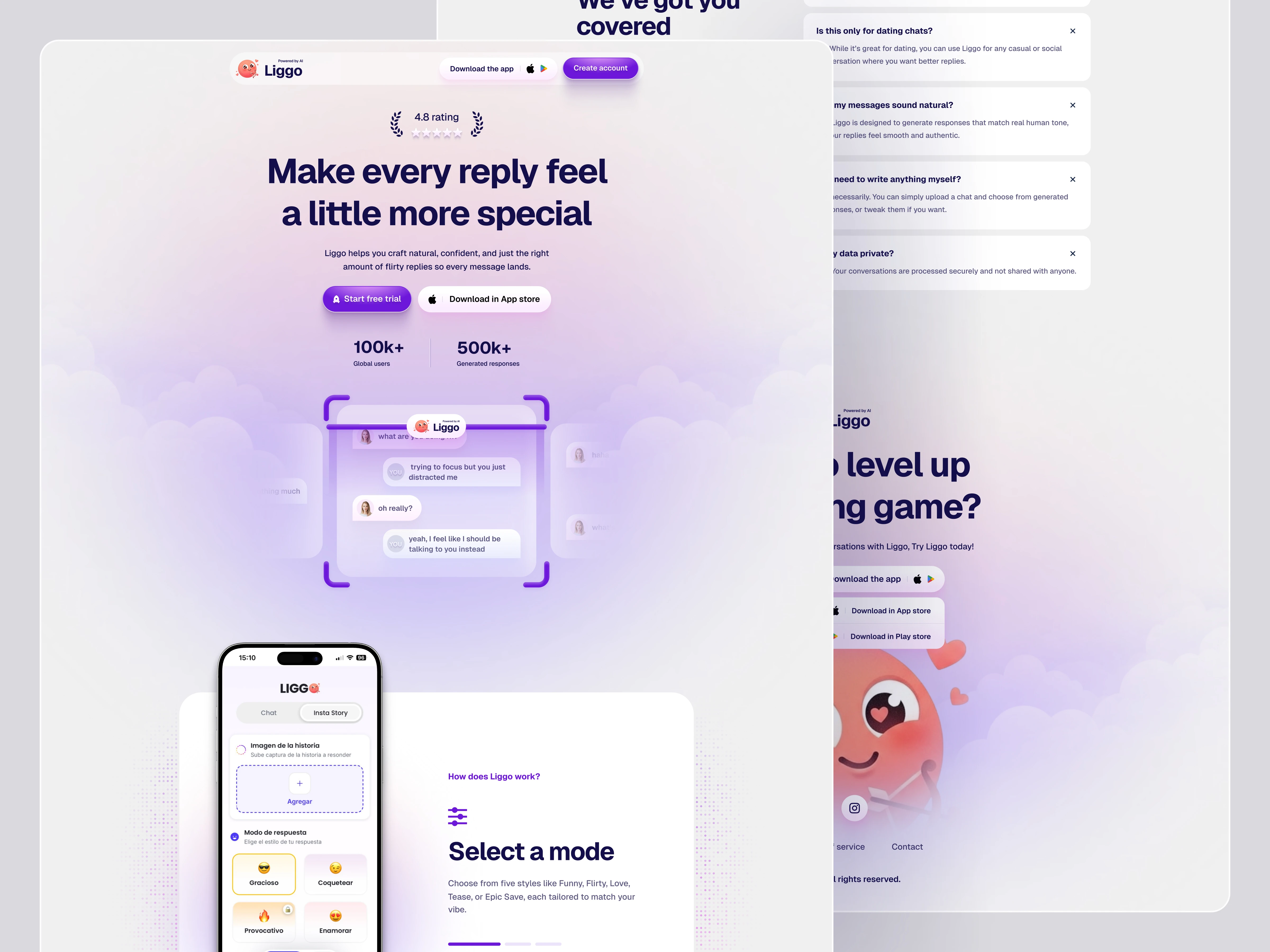
LIGGO OLD WEBSITE
Goals
The redesign focused on:
Improving the messaging across the entire experience
Making the value proposition instantly clear
Increasing app downloads and conversions
Creating stronger visual consistency
Introducing heavier social proof
Building a more engaging storytelling experience
LIGGO ALT COLOR
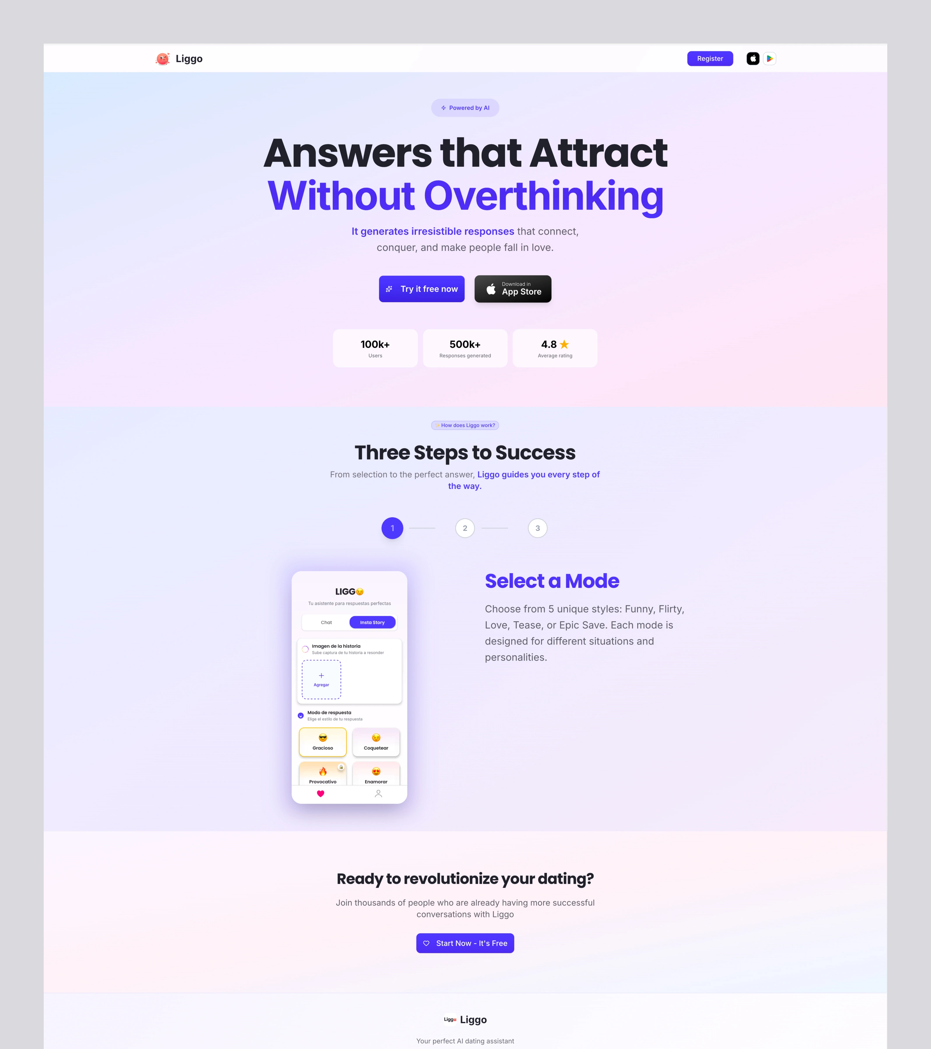
Design Direction
I explored a softer and more modern visual direction built around:
Clean typography
Rounded UI components
Light gradients and glow effects
Screenshot-driven storytelling
Conversational interactions
The overall experience was designed to feel approachable, playful, and emotionally engaging while still maintaining clarity and structure.
LIGGO REDESIGN FOOTER
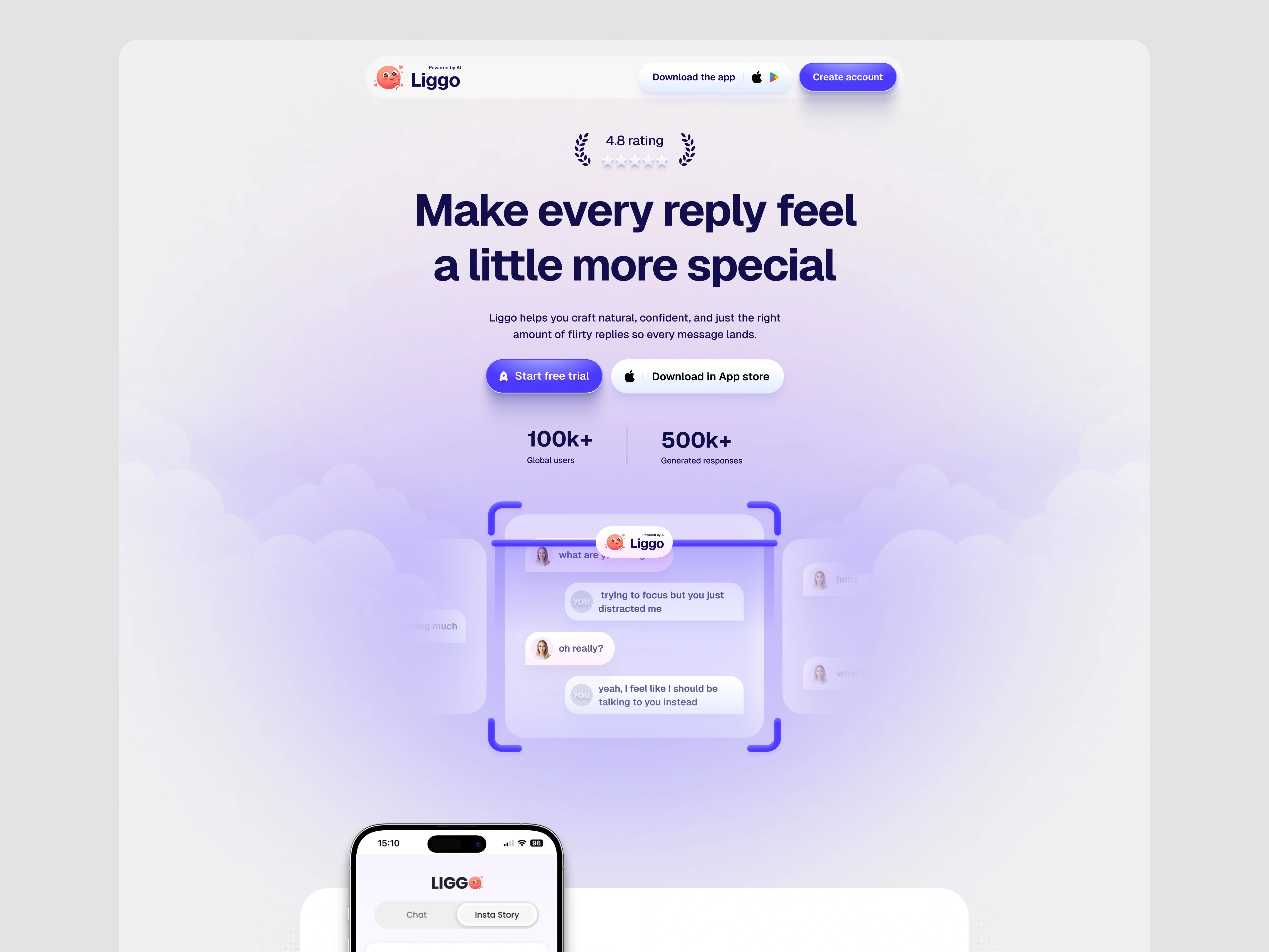
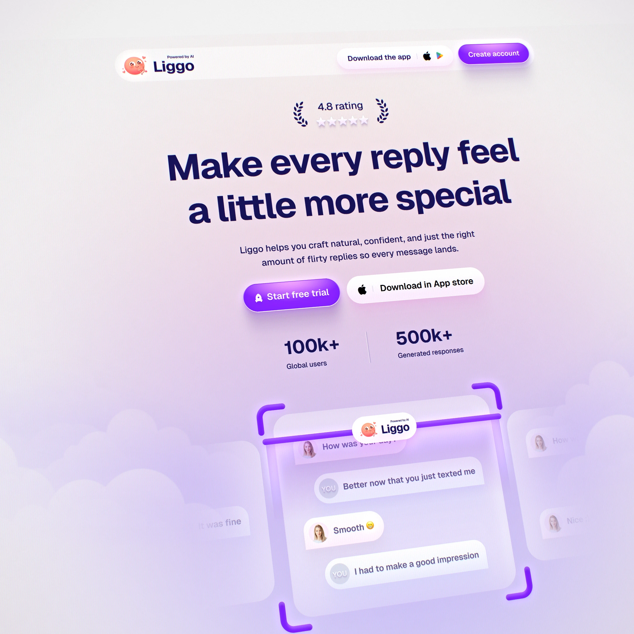
Hero Experience
One of the biggest focuses of the redesign was the hero section.
Instead of using a static mockup, the hero visual animates in real time to show how conversations instantly change when users use Liggo. This made the interaction itself part of the storytelling experience.
The goal was to help users immediately understand:
What the product does
How it improves conversations
Why it feels valuable
before even scrolling further down the page.
LIGGO HERO - CLOSE SHOT
Conversion Improvements
The landing page structure was redesigned to create a clearer conversion path.
This included:
Stronger CTA hierarchy
More intentional section flow
Better onboarding explanation
“With vs Without Liggo” conversation comparisons
Trust-building statistics and social proof
Clearer app download prompts
Each section was designed to progressively reinforce trust and encourage interaction.
LIGGO FULL REDESIGN
Outcome
The redesign transformed Liggo from a feature-focused experience into a more emotionally driven product story.
The final direction feels:
More cohesive
More modern
More engaging
More conversion-focused
Most importantly, the experience now communicates the product’s value much faster while making the brand feel more memorable and approachable.
Credits
Led the end to end redesign, from positioning and UX strategy to UI and Visual system.
Focused on clarity, product storytelling, and conversion driven structure.
Landing page development by KREE8 team
Animations by Me and KREE8 team
For AI & SaaS Teams
I design and animate high performing landing pages for AI and SaaS startups — whether it’s a full redesign or building from scratch.
If your product is powerful but your landing page isn’t converting, let’s fix that.
Available for new builds and strategic redesigns.
Like this project
Posted Jun 8, 2026
Redesigned Liggo to improve messaging, strengthen conversion, and create a more engaging AI-powered dating conversation experience.
Likes
3
Views
23
Timeline
Apr 22, 2026 - Jun 27, 2026
Clients
Sprrrint