VARESE: Redesign of an Italian brand
Toni Sabato
Together with a swiss graphic design studio I was commissioned to undertake a comprehensive brand relaunch for VARESE, aimed at showcasing the brand's evolution.
I began by aligning all aspects of the company's communication with its unique Italian DNA. This involved an update of the logo, moving image and magazine. My focus was to convey the essence of 'pure Italianità', a blend of sensual, casual elegance, high-quality materials, and outstanding workmanship, complemented by joie de vivre and light-heartedness.
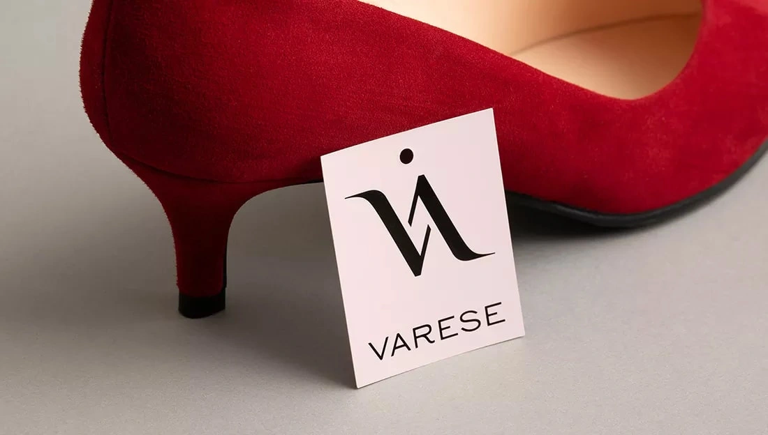
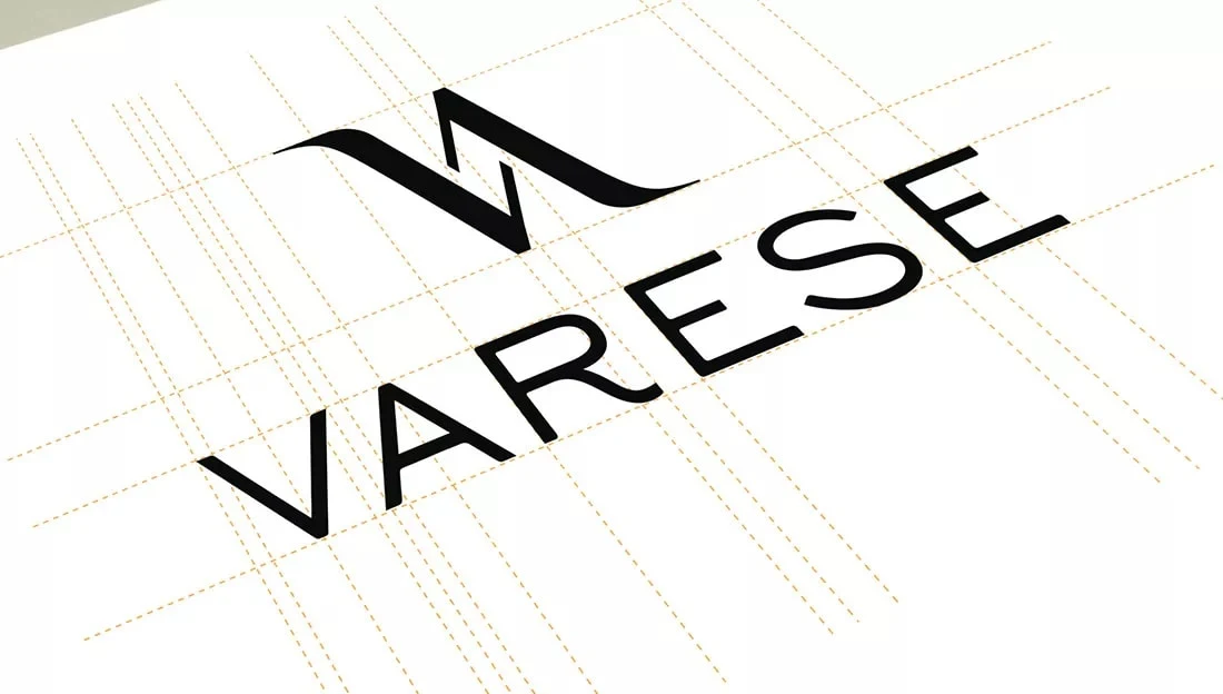
The essence of a brand's identity lies in the first impression that is made, and it all begins with the logo.
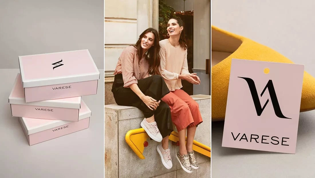
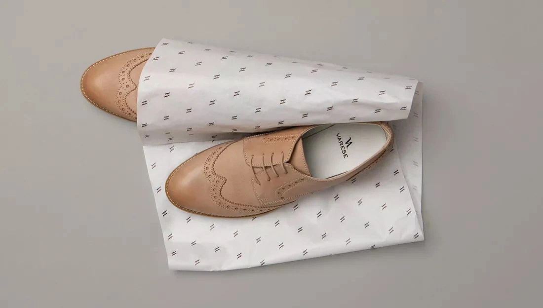
From there, the experience is carried forward by presenting a high-quality, polished appearance across all packaging materials, including elegant tissue paper and sophisticated cardboard boxes.
By consistently providing this level of attention and care to even the smallest details, a brand can create a truly exceptional experience for their customers, and establish a stronger level of brand loyalty.
By using their website, Instagram account, and ShoeTime magazine with a circulation of 700,000, VARESE displays its fashion expertise and communicates with a vast audience. The brand curates its collections and engages with its clients by portraying its innovative designs, brand values, and developing long-term relationships.
Like this project
Posted Jun 28, 2023
A full brand relaunch for VARESE: pure Italianità meets Swiss precision—across logo, film, magazine & packaging with sensual, casual elegance.
Likes
0
Views
54
Timeline
Jul 16, 2020 - Aug 16, 2020