Digital Marketing Mermaid

George Rowland
Visual Designer
UI Designer
Framer Designer
Figma
Framer
The website for Digital Marketing Mermaid, the business of my partner Renate Linnenkoper. Renate is a travel writer who also offers services such as copywriting, illustration and coaching.
Check it out here 👉 digitalmarketingmermaid.com
Our goal was to create something that reflects Ren's vibrant writing style and personality. We decided to go for a Brutalist style.
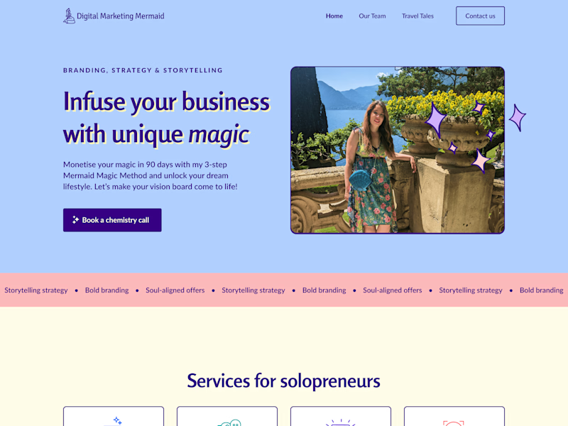
With its bright colours, edgy typography and solid drop shadows, Brutalism is something of a divisive style that can be bad for accessibility. However, we felt it aligned with the feeling we were after and would mesh well with Ren's illustrations.
Logo
The logo symbol was inspired by the statue of the Little Mermaid in Copenhagen. The logotype is Signika Negative and was chosen as it echoed the quality of line found the symbol.
Typography
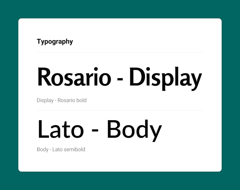
For the typography, we selected Rosaria for the display text and Lato for the body text. We liked the classical qualities of the fonts and felt they paired well together. Ren had grown up reading a lot of classic literature and we wanted to try and capture a feeling of 'bookishness'.
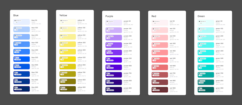
Colour palette
Colours: we wanted a 'beach vibe' and went for colours of 'the seaside at sunset' that felt fresh.
Images
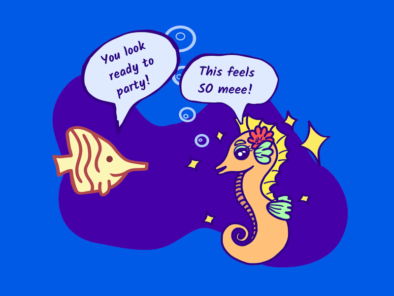
Renate made illustrations of various sea creatures, we wanted to bring a bit of motion and added a scroll effect to them.
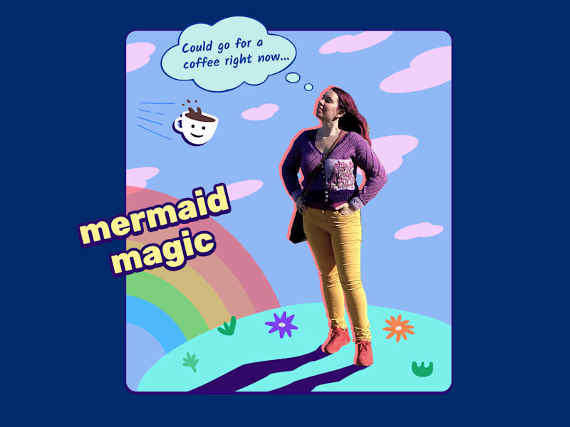
I made a graphic for the CTA section. We liked the idea of making the coffee cup fly towards Renate as they scrolled further down the page.
