Markets Made Clear
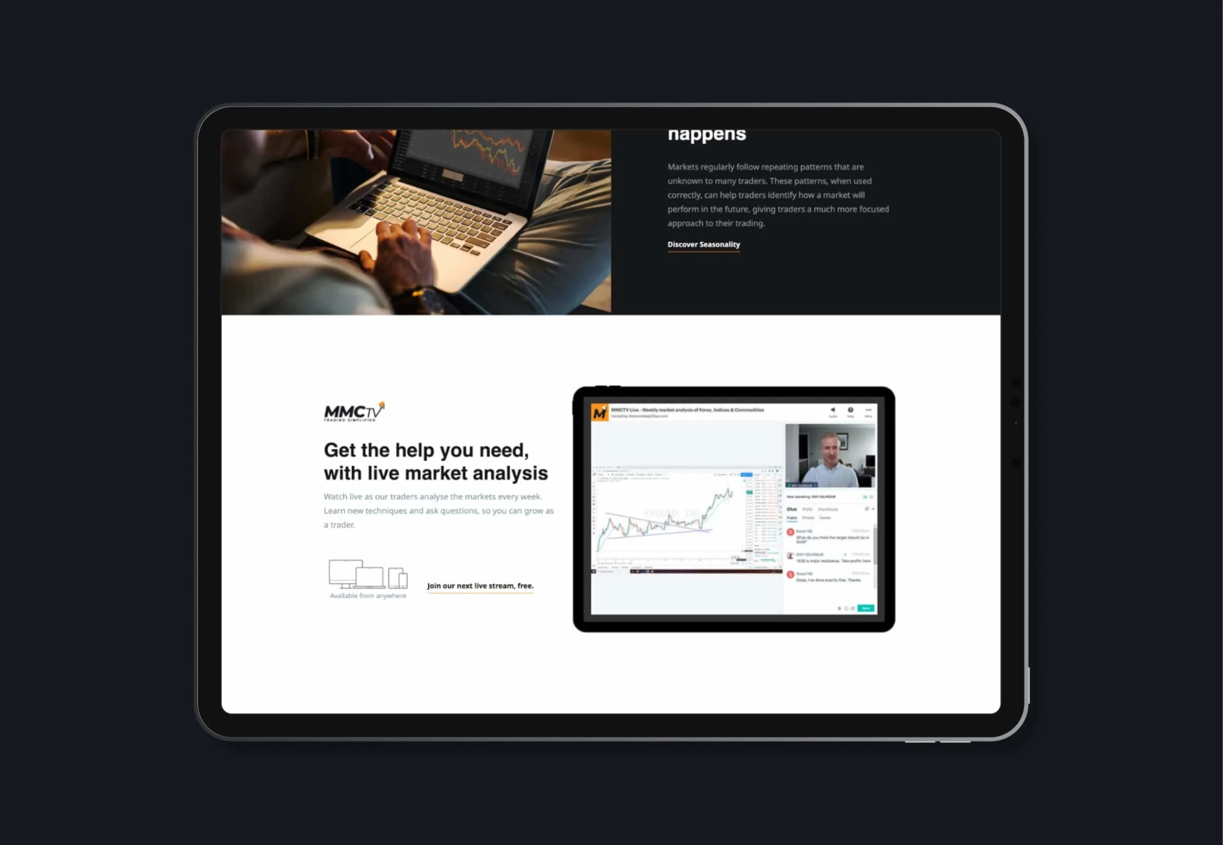
Markets Made Clear is a leading provider of complex trading tools and expert advice that enables users to visualise markets in 3D using the Commitments of Traders. The company’s application is intended to provide its users with an unique and strong trading experience.
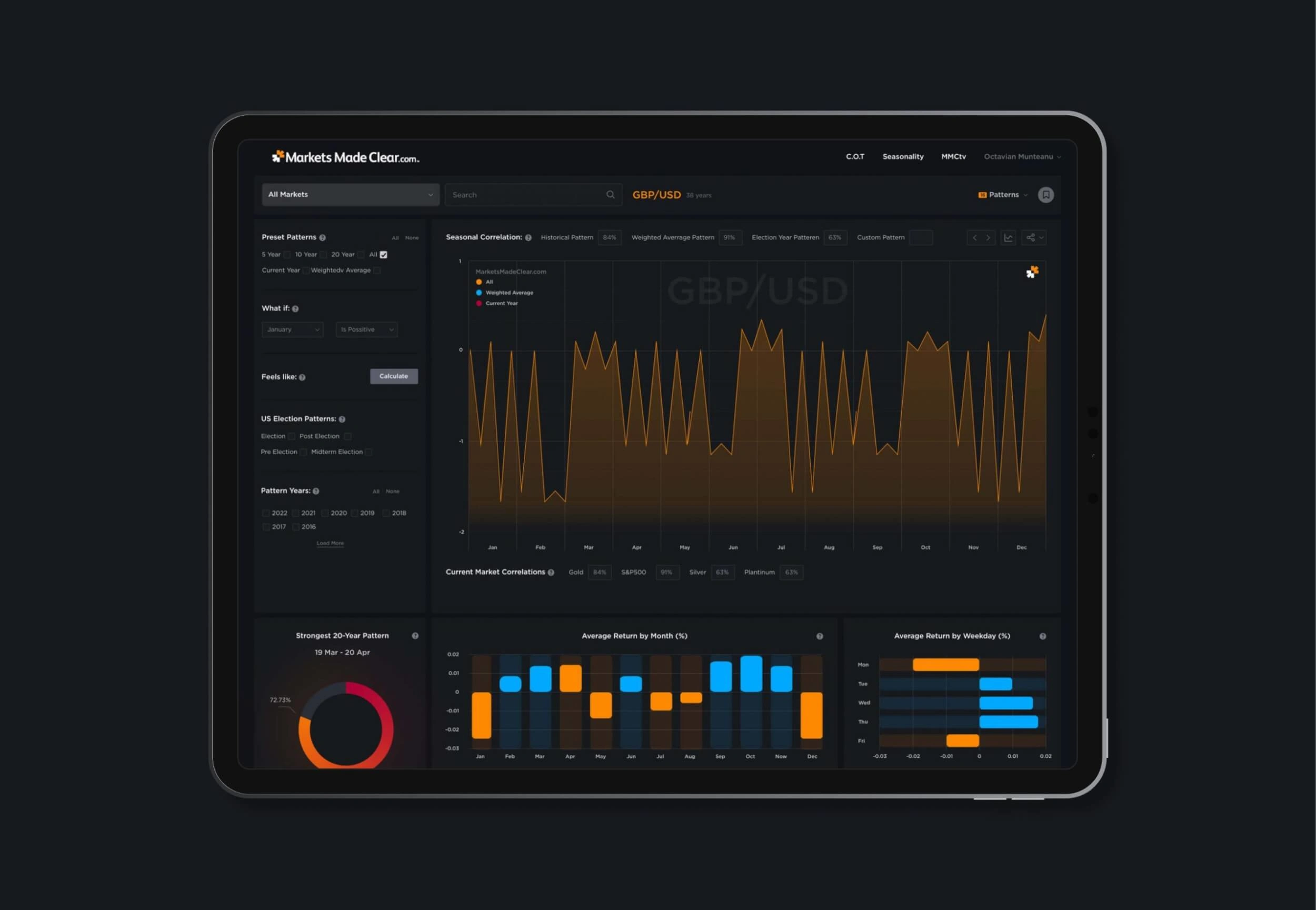
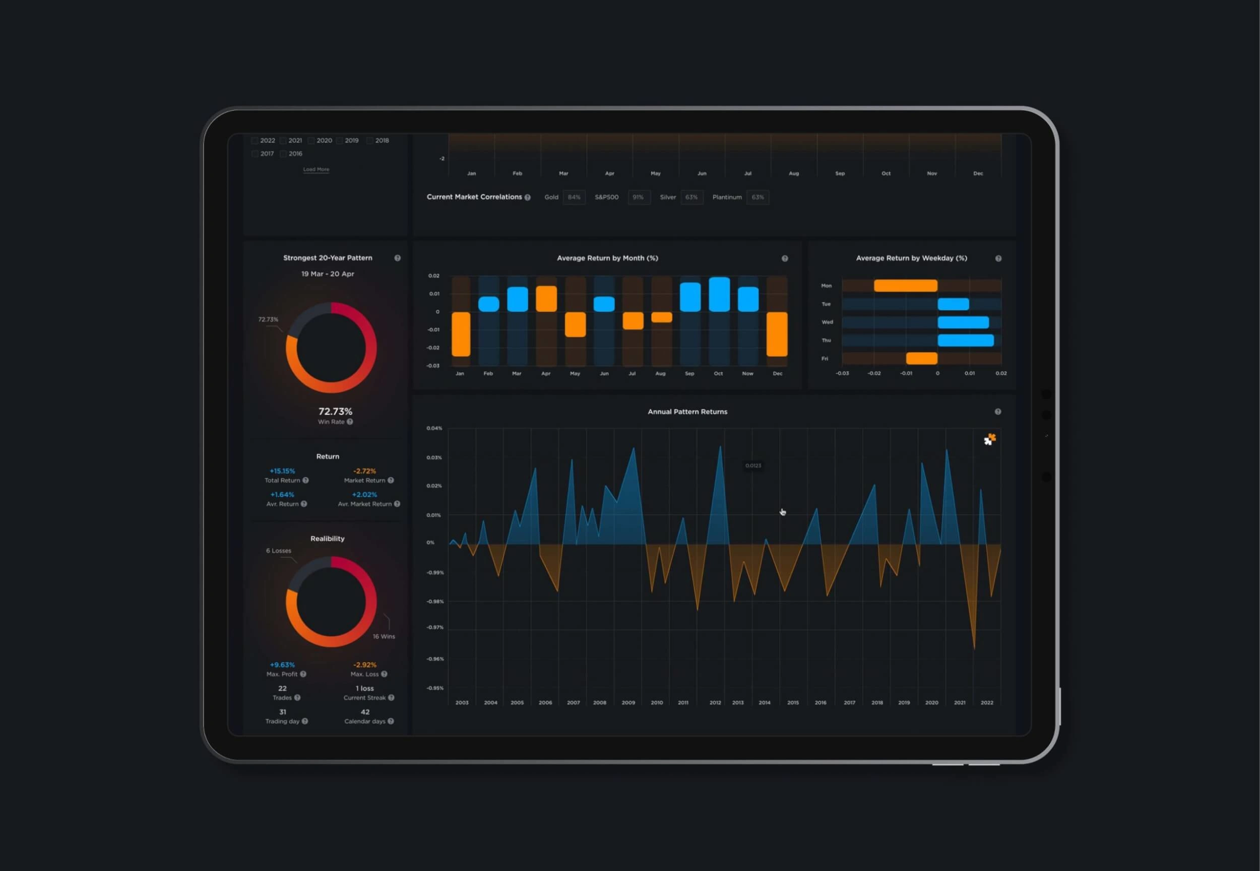
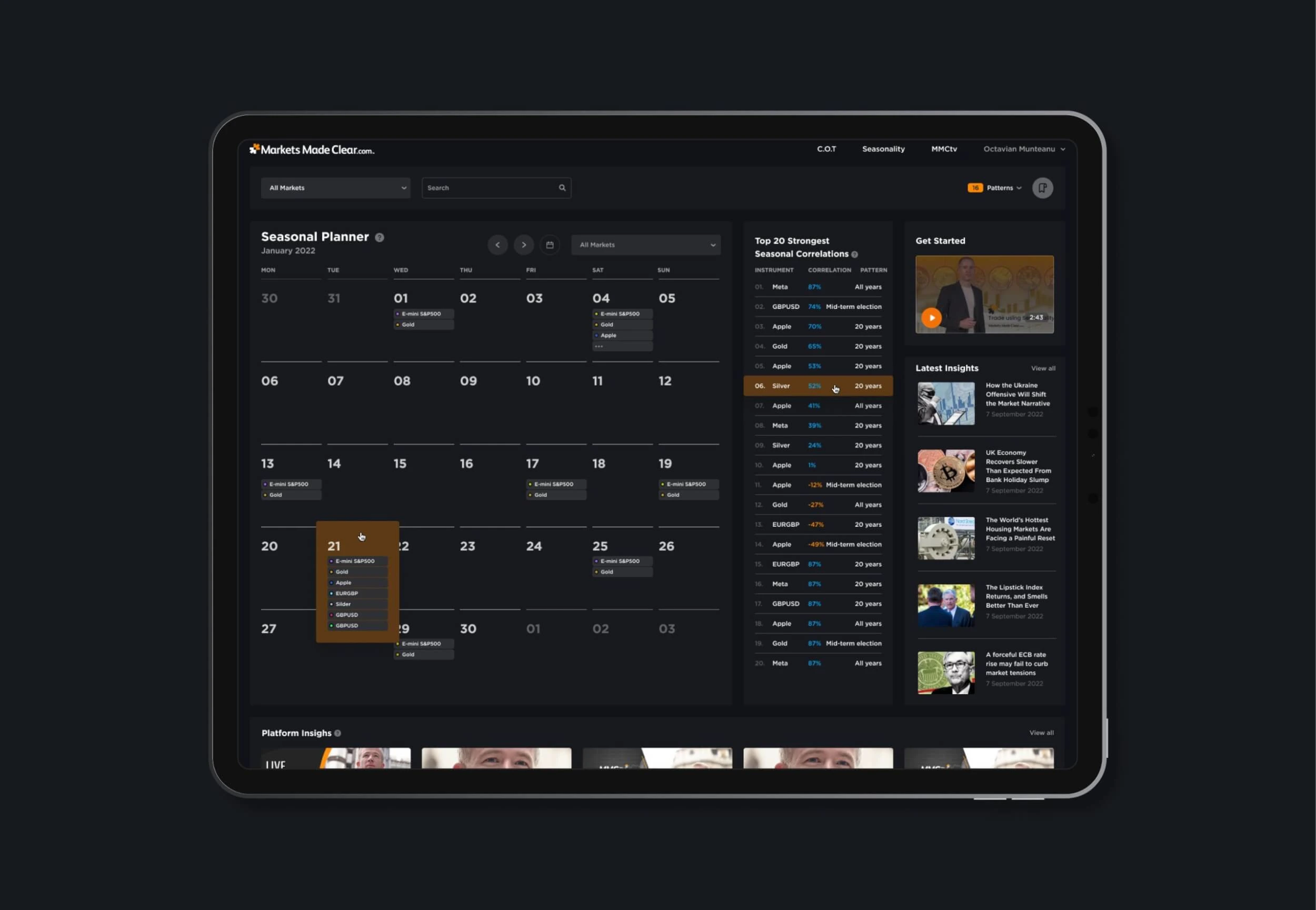
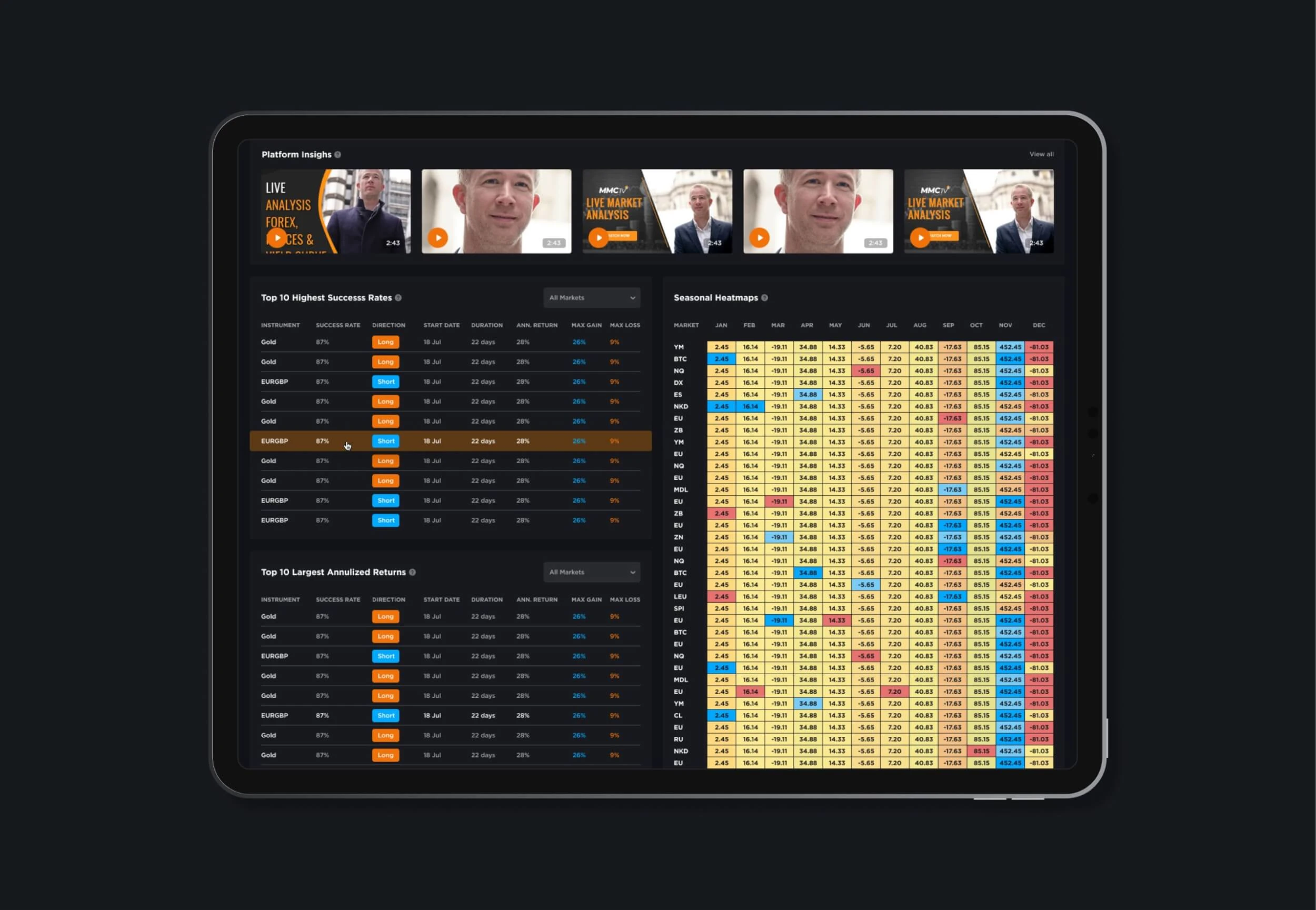
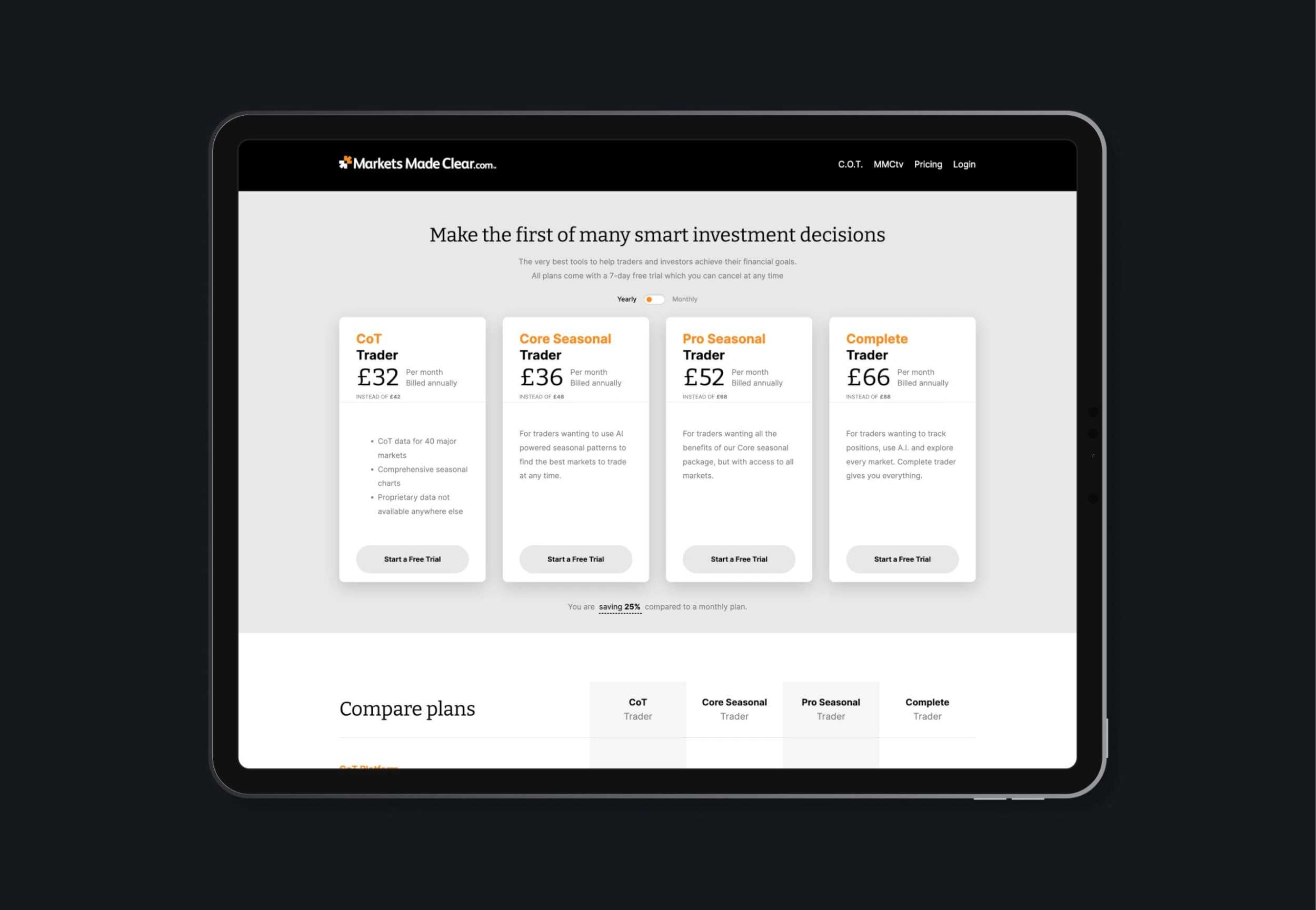
I’ve had the pleasure of working with Ray from Markets Made Clear over the past few years to improve their app by adding new tools and creating wireframes, information architecture, and high-resolution designs for existing and new features, as well as other promotional materials. The client’s goal was to reach a new audience by developing an attractive, minimalistic design that empowered instinctive and explicit interactions with the available tools.
To get started, I did a lot of research on the existing application and its user base. This assisted me in comprehending the user’s needs and pain points, as well as how the new design could address these issues. I also reviewed user feedback and competitor services to identify areas where the design could be improved.
Following the research phase, I created a design strategy that emphasised minimalism, simplicity, and usability. I developed a set of design principles that guided the application’s development, including the use of a simple and easy-to-use interface, clear and concise language, and a focus on the service’s core features.
Next, I began the design process with wireframes and low-fidelity prototypes. This method allowed me to test the application’s functionality and usability before committing to a final design. I used user feedback to improve the design and iterated until I had a functional prototype that met the client’s specifications.
The next stage of the project involved developing the application’s visual design. I created a design system with typography, colour, and iconography guidelines. The visual design was created to reflect the application’s minimalistic and user-friendly approach. To achieve a modern and professional look and feel, I used a simple colour palette of black, white, and orange.
After the visual design was completed, I began the project’s development phase. To ensure that the application was accessible and usable on all devices, I used a responsive design approach. I also incorporated accessibility best practices to ensure that people with disabilities could use the application.
"I received excellent work from Octavian and he was really proactive about providing design solutions for what I was looking which was a great help. Well certainly be using again on our next project." 🚀
RAY GILMOUR

Like this project
Posted Sep 18, 2023
Markets Made Clear is a leading provider of complex trading tools and expert advice that enables users to visualise markets in 3D using the Commitments of Trade

