Website Redesign
About
Bikes Not Bombs is a nonprofit based in Boston, MA. Its mission is to use bikes to bring about social change. They do this primarily by sending donated bikes to less fortunate people both locally and internationally and providing bike education programming for local youths and young adults
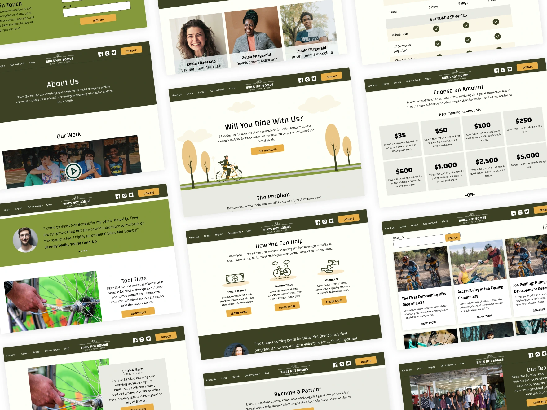
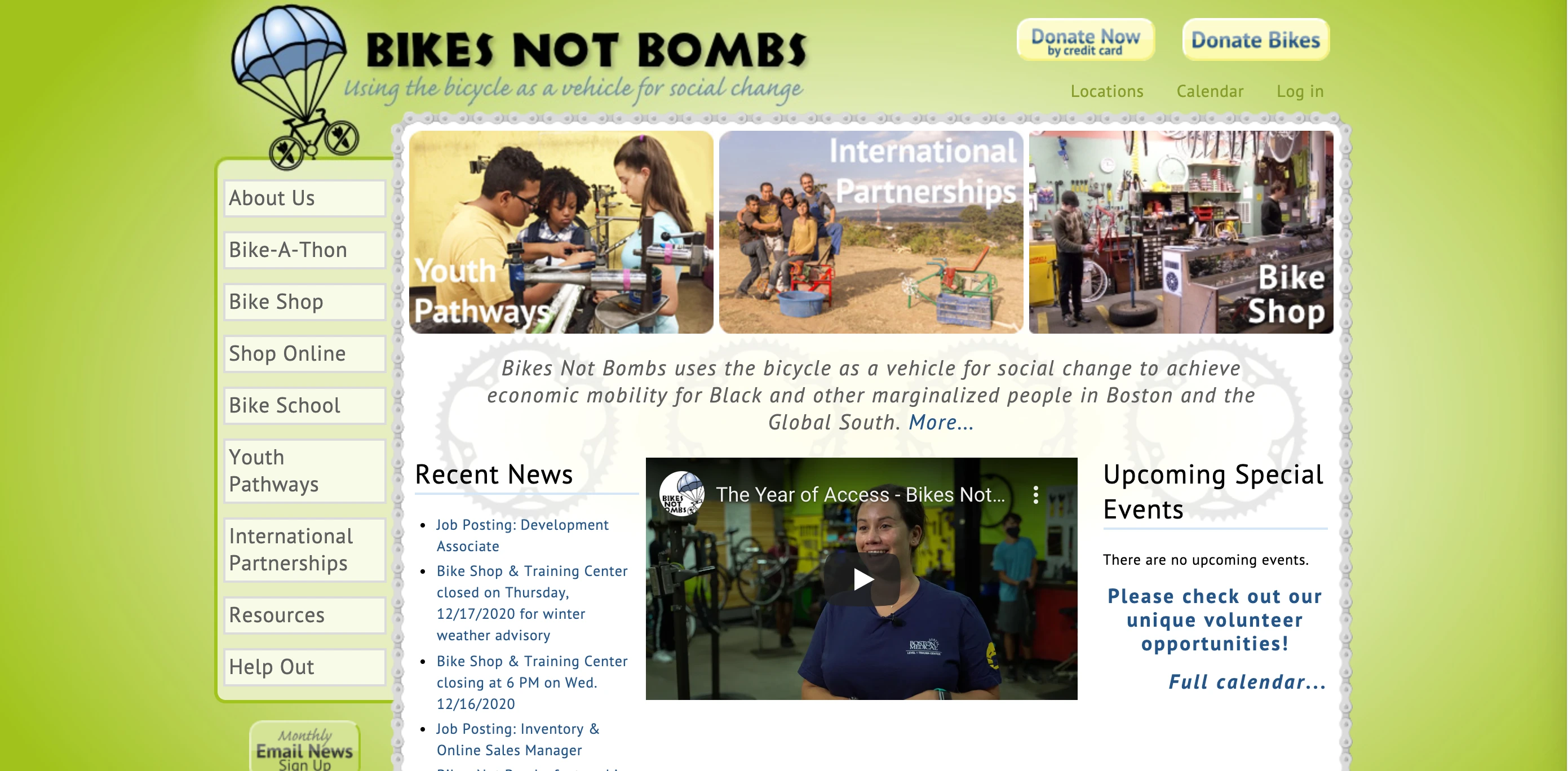
The current site is not responsive and uses block text to convey information. This redesign focuses on creating a responsive design, updating Bikes Not Bombs’ branding, and restructuring the visual hierarchy of their site.
Current State
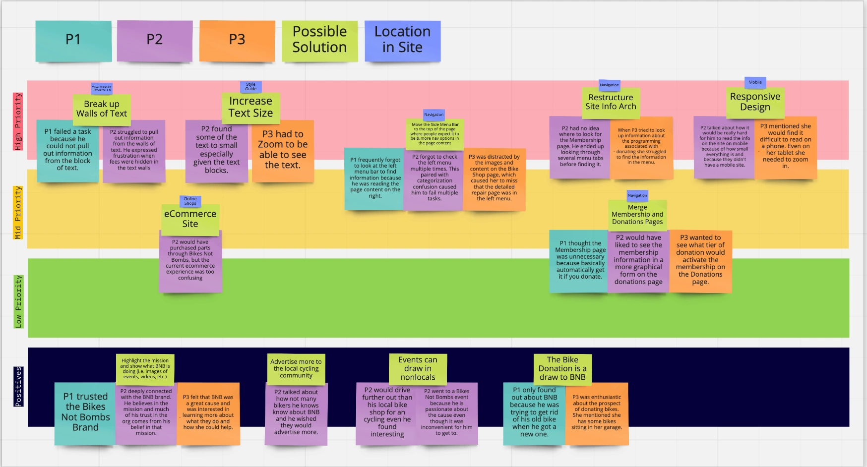
After looking through the Bikes Not Bombs website, I made a few assumptions that I wanted to test through a usability study.
The block text will likely cause users to miss important content when they are skimming the paragraphs.
The side menu bar may cause some confusion if users are used to looking for the menu at the top of the page.
The graphic table comparing the tune-ups will be more successful at conveying information to users than the block text. More breakdowns like this would be helpful in the site.
Some areas of the site like the side column on the repair page are not utilizing visual hierarchy well. This may cause users to miss important information.
Research
I conducted a usability study of the current version of the site to better understand what changes to the site would have the biggest impact.
In addition to a usability study, I ran a "5 second" impression test where participants were shown an image of the home page for 10 seconds and asked to select what words they felt best described the site. I did this as a way to understand if the brand message of Bikes Not Bombs was getting across to users, and as a means to directly compare the sites after the a redesign.
Participants tended to identify the site as:
Dated
Busy
Overwhelming
Ordinary
Meaningful
Design
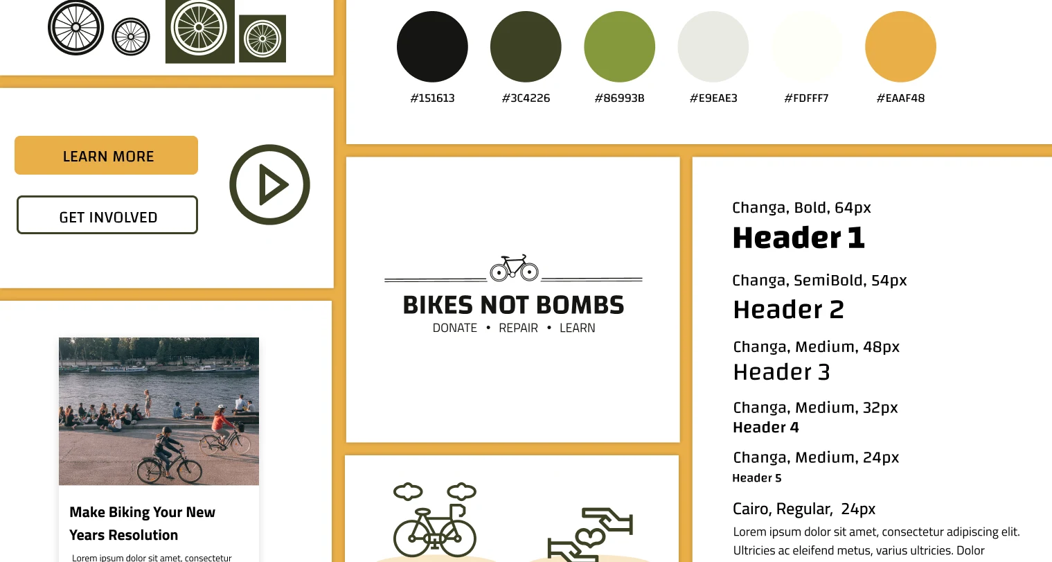
I used the Bikes Not Bombs green color palette as inspiration for the colors I chose for the redesign. I darkened the palette to make it a more earthy tone and added more neutral colors. I wanted the brand coloring to reflect the message of sustainability, so keeping the focus on greens kept it on brand.
I chose to forego straight line divisions between the sections in order to make the site feel more approachable. It was also useful to bring into the background of the illustrative hero to give the grass and road a more natural look.
Wireframe
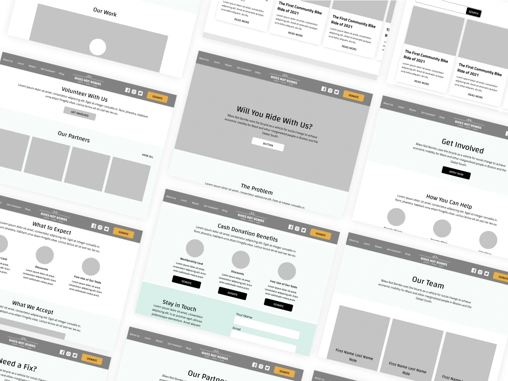
I started out by pulling together a site map of all of the current pages in the Bikes Not Bombs site. Then I prioritized the pages to be built based on how up to date the information was, if the page contributed to driving donations/engagement, etc. I also looked at other nonprofit sites to make sure I was following common UI patterns in the industry (i.e. the Donate button).
After determining what pages needed to be built out, I started sketching some page layout ideas and then brought those sketches into Figma to flesh out.
Applying Style Guide to Wireframes
I applied the Style Guide to the wireframes and brought in stock images to give the wireframes a more high-fidelity look before beginning to prototype the interactions.

Prototyping
I built out interactions for a desktop and mobile version of the site.
Testing
I tested the redesign using the same usability test I conducted on the original design. In the final usability test, all participants were able to complete their tasks easily.
When given the same "5 second" impression survey, but with the newly designed homepage, participants described the site as:
Clean
Appealing
Attractive
Creative
Accessible
Overall, showing that users had a far more positive view of the site after the redesign.
Like this project
Posted Apr 14, 2021
Likes
0
Views
10


