Tegus Logo Update – Concept
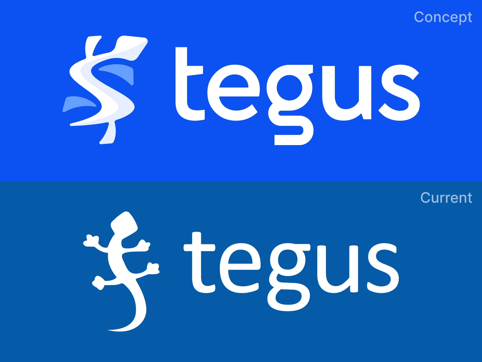
Always like to tinker with potential new logos in any "down time" I find. Thought it'd be fun to hide a $ in the lizard mark given we're a financial research platform. A lot more fine tuning possible to tighten up the geometry and balance of it but no time at the moment. As always, would love feedback from more experienced logo folks.
Like this project
Posted Mar 30, 2025
Thought it'd be fun to hide a $ in the lizard mark given we're a fintech platform.

