Legiral – Conversion-Focused Landing Page Design
Stephen Kolawole
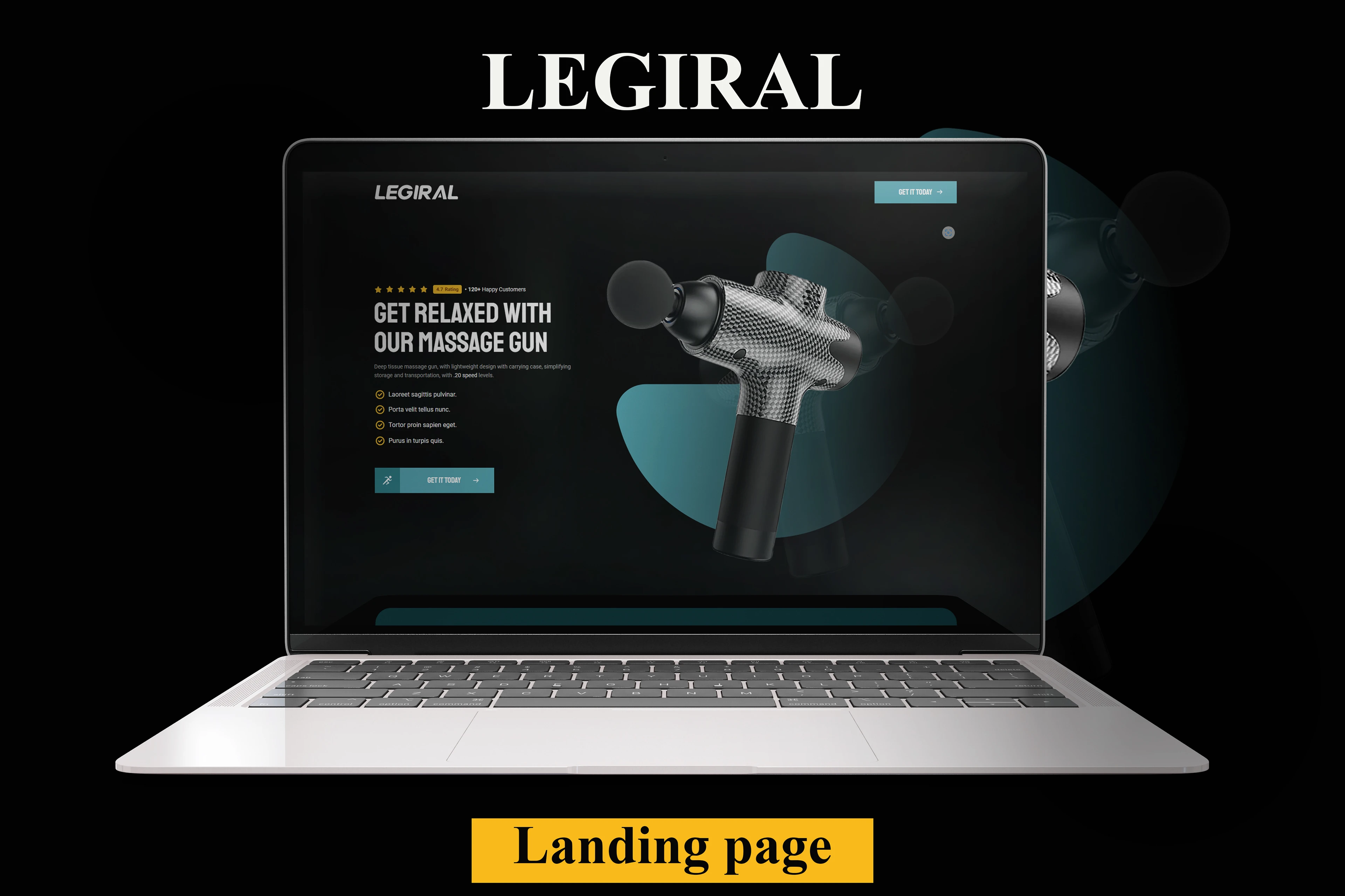
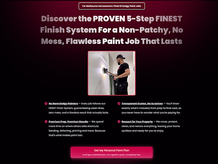
Legiral — Designing a Landing Page That Converts Attention Into Action
Most landing pages lose users in the first 5 seconds.
Legiral was designed to do the opposite.
This project explores how a focused layout, clear messaging, and intentional visual hierarchy can guide visitors from curiosity to conversion — without distractions.
What I Did
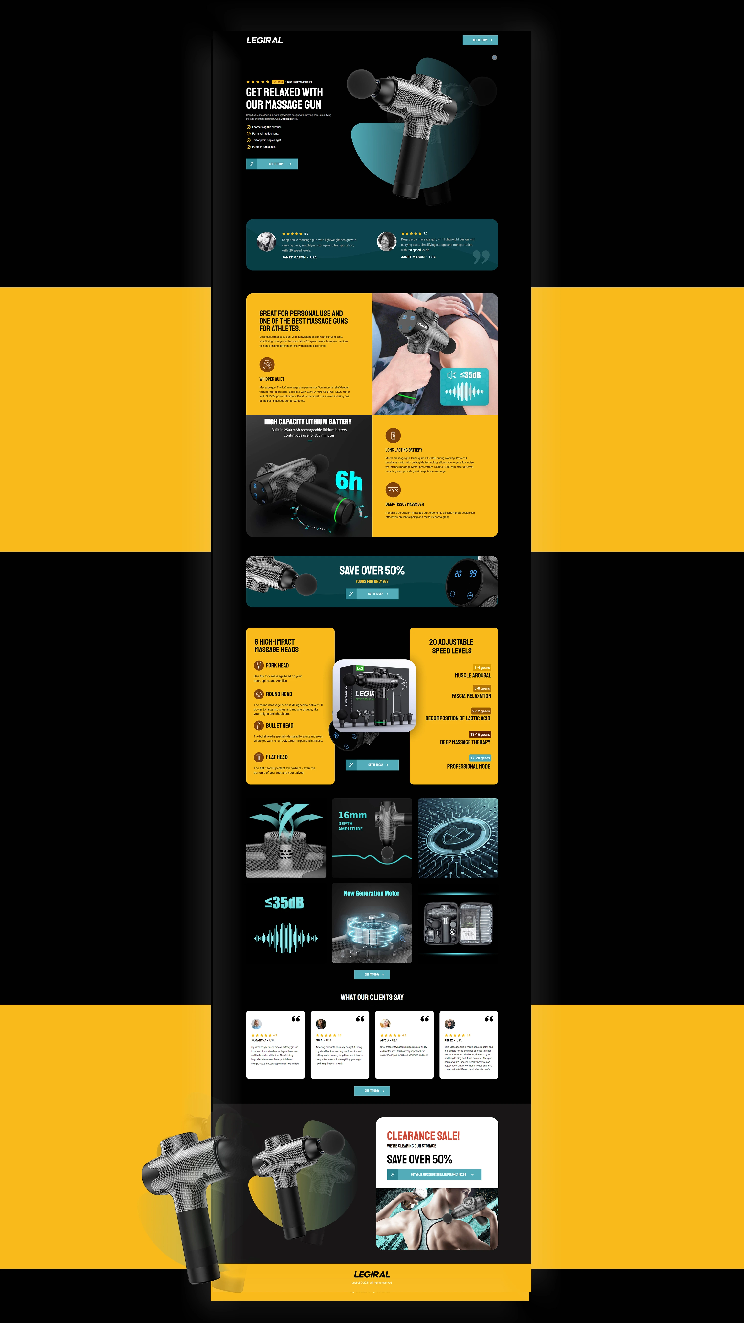
I designed a conversion-first landing page that:
Communicates value immediately above the fold
Uses clean structure and spacing to support fast scanning
Highlights benefits before features to match user intent
Leads users toward a single, clear call-to-action
Every section was purposefully designed to answer one question:
“Why should the user care ,and what should they do next?”
Why It Works
Strong hero section with a clear value proposition
Benefit-driven layout built for marketing campaigns
Minimal navigation to reduce friction and boost focus
Modern UI optimized for no-code platforms like Gohighlevel
Result
A polished landing page concept that balances visual clarity, user psychology, and conversion strategy ,built to perform, not just look good.

Like this project
Posted Jan 28, 2026
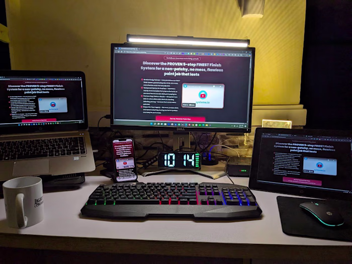
A modern landing page concept designed to capture attention, communicate value clearly, and guide users toward a single high-impact call-to-action.
Likes
1
Views
3