Transforming HerogoTV — An Impactful Design for Better Viewing
What is HerogoTV and what did you do?
HerogoTV is an online streaming platform that provides users with access to a wide variety of content, including TV shows, movies, and documentaries.
I worked with their team to revamp their website's UI and navigation flow. After meeting with stakeholders, I proposed a visually cohesive version of the website, elevating the overall experience for users.
Why a redesign?
HerogoTV seeks to establish itself as a contender in the content streaming space. Though showcasing an enjoyable content lineup, HerogoTV's user experience and digital presence failed to demonstrate the technical capabilities needed to make a great impression on users, resulting in scrutiny from online blogs and reviews.
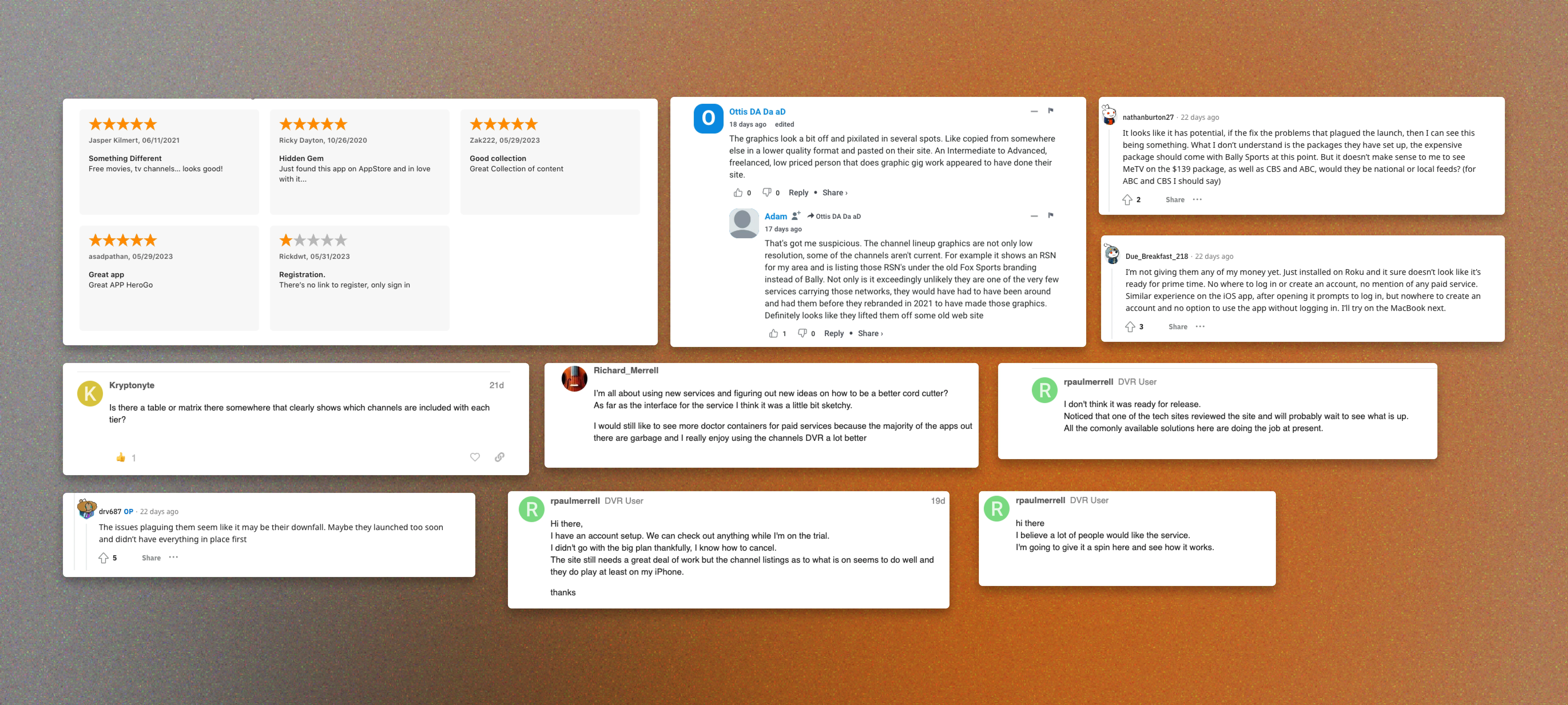
Reviews and comments about HerogoTV's initial rollout
Knowing that, I developed a revamped onboarding and visual experience that resonates with users and complements its promising content offerings.
Before

Original Landing Page
After
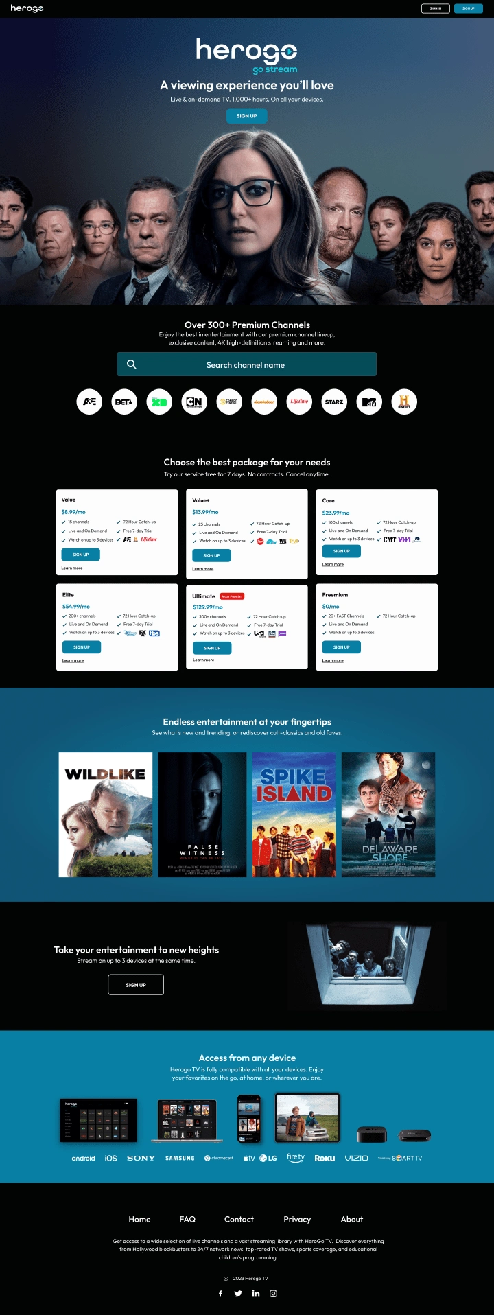
Redesigned Landing Page
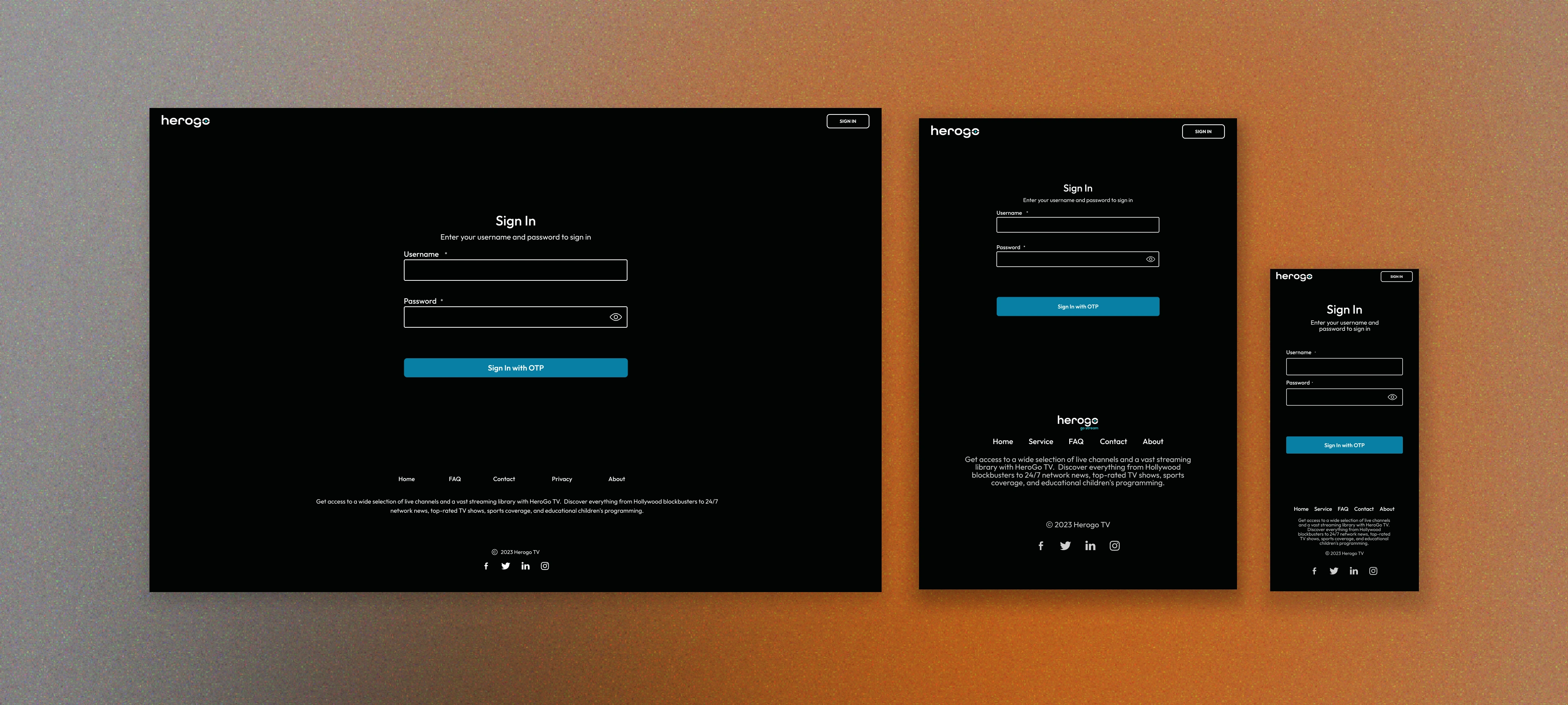
Sign In/Sign up Page (Responsive Shot)
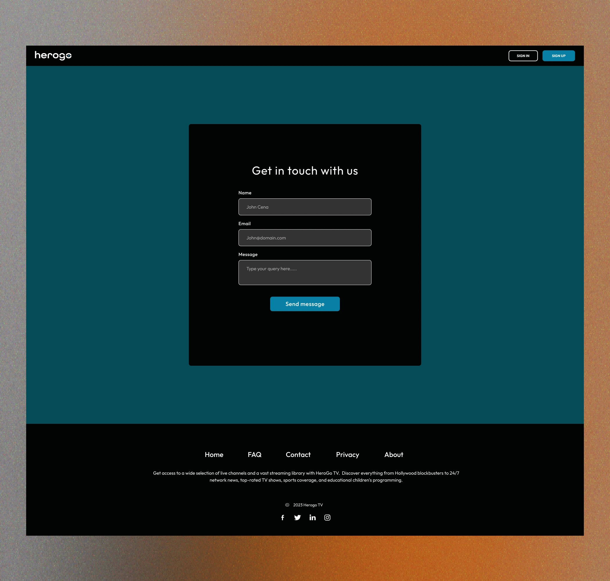
Contact Page
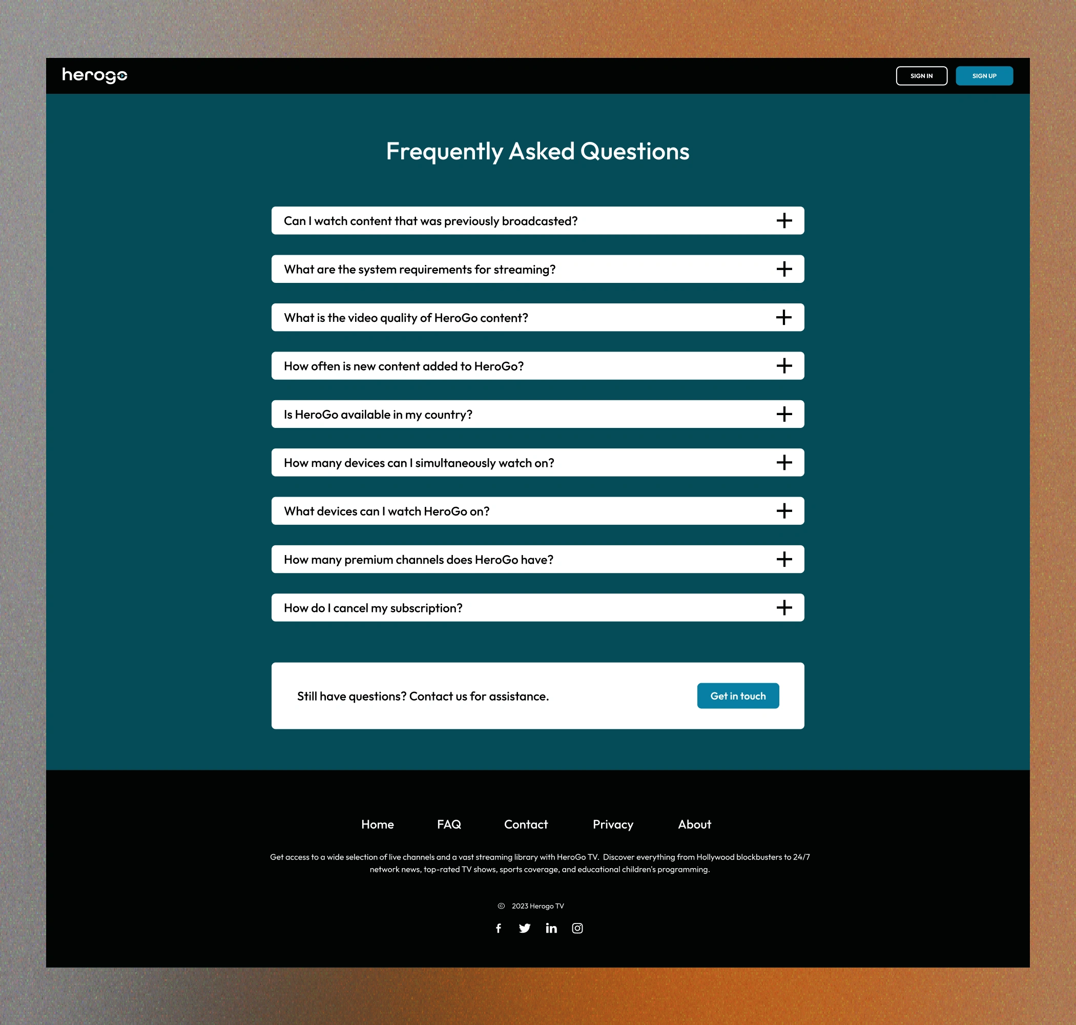
FAQ Page
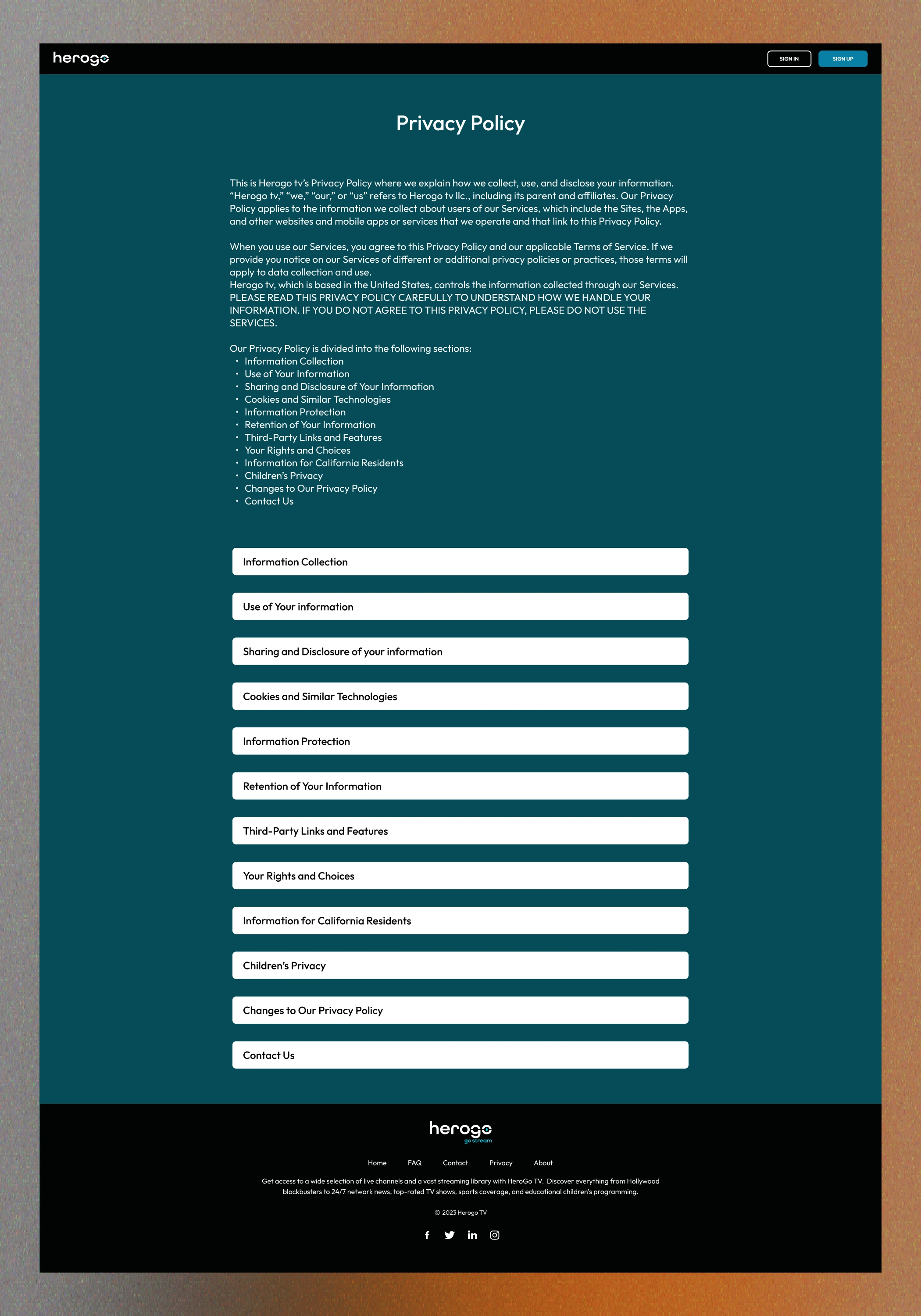
Privacy Policy Page
Can you break down your site structure?
Sure, let's start with the header. I wanted to create a pyramid formation with characters from a show available on the platform. Media is image first and text second. Cleaning up clutter that can cause information overload. The goal was to make it simple with copy that welcomes the visitor to the website.
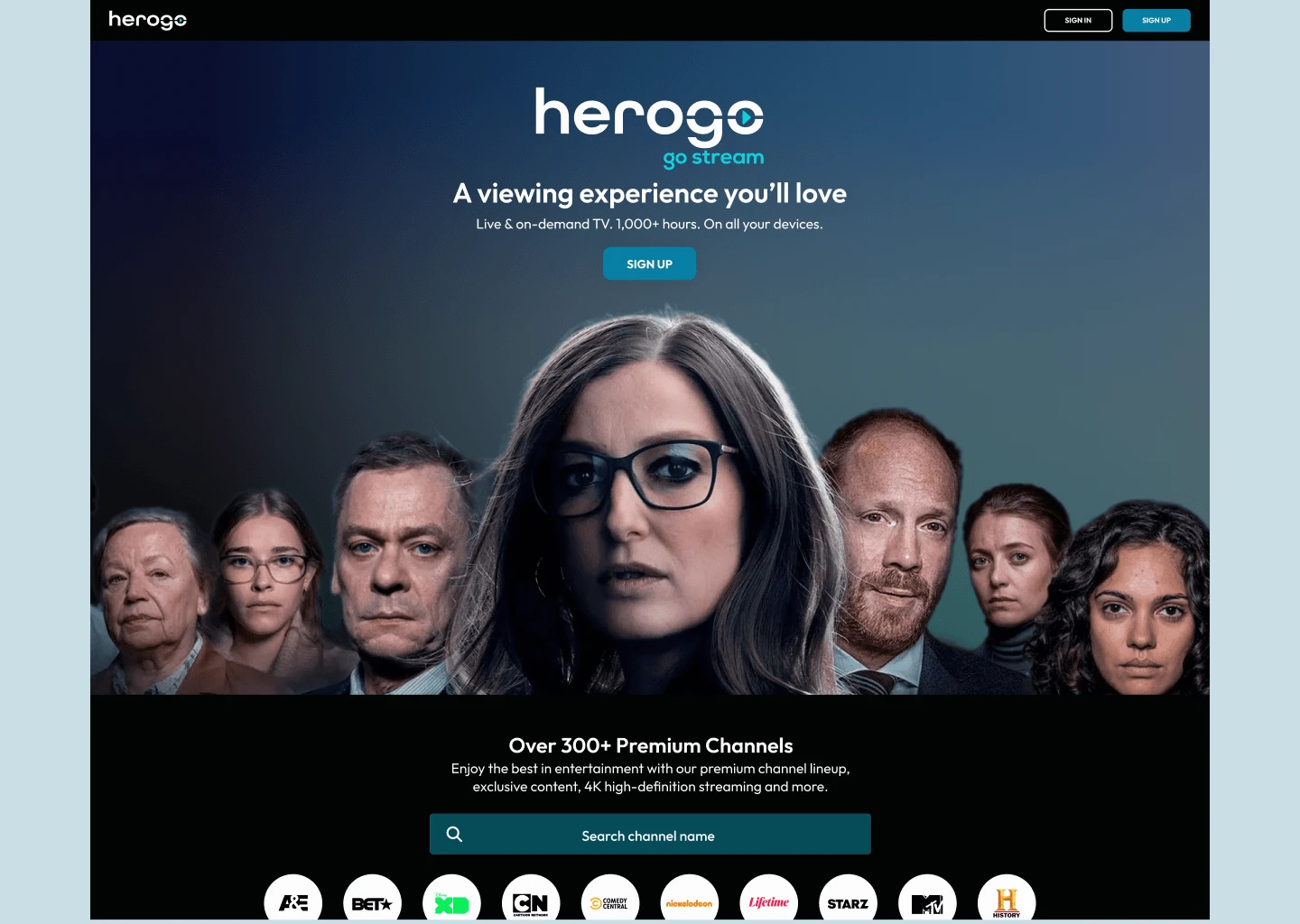
Website header
The client's main desire was showcasing their content and informing the visitor that they have over 300+ channels. That's a lot of content for the average user. If I were to sign up, I would want to know what channels I got without searching the entire site.
I sat with the team and discussed allowing visitors to use a search option to see if their favorite channels are on the platform.
Below that are the packages. I streamlined the package selection process by presenting six clear options, reducing choice overload. The “most popular” banner guides users towards a preferred choice, influencing decisions without overwhelming them.
Some examples of popular channels are nestled below to give them some ideas of what they can expect in each package. Overall, the goal was to make it easier for users to compare and select the best option for their needs, ultimately improving the overall user experience and conversion rate.
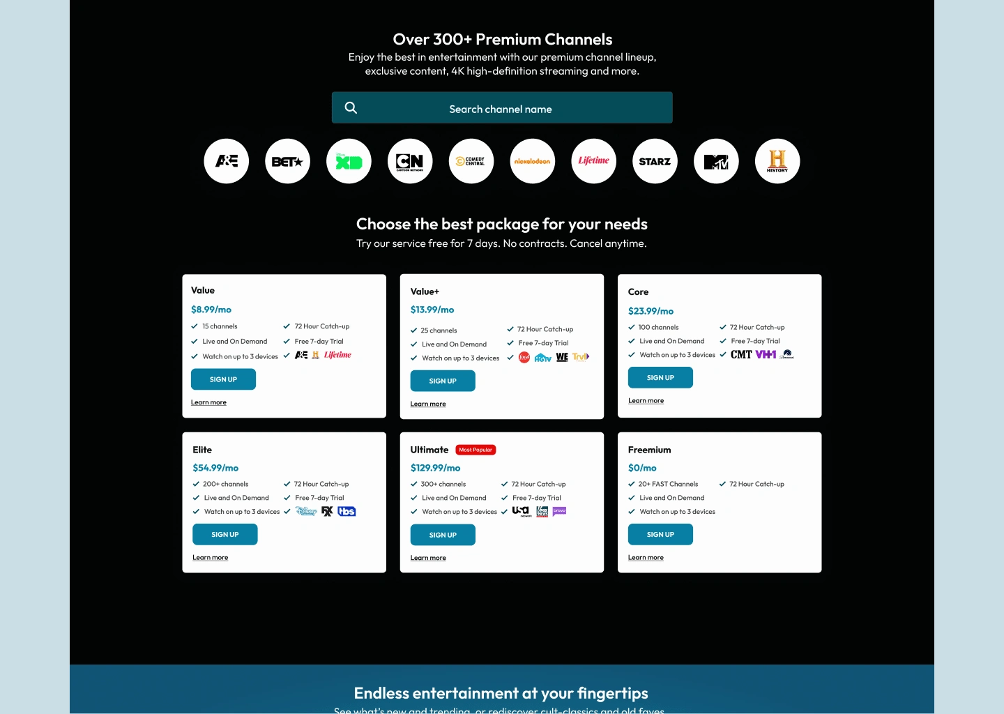
Channel and package section
Around this time, some familiar names were featured on HerogoTV (Emilia Clarke from Game of Thrones and Ella Purnell from Fallout.) The goal here was to use familiar faces as a way to encourage visitors to sign up. The bigger the name, the more likely visitors are to convert.
The next two images below are letting the user know HerogoTV is available on any device. The section with the kids looking down is one of my favorite CTAs. I thought it was pretty clever to use copy that plays on the image seen. (The shot is from the movie Spike Island, btw.)
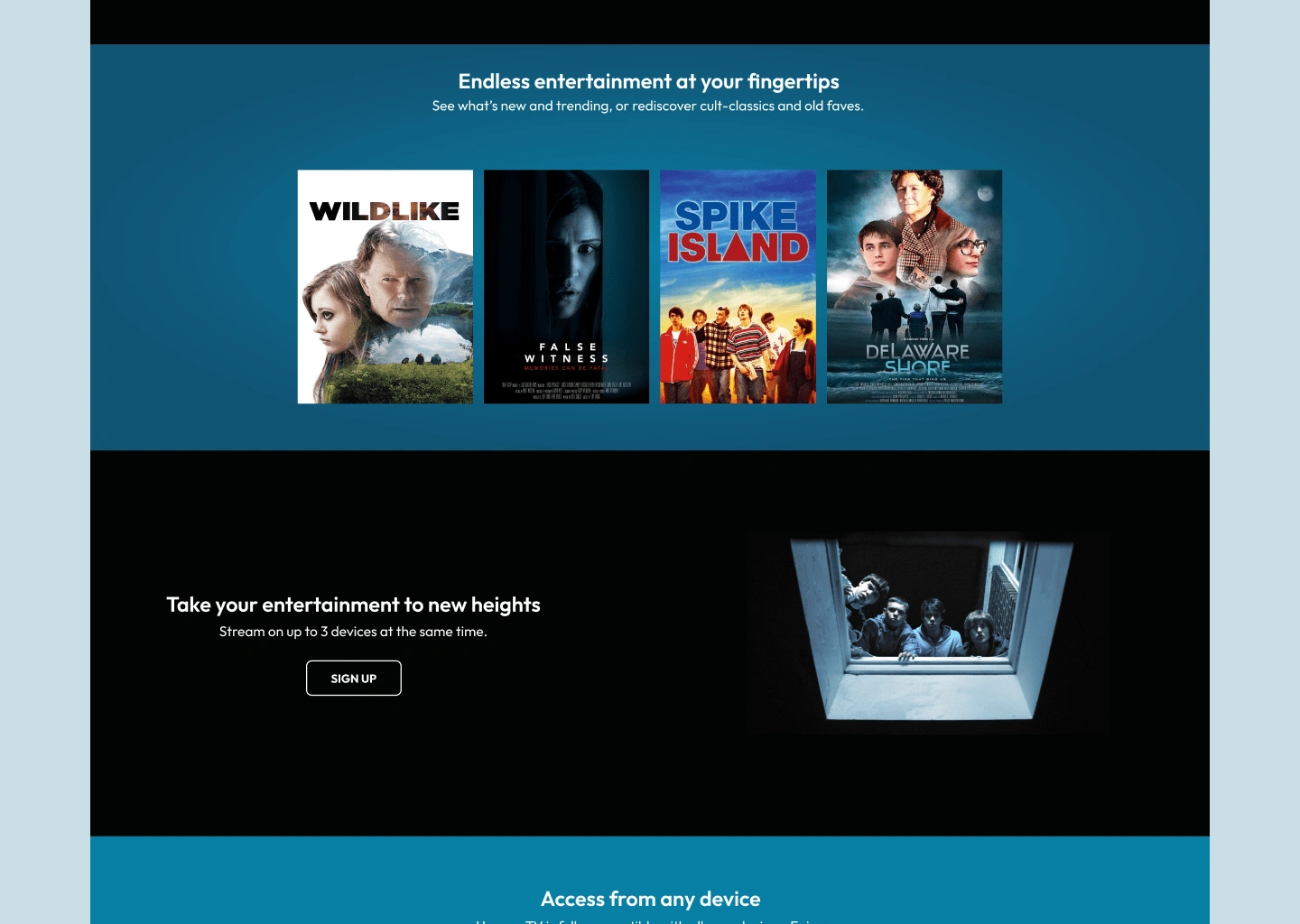
Movie showings and CTA
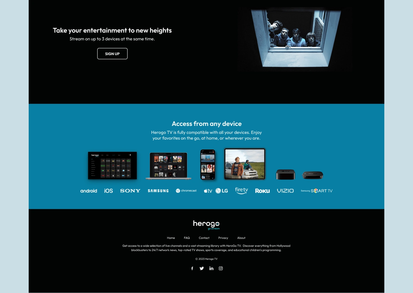
CTA, Device section and footer

Like this project
Posted Jul 3, 2023
HerogoTV is a streaming service that provides users with access to an extensive range of live and on-demand content, including movies, TV series, and sports.
Likes
0
Views
49
Timeline
Jun 5, 2023 - Jun 23, 2023
Clients

Herogo TV


