User Research and Redesign of Healthcare Website
During the course, I combined users’ needs with Peppermint’s tone and mission. The intention to increase senior citizens’ well-being motivated me to continuously iterate the redesigns.
ROLE content strategy intern
TEAM Me, Content Head, Product Manager
TIME 6 weeks
1 Usability Testing: Understand Dashboard’s Problems
“Peppermint has great content, but it’s not yet a great product,”
said Craig Parks, Content Head of Peppermint.
Peppermint is a content feast for retired groups to connect with like-minded people and explore new passions. Since its launch, we continuously heard about users’ complaints, especially about the dashboard.
To improve users’ dashboard experience, I pitched usability testing to find out the causes and intended to solve the problems with a redesign.
Our high level goals are:
Research to find out the problems of the dashboard
Improve the site structure to connect users with the right content
Clarify Peppermint’s concept and core actions with the redesign
Increase content consumption, user retention, and engagement
Collaborating with Content Head and Product Manager, I wrote the usability testing plan and testing script. We seek to understand why the dashboard confuses users and what can we do better.
Usability Testing Plan
In this usability testing, we focused on new users’ onboarding and dashboard experience. We want to see whether the current design conveys Peppermint’s concept and mission clearly and what confuses users by observing how users interact with Peppermint.
Methodology: moderated usability study, semi-structured interview
Metrics: System Usability Scale (SUS), Customer Satisfaction Score (CSAT), Net Promoter Score (NPS)
Script:
Requires users to think out loud while they take onboarding questionnaires and scroll down the dashboard
Ask users what first attracts their attention, and what looks confusing in the dashboard
For the navigation bar: ask users what they expect to see under each content category and whether drop-down menus correspond to their expectations
Require users to evaluate their onboarding session and dashboard experience, whether they think Peppermint is easy to understand.
2 Produce Actionable Insights based on User Feedback
“The layout is confusing…I will have to scroll endlessly, without finding anything I want,”
said Kathy Renbarger, 55, Peppermint’s new user
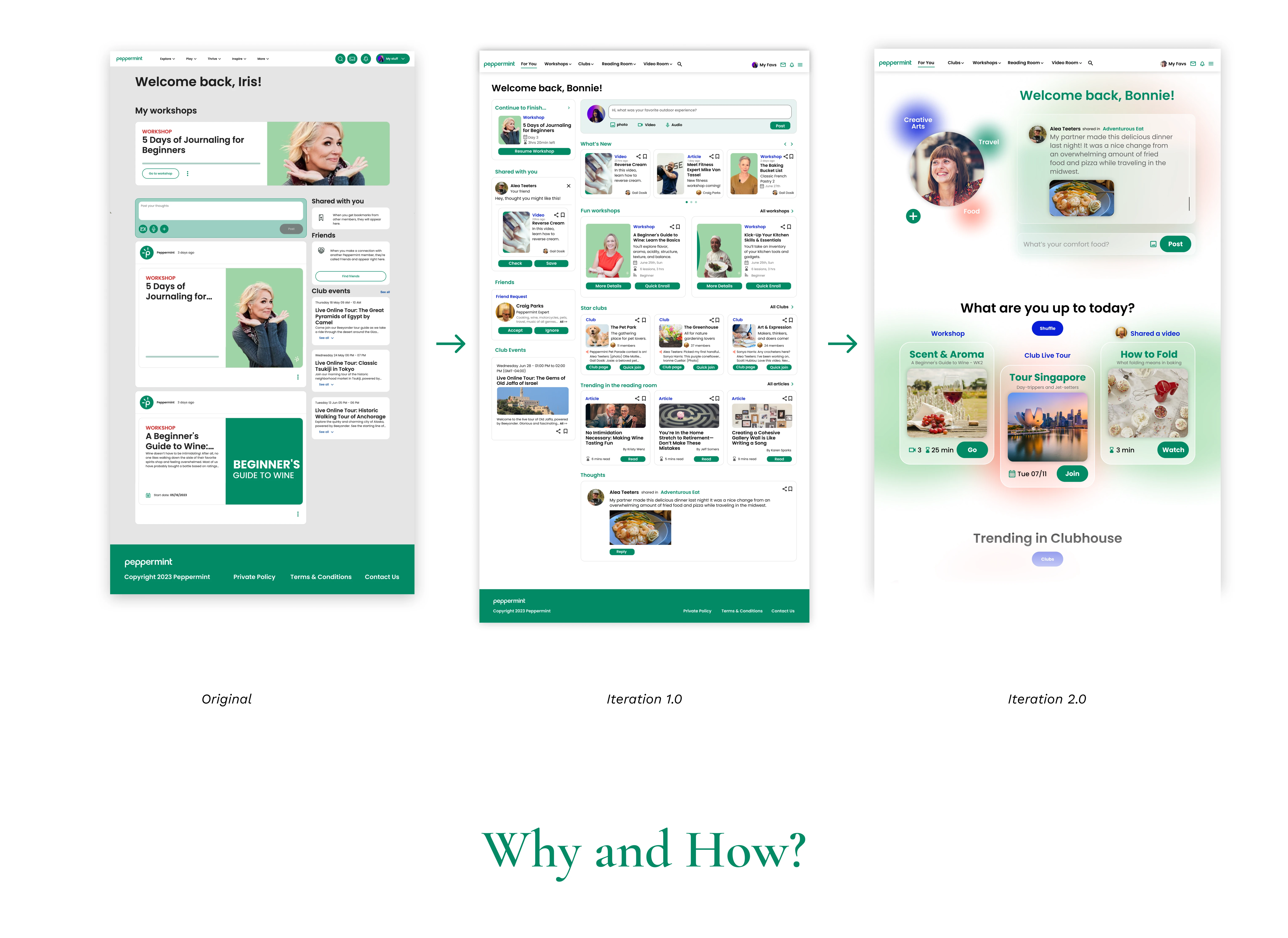
Peppermint Original Dashboard
During the testing, we found the problems of inefficiency, inconsistency, and low discoverability.
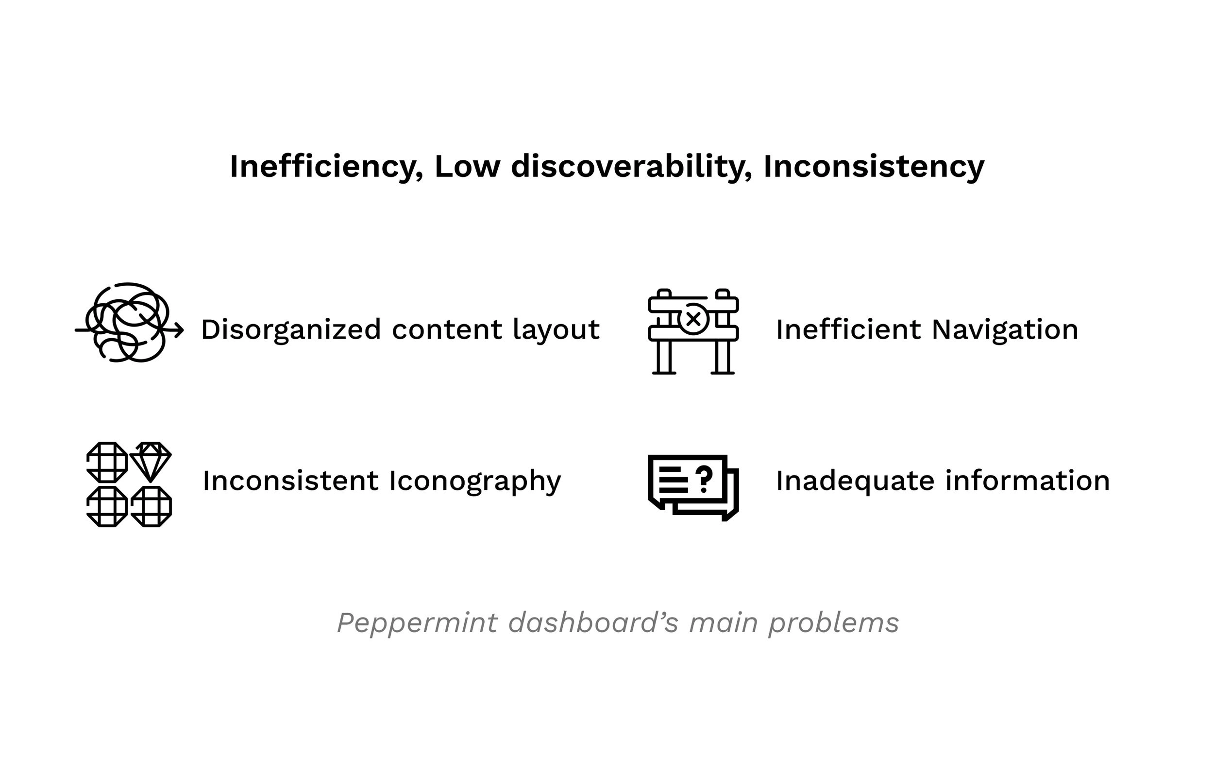
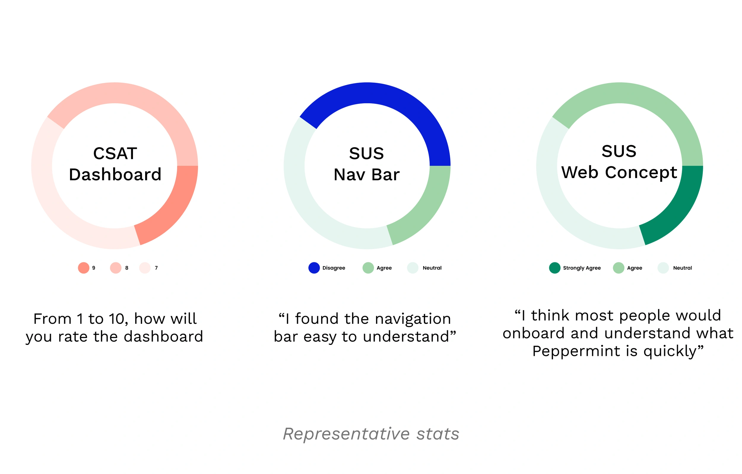
Metrics points out that not ideal dashboard experience and confusing navigation lead to unclear web (product) concept.
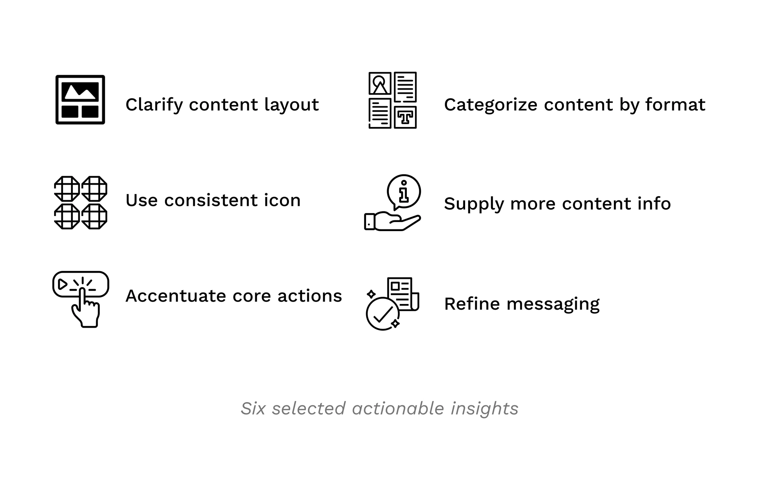
According to the testing result, I generated 20 actionable insights to improve the dashboard, ranging from accentuating call-to-action buttons and clarifying content layout.
3 Iteration 1.o: Making Peppermint Organized and Informational
How might we help users navigate through the homepage content effortlessly?
Before:
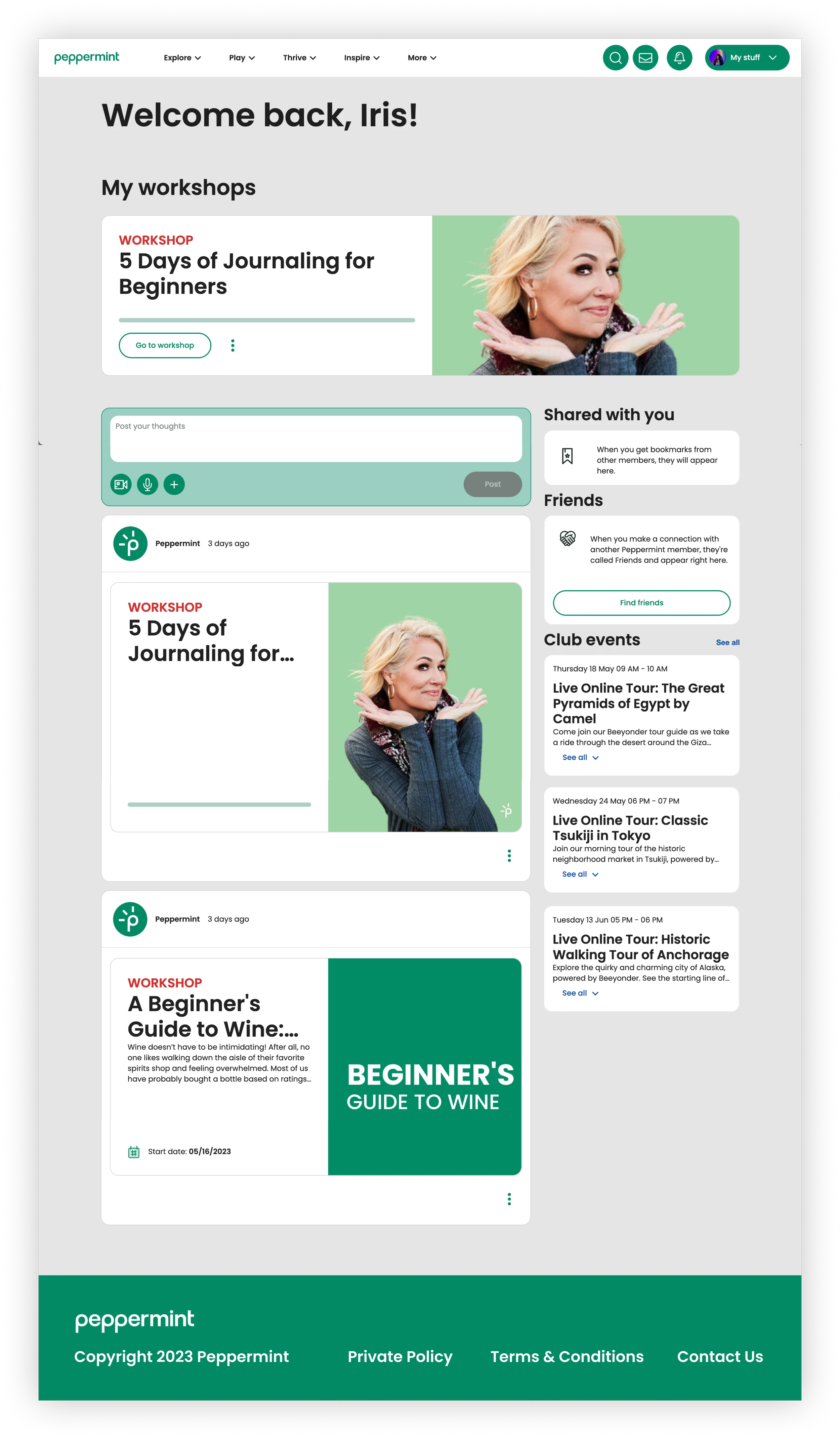
After:
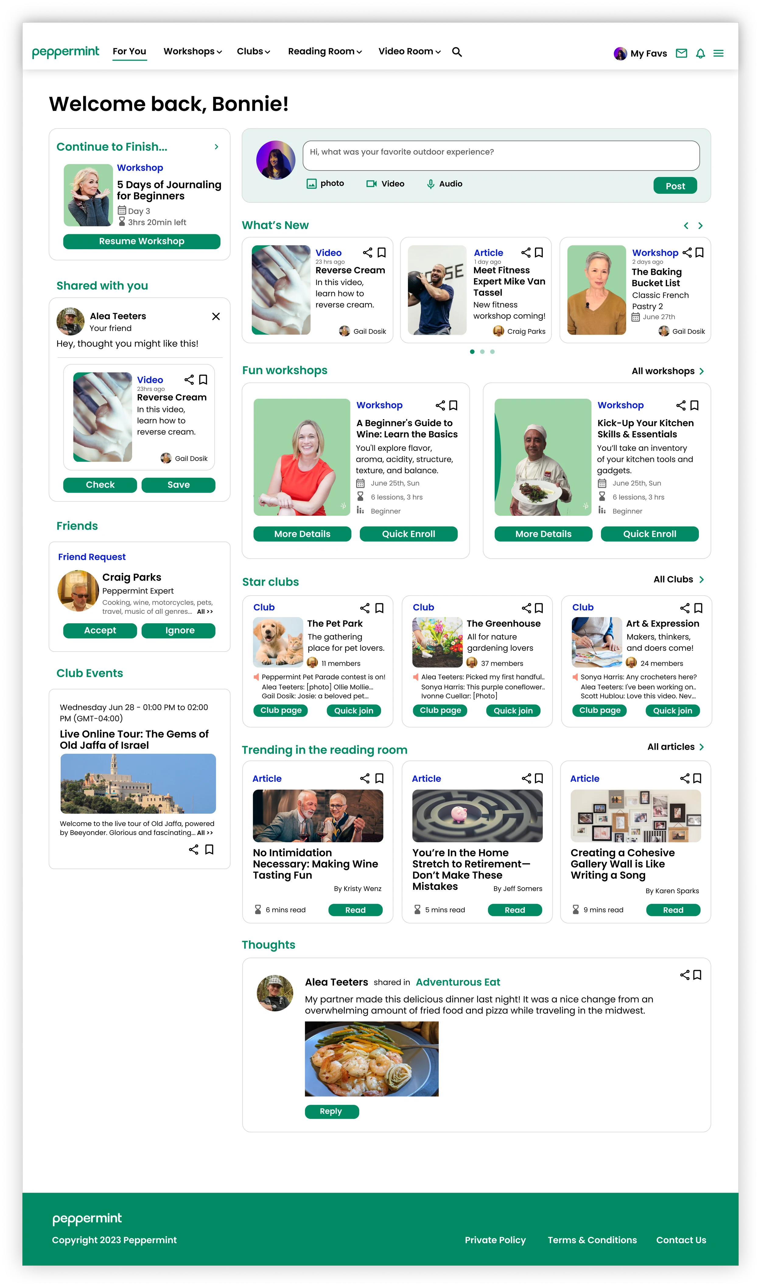
I organized each content format into a fixed position, added enough information, and stressed the call to action.
Specifically, I redesigned the information architecture by categorizing content by first format and then content topics.
Before:
After:
“This is very informational, but Peppermint is to inspire, not just to inform,”
said Rich Maggiotto, CEO of Peppermint.
Rich’s feedback opened my eyes. I redesigned the dashboard based on users’ needs, but I forgot the brand tone and Peppermint’s mission.
With tone and mission in mind, I set design principles and restarted the design.
4 Iteration 2.0: From Informational to Inspirational
I iterate on the design based on the design principles and changed the design direction.
How might we map out content to engage and inspire users?
I brainstormed 8 content layout wireframe ideas. Then, I chose one to further develop into a high-fidelity design.
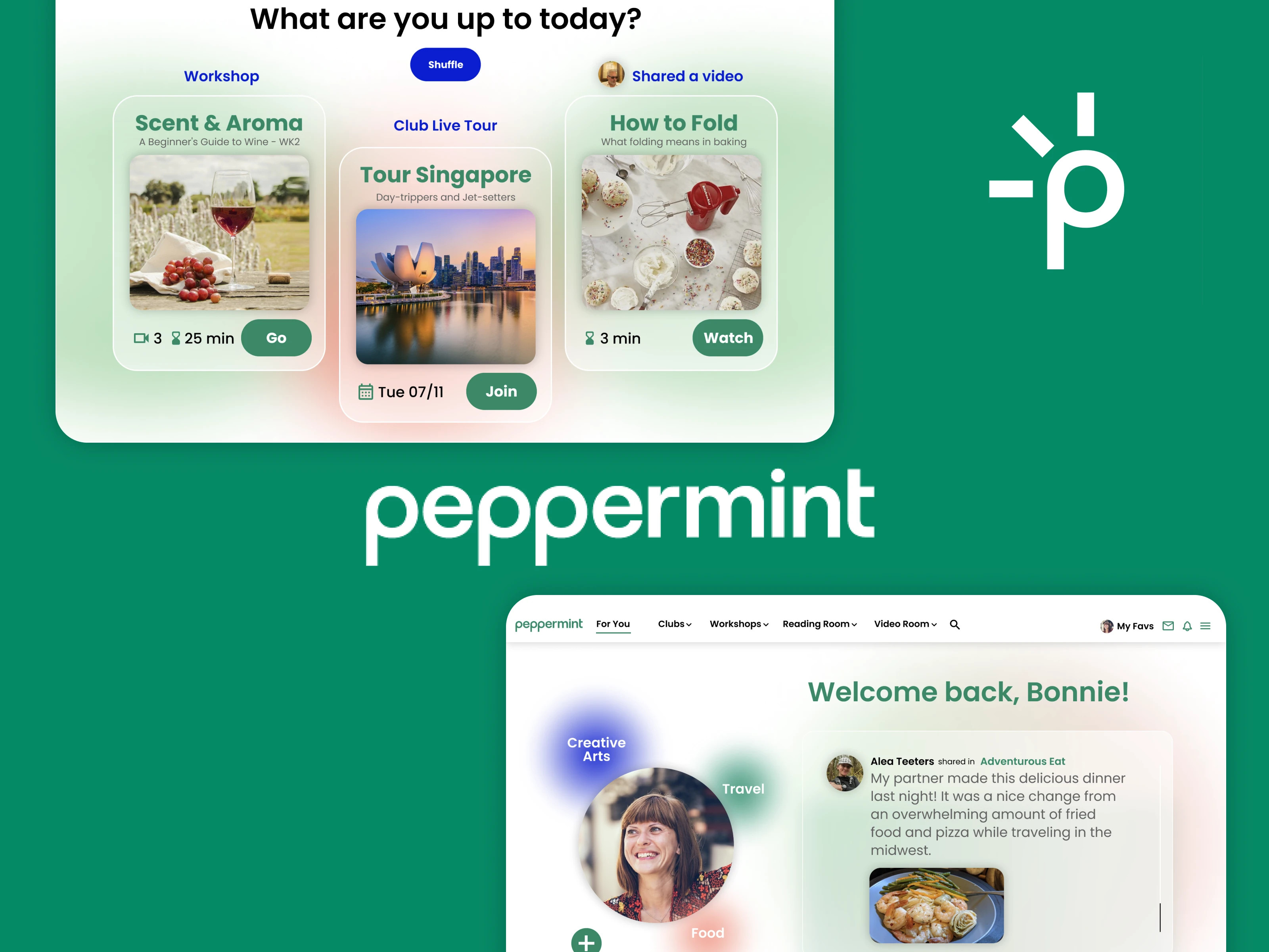
In the second iteration, I focused more on visual engagement and concise layout.
Visuals and whitespace make an easy and enjoyable browsing experience. Interactive elements like community posts, cards shuffling, and appealing visuals increase content consumption.
5 Reflection: Aging Is Cool People Growing
“So does this imply that I can’t figure the system out by myself?”
said Debbie Wolfe, 67, a camping lover.
The current growth of the population aged 55 and older is one of the most significant demographic trends in US history. And this non-digital native group is severely underserved in the current technology landscape.
However, stepping into 55+ does not mean that they are not cool anymore, not intelligent anymore, and not open-minded anymore.
During the usability testing, they display their high requirements on visuals:
“This image turned me off.” “The red color is too intense.”
Also, they demonstrate a unique interpretation of accessibility:
“I appreciate the big fonts. But it might be too big. I’d rather have more information.”
Mentally, they are sensitive to their ages and how we present the content.
Correspondingly, the key for this project is to keep a subtle balance between accessibility, aesthetics, and engagement.
Most importantly, don’t underestimate elder citizens, treat them equally. Design for their well-being instead of only accommodating physical limitations.
Combine users’ needs with brand tone and mission.
I overlooked the brand tone and mission in the first redesign. This leads to a highly utilitarian and informational dashboard instead of an inspiring, engaging and tantalizing content feast.
In the future, I will remember to balance these two important factors.
Any Thoughts?
Like this project
Posted Sep 17, 2023
I generated 20+ product insights by conducting usability testing and User research and grew Customer Satisfaction Score by 25% by redesigning the dashboard.
Likes
0
Views
15

