Logo & Branding for Women's Services Org

Brian Olson


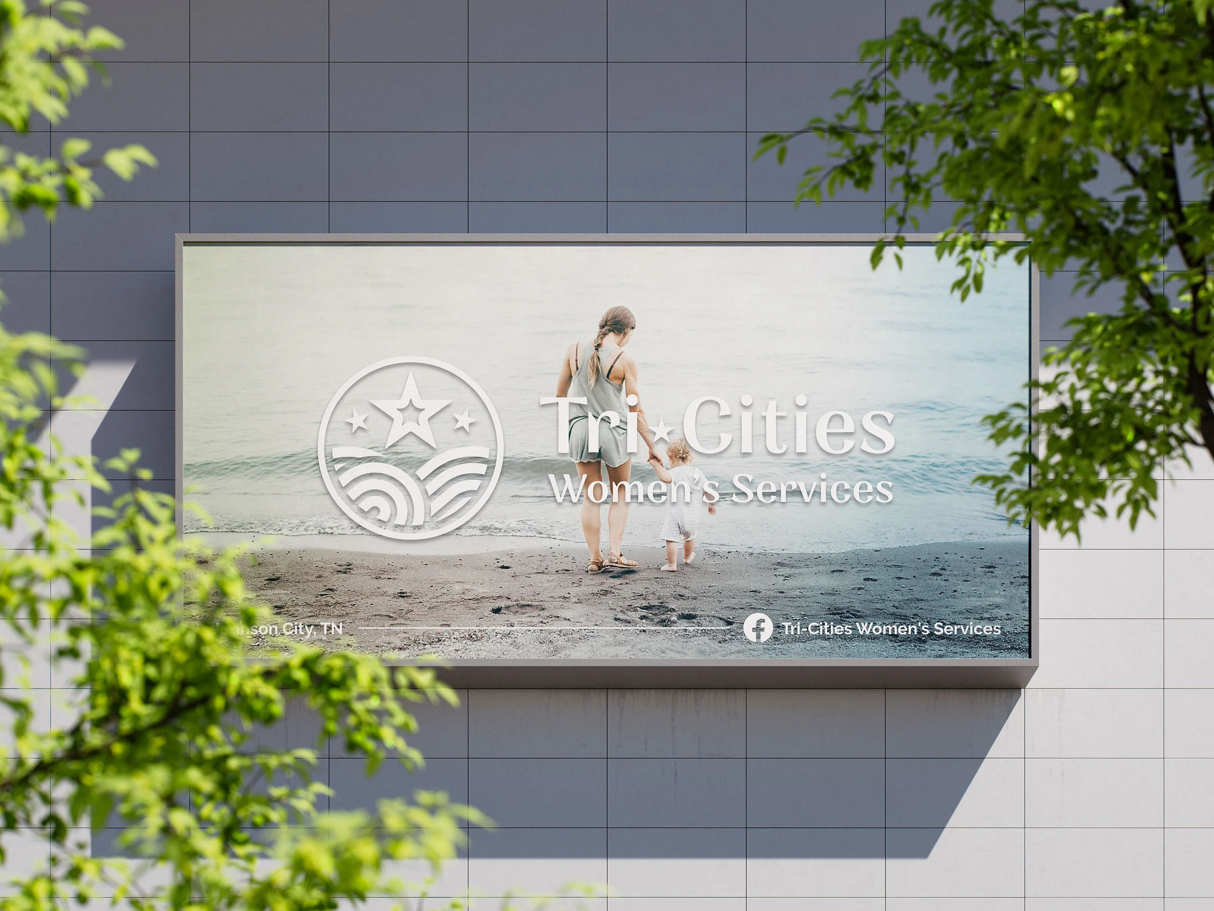
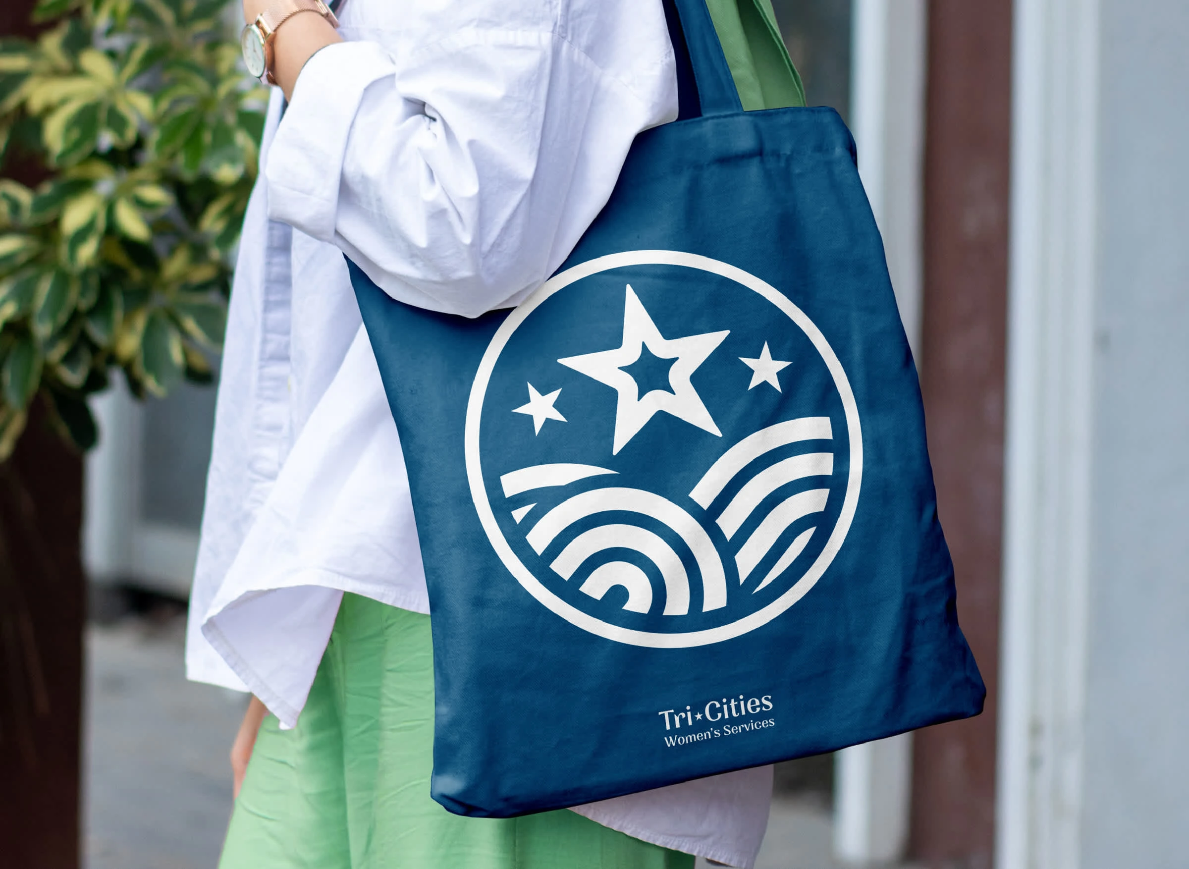
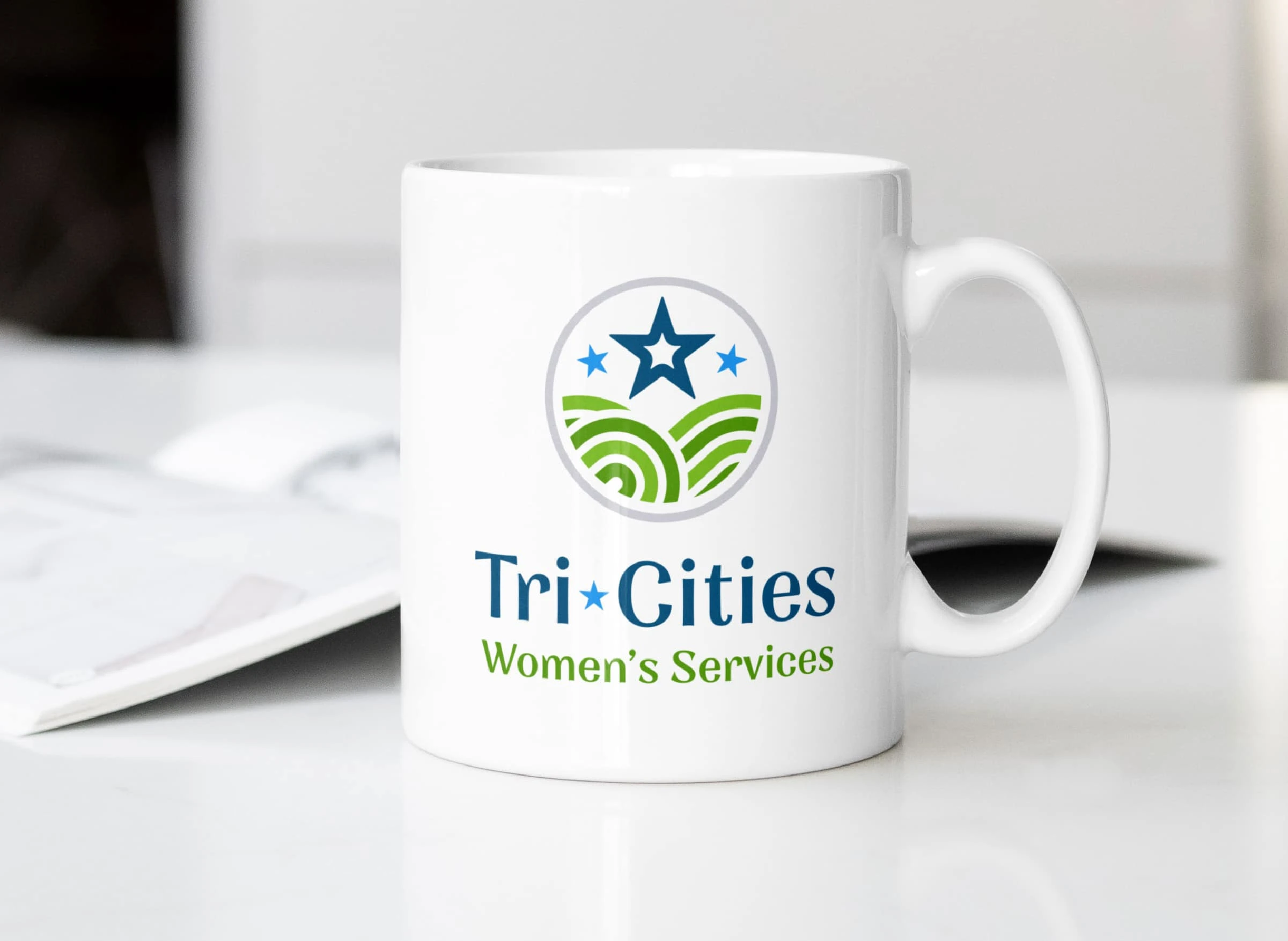
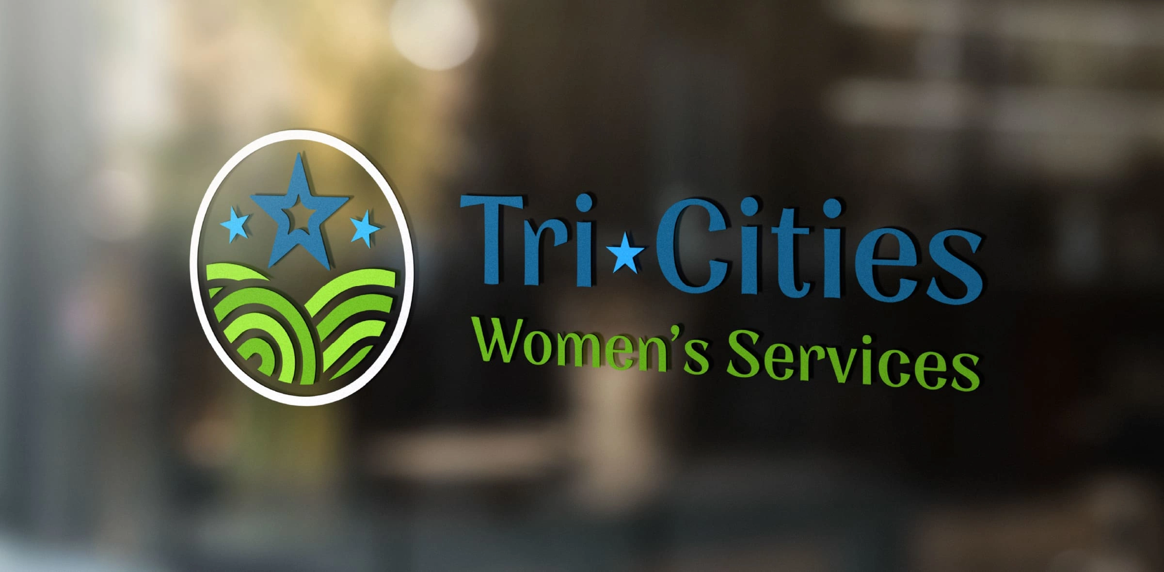
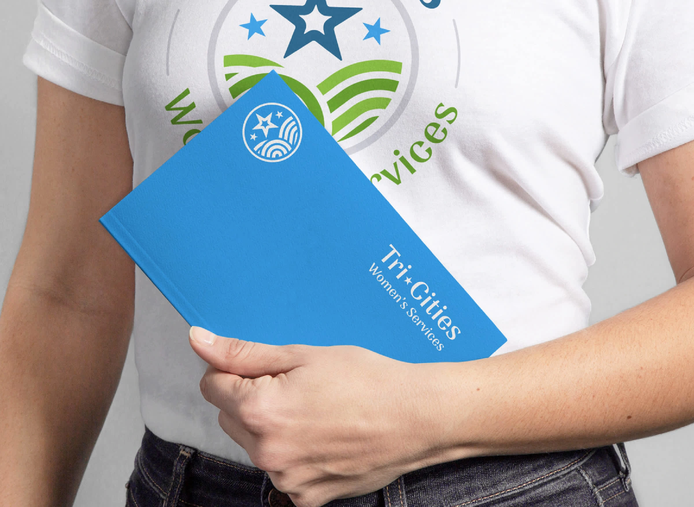
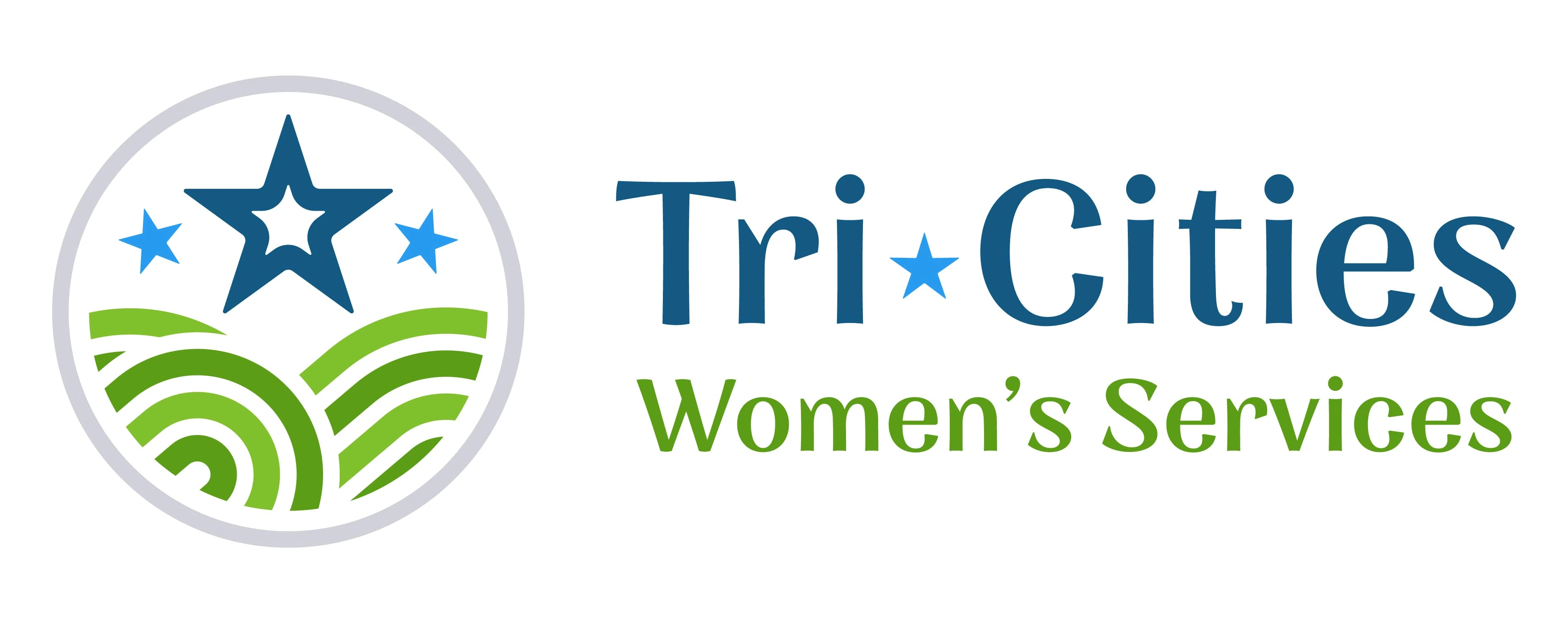
We partnered with Save the Storks to develop a powerful logo suite and light brand suite for Tri-Cities Women's Services.
Based in Johnson City, TN, they wanted to keenly portray their allegiance to the local community. We pulled subtly from Tennessee landmarks, and aggressively from the Tennessee flag for an undergirding concept. This was tied up in a pleasing lockup with youthful typography, verdant primary colors and softened edges. The notion of strength combined with femininity and gentle support were key drivers behind this design suite.
Ready to Set your own business apart?
Like this project
Posted Feb 25, 2025
Pulling from local landscapes & the heritage of the TN flag, we built a strong framework. Youthful type, verdant colors, & soft edges brought it to the finish.
Likes
0
Views
2
Timeline
Sep 1, 2024 - Nov 1, 2024
Clients
Save The Storks


Strategy & Brand Development | Responder Six Coffee Co.

OLSON Swag Concepts
Brand Collateral - MDG
Our Exceptional Life | Photo Book Design