EPoint - Loyalty Program | App Design UI/UX
Overview
Epoint is an application of EVN HANOI, the product is built and developed with the purpose of taking care of customers using electricity, and helping customers to monitor their daily electricity consumption and electricity bills.
Epoint application also allows users to accumulate points from many different programs, and redeem rewards by burning points.
Objectives & Goals
Epoint wants to deliver the NEW experience by the modern style design, bring the clean look & feel to user. So they decide to redesign the app to a new version.
GoalsRedesign the old fashion app
Better visual hierarchy
Clean and modern layout
High affordance
Problems & Solutions
Problems of the old design:Outdated style
Spread out content
Illustrations and icons are not consistent
Primary color is quite boring (blue)
Secondary color is low contrast (yellow)
👉
Solution:Using the new primary and secondary color
Redesign components and layout to make the app look more modern
Illustration conveys close meaning
Using new icon set
The Old Version
These are some screens of the old app.
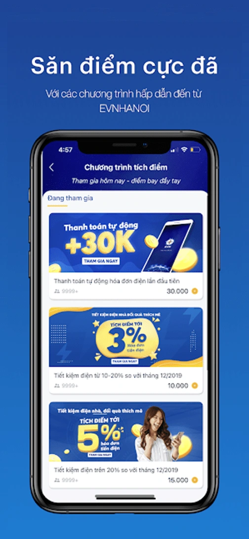
List of vouchers to redeem
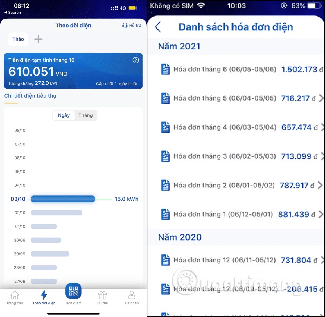
Electricity tracking and electricity bill list
👉 The New Version
Let's see what we have done!
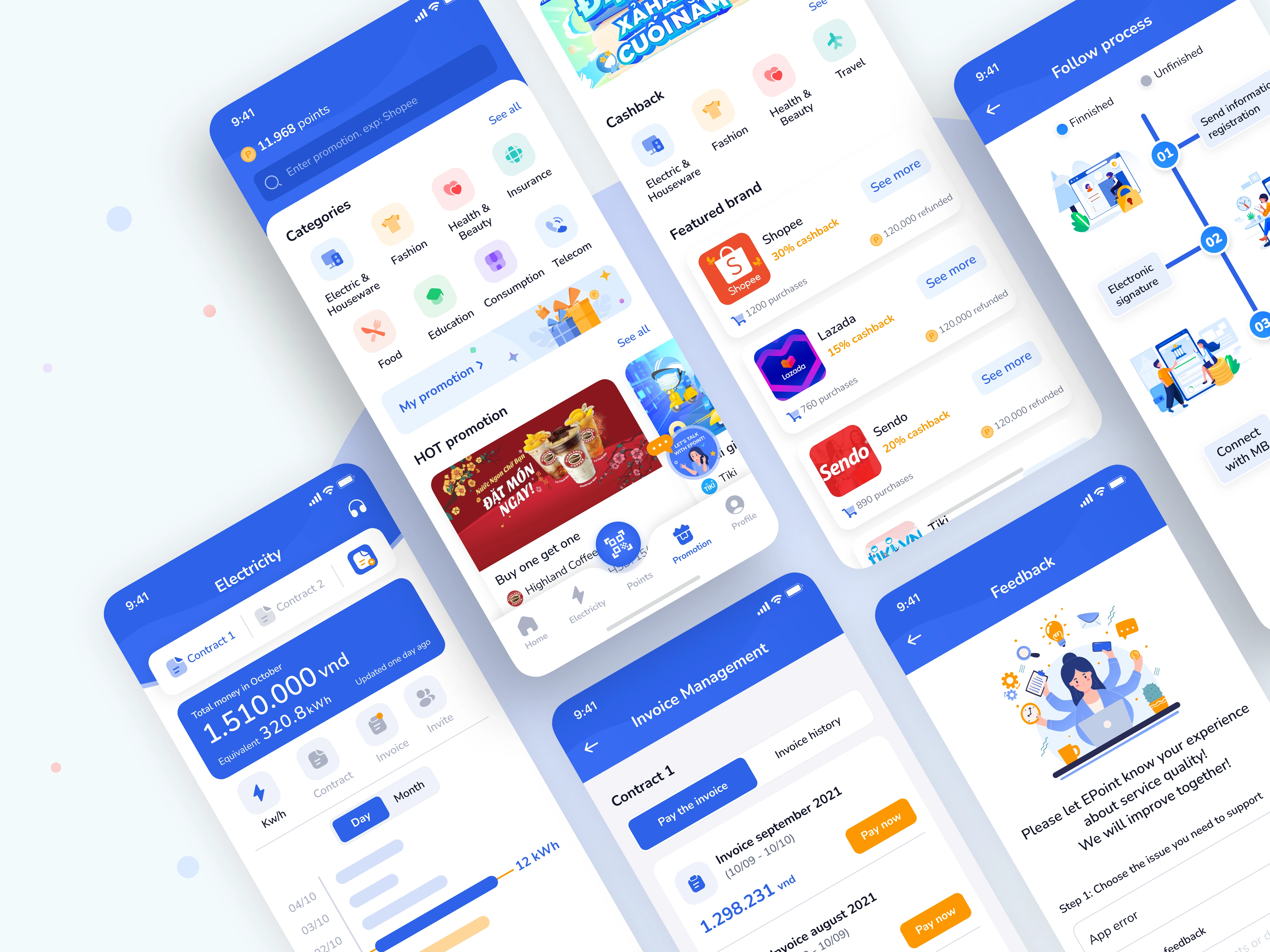
New UI
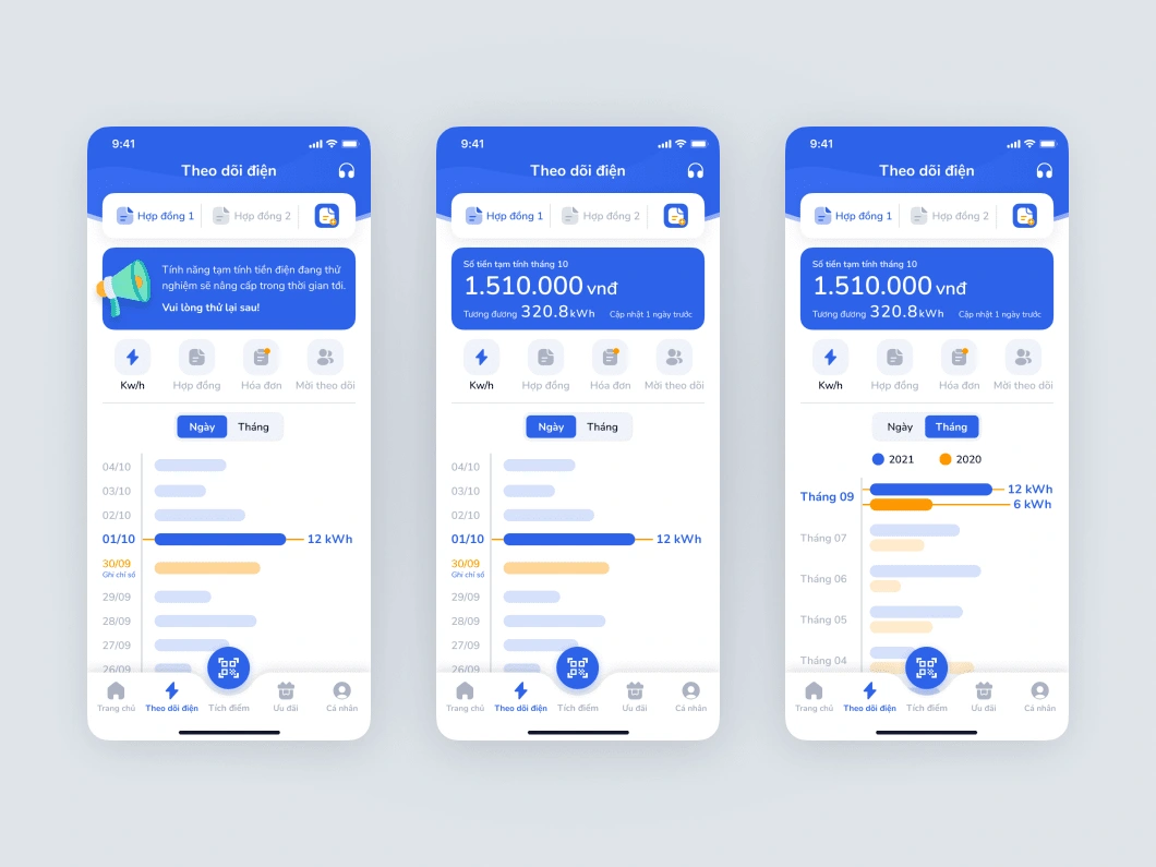
Electricity tracking
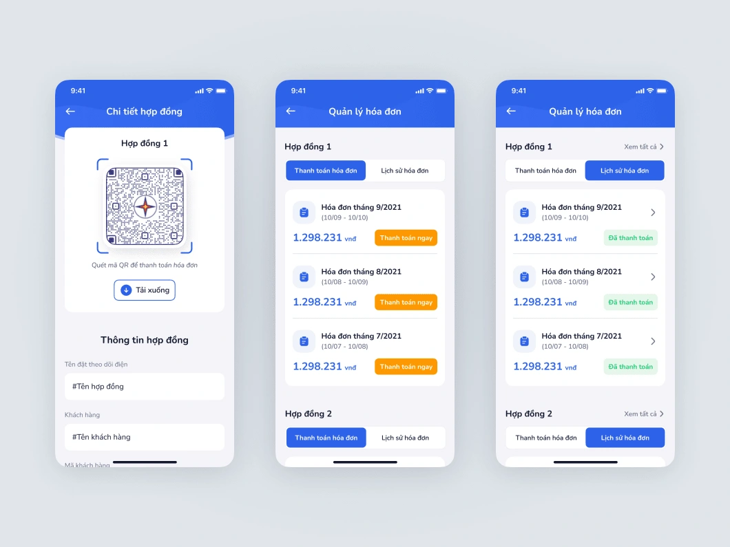
Bill management
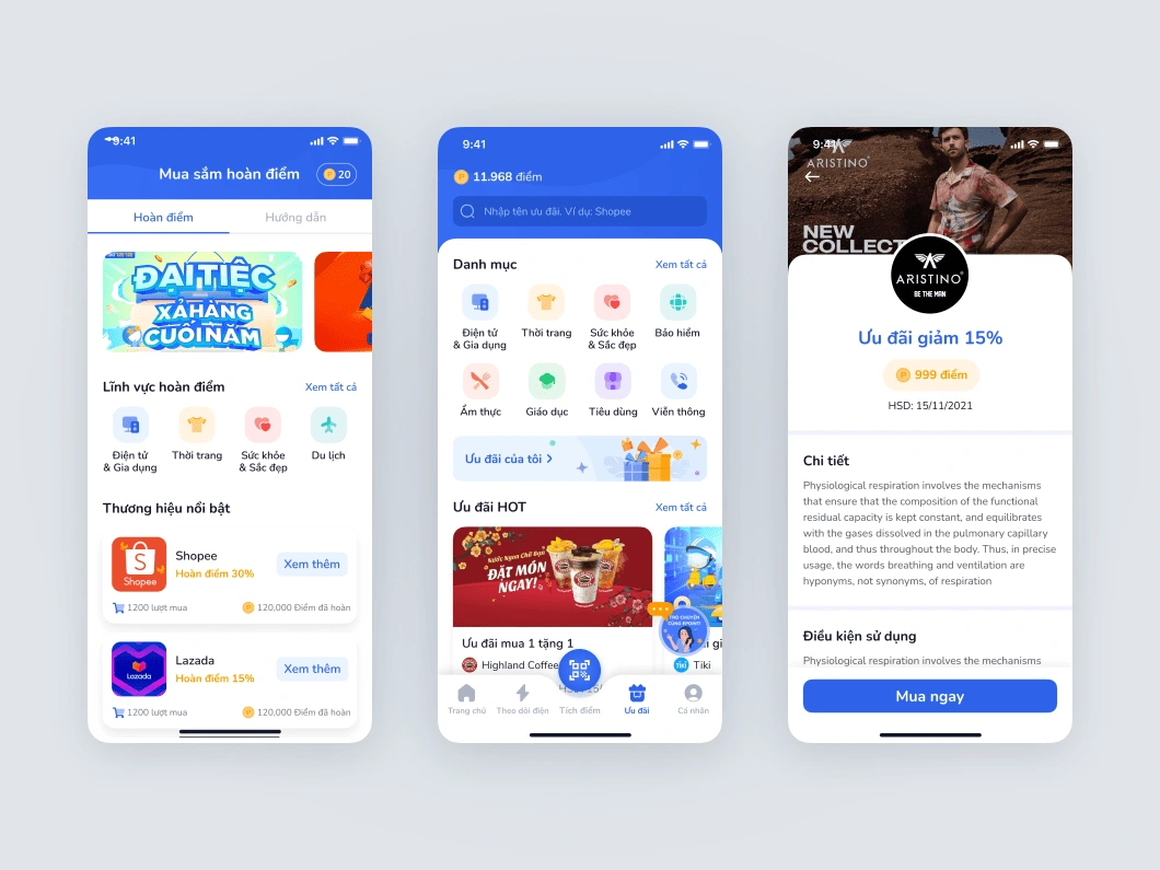
Redeem points
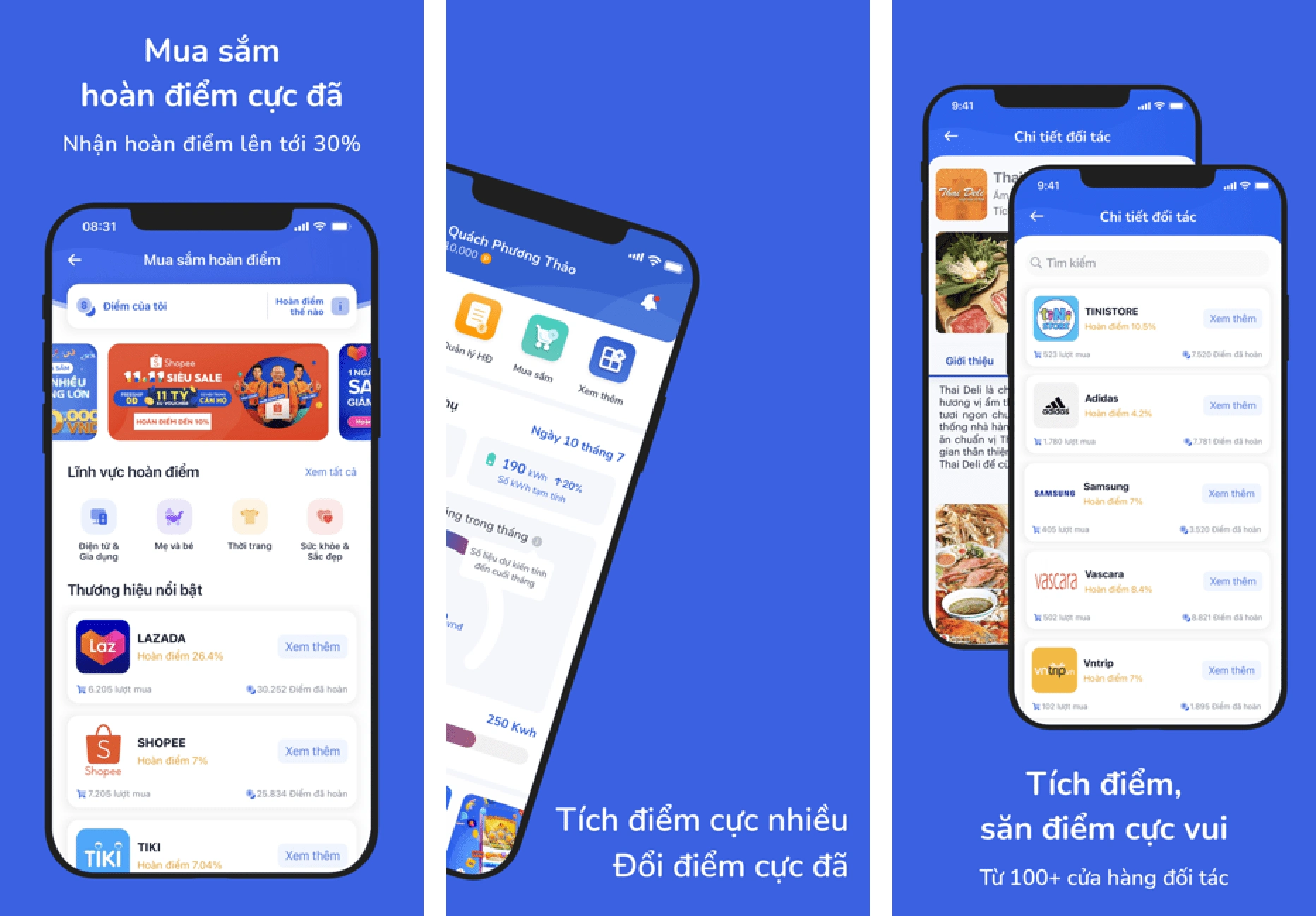
Appstore screenshots
Like this project
Posted Jan 7, 2023
Epoint is an application of EVN HANOI
Likes
0
Views
37

