Banking on better design
Arnav Dogra
Overview
The goal of this redesign is to transform the user experience of the outdated HDFC mobile banking app. By streamlining convoluted flows, removing redundancies, and consolidating features, the redesigned app will become an intuitive one-stop solution for all banking and payment needs. This unified experience aims to reduce the current dependency on third-party apps for payments, bringing everything together in a modern UI aligned with today’s UX best practices. The result is an excellent all-in-one banking and financial management tool tailored to customers’ needs.
Problem statement
As a long-time HDFC customer, I have experienced firsthand the friction and frustration of using their outdated mobile banking application. Mundane tasks often require navigating complex flows and even finding basic information is a chore.
As for payments, most of the time, I leaned on third-party apps like Google Pay and PayTM for online transactions due to the app’s modern up-to-date and easy-to-use UI. This bifurcated experience is far from ideal - needing two apps for intimately connected tasks was cumbersome.
Strategy
The redesign aims to transform HDFC into a one-stop banking solution by addressing the following pain points faced by an average user:
Confusing and Outdated UI:
The current user interface presents a significant challenge with its outdated design, causing confusion among users. Implementing a modern and intuitive UI will not only enhance the aesthetic appeal but also drastically improve the overall user experience.
Lack of Standardized Patterns and Components:
The absence of standardized design patterns and components across the app contributes to a disjointed and inconsistent visual experience. Establishing a cohesive design framework with standardized elements will promote a seamless and unified interaction for users.
Difficult to Navigate Due to Complex Flows and Redundancies:
Users often grapple with the app’s intricate navigation, hindered by convoluted flows and redundant features. Streamlining navigation paths and eliminating unnecessary redundancies will simplify user interactions, fostering a more efficient and enjoyable banking experience.
Non-Robust Payment and UPI Features:
The current state of payment and UPI features falls short of providing a robust and dependable service. Enhancing the reliability, speed, and functionality of payment and UPI features will instil confidence in users, encouraging them to utilize the app for a broader range of financial transactions.
Phase 1: Discover
Initial brief
In the initial phase of this project, I opted not to conduct user interviews, primarily due to two key factors:
Firstly, within my social circle, only three individuals, myself included, were users of the HDFC app.
Secondly, given the time constraints of this rapid design sprint, sourcing participants for user interviews posed a challenge.
Consequently, I made the strategic decision to allocate more emphasis to secondary research, specifically focusing on desk research.
Primary Focus:
Scrutinizing the Google Play Store and app store to identify user pain points.
Analysing third-party apps that people frequently use to understand why they prefer using the aforementioned apps and not the banking app.
Secondary research
For secondary research, it was important to analyse existing user data and reviews to identify potential issues and gather insights, hence, the first stop was the Google Play Store and App Store.
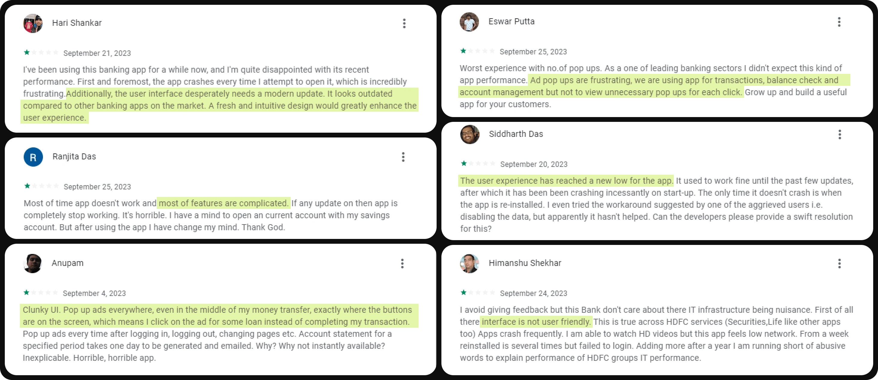
Next, according to Forrester’s Global Mobile Banking report, mobile banking in India has yet to reach world-class standards. In this context, HDFC Bank emerges as a central focus, and its mobile banking functionality falls below the global average, with a score of 48 out of 100. This assessment underscores the need for HDFC Bank and other Indian financial institutions to enhance their mobile banking capabilities and align with international standards to provide customers with a more robust and user-friendly digital banking experience.
Phase 2: Define
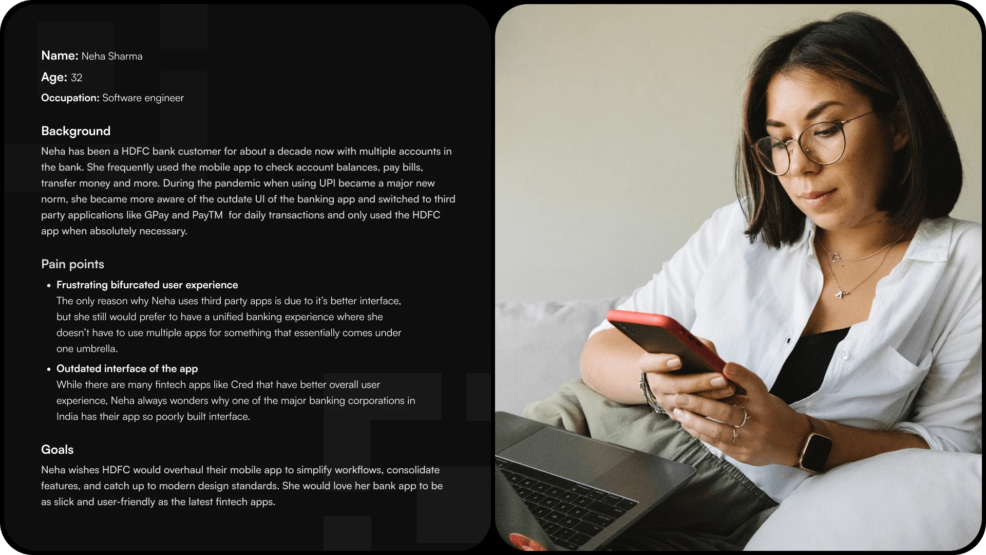
User persona
Phase 3: Ideate
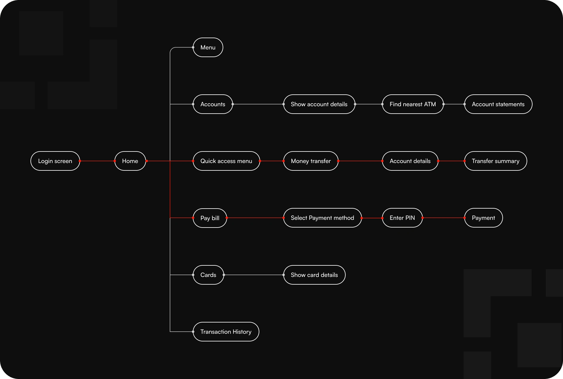
Information Architecture
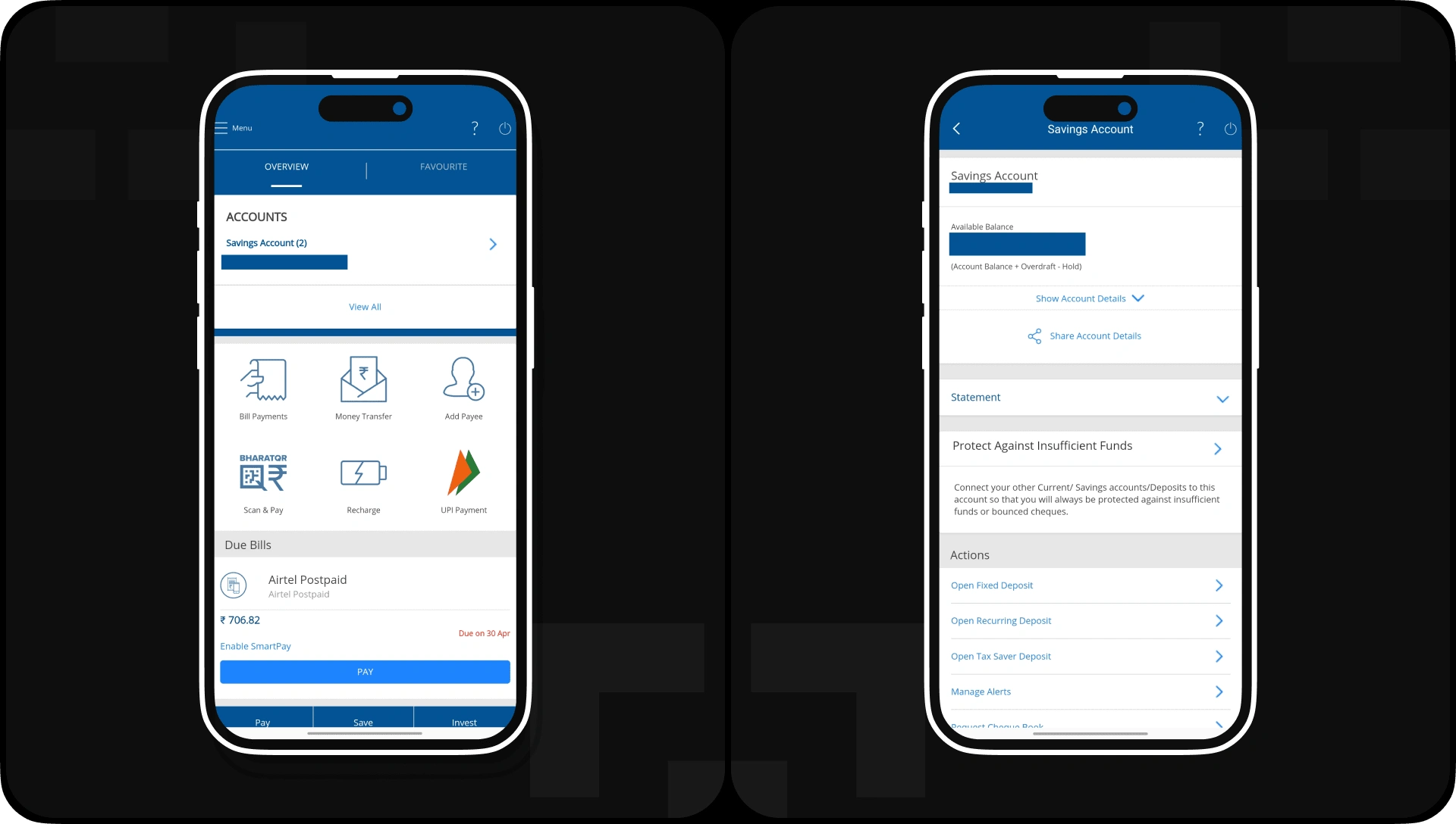
Original Screens
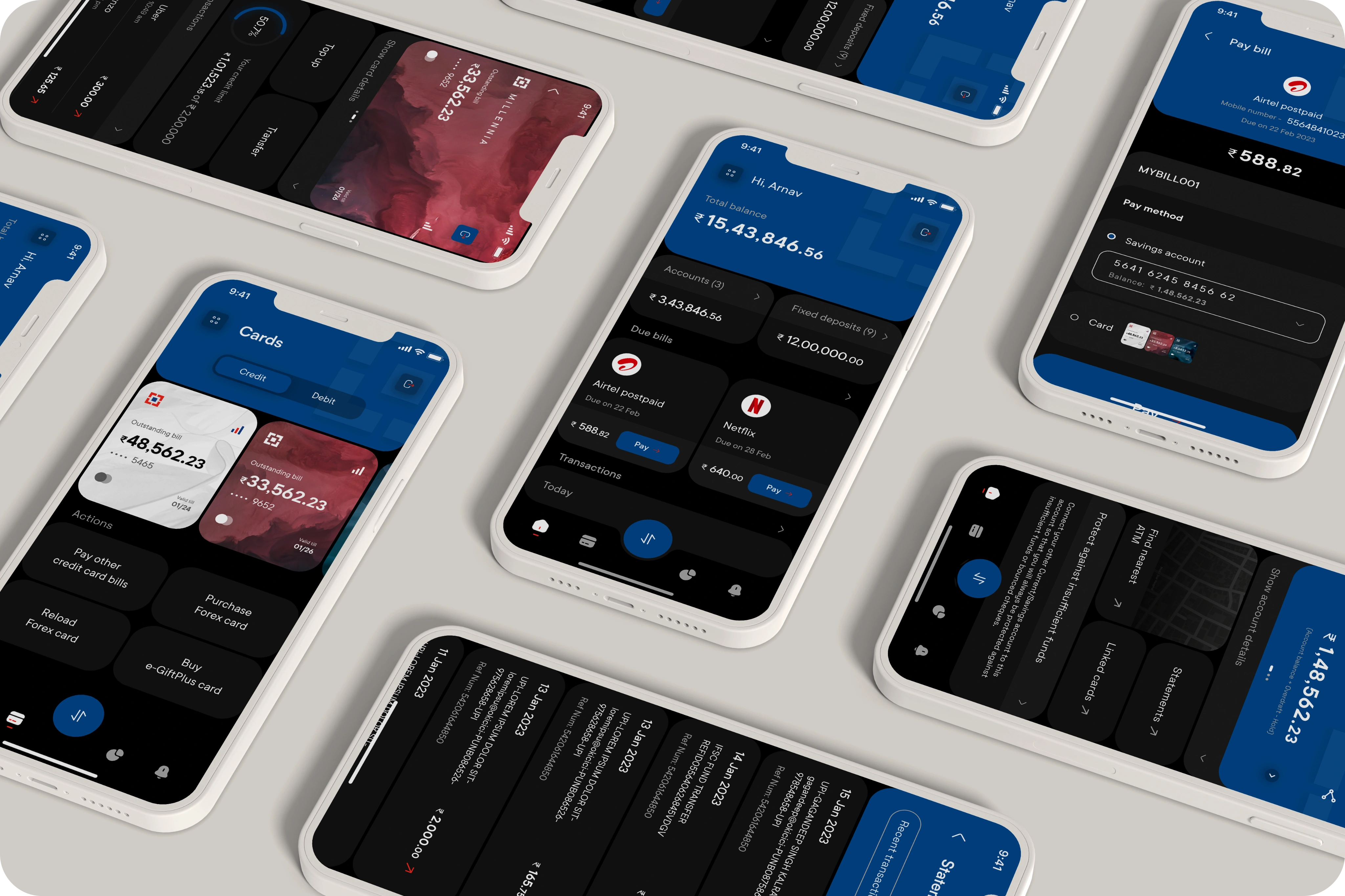
Phase 4: Design
The concept UI redesign draws inspiration from a very recent design trend called the Bento Grid. This design style is inspired by Japanese lunch boxes with the same name (Bento) where elements are grouped in cells of different sizes.
Adopting this design style helped in organizing what was previously a scattered interface and ensured that the user flow became easier for an average customer.
Understanding the diverse user base of HDFC, the redesign prioritizes the needs of the average customer. The Bento Grid's organized layout is particularly beneficial for users seeking a straightforward and user-friendly experience. With features grouped logically, users can swiftly locate and access the functions they need, reducing the learning curve associated with digital banking interfaces.
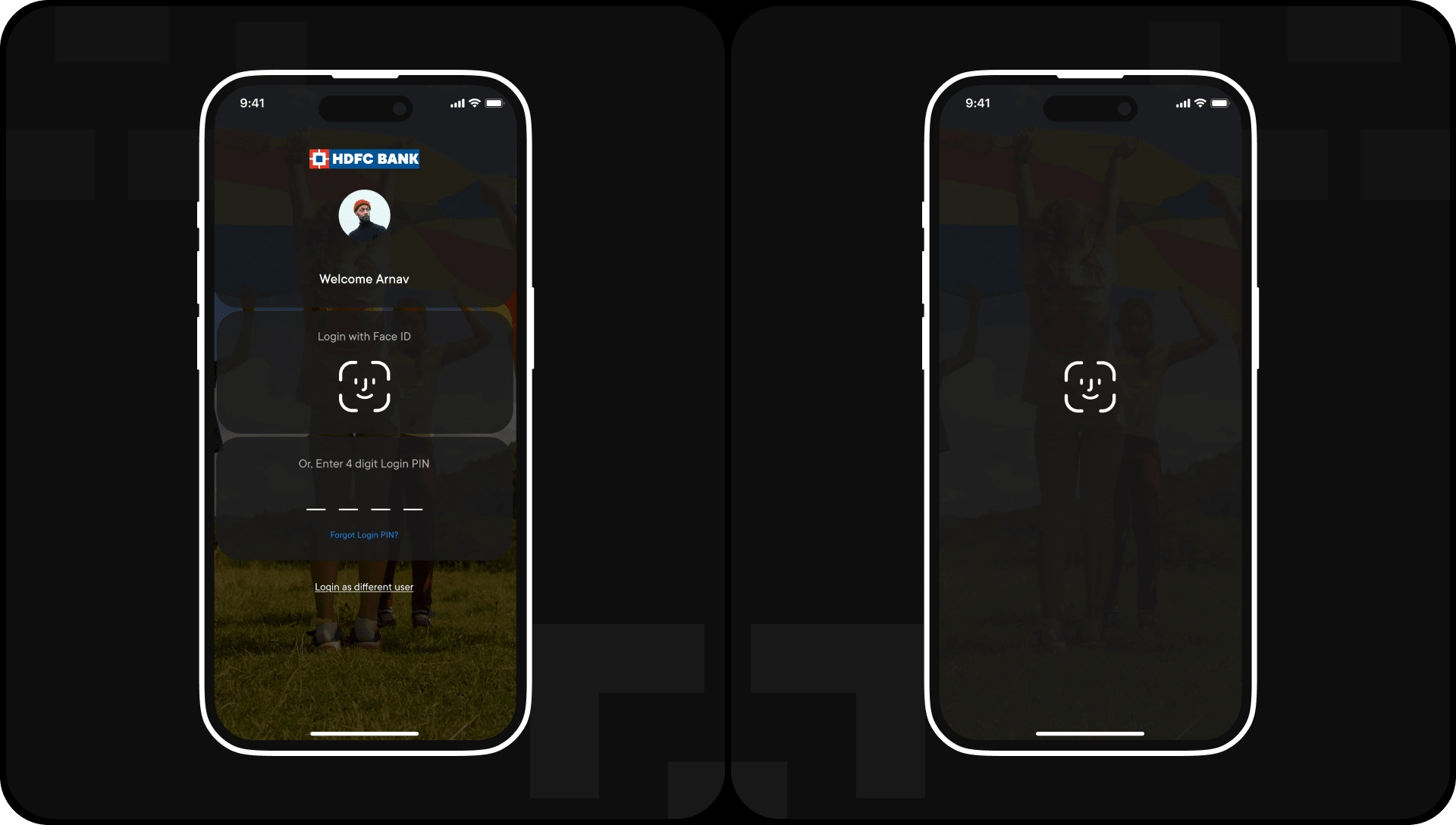
Login Screen
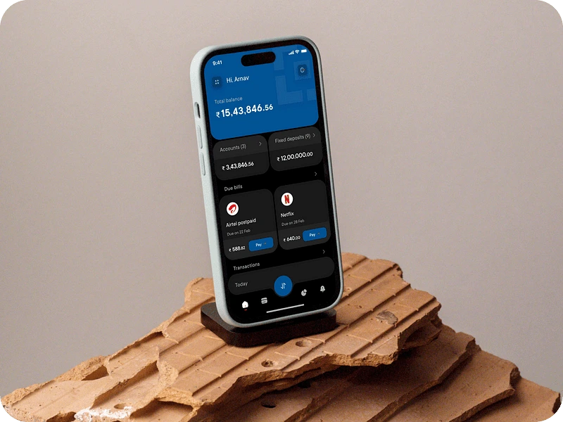
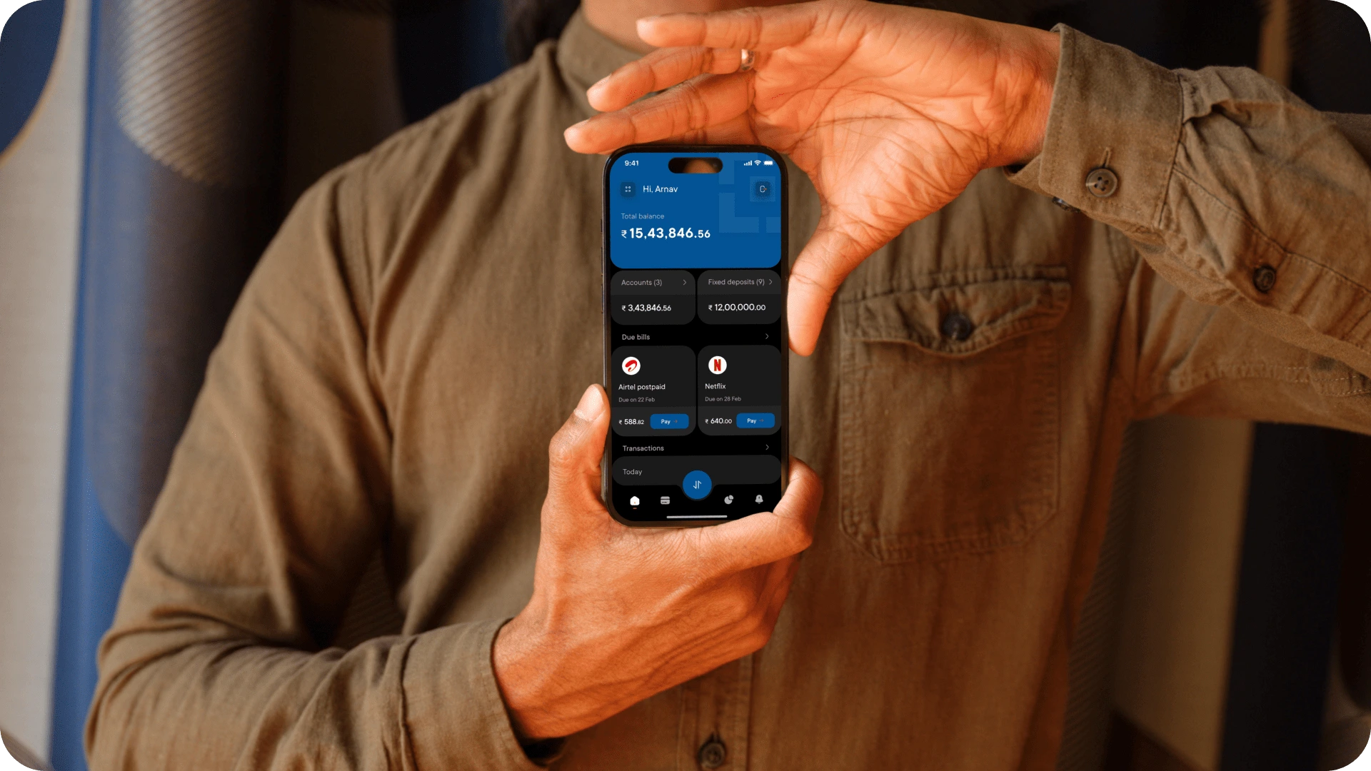
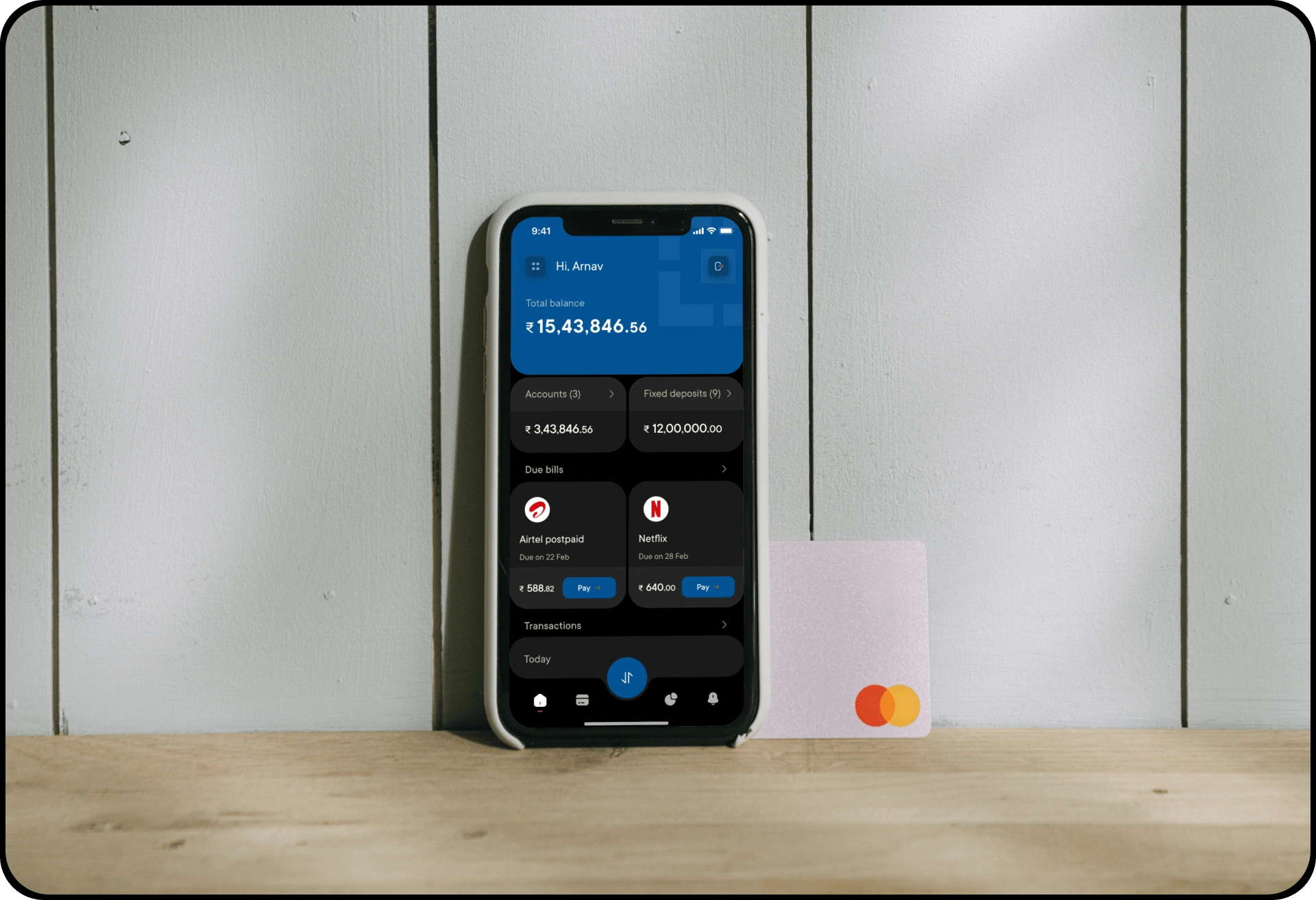
Home screen
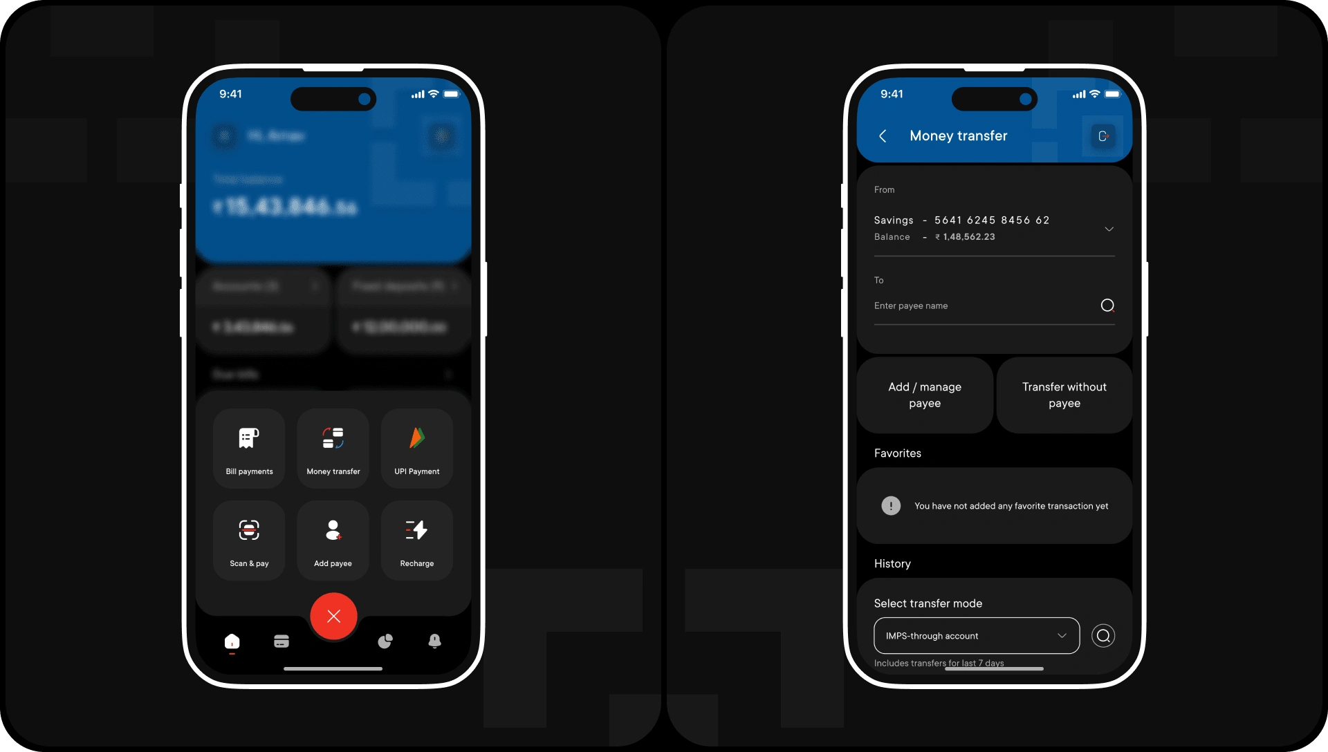
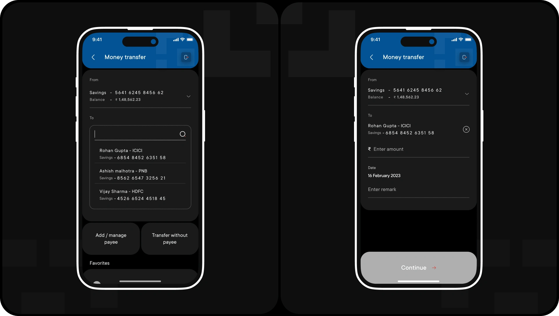
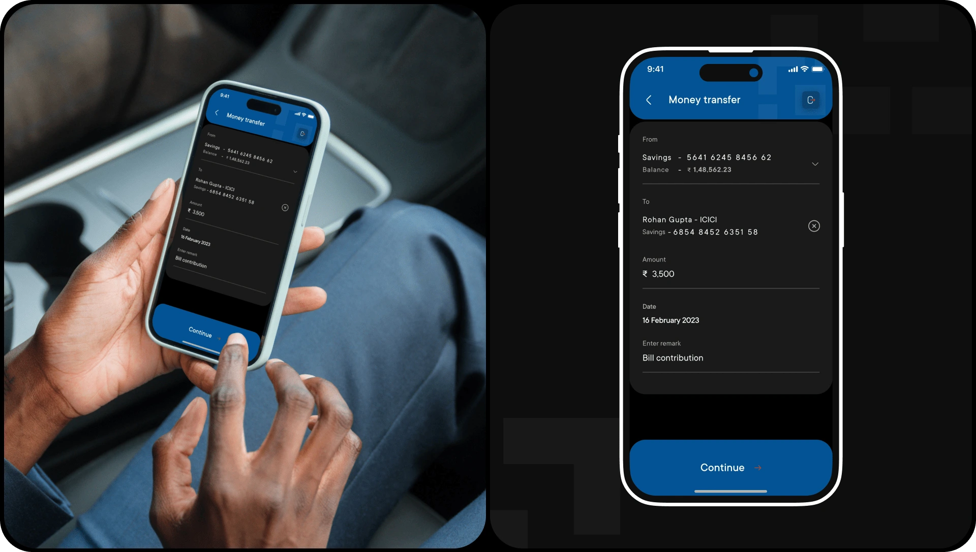
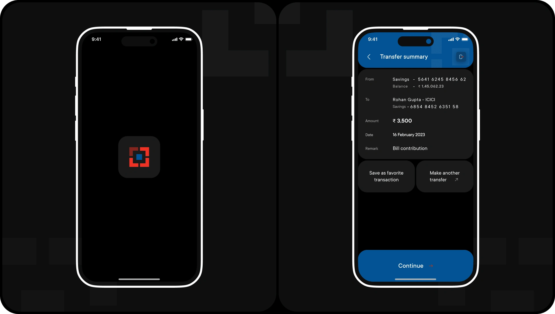
Money transfer flow
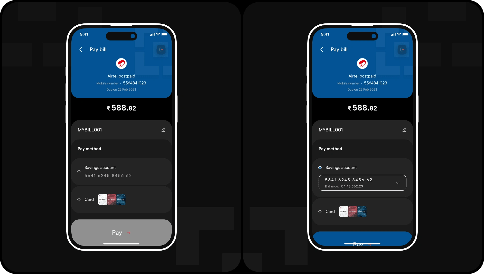
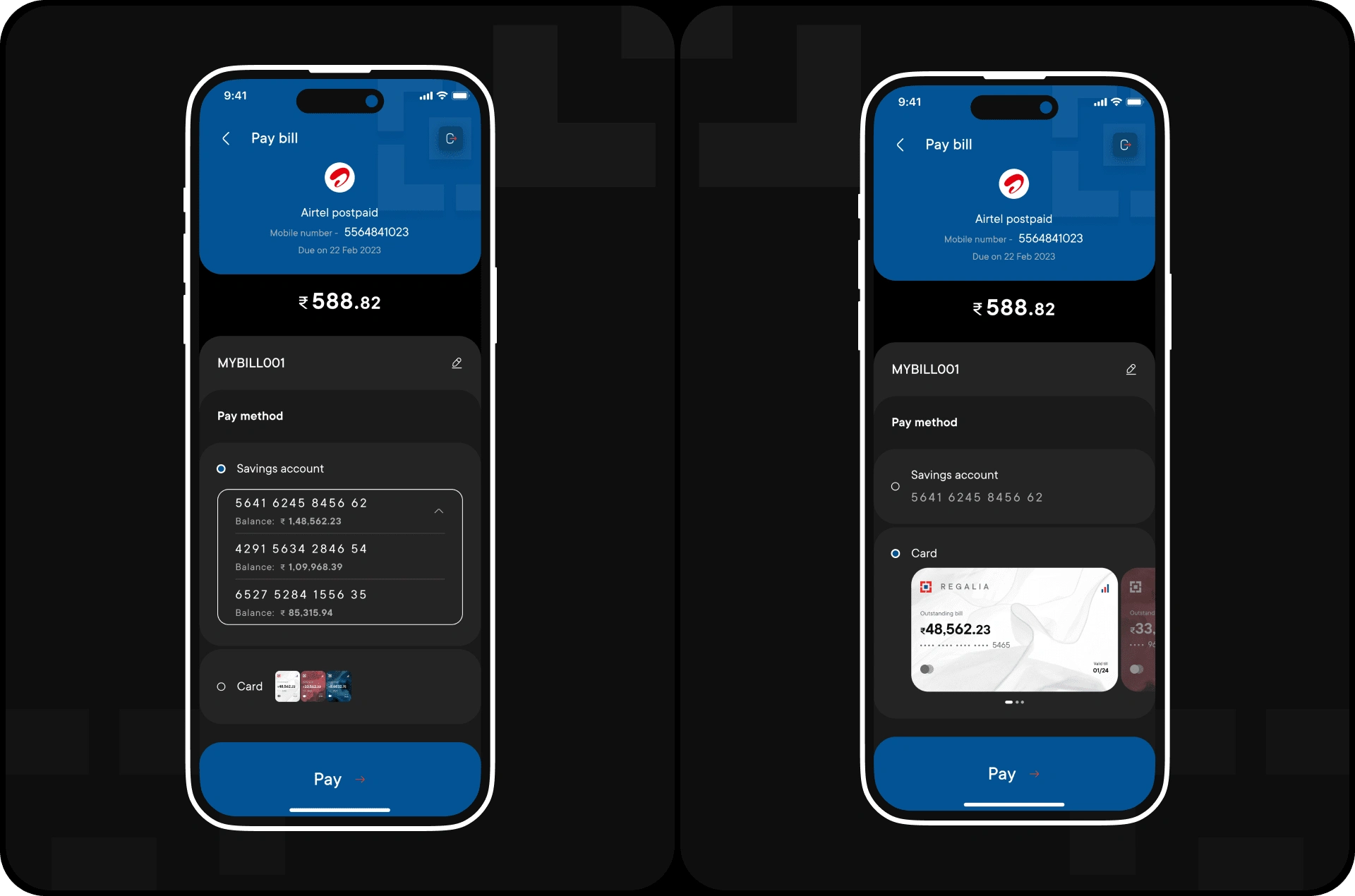
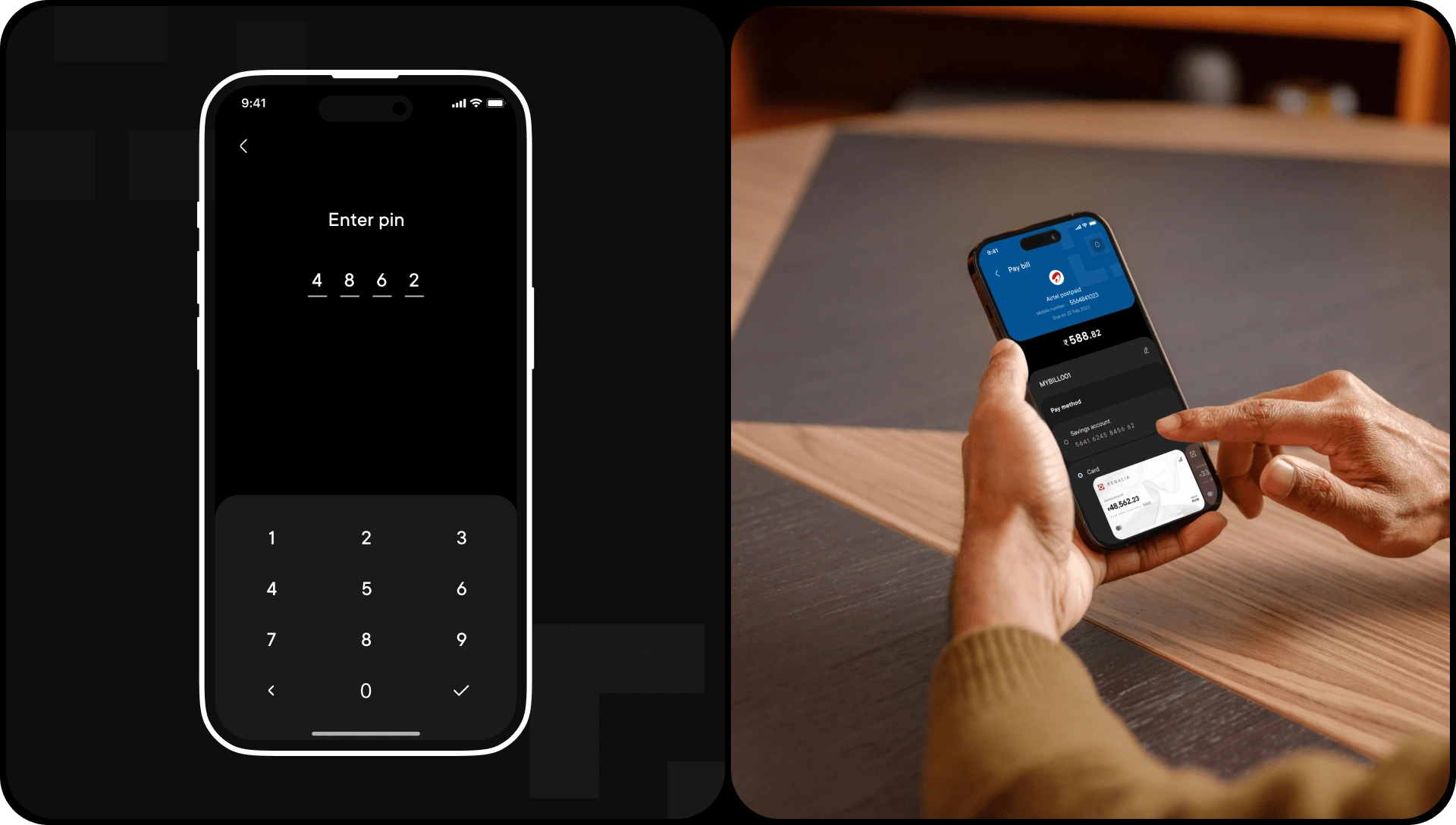
Bill payment flow
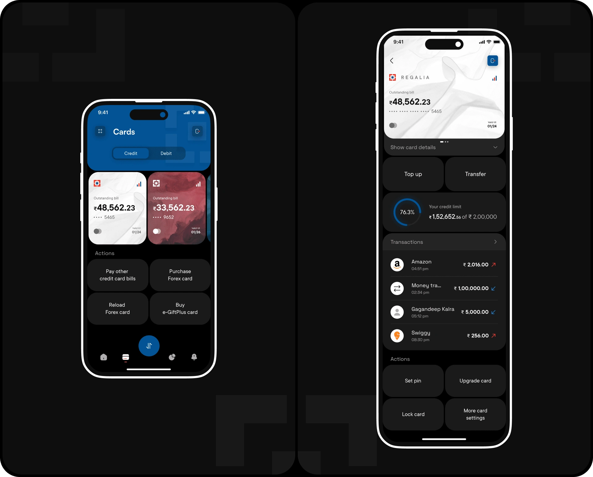
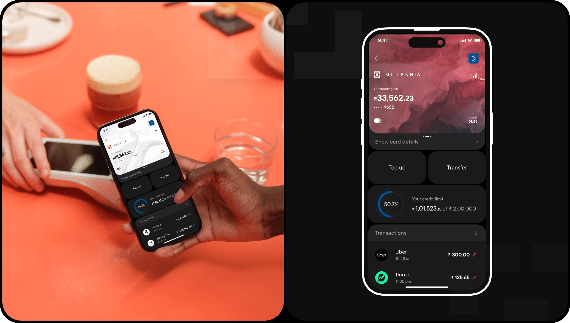
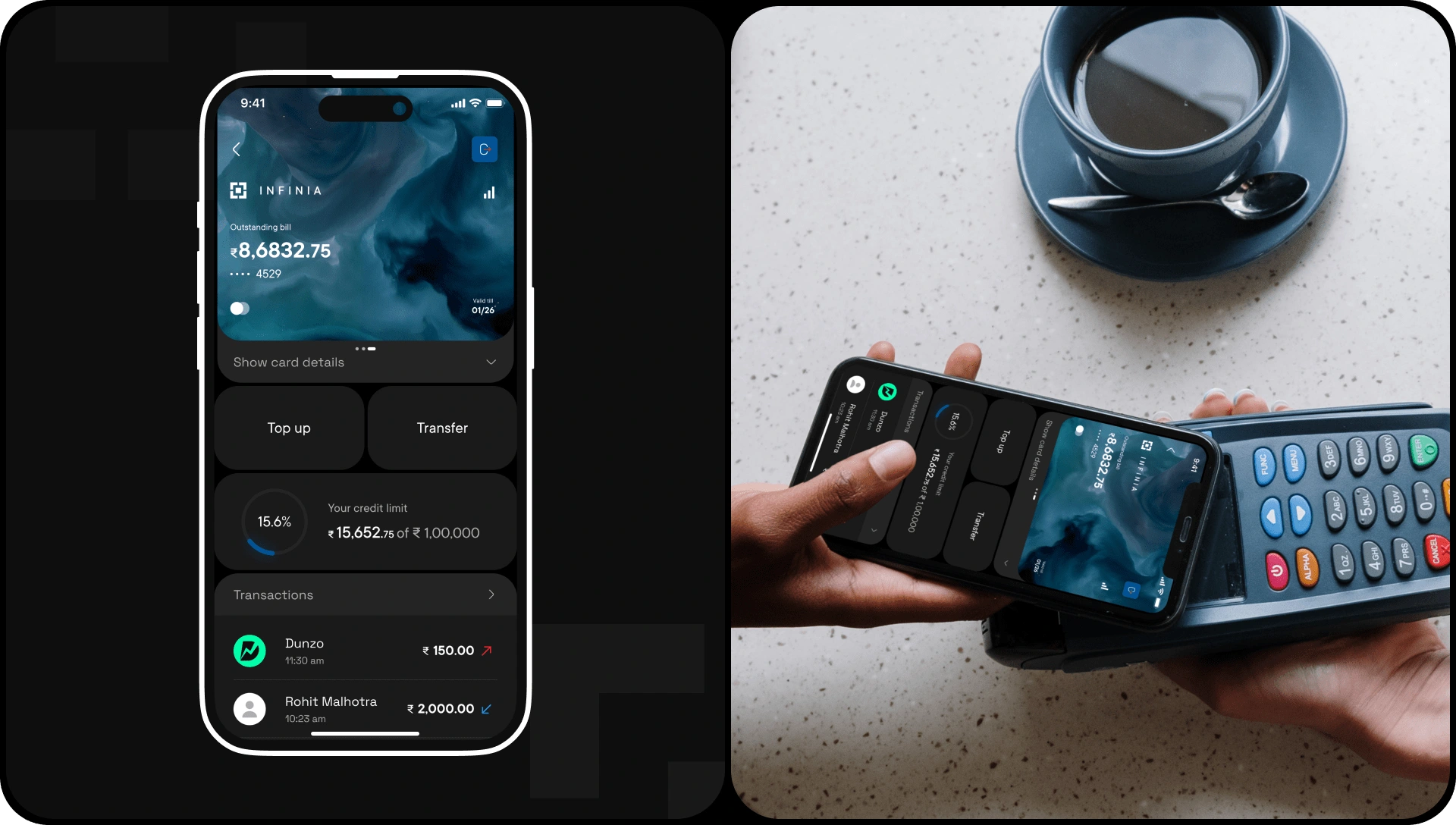
Cards
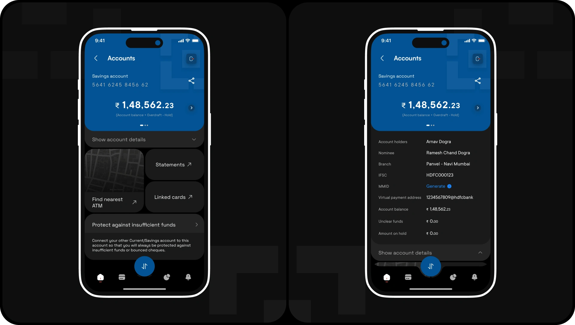
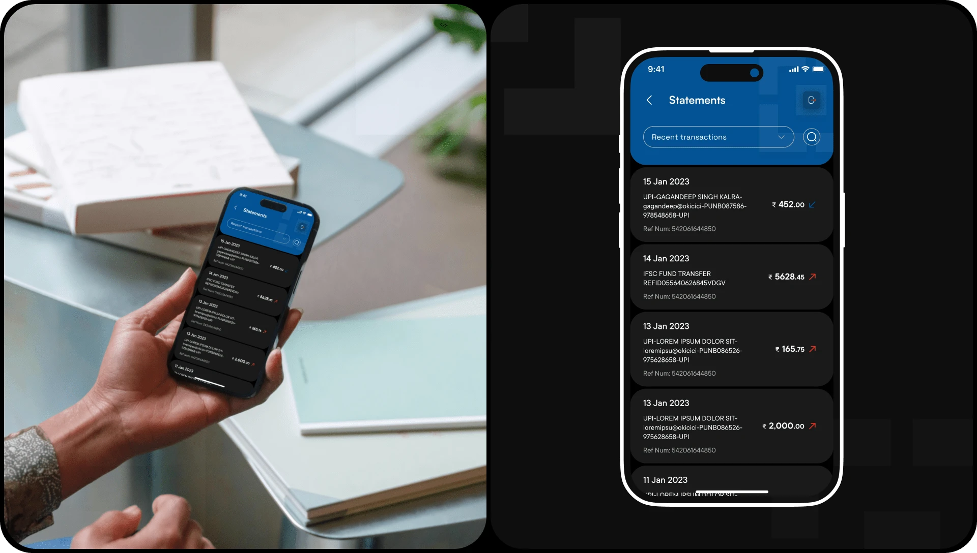
Accounts
Prototype
Like this project
Posted Dec 12, 2023
The goal of this redesign is to transform the user experience of the outdated HDFC mobile banking app.