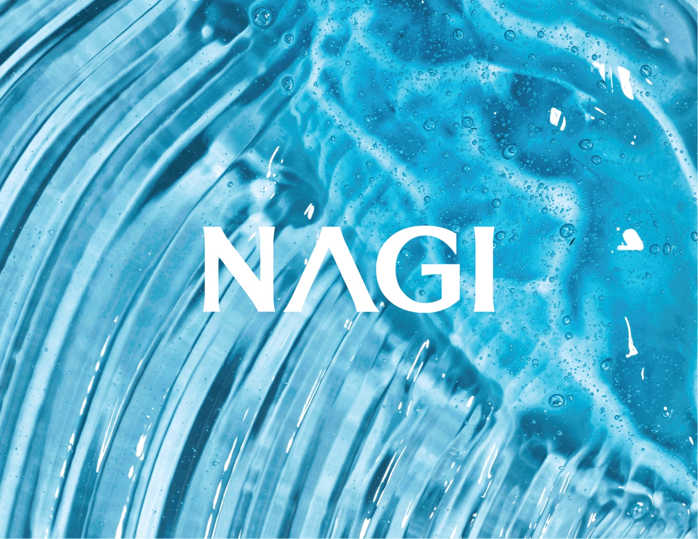
NAGI SKINCARE | Brand Identity Design

Vaishnavi .


About Brand:
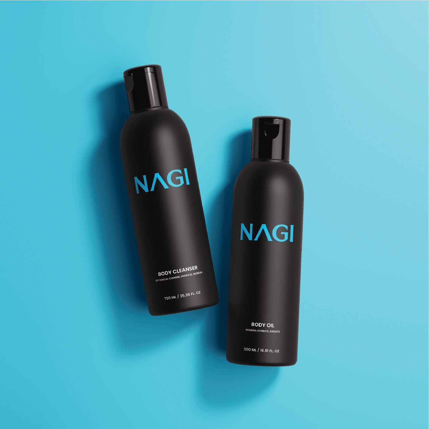
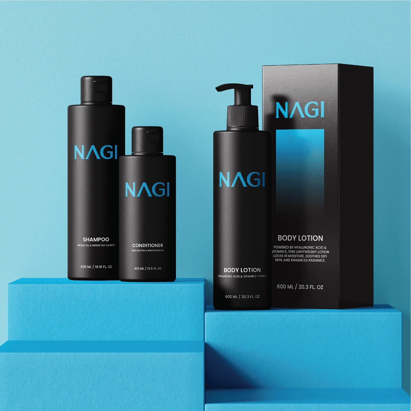
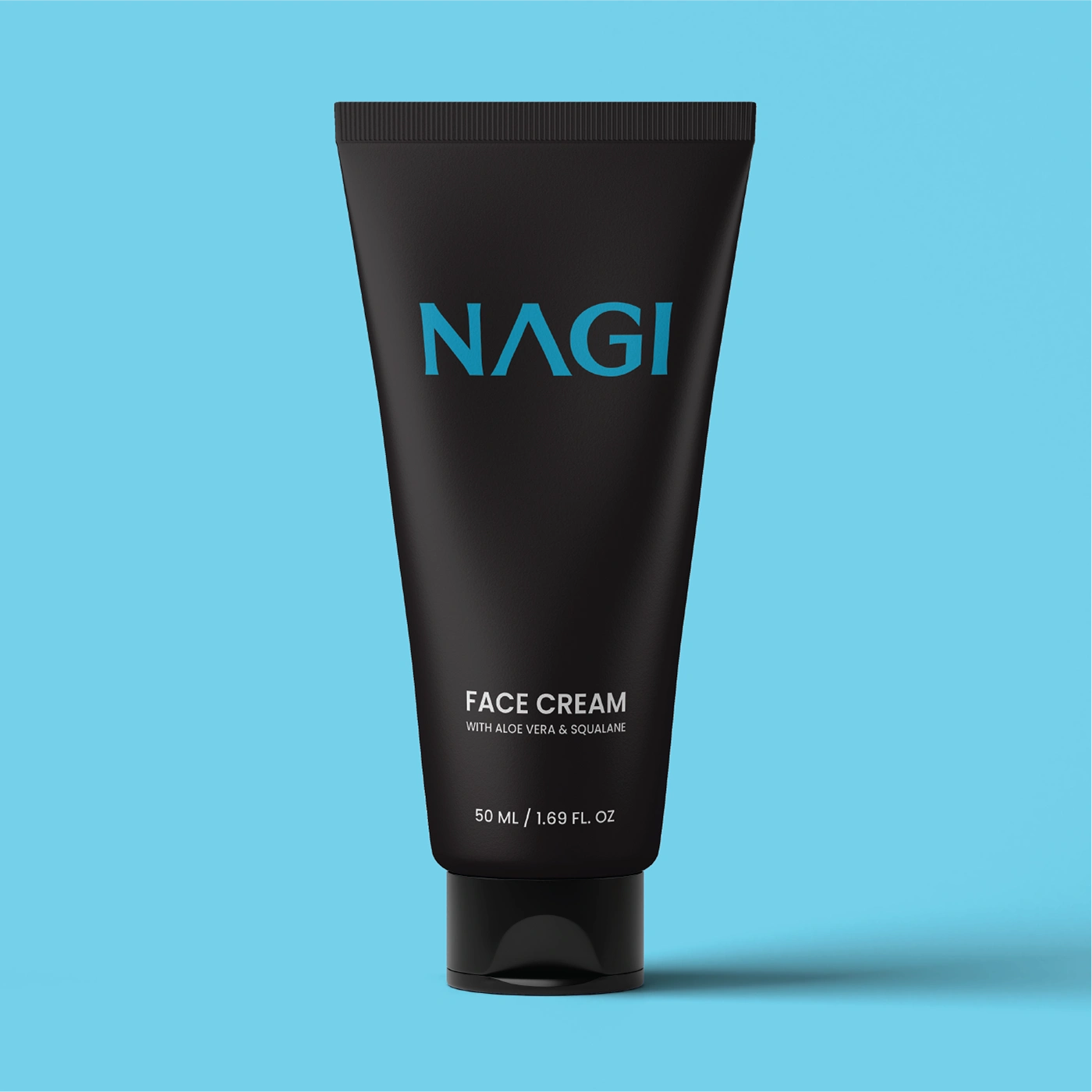
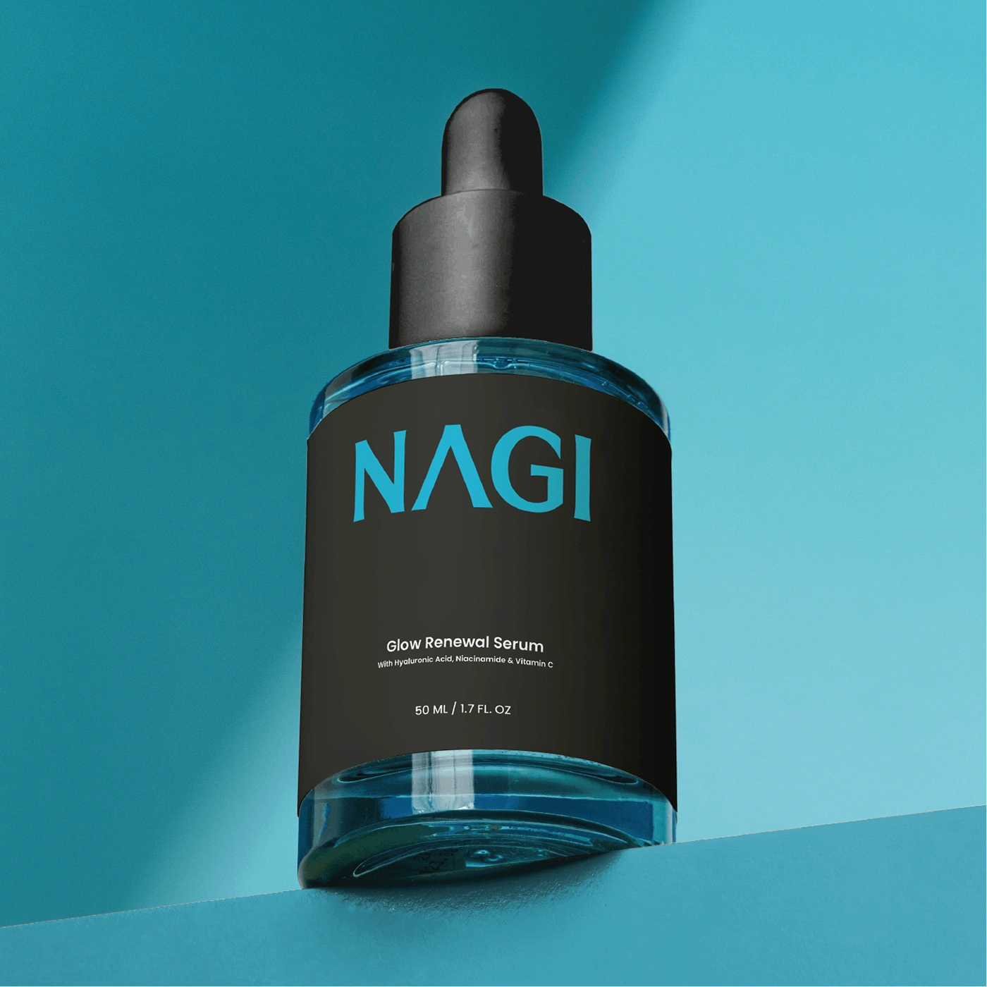
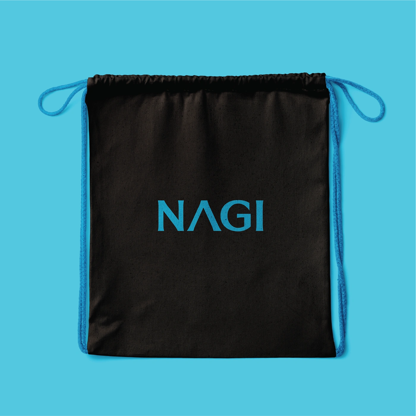
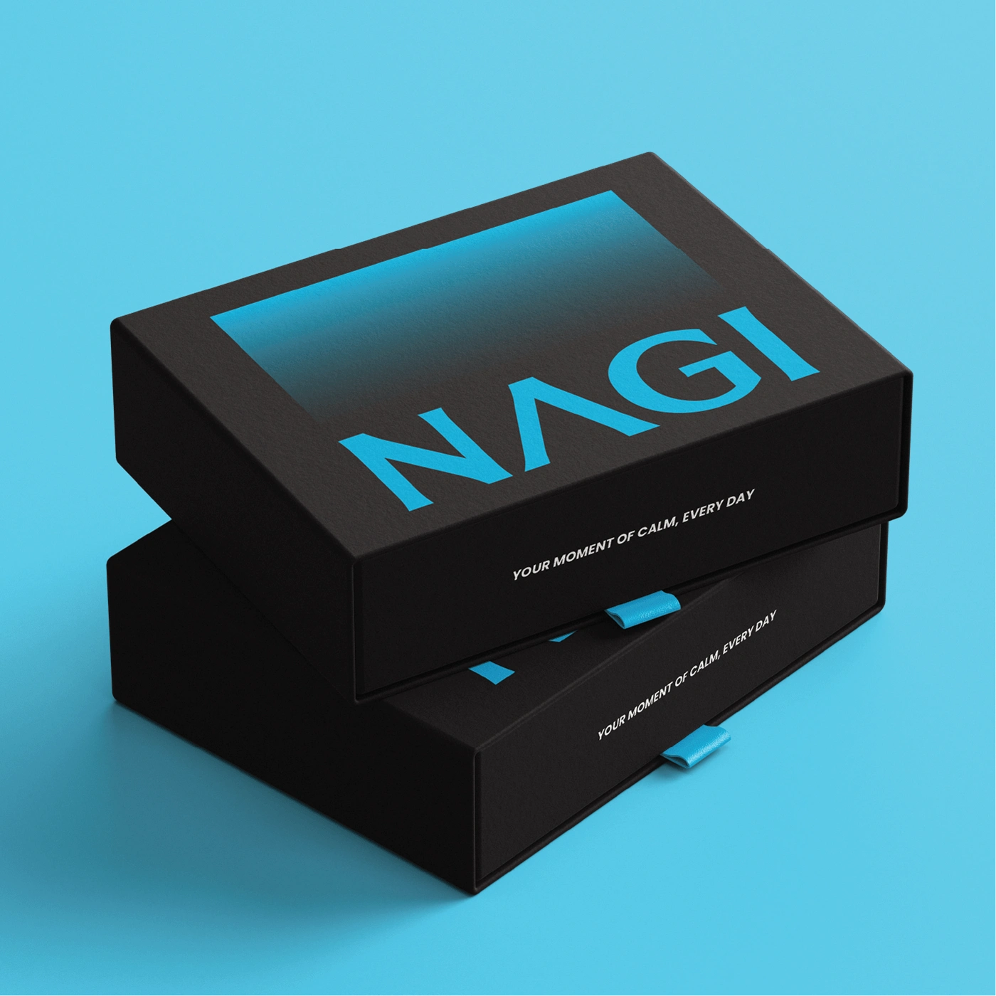
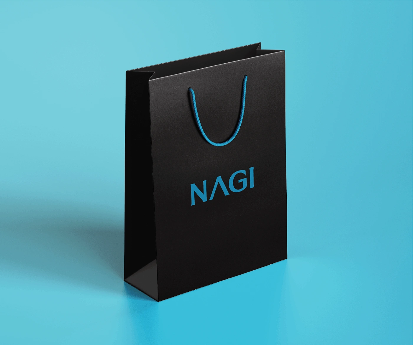
NAGI | Brand Identity & Packaging Design
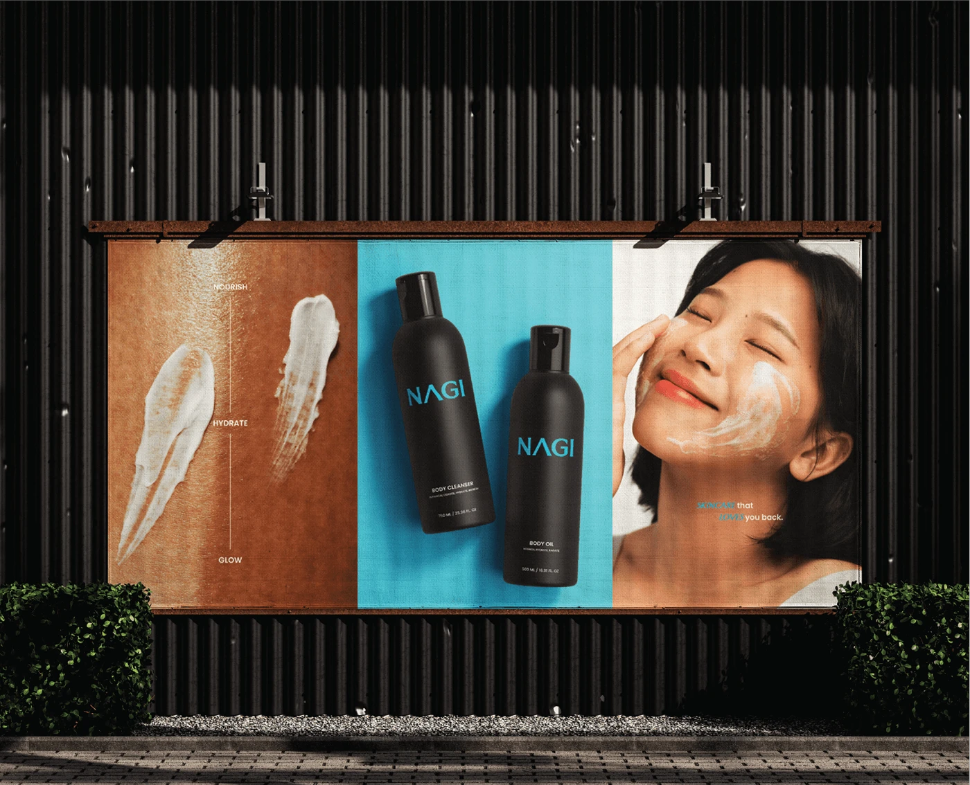
Nagi, meaning “calm waters,” is a premium skincare and wellness brand inspired by the serenity of Japanese nature. Rooted in the philosophy of holistic self-care, Nagi transforms skincare into a mindful beauty experience.
Design Approach
The goal was to craft a minimal yet sophisticated identity that embodies Nagi’s essence calm, pure, and effortless. So, I focused on:
- A clean, refined typographic system for an elegant aesthetic.
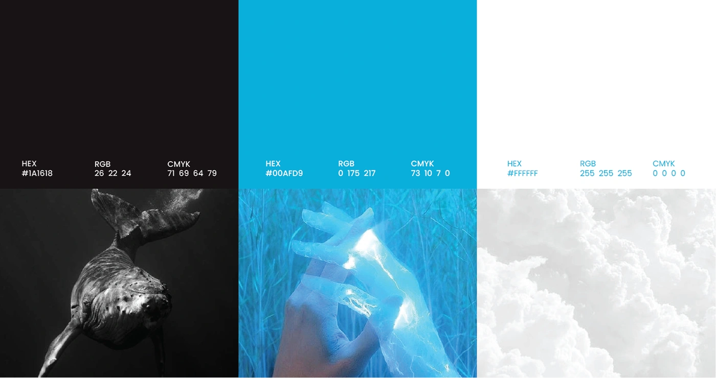
- A soothing color palette that evokes nature’s tranquility.
- Minimalist packaging that enhances the user experience.
- Premium finishes to reinforce the brand’s premium appeal.
Premium yet tranquil, Nagi embodies calm, pure, and effortless self-care because skincare should be a ritual, not a routine.
Like this project
Posted Mar 24, 2025
Brand identity design for Nagi, a minimalist skincare brand rooted in calm, mindful beauty and holistic self-care.