WIREWAX
WIREWAX is the world's leading interactive video technology company. The company wanted to update and upgrade their cloud-based studio, to introduce new features and functionality to attract new users and retain existing ones.
Results
In five months myself and two other designers completely overhauled the look and feel of the studio product, which allowed for new features to be rolled out and saw a month on month increase of 7.5% in subscriptions.
Principles
To start with, I held a quick brainstorming workshop with stakeholders to pull together the new studio’s positioning and a set of principles. These principles would not only help steer decisions but also maintain focus and consistency throughout the project.

From this session, I was able to gather the following principles:
Simplicity
Don’t overwhelm the user with features/tools/functions
Accessibility
Easily preview, scan and digest information, with minimal latency
Clarity
Ensure the user understand where they are and how they got there
Interviews
I conducted user interviews with 10 participants to gather insights into how typical users might interact with digital asset management platforms, specifically focusing in on pain points and workflow. From these interviews I was able to gather key insights and identify opportunities.
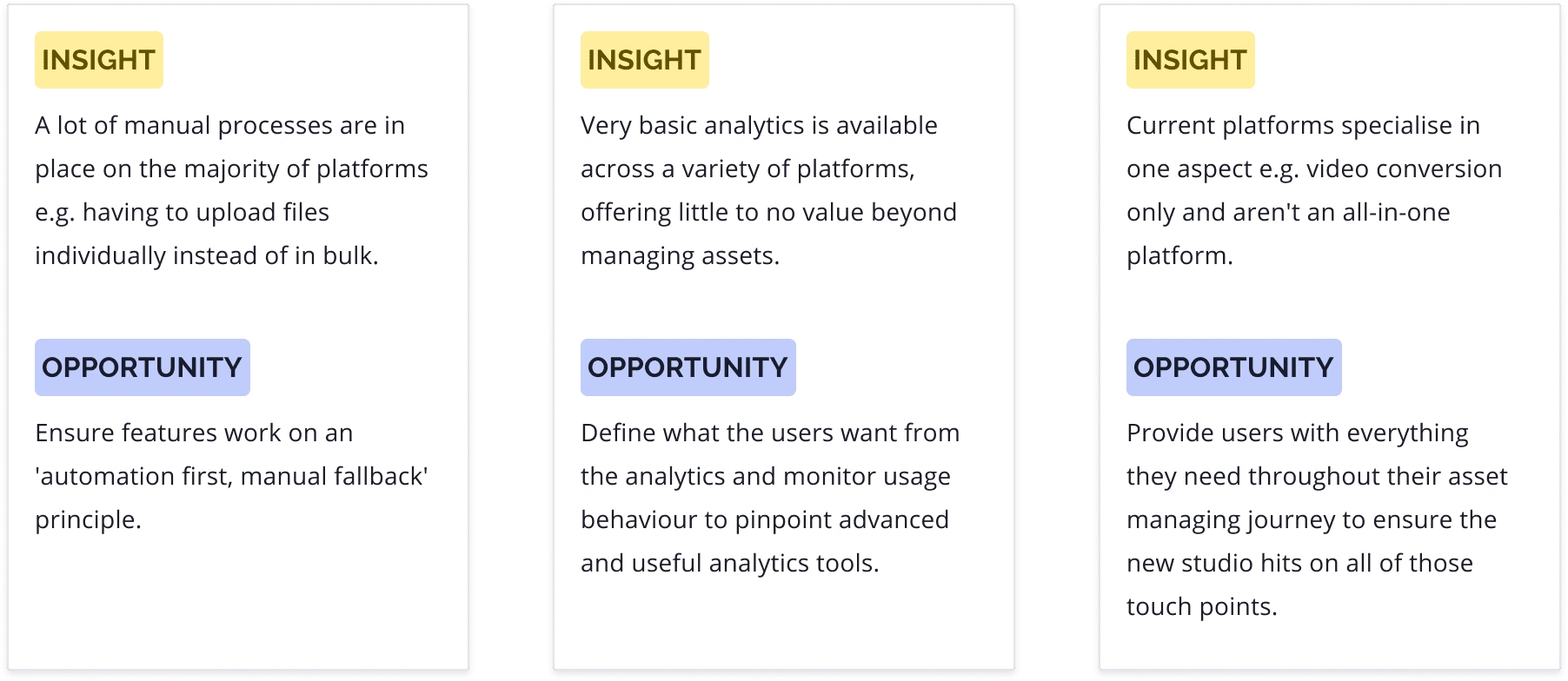
User types
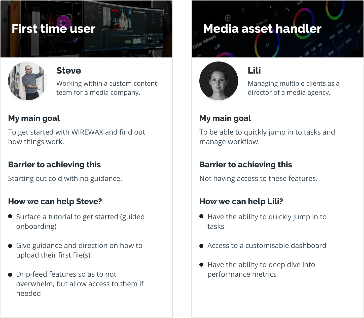
There are many different types of users that use WIREWAX, however, following on from the interviews I identified two types that covered the majority of the user base:
'First time user'
'Media asset handler'
The 'First Time User' and 'Media Asset Handler' personas helped to remind us of who we were designing for and why. By focusing on these personas, we were able to create a user-friendly experience for all users of WIREWAX.
First time user journey
Utilising the key principles of simplicity, accessibility and clarity, the first time user experiences a curated journey the first time they use the studio. This is to avoid any overwhelm and help them maximise their experience.

Media asset handler journey
To help the media asset handler use the studio efficiently a 'surf & immerse' I took a approach, to allow them to access everything they need at a basic level and immerse themselves into the details e.g. analysis, if required.
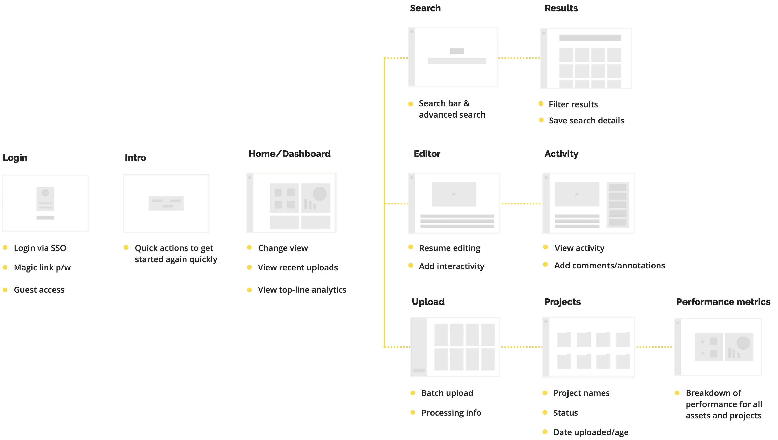
Functionality foundations
I created low fidelity wireframes of key function areas within the studio to share and review with the team. These proved to be very useful in helping us spot any pitfalls and redundant functionality in the early stages.
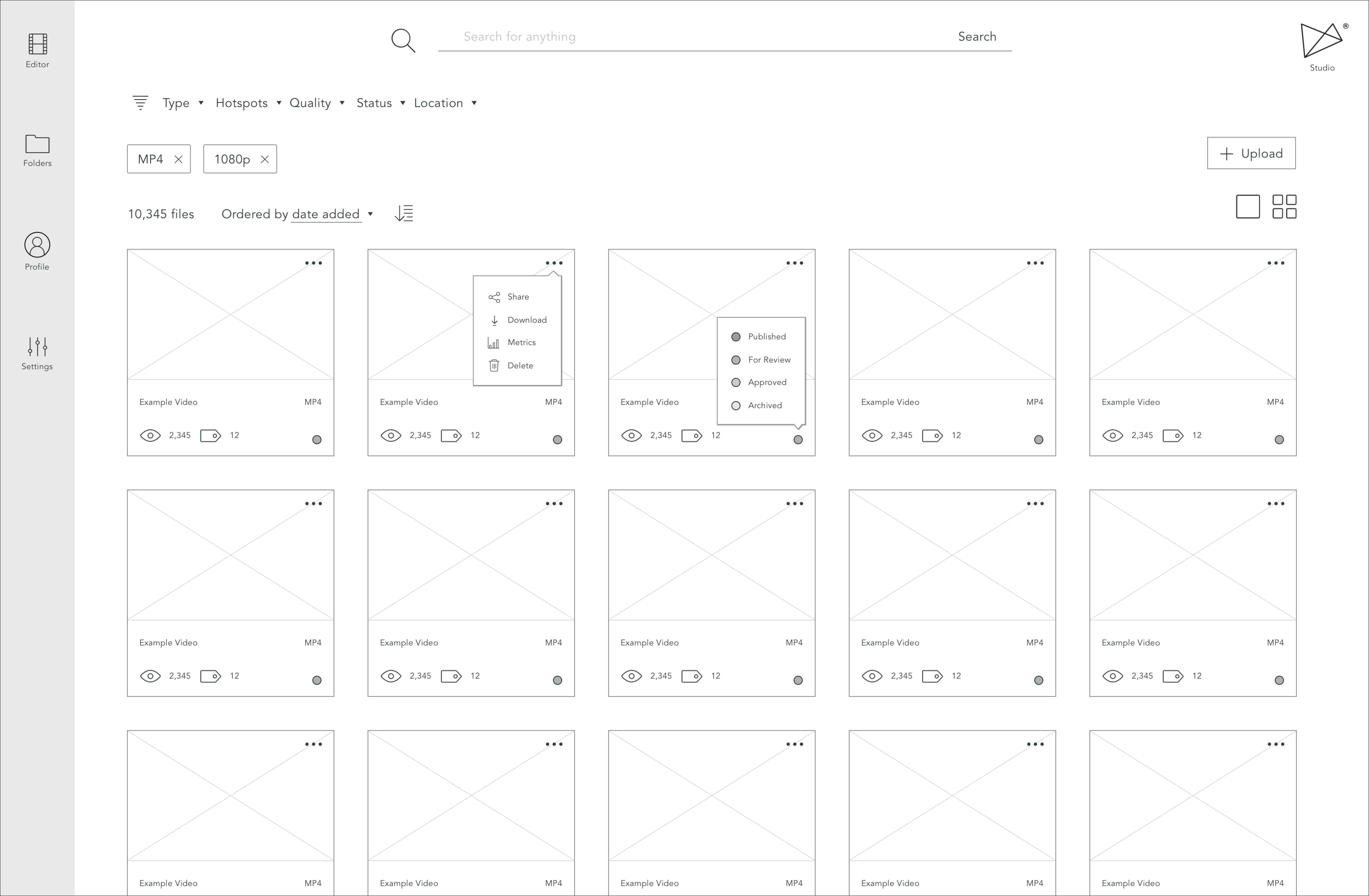
Grid view
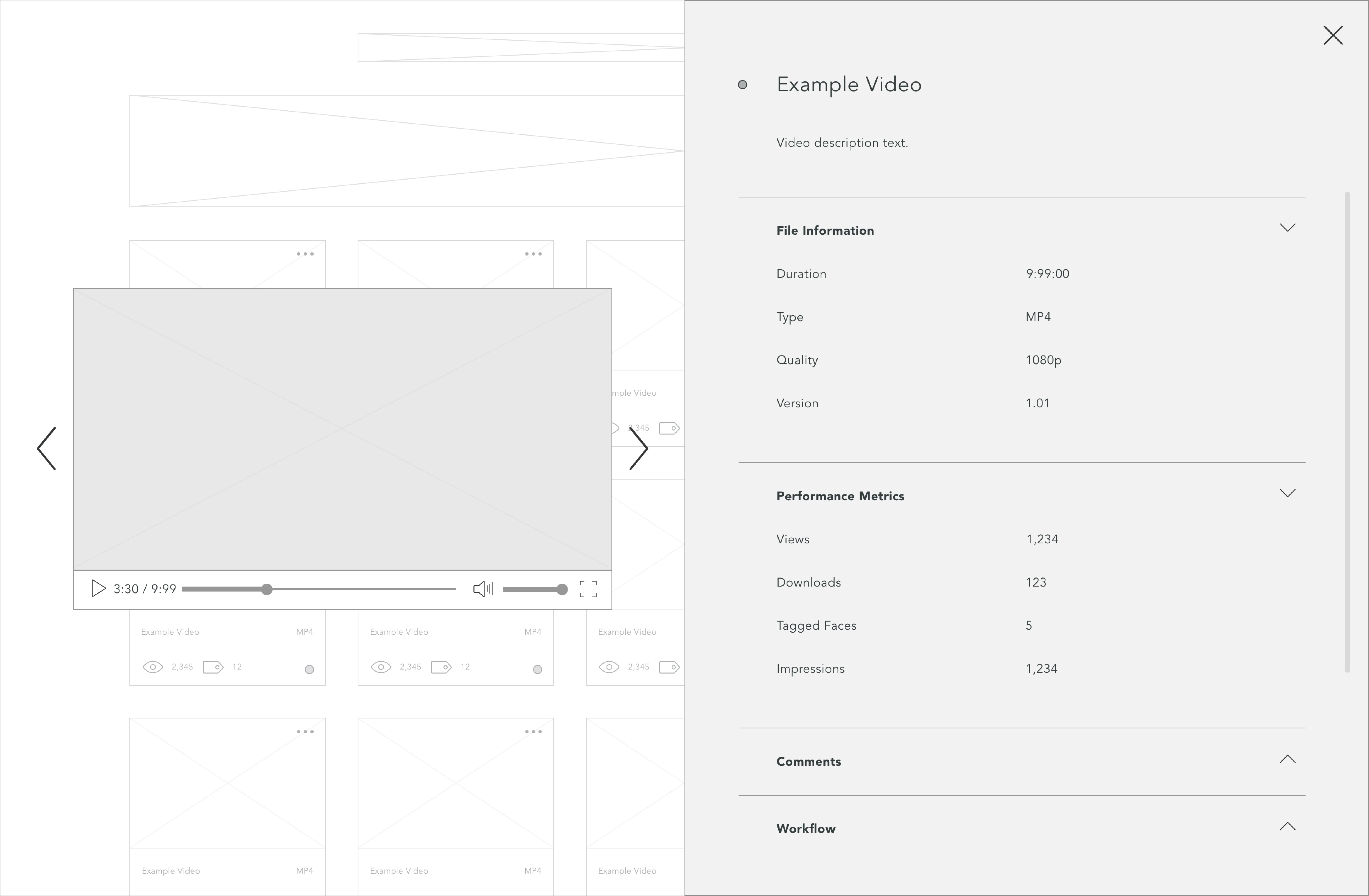
Previewing an asset
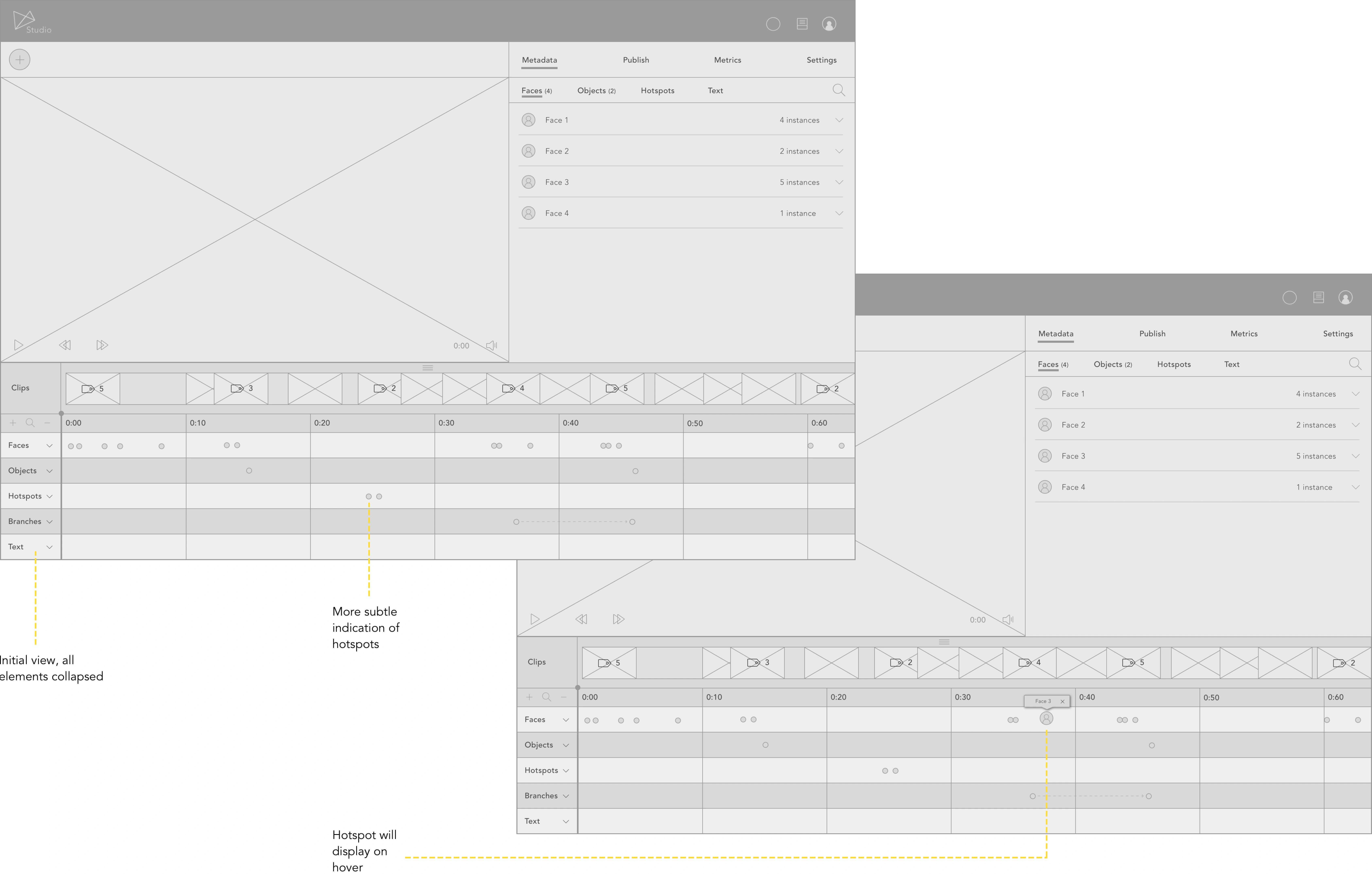
Editor timeline iterations
A new look
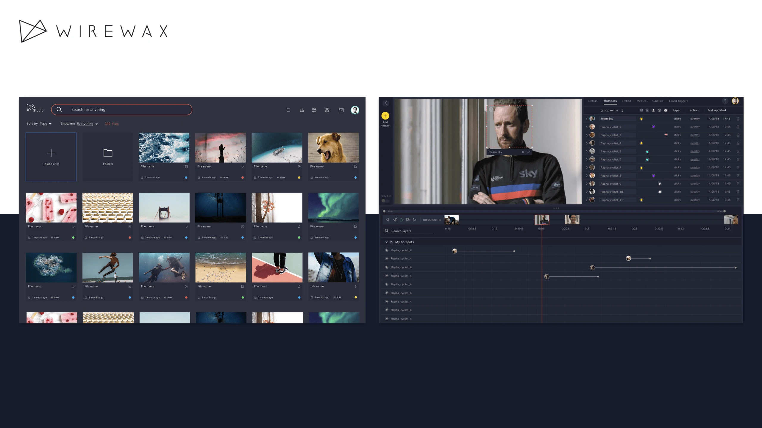
Previous iterations of the studio UI had difficulty drawing users' attention to key information. I created a sleek, modern dark UI that not only looked great, but also addresses these previous issues with past iterations.
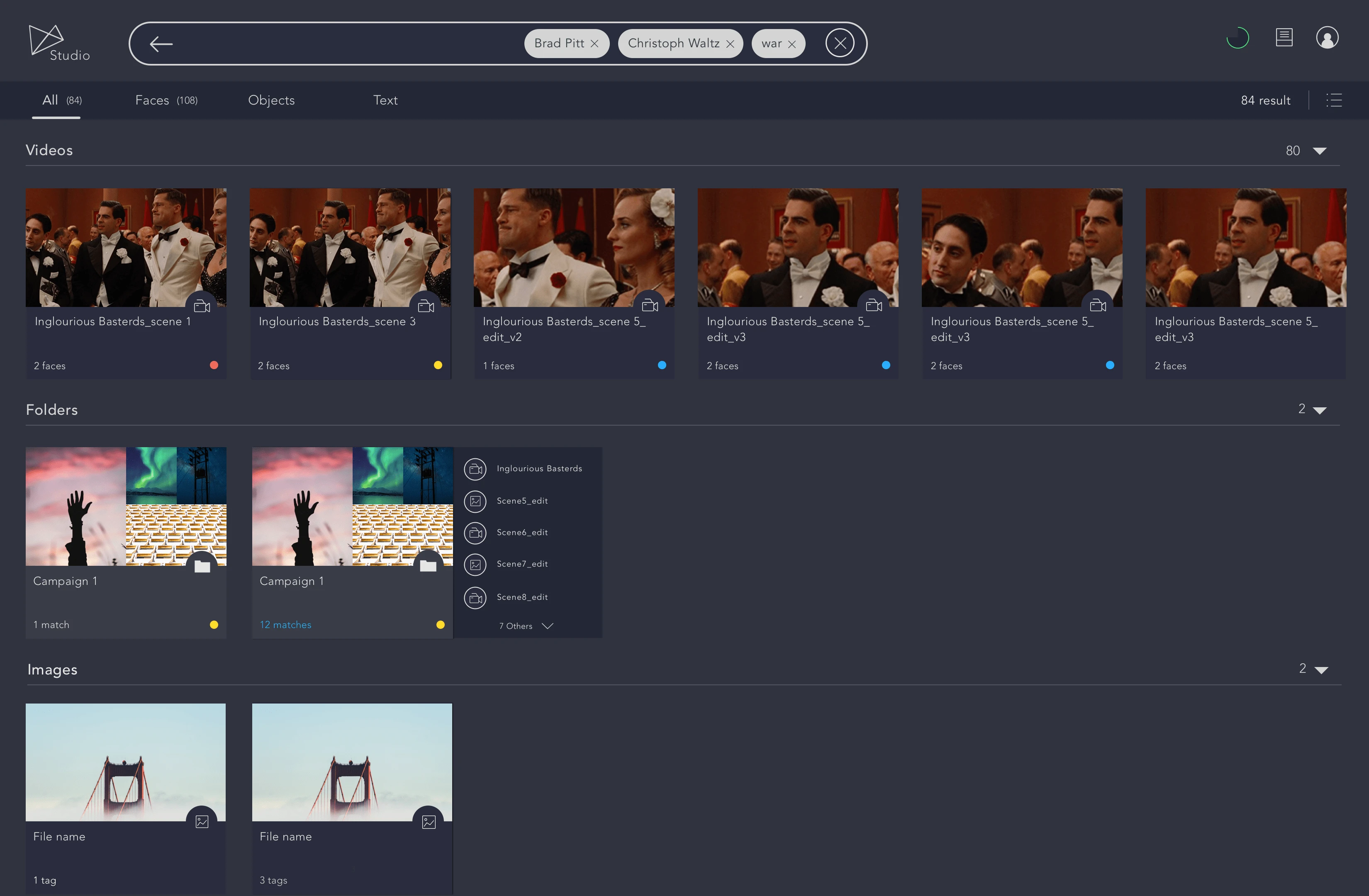
Search filters and grid view
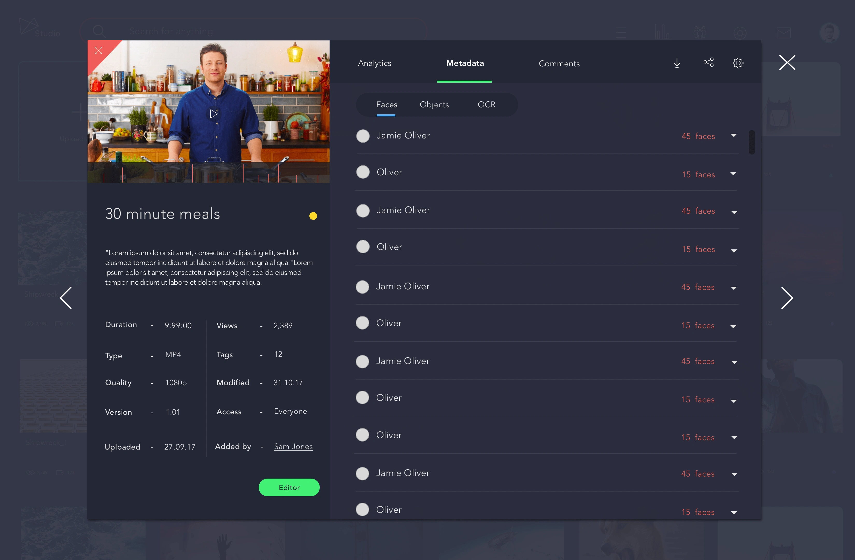
Asset preview - metadata
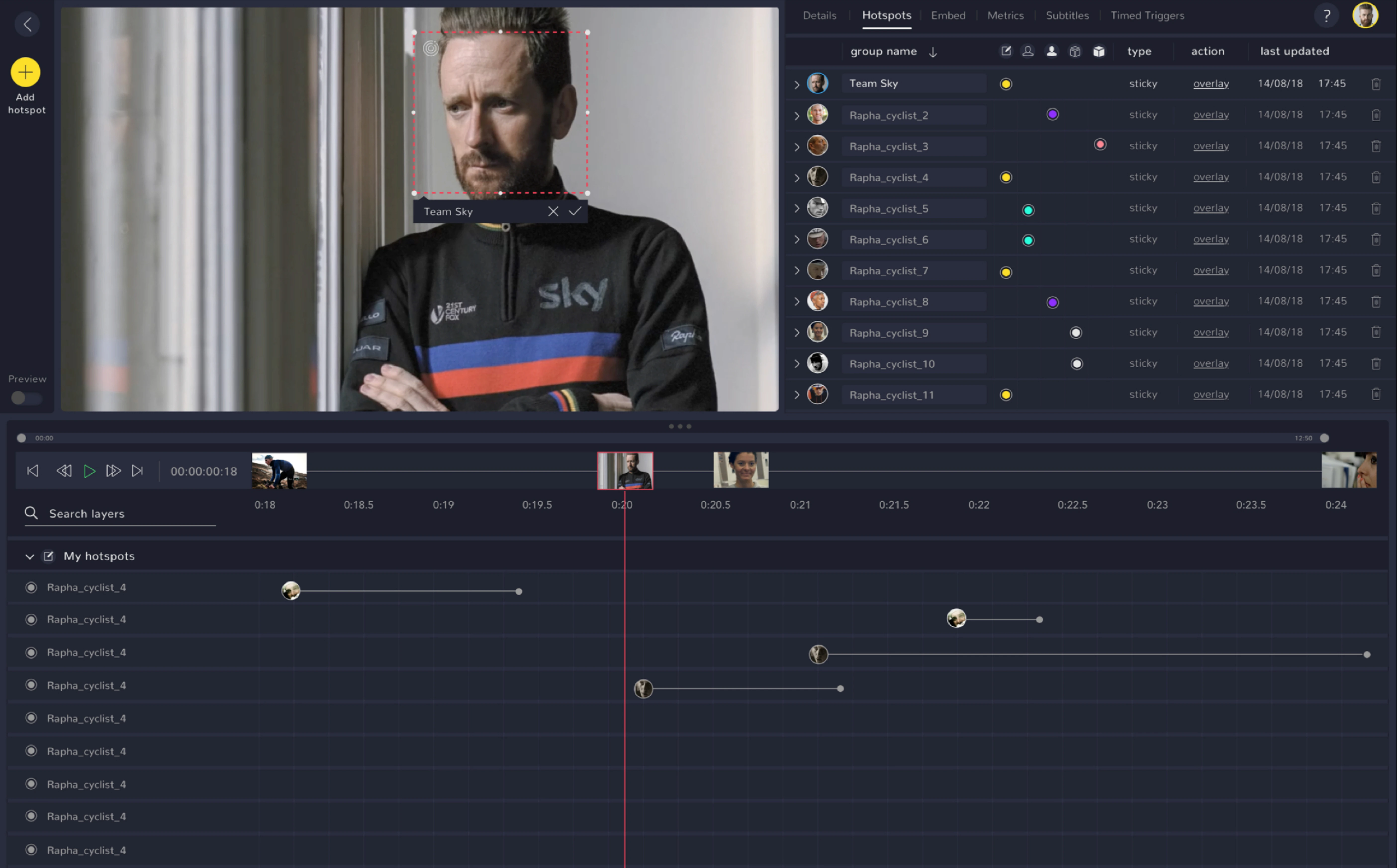
Editor with timeline review
Like this project
Posted Apr 3, 2023
Research and redesign for the world's leading interactive video cloud-based platform.


