(Branding)Logo Design for RE

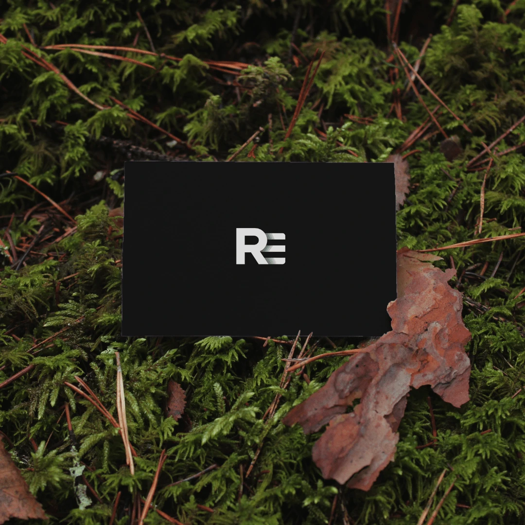
The client, Rajendra Enterprise (RE), requested a logo design that features the company's initials. After discussing with the client, we decided to create a lettermark logo. For this project, the main focus was on the letter "R" which represents the name of the company. The "E" which stands for Enterprise, was designed to complement the "R" and take a secondary role in the logo. To enhance the logo design, I incorporated shadow work.
I created two different versions of the logo. The first version features a blue background with a white logo. The second version has a white or transparent background with the letter "R" in black and the letter "E" in blue, along with a dark shadow effect to add depth to the design.


Like this project
Posted May 16, 2024
The client, Rajendra Enterprise, requested a logo design that features the company initials. On discussing with the client, we decided to create a lettermark.
Likes
0
Views
1


