Peony and Honey Lifestyle Blog
Winter Andersen
It was so inspiring to sit down with Cam and talk about her vision for the future of her company. She’s a talented creative and savvy businesswoman who isn’t afraid to dream big. It was my pleasure to take part in her vision by helping craft a new brand identity for her business as it continues to evolve.
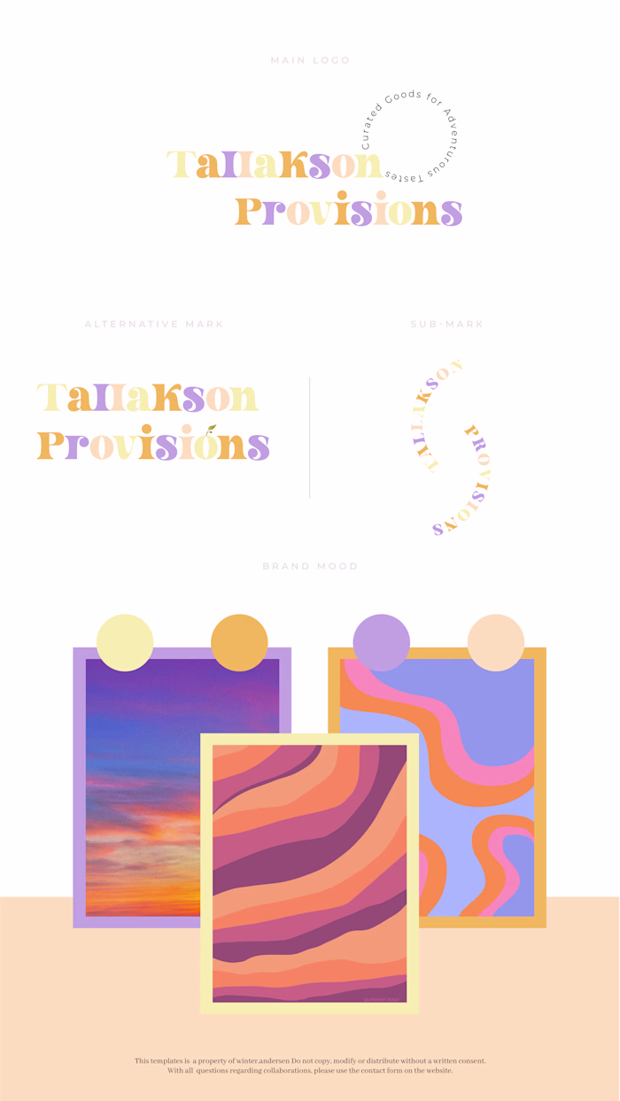
Peony and Honey needed a brand update to reflect the modern, organic, and innovative approach to design. We needed something that felt clean, and – most importantly – versatile. With those stipulations in mind, we landed on a logo design with clean typography.
Like this project
Posted Jan 18, 2023
Brand Board | Brand Identity: Peony and Honey
Likes
0
Views
54