Pay4me Landing page redesign
Abhishek Bariya
About the Project
Pay4Me is a platform that makes international payments easy and hassle-free, helping students and professionals pay for tuition, visa fees, and other expenses abroad.
But their landing page has alot of scope for improvement in terms of conversion and that's where I step in.
Please note this is not a official project but a proposed design that will help significantly
Process
Study the brand
Find pain points in the current landing page
Ideate a better solution
Develop Wireframe
Current landing page
Points of improvement in current design
Slow loading time
no consistent design style
not communicating values effectively to the right audience
CTAs are misleading
Too much text - makes it hard for user to scan the content on website
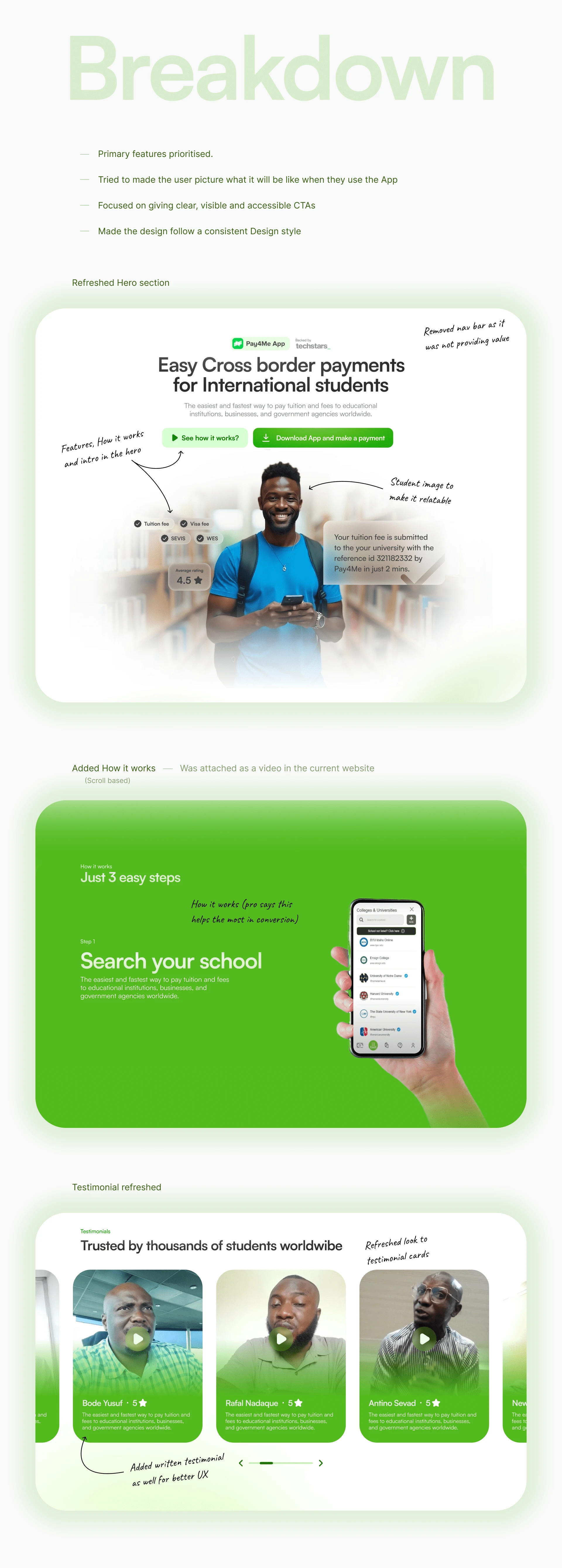
My Re-design
breakdown ahead
Breakdown on my Design
Conclusion
The new design can significantly imrpove conversion and help Pay4me communicate its value to its right audience.
Like this project
Posted Feb 11, 2025
I analysed the current website of Pay4me and re-designed it to significantly boosts conversion and better visual communication.
Likes
1
Views
8