Brochures Designs
Sumayya Maya
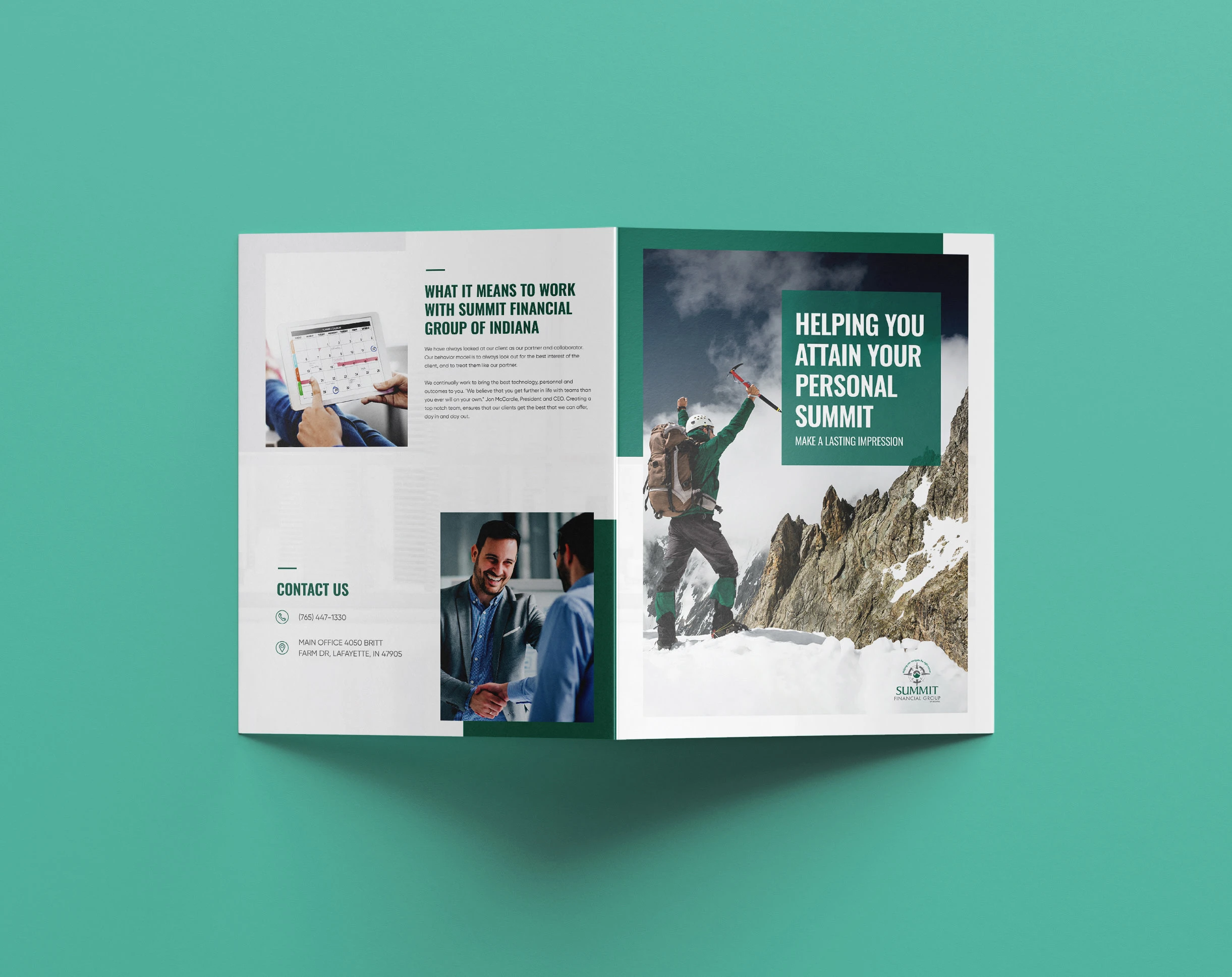
Corporate Brochure Design for Summit Financial Group
Detailed Description
A clean, professional brochure design crafted to reflect trust, growth, and success. The bold imagery of a climber reaching the summit reinforces the brand’s promise of helping clients achieve their financial goals.
Layout & Format Explanation
Format: Bi-fold brochure, A4 size.
Cover: Full-page imagery with bold headline in contrast box (hierarchy-driven).
Inside Spread: Grid-based layout with sections for company intro, visuals, and contact details.
Balance: Combination of large visuals with structured text blocks to avoid clutter.
Visual Identity Elements
Color Palette: Green (trust, stability, growth) + White/Gray (professional, clean).
Typography: Bold sans-serif for headlines (authority, strength), clean sans-serif for body (readability, modern look).
Imagery: Motivational (mountaineer reaching the summit) to align with brand messaging.
Tone: Professional, aspirational, trustworthy.
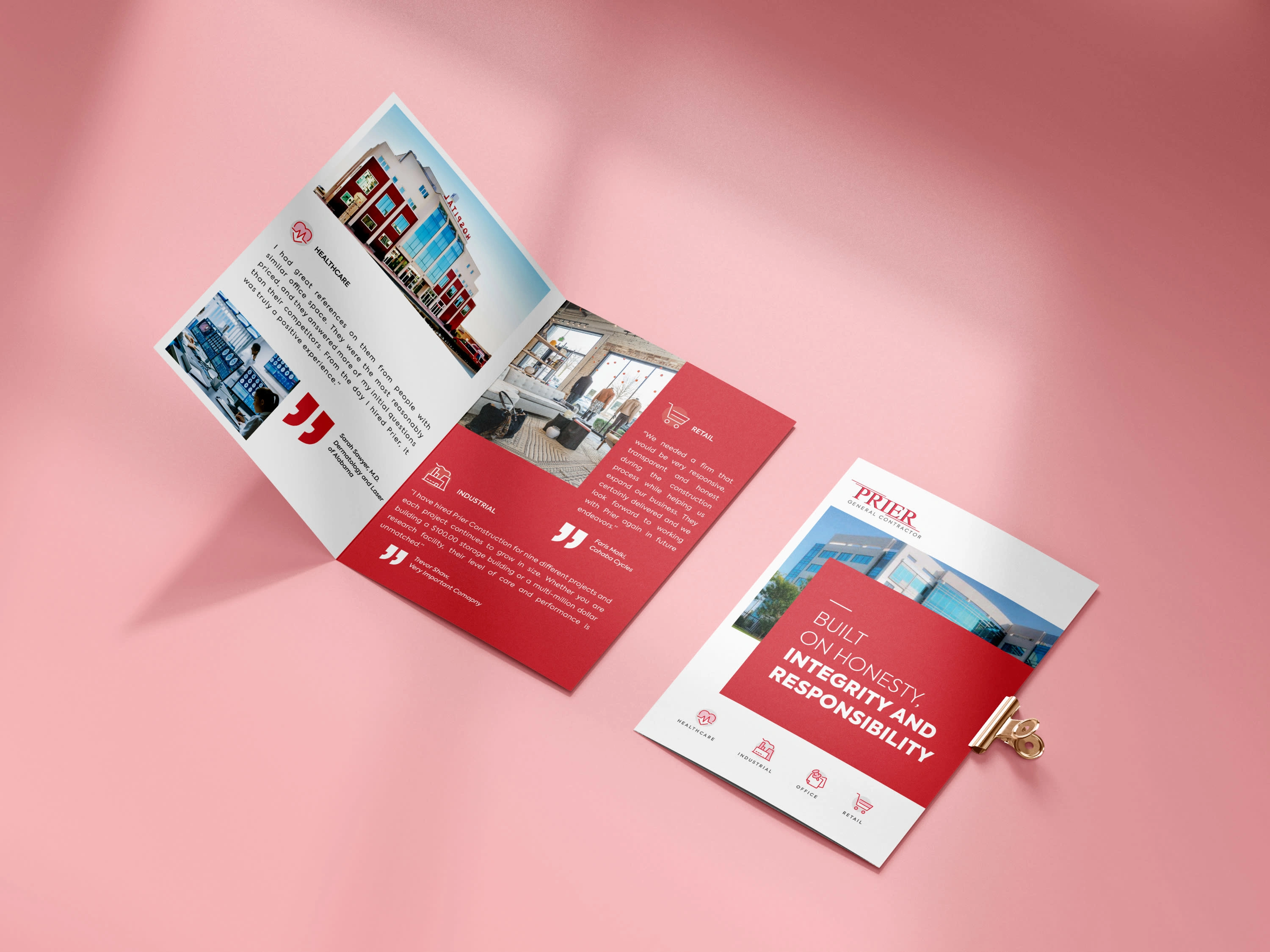
Corporate Brochure Design for Prier General Contractors
Detailed Description
A bold and modern brochure design highlighting Prier General Contractors’ core values, honesty, integrity, and responsibility. The strong use of red conveys strength and trust, while the clean layout ensures clear communication across industries.
Layout & Format Explanation
Format: Bi-fold brochure, A4 size.
Cover: Minimalist with strong branding, tagline, and project image.
Inside Spread: Grid system dividing sectors (Healthcare, Retail, Industrial, Office) with clear icons and testimonials.
Hierarchy: Bold red sections draw attention, while white space enhances readability.
Visual Identity Elements
Color Palette: Red (strength, confidence, responsibility) + White/Gray (clarity, trust, professionalism).
Typography: Bold sans-serif for headings (impact, authority), clean sans-serif for body (legibility).
Imagery: Real architectural visuals paired with client testimonials for authenticity.
Tone: Trustworthy, reliable, client-focused.
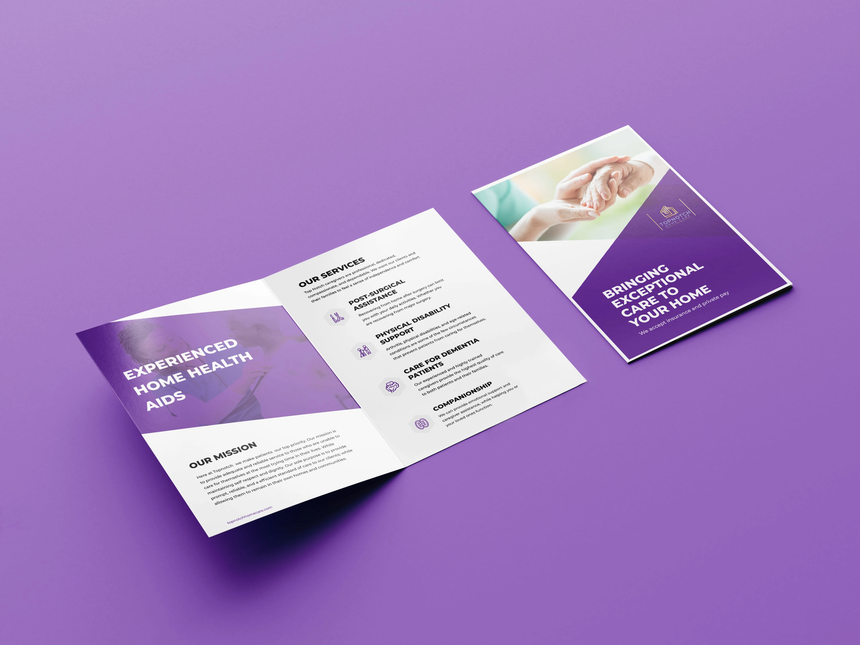
Healthcare Brochure Design for Topnotch Homecare
Detailed Description
A compassionate and professional brochure design created for Topnotch Homecare. The clean layout and purple color palette reflect trust, care, and wellness, while the structured service breakdown makes it easy for clients to understand offerings.
Layout & Format Explanation
Format: Bi-fold brochure, A4 size.
Cover: Warm photography (hands symbolizing care) with bold tagline for instant connection.
Inside Spread: Service-based layout with icons for quick readability, paired with mission statement for brand identity.
Balance: Mix of visuals, icons, and structured text to ensure clarity.
Visual Identity Elements
Color Palette: Purple (compassion, healing, dignity) + White (purity, trust, care).
Typography: Bold sans-serif for headlines (clarity, strength), modern sans-serif for body (readability).
Imagery: Human-focused, showcasing warmth and care.
Tone: Empathetic, reliable, patient-focused.
Like this project
Posted Aug 18, 2025
Engaging brochure designs that balance creativity and strategy, helping you effectively present products, services, and ideas.