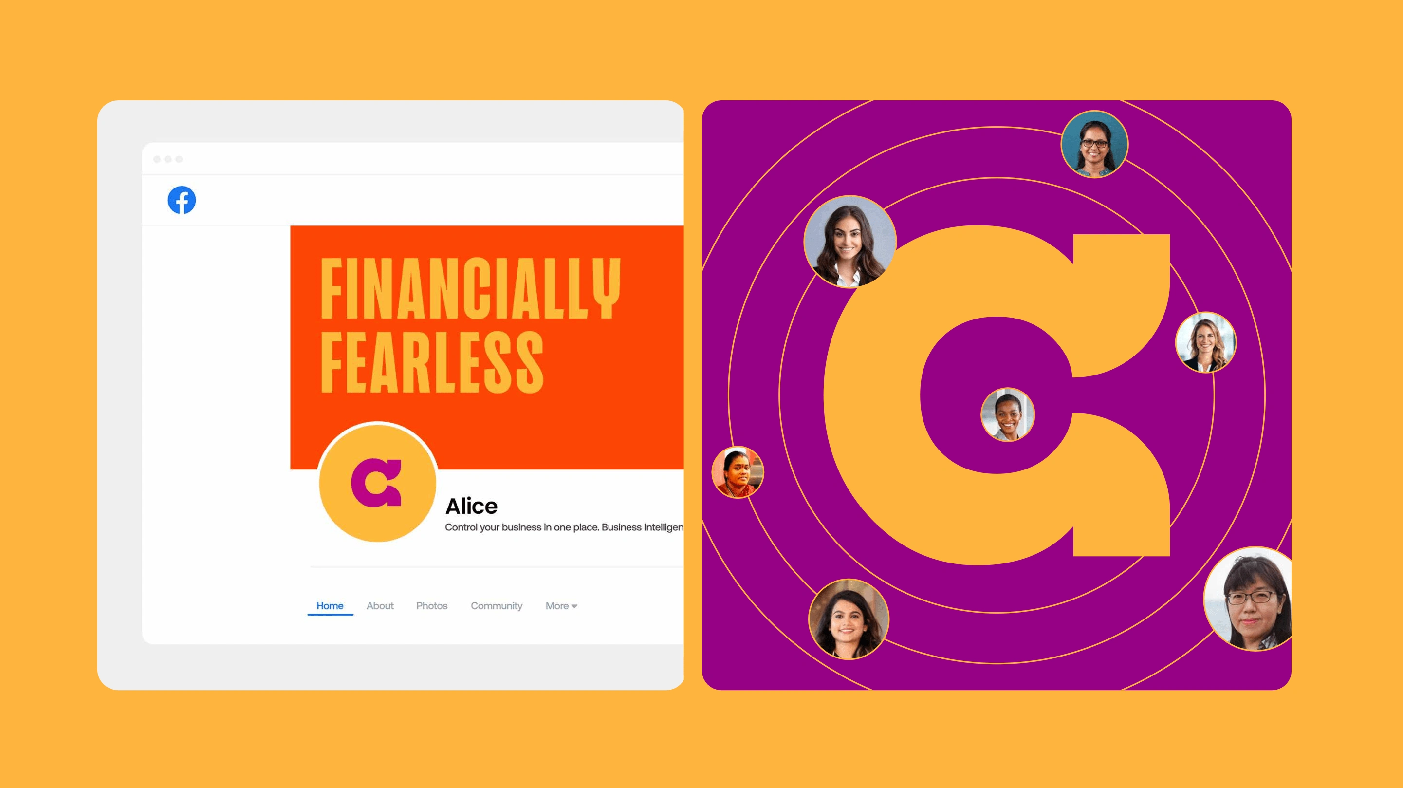
Alice: Financially Fearless
Pari & Bhavyajeet
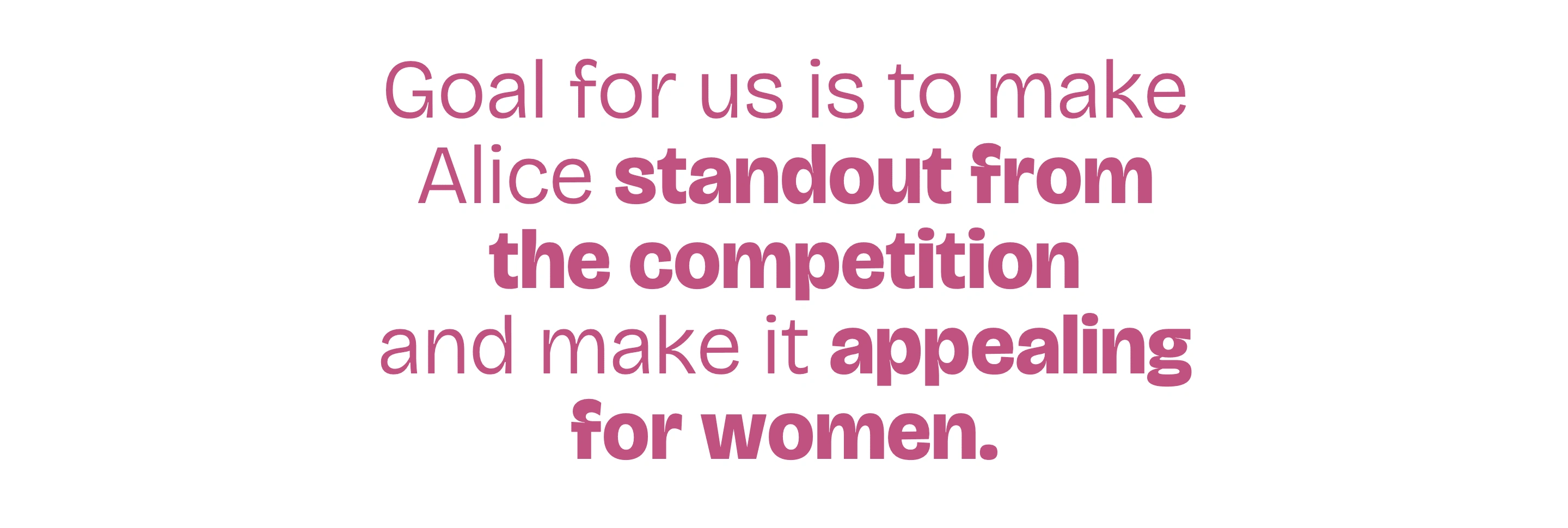
The Challenge
The financial world is often perceived as cold, complex, and out of reach for many, especially for most women in India.
Alice needed to break down these barriers and create a brand that made finance feel easy and enjoyable without sacrificing the credibility necessary for a financial platform.
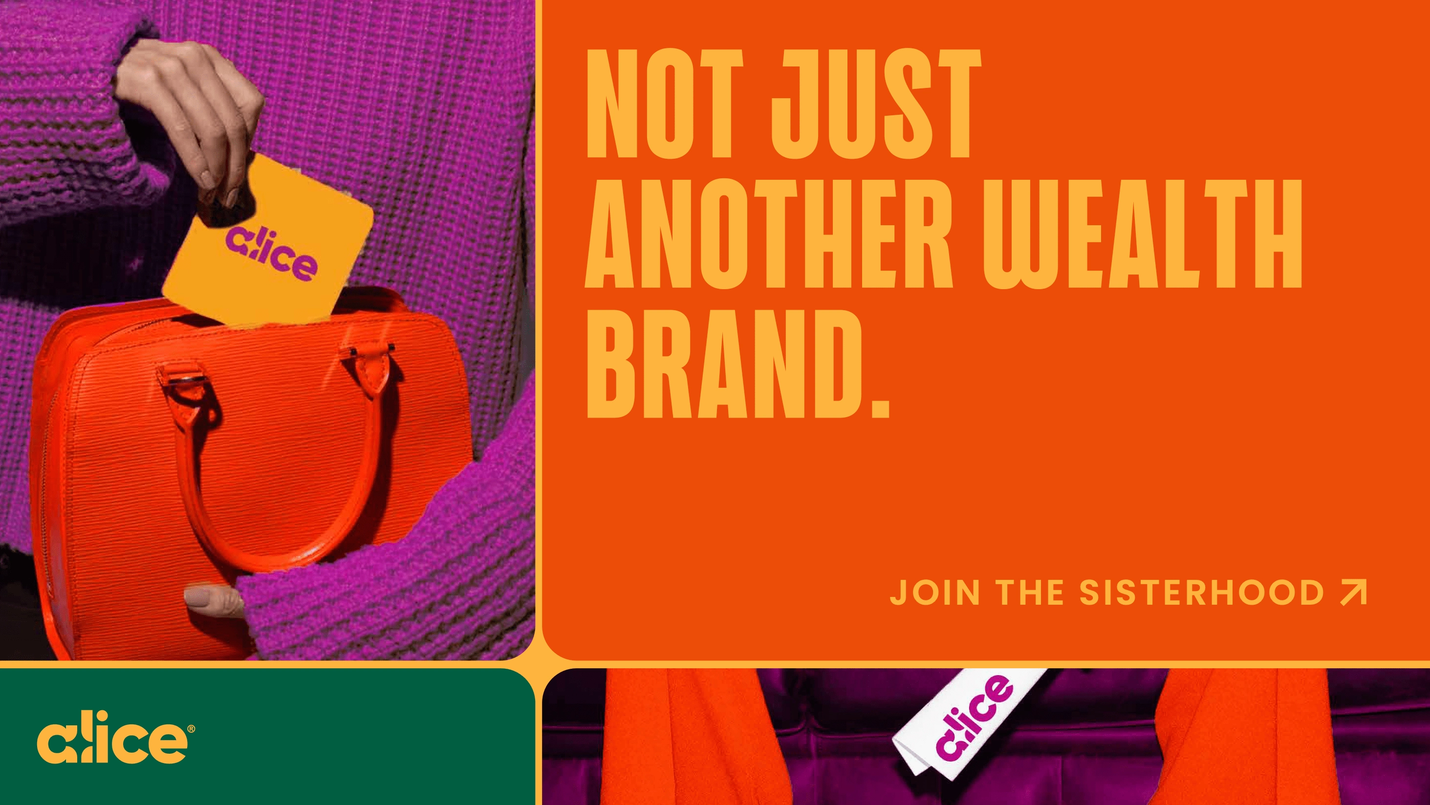
The Solution
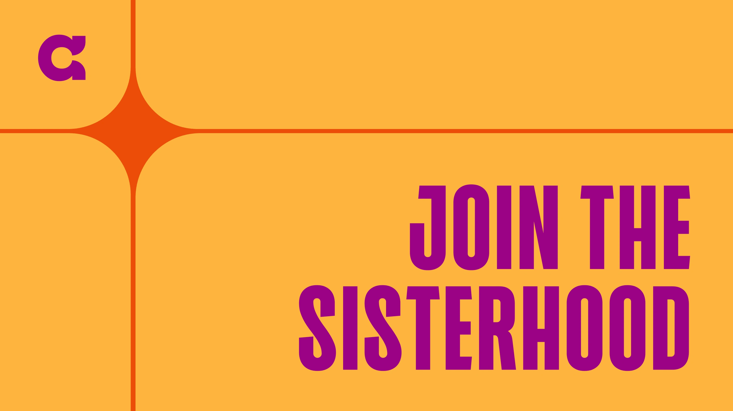
Financially Fearless is not just a concept; it's a bold declaration, an unapologetic mission undertaken by Alice to shatter the barriers, close the money gap, and empower women to take control of their financial destinies.
This concept embodies a visual language that is daring, empowering, fearless BUT also approachable & friendly at the same time.
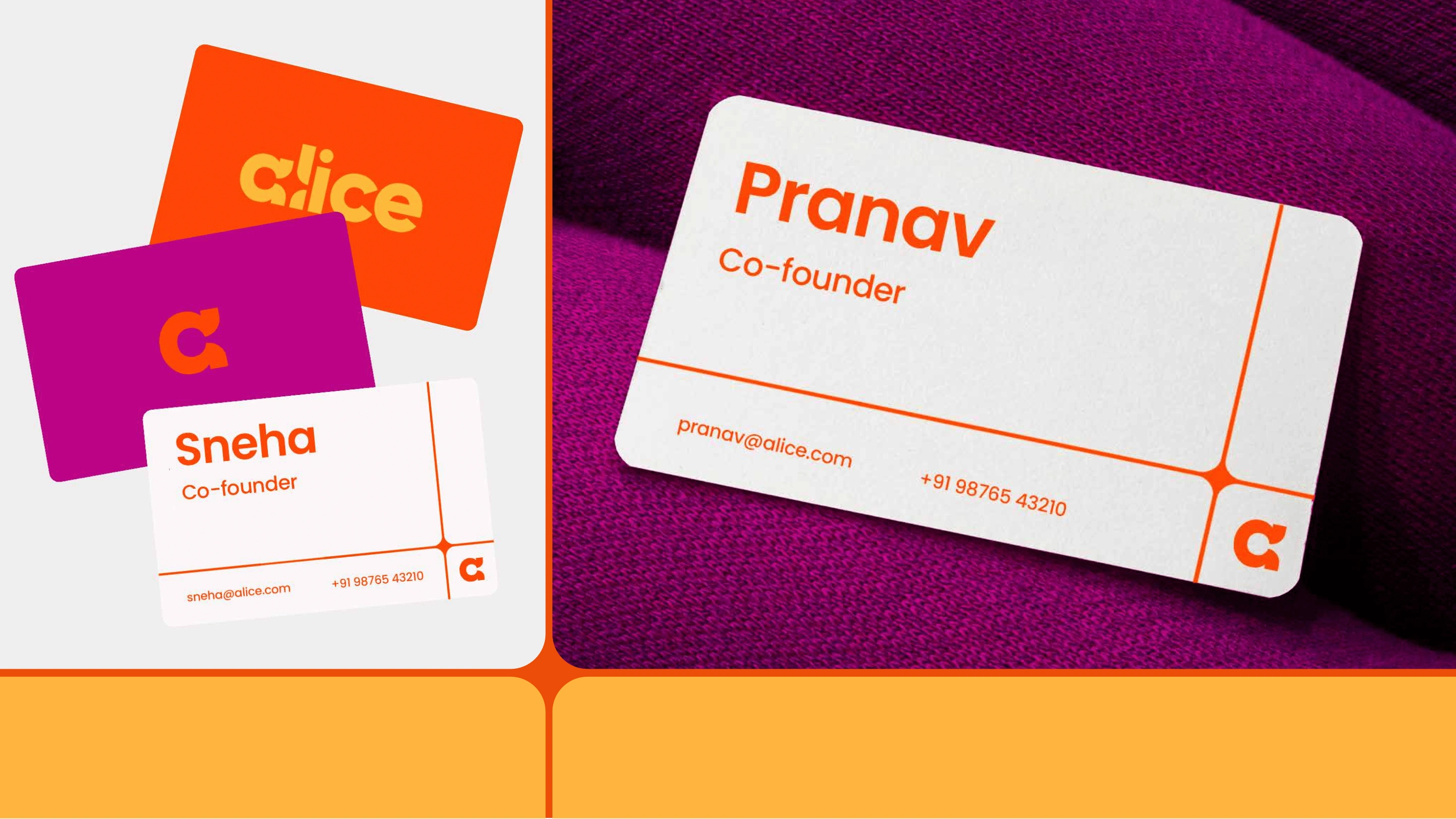
The Logo
The visual elements convey a balance between aspiration and approachability, ensuring the brand feels both sophisticated and welcoming. The shimmering details reflect ambition and success, and embodies the idea of reaching for the stars and creating a bright financial future.
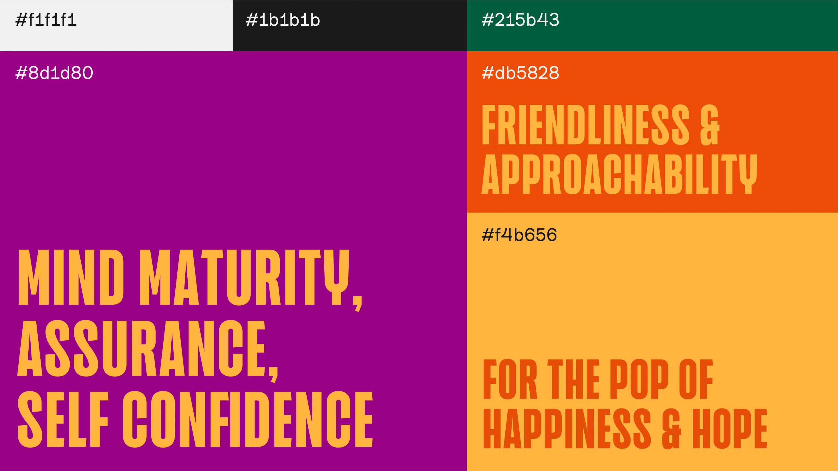
The Palette
The overall palette is a vibrant fusion of bold, warm, and grounded tones that collectively communicate confidence, energy, and optimism while maintaining a sense of maturity and trust.
The rich purple represents maturity, self-assurance, and creativity, forming the foundation of the brand’s personality. The vibrant orange and golden yellow bring in energy, friendliness, and optimism, adding a dynamic yet inviting touch. The deep green grounds the palette with stability and trust, balancing the overall vibrancy. Black and white ensure clarity and contrast, keeping the visuals sharp and impactful.
The Typography
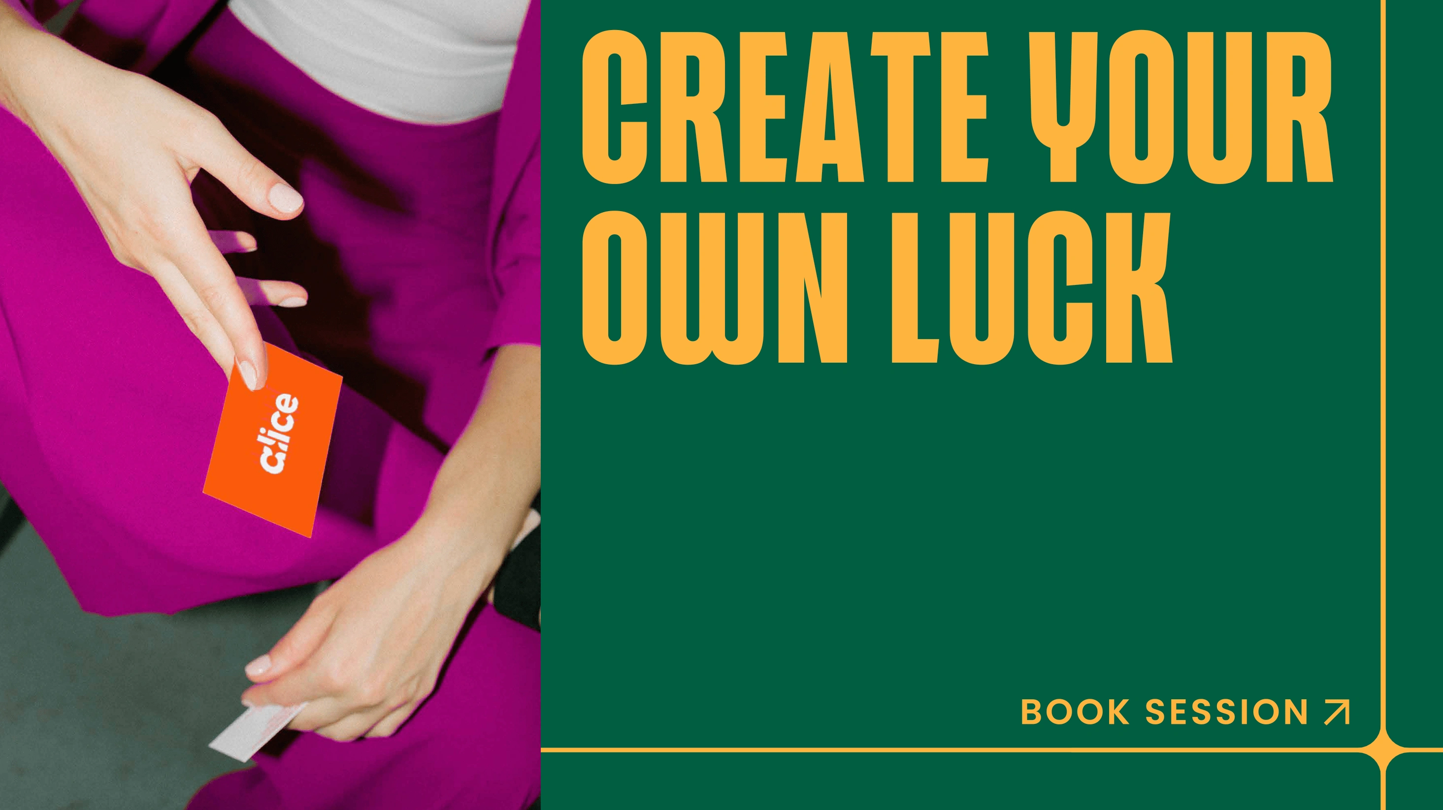
The typography is bold, expressive, and energetic, reinforcing the confident and dynamic personality of the brand.
The heading font is strong and impactful, demanding attention and setting the tone for a bold identity. The body font is clean and modern, ensuring readability while maintaining a sense of warmth and approachability. A secondary accent font adds versatility, allowing for emphasis when needed.
The combination of these typefaces creates a balance between assertiveness and friendliness, making the overall typography system both engaging and functional.
Art Direction
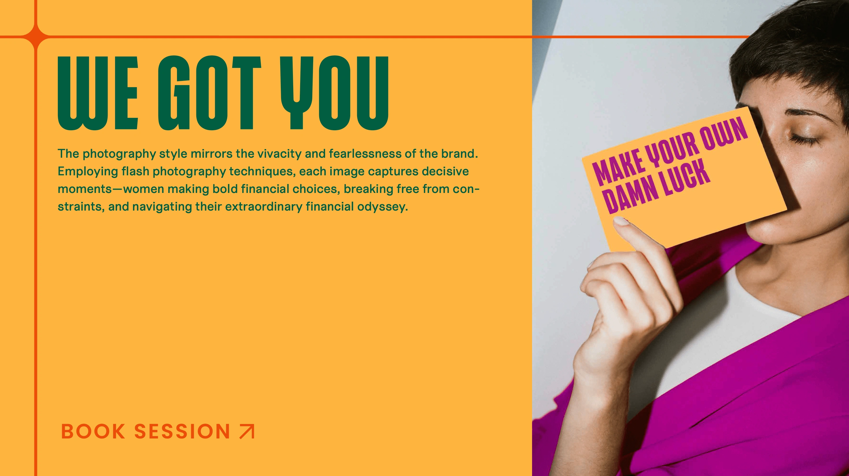
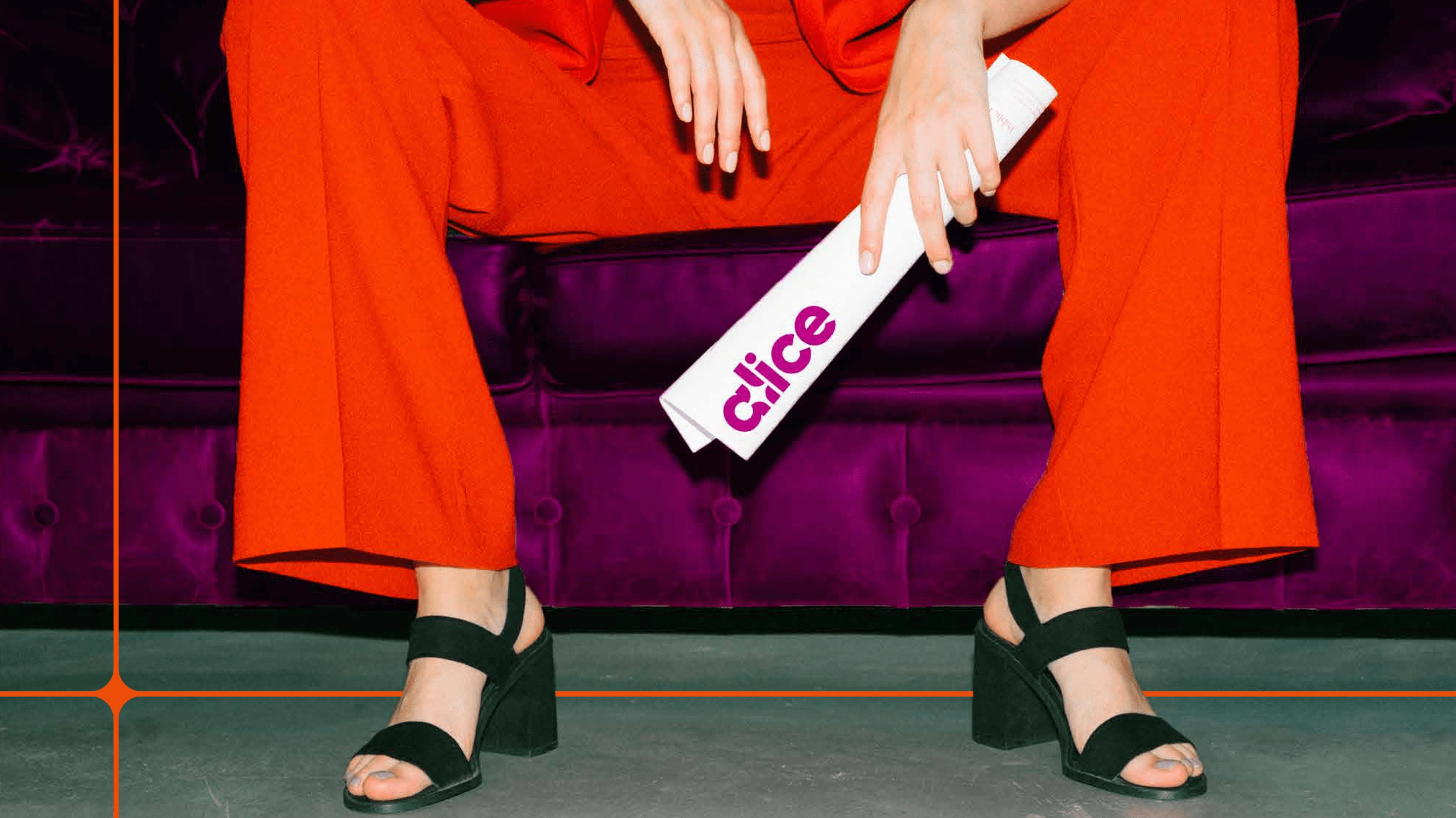
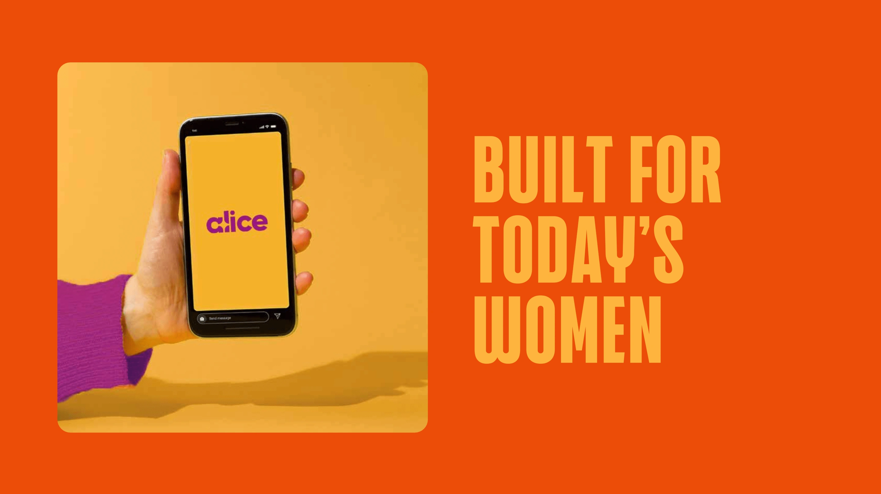
The art direction embraces a bold and striking aesthetic, characterized by high-contrast compositions and the use of flash photography. The visual style is direct and unapologetic, capturing moments with a raw, almost cinematic intensity. Flash photography adds a sense of immediacy and energy, highlighting textures, details, and expressions with sharp clarity.
The result is a dynamic, high-impact look that exudes attitude and presence.
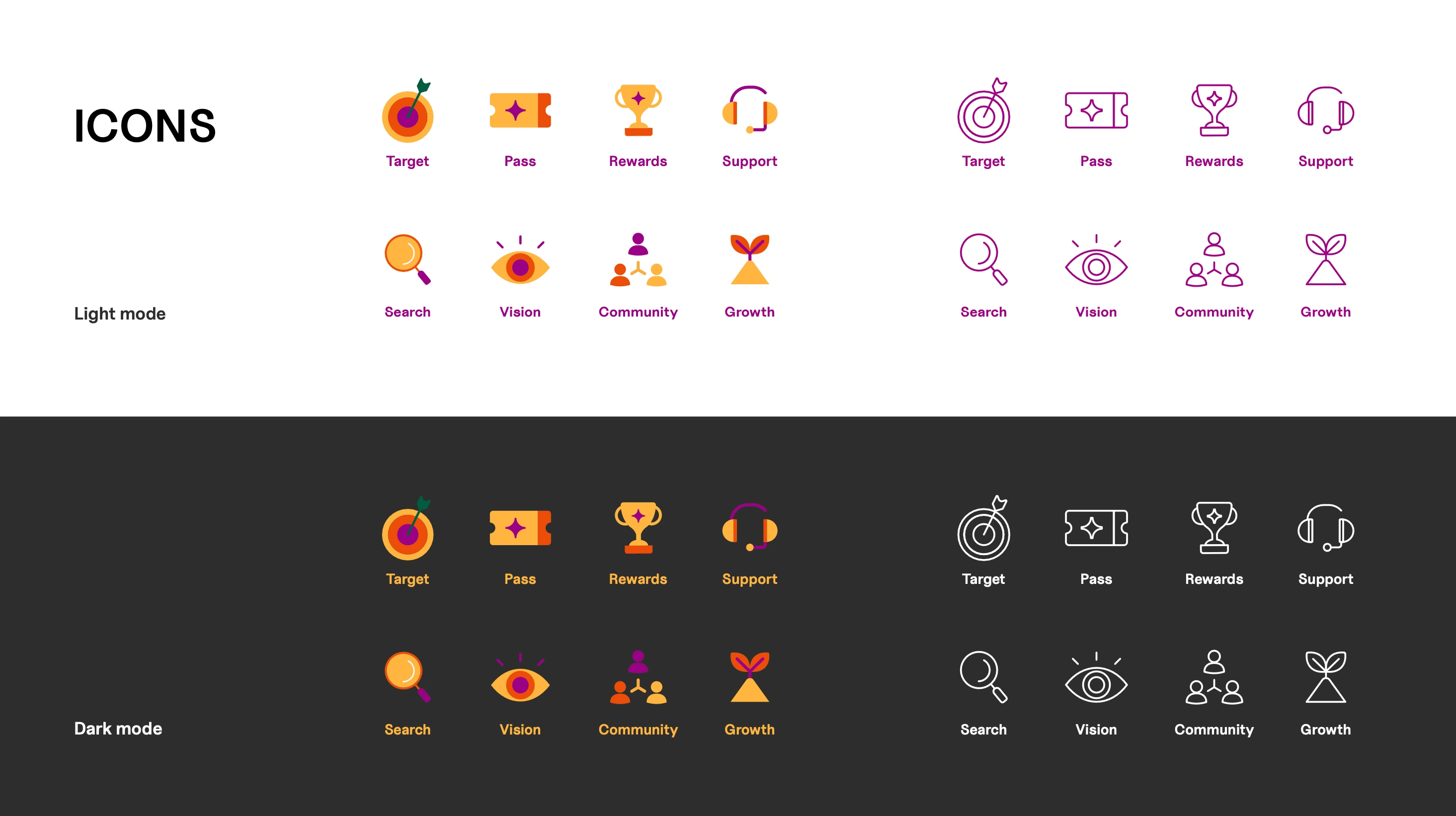
The Iconography
The iconography follows a bold, minimal, and highly legible approach, ensuring clarity and immediate recognition. Icons are likely geometric, with sharp edges and strong contrasts to align with the overall visual direction.
The icons work seamlessly with the typography and colour palette, reinforcing the brand's bold and modern aesthetic while maintaining functionality and accessibility.
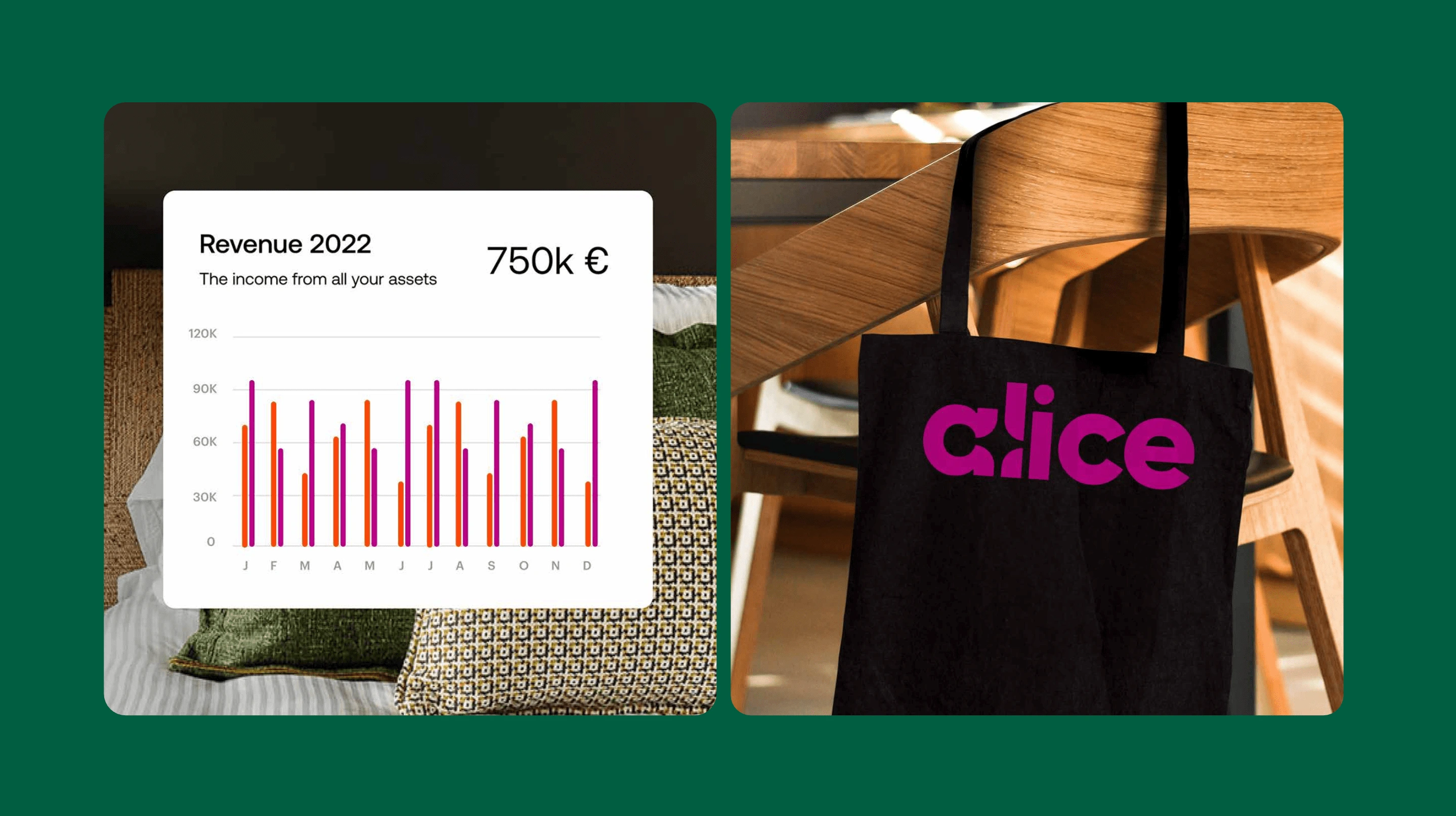
Information Visualisation
The information visualisation follows a bold, high-contrast approach that ensures clarity and impact. Using strong typography and vibrant colors, data is presented in a way that is both engaging and easy to comprehend. The layout prioritises hierarchy, making key insights immediately noticeable.
Like this project
Posted Mar 9, 2025
We designed a bold yet approachable brand identity system that reflects strength, clarity, and trust, ensuring that Alice feels like a financial companion.
Likes
1
Views
9
Timeline
Dec 25, 2023 - Feb 15, 2024