House Creative Media Co | Case Study: Moose Jaw River Watershed…
Table of contents
Introduction
Let's paint a picture:
It's July of 2019. We're barely off the ground as House Creative, and had just decided to go full-time in our business. For the first couple months, we were eating through our savings, and working with what clients we could find.
And then, in November, we got a phone call from the Moose Jaw River Watershed Stewards, and soon after, our first real chance at doing something larger than ourselves. The MJRWS helped us to find our footing, and for that, we are truly forever grateful for the opportunity that they gave us.
What We Did
The MJRWS didn't want a rebrand—they wanted to revolutionize their industry's concept of branding, and equip other watersheds on how to brand themselves, and the way that this would be accomplished was documenting us rebranding them. With that, there were two primary objectives that we followed:
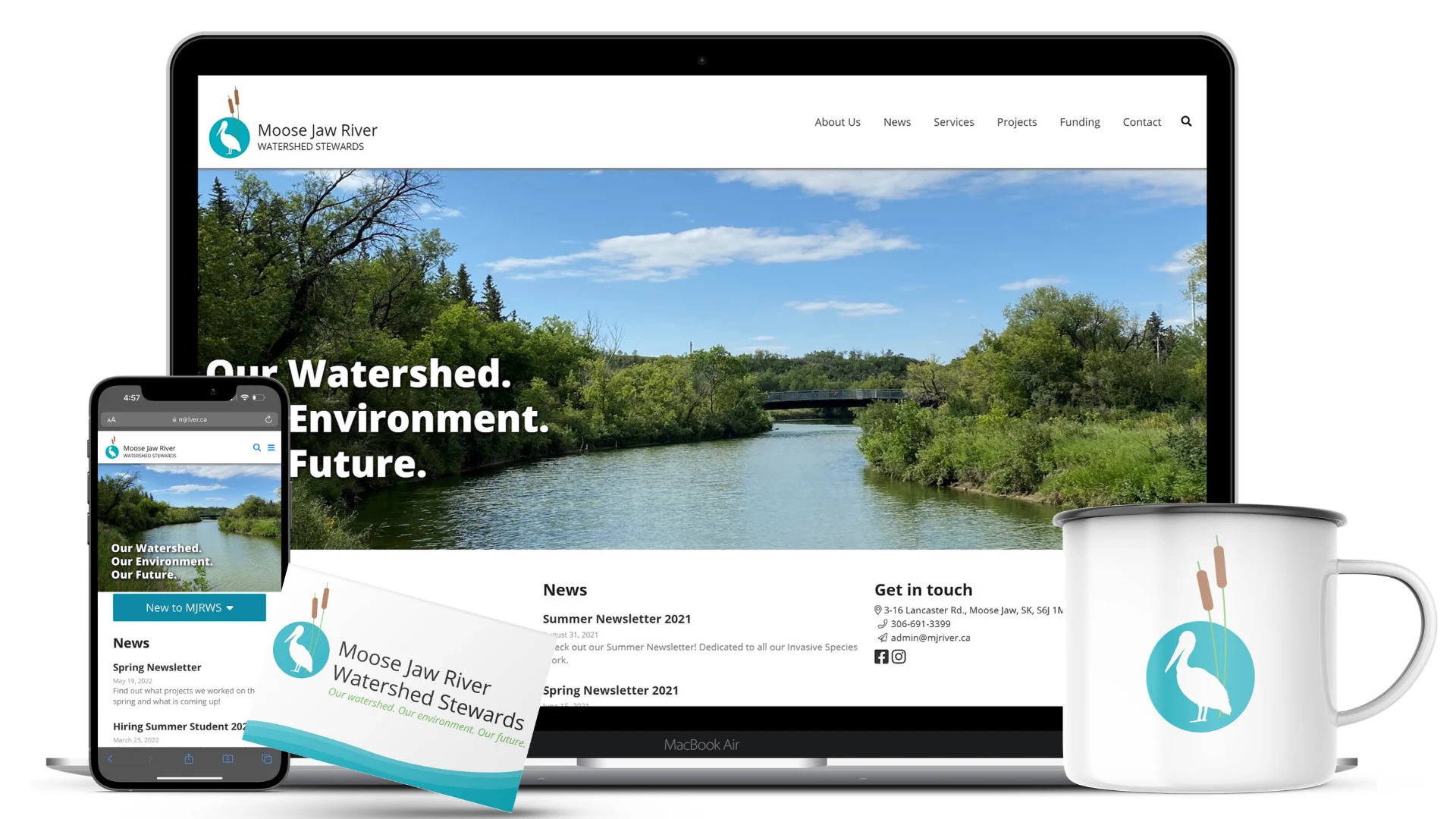
Rebrand the Moose Jaw River Watershed Stewards and create an entire brand system: website, logo, stationary, signage, and even letterhead and newsletter templates.
Document the rebranding process through reports and video tutorials to be available for other watershed organizations to view and learn from
Consult on Facebook and Instagram marketing tactics
Logo Design
When we did a preliminary study on what other logos looked like for watershed stewardship organizations, we noticed a common—and obvious—theme: water droplets. So with an overdiluted use on "water droplet logos", we decided to go in a completely different direction by using a pelican and cattail, a popular bird and plant in the Moose Jaw River Watershed territory.
Website Development
The website is built on a fully custom-developed CMS called Dash, designed and built by Luke Johnson (Codigo Webworks). While we are able to design and build websites in-house (no pun intended), bringing in a more experienced developer ultimately was the best decision, since the website needed to be highly versatile and customizable, since the MJRWS has many different programs and projects happening all at the same time.
Branding
We wanted to create a brand that was both professional and approachable; confident yet friendly; youthful yet multi-generational. And to do that, we used a nature-themed colour palette, and Open Sans as the font of choice due to its simplicity and readability. Furthermore, we wanted to create a brand that resonated with the general public as well as corporate entities.
Video Production
Conclusion
The Watershed was our first major project, and it was definitely a wonderful learning experience. They are a great organization with a powerful mission for Saskatchewan, and we were honoured to be able to work with them on rebranding and focusing on their organization!
Like this project
Posted Jul 17, 2024
Headquartered in Moose Jaw, Saskatchewan, the Moose Jaw River Watersheds spearhead the protection of nature throughout a large portion of Southern Saskatchewan.
Likes
0
Views
5

