Elevating patient experience for chronic disease App.
Timeline - 1 Year | UX Consultant (Freelance contract)
I worked as a consultant for this Indian startup in the digital therapeutics domain. They worked on helping patients with chronic disease conditions better their health by creating various personalised programs for them. They had an in-house team of certified clinicians who designed these programs.
They had created a mobile app to aid patients in this journey to ensure compliance and educate them.

My Role:
I worked on improving the engagement on the app and understanding why adoption was low. Apart from that I worked on various other feature enhancements for one year and was a part of the strategic and product discussions being the only UX/ product designer on this app.
I started by understanding the business requirement and collating a brief understanding of the existing app and its issues, there was a considerable amount of domain study needed.
In the discovery phase, I conducted stakeholder interviews, a couple of user interviews, expert review of the app to identify usability issues. I created a brief playback of it to decide on the scope, and goals and redefine the problem to align all stakeholders.
Business Goals:
1. To ensure patients follow their planned program.
2. Provide users with easy access to their plan along with ease of updating compliance and progress monitoring.
3. Make it engaging to ensure better retention with content.
4. Achieve 80% patient engagement and compliance (engaged users are those who open the app 5 days a week)
Challenges:
1. The solution had to be personalised for patients across different programs.
2. Since right from profiling call the user journey begins outside app, it is important to also get them smoothly transitioned onto the app and let the app act as hand holder instead of complete dependency on coach for everything.
It is a business goal to make users read content while patients might not be very keen to read.
Expert evaluation insights
1. No guided approach for patients thereby failing to ease their job of following the plan.
2. No progress shown to users which could be a trigger/motivation for them.
3. Multiple usability and heuristic issues existed that needed to be fixed at least the low hanging fruits.
4. Visually the app looked quite neat and clean but the language needed to be more cohesive.
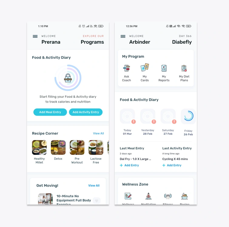
After an extensive discovery phase with stakeholder interviews and user research, the three major issues identified and prioritized were:
1. The Information architecture of existing app fails to tie with the users mental model and they constantly need handholding of coach. (Navigation issues)
2. There is no consolidated view for a user as to - where he is in the program, what is his goal and progress and what they should do to stay on track.
3. Food diary input is difficult for users as process is lengthy, search is not optimum.
A remote card sorting exercise was done with existing users and stakeholders to come up with a better more functional and usable Information Architecture.
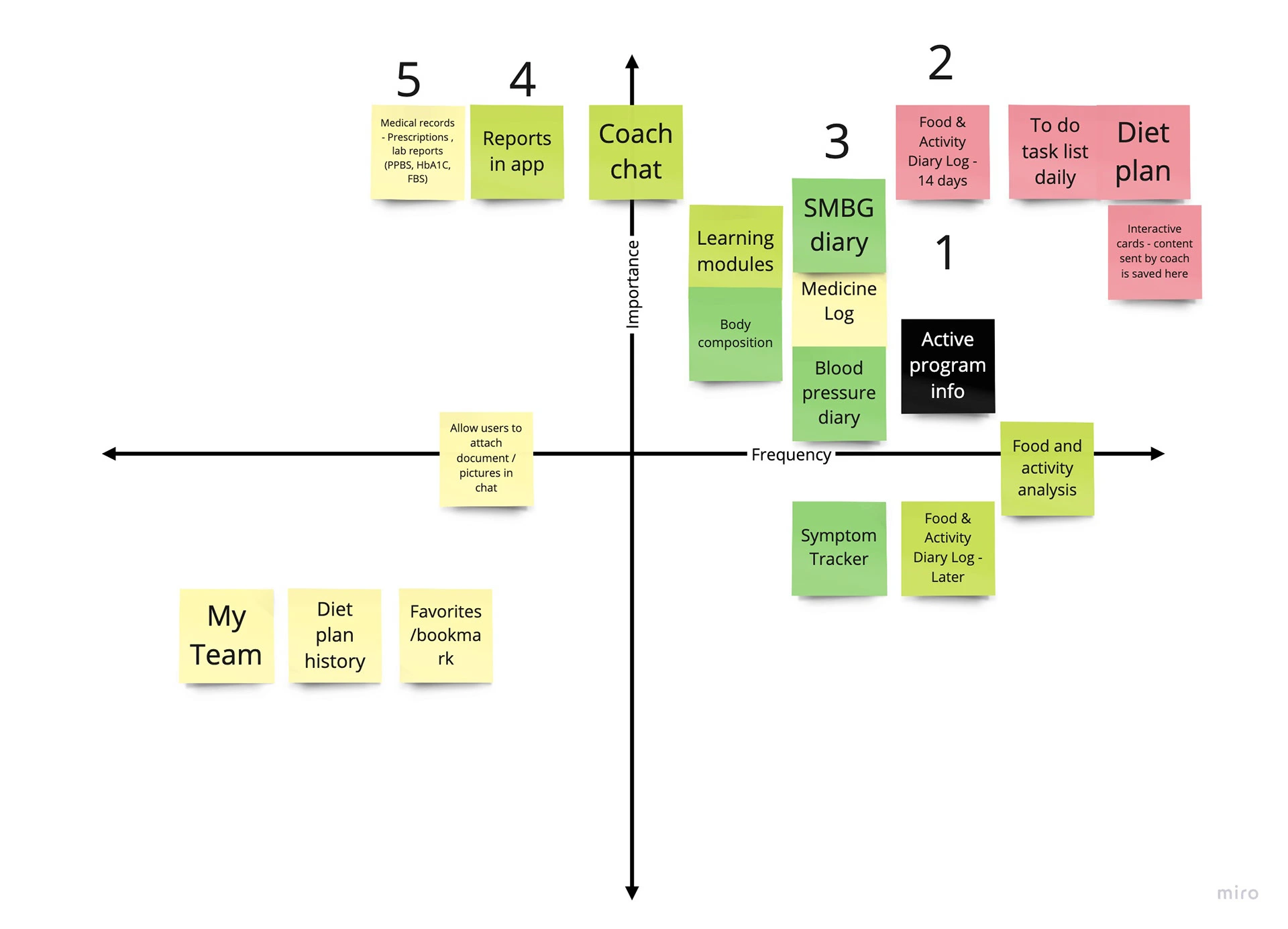
Work done for 1 year included the following in this priority.
Navigation & Home page revamp - Users could see their weekly goal and daily tasks.
Some parts of the dashboard had to be retained due to technical and stakeholder constraints.
Blood glucose diary
Acu check integration
GFit and Fitbit integration
Assessments/Quiz screen UI and flow changes
Food diary success and insight flow
Impact
Patients started using the app more as the usability issues and major concerns were addressed. The app open rate increased from 1 per day to a minimum of 2 per user per day.
Smart integrations and ease of entering the data helped in improved CSAT and the overall ratings on Playstore went up from 3.6 to 4.3 (Currently 4.6)
Retention was the difficult part, and the assumption that only delivering content would solve this proved to be wrong, session time did not show a significant increase. It can be concluded that the educational and knowledge base content needed more study and modification as per user needs.
Takeaways
Startups are difficult to work with due to their fast-changing environment and pivotal nature. The amount of flexibility and dynamism needed in this project was huge and taught me a lot about how to adapt without being too rigid. Sometimes it becomes difficult for a UX designer to conclude anything without testing / validating and here we had to move on to the next thing without getting time to validate, in such times fast iterations and thinking on your feet matters and it helped me cope with this environment.
Like this project
Posted Jun 4, 2024
I worked on improving the engagement on the app and understanding why adoption was low. Apart from that I worked on various other feature enhancements for one y
Likes
0
Views
2
