Built with Framer
Artisan Coffee Brand — Turning Atmosphere Into a Framer Website
Angel Jaramillo
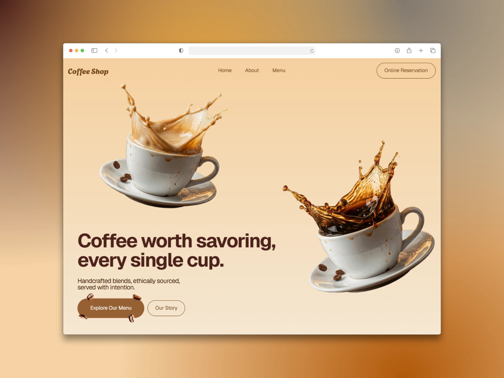
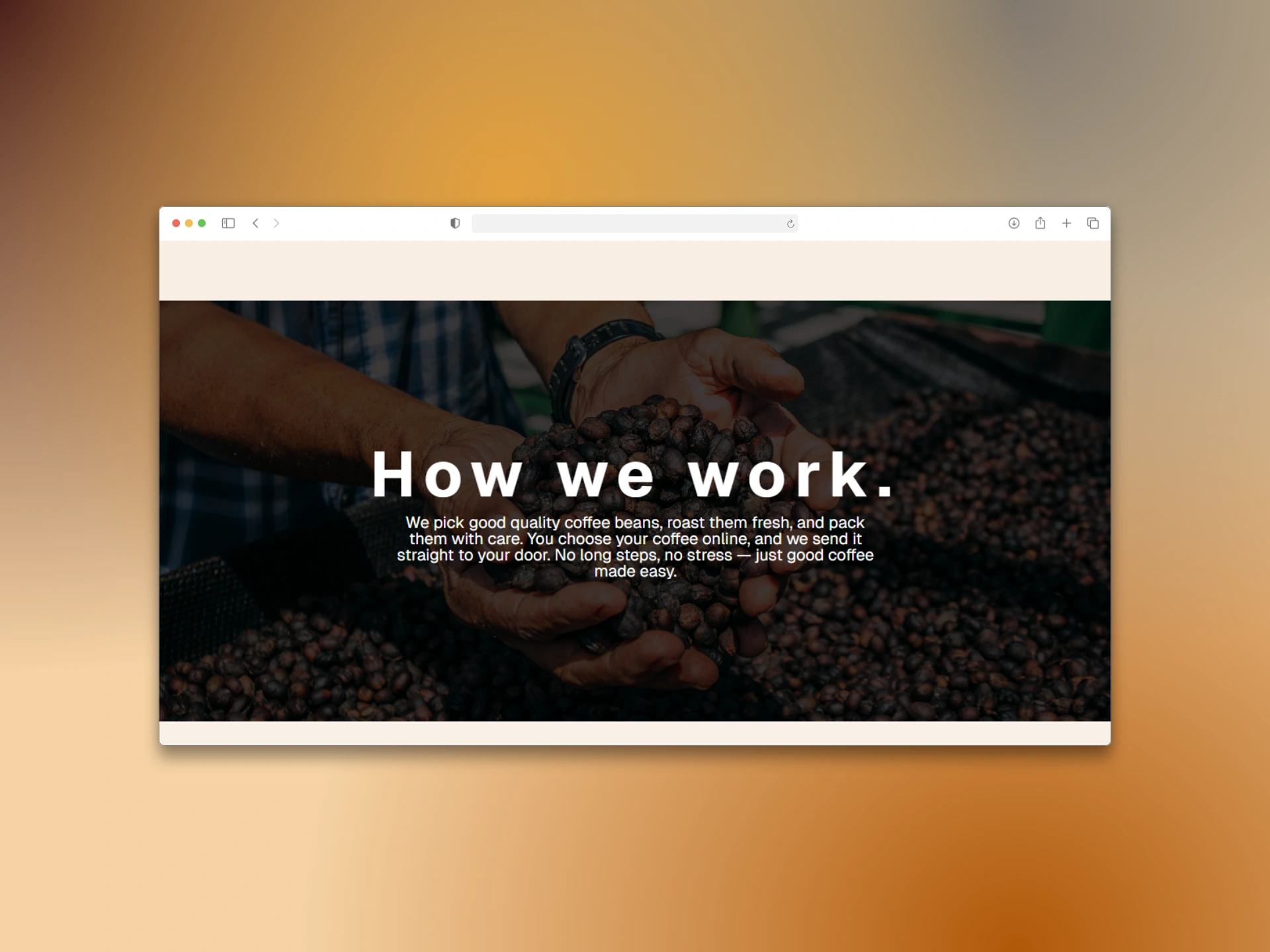
Most coffee brand websites look the same: a hero image, a menu grid, a contact form. The brief here was different. The client needed a site that didn't just show the product — it had to make you feel it before the first sip.
The real design problem wasn't layout. It was atmosphere. How do you translate the warmth of a hand-poured cup, the smell of freshly roasted beans, and the story of a small farm in Colombia into a digital experience that loads in under 3 seconds?
That was the challenge.
My Role
Solo designer and developer. Responsible for information architecture, visual design, motion, and full Framer build — from first wireframe to live site.
Design Decisions That Mattered
Editorial typography over decorative graphics
Instead of relying on custom illustrations or icons, I used italic type as the primary emotional tool. Words like care, time, and craft appear in italics mid-sentence — creating emphasis and rhythm without visual noise. It keeps the design clean while adding personality where it counts.
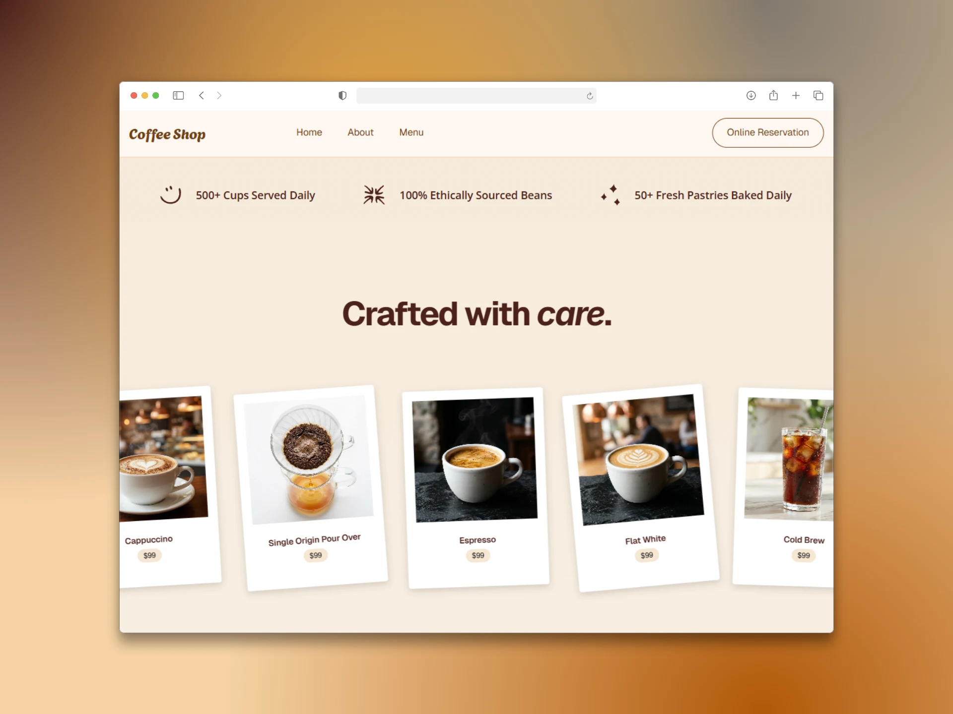
Infinite carousel for the menu
A static product grid would have killed the browsing momentum. The horizontal infinite scroll lets users discover Espresso, Flat White, Cold Brew, Cappuccino, and Single Origin Pour Over at their own pace — more like flipping through a lookbook than reading a menu. It also keeps the section visually alive without requiring user input.
Numbers that build trust immediately
The brand metrics strip — 500+ cups daily, 100% ethically sourced, 50+ fresh pastries — isn't decoration. It's positioned right after the hero because it converts curiosity into credibility before the user scrolls further. Concrete numbers do what adjectives can't.
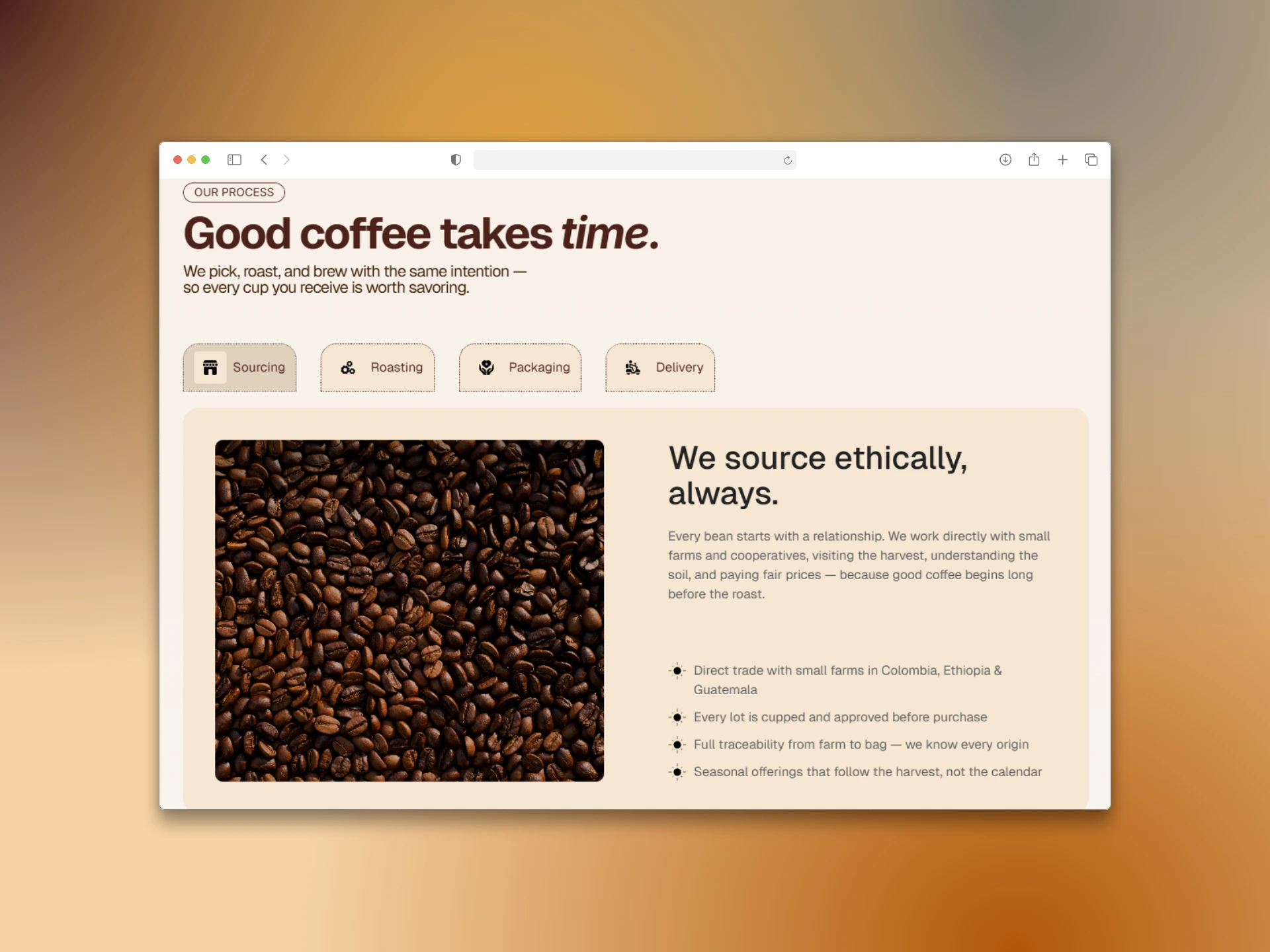
Process as a brand story
Most "how it works" sections feel like legal disclaimers. Here, the four stages (Sourcing → Roasting → Packaging → Delivery) are presented as a narrative, not a checklist. Each stage has a verb, not a noun — because the brand is about doing, not just having.
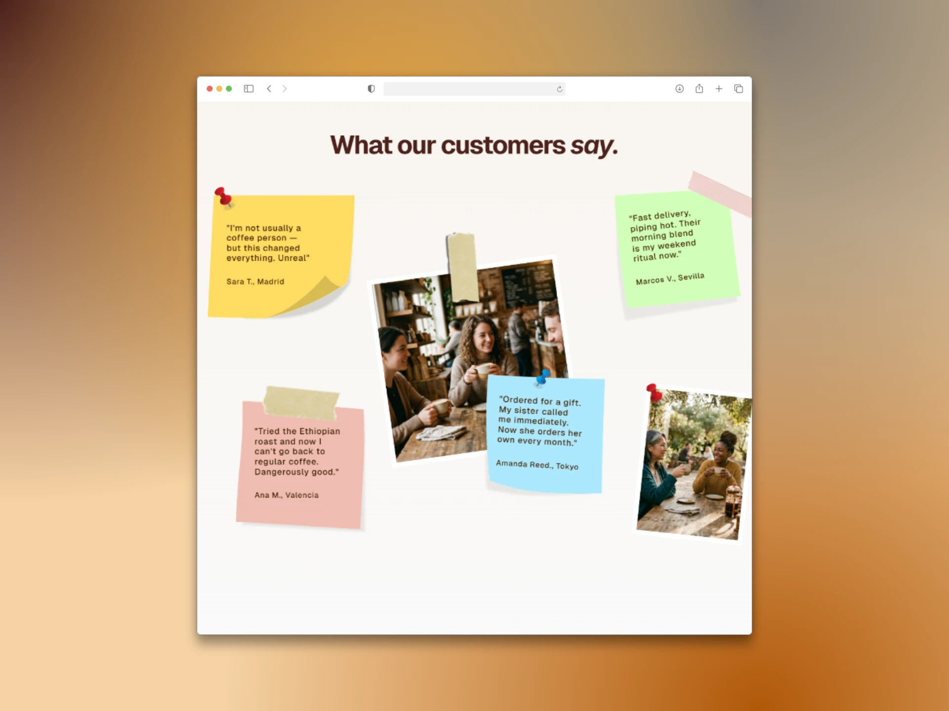
Testimonials that don't look like testimonials
The review section breaks the typical card-grid format. Collage layout, tape-strip visuals, organic background shapes — it feels like a pinboard, not a database. Voices from Madrid, Valencia, Seville, and Tokyo give geographic breadth without feeling forced.
Navigation Philosophy
Four items only: Home, About, Menu, Online Reservation. No dropdowns, no mega-menus. Every click takes the user closer to one of two actions: explore the product or make a reservation. Anything else was cut.
Outcome
A website that sells the experience before the coffee. Every section earns its place — the hero sets the tone, the metrics build trust, the carousel drives discovery, the process section justifies the price point, and the sourcing section turns ethics into a selling point.
The result is a site that positions the brand as a reference in the specialty coffee space — not just visually, but editorially.
What I'd Do Differently
I'd push for a live demo link earlier in the brief conversation — the site's animations and scroll behavior are part of the design, and static screenshots don't capture them fully. Next iteration: a short screen-recorded walkthrough as the first media asset in the post.
Like this project
Posted Apr 10, 2026
How do you make someone feel a coffee before the first sip? Full Framer build: editorial type, infinite carousel, and storytelling that converts.
Likes
6
Views
9