GoBe is a network for consumers looking for unique traveling experiences. As a subsidiary of the Royal Caribbean, GoBe offers unique experiences, stays, and trips for a fair rate. Some describe it as AirBnB experiences with a hotel component.
GoBe at this time did not see the light of day as the project ended up being sunset before launch, but a great deal of effort helped craft a unique experience that I'm still proud to share.
View the entire case study here.
My role
I was the lead product designer and illustrator in this role and worked with two teams to help deliver the quality the client was striving for. The core deliverable is a response web-based experience with e-commerce capabilities. I was tasked with designing an entire platform encompassing everything from landing pages to checkout flows.
Providing a great user experience was at the top of my list since it could significantly affect sales and conversions.
Inspiration
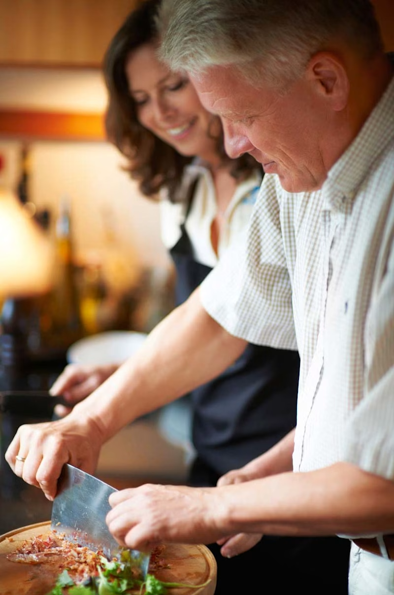
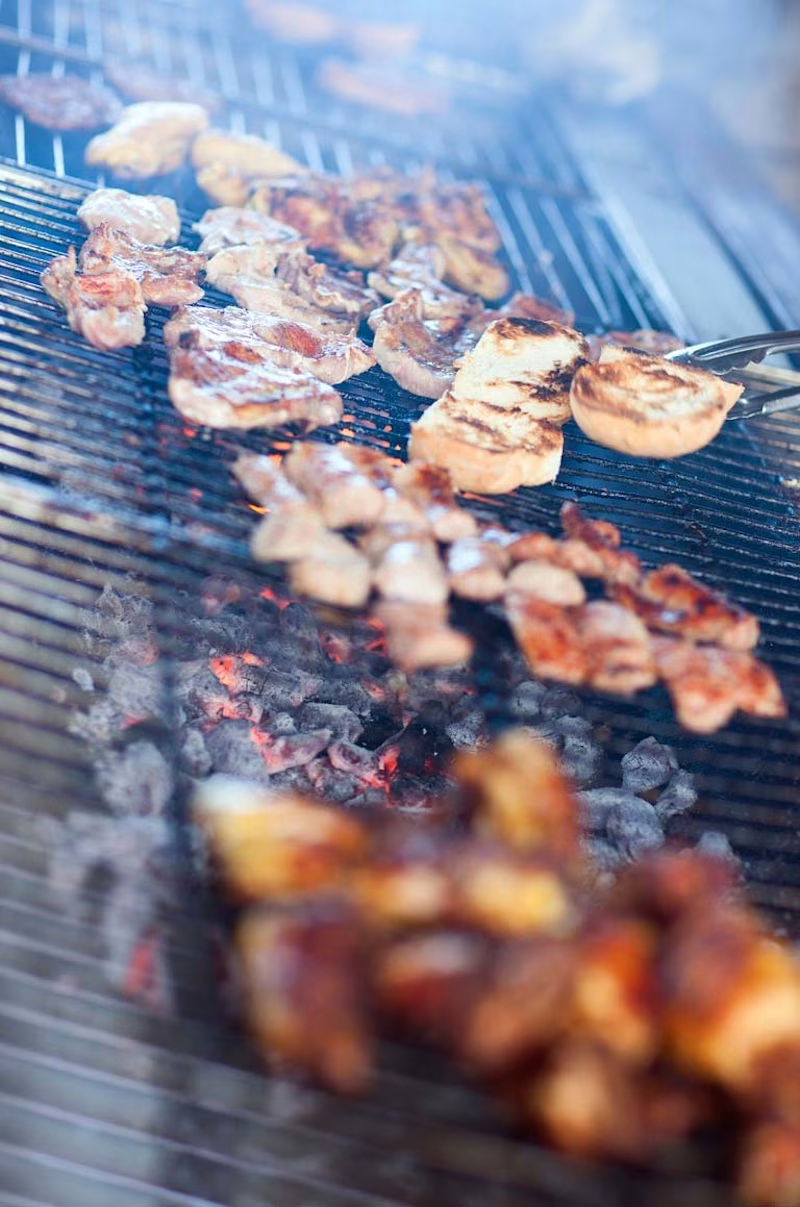
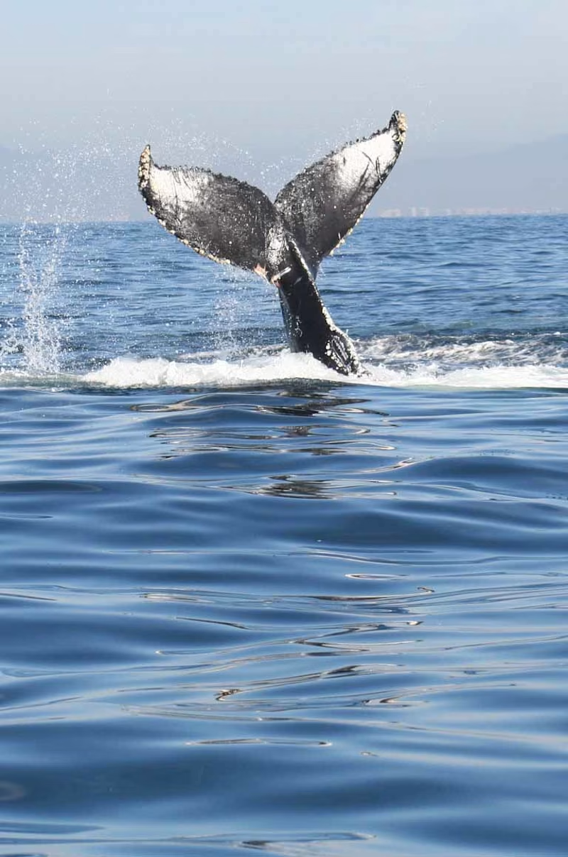
Inspiration was collected from competitive audits, other online networks like Airbnb, and the culture you might experience when traveling the world.
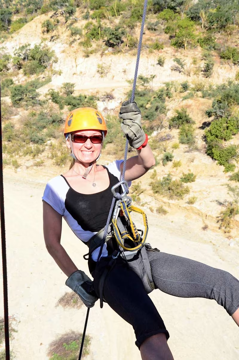
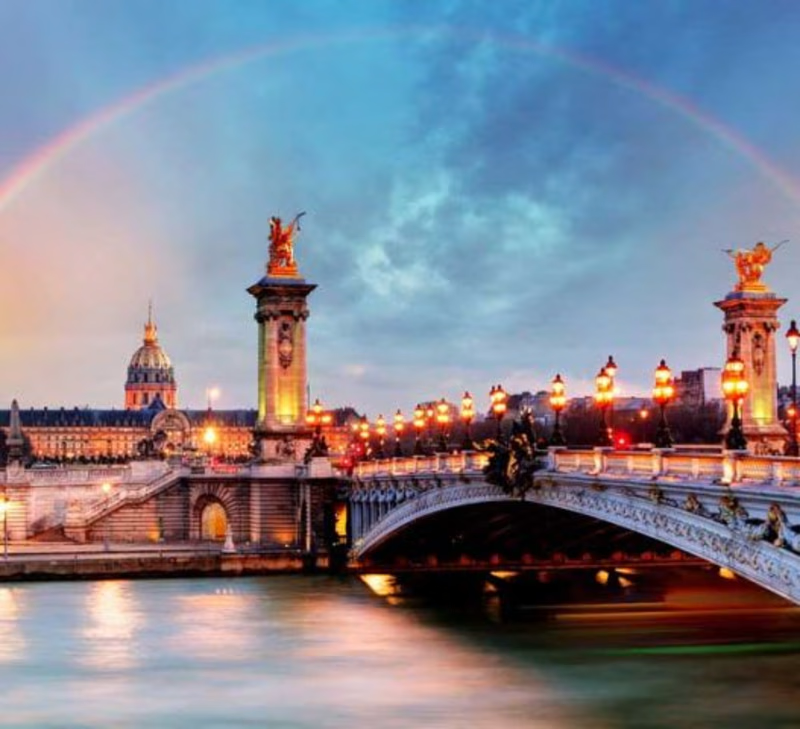

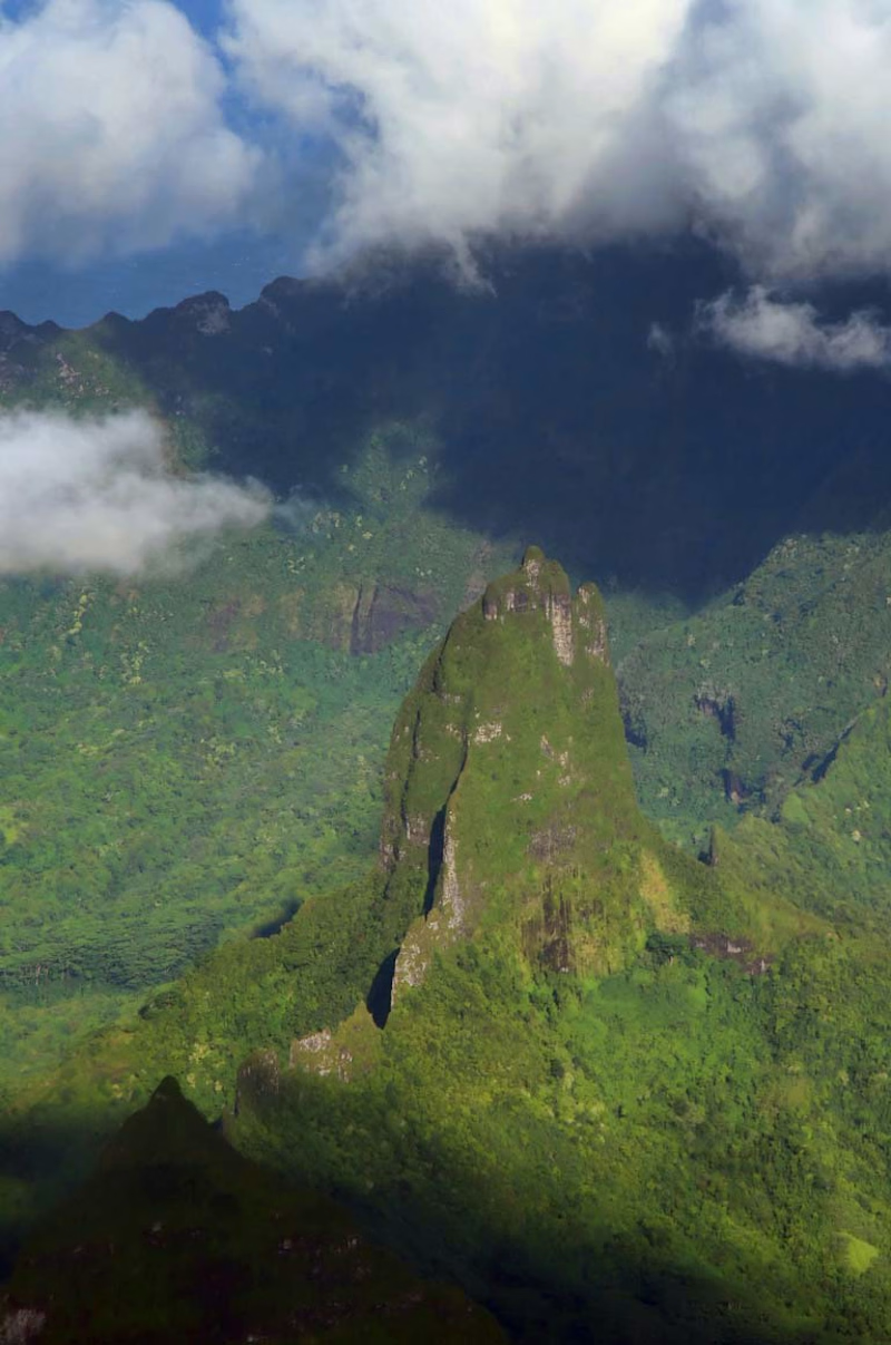
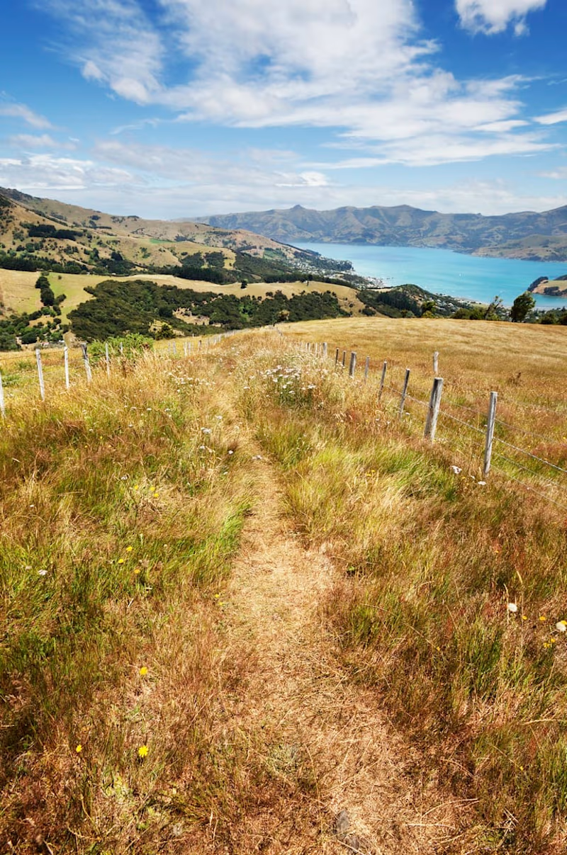

Branding
GoBe had preexisting branding, so that I could use their logo as another source of inspiration. The color selection is a CMYK type of palette which gave me near free range to choose an optimal color palette for the project. I enhanced it to use it in black-and-white applications where color isn't ideal.
The process
At the start of any UX/UI-related project, I first research and take cues from the inspiration I previously collected. After this phase, I begin thinking about scalable systems.
Web and mobile applications often feature several components that make up the whole. I brainstormed those components and how a given user might react during this time.
These types of components could be anything from buttons to form fields. Before designing any specific page, I tend to create what I refer to as a "Design System" to help myself and future colleagues understand the story.
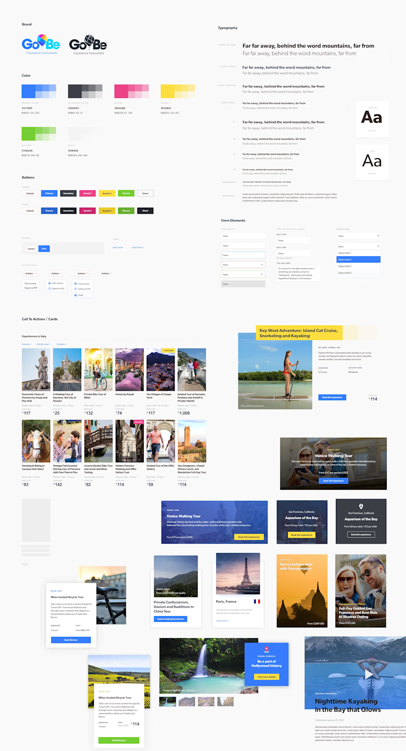
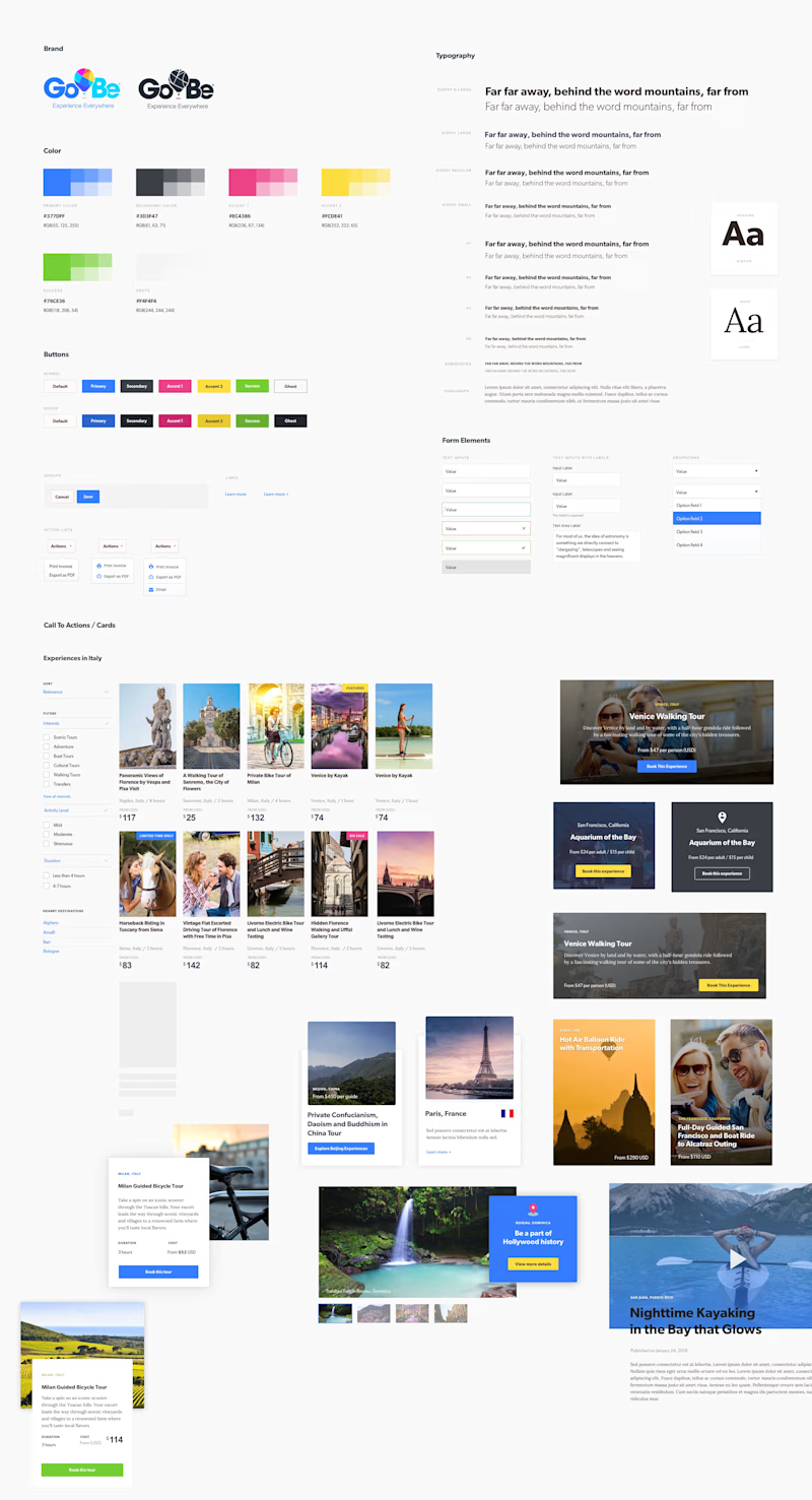
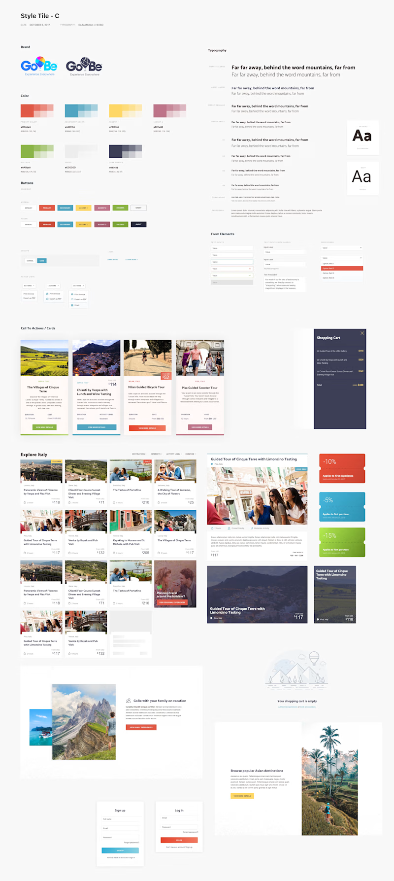
I created several systems for this project that the client could choose between. These feature different imagery, color palettes, typography, UI treatments, and more. Nothing about this phase is set in stone, so it's a great time to explore more deeply and push any boundaries possible.
Design systems
Below are a few explorations of the types of compositions we explored during the project. This process was iterative and evolved. Ultimately, we landed on one set and pressed forward to wireframing.
Wireframes
To focus more on the core user experience, the team I was partnering with found it suitable to extract any aesthetics from the mix and focus on first principles. With this in mind, I created wireframes for my benefit and the client's input.
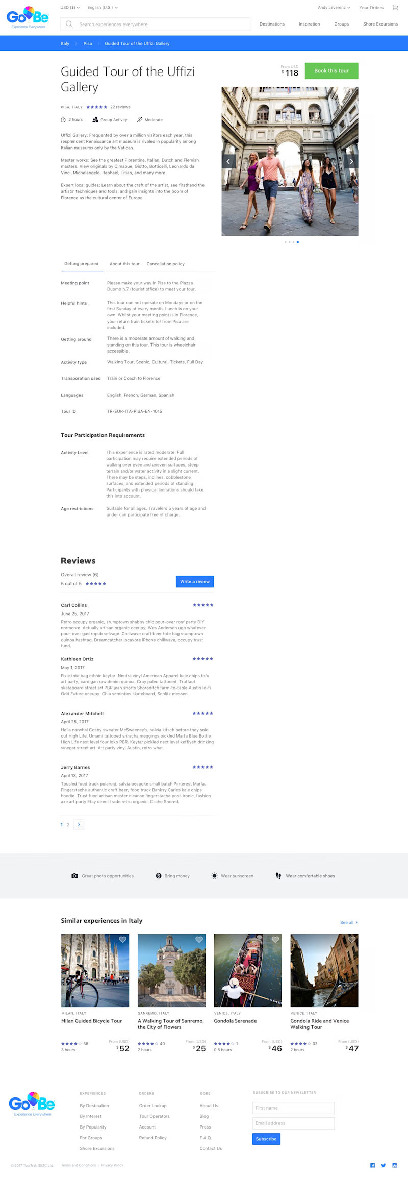
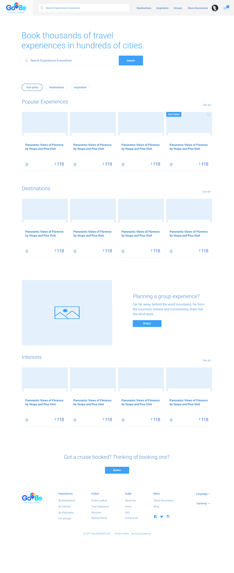
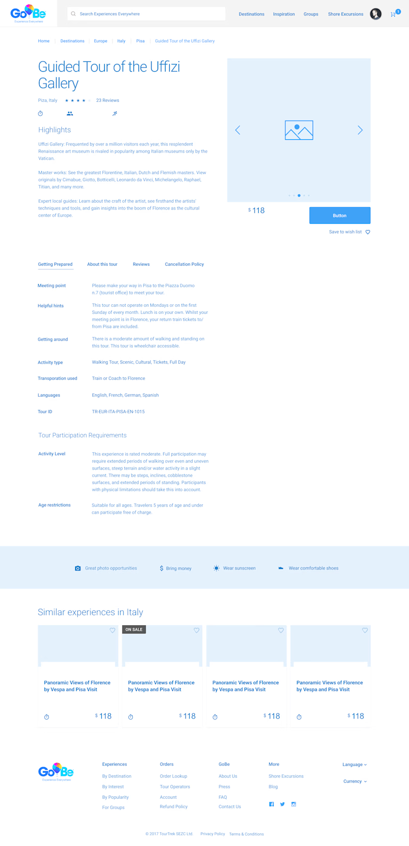
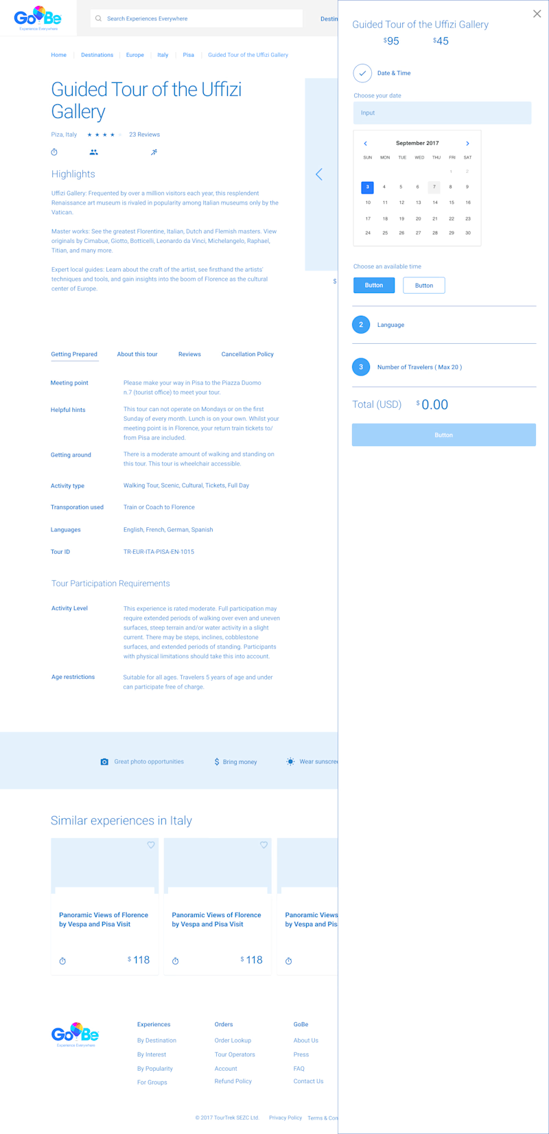
These feature a home page, listing page, and listing detail page. Each has its own set of constraints, but the general idea is to provide experiences to consumers and allow them to purchase those in a self-service fashion using a credit card online.
Below are a small selection of wireframes. I used a wireframing kit to save time by creating every component by hand.
Home Page
Detail page
Detail page with cart flyout menu active
Designs
After lots of planning, discussions, and revisions we arrived at a sound version 1 of design the team was satisfied with. While this didn't get to see the light of day I think the outcome was great.
Home page

Product listing page

Product Detail page
