Kish Computers Rebrand | Bold Branding for a Tech Startup
Ashar Iqbal
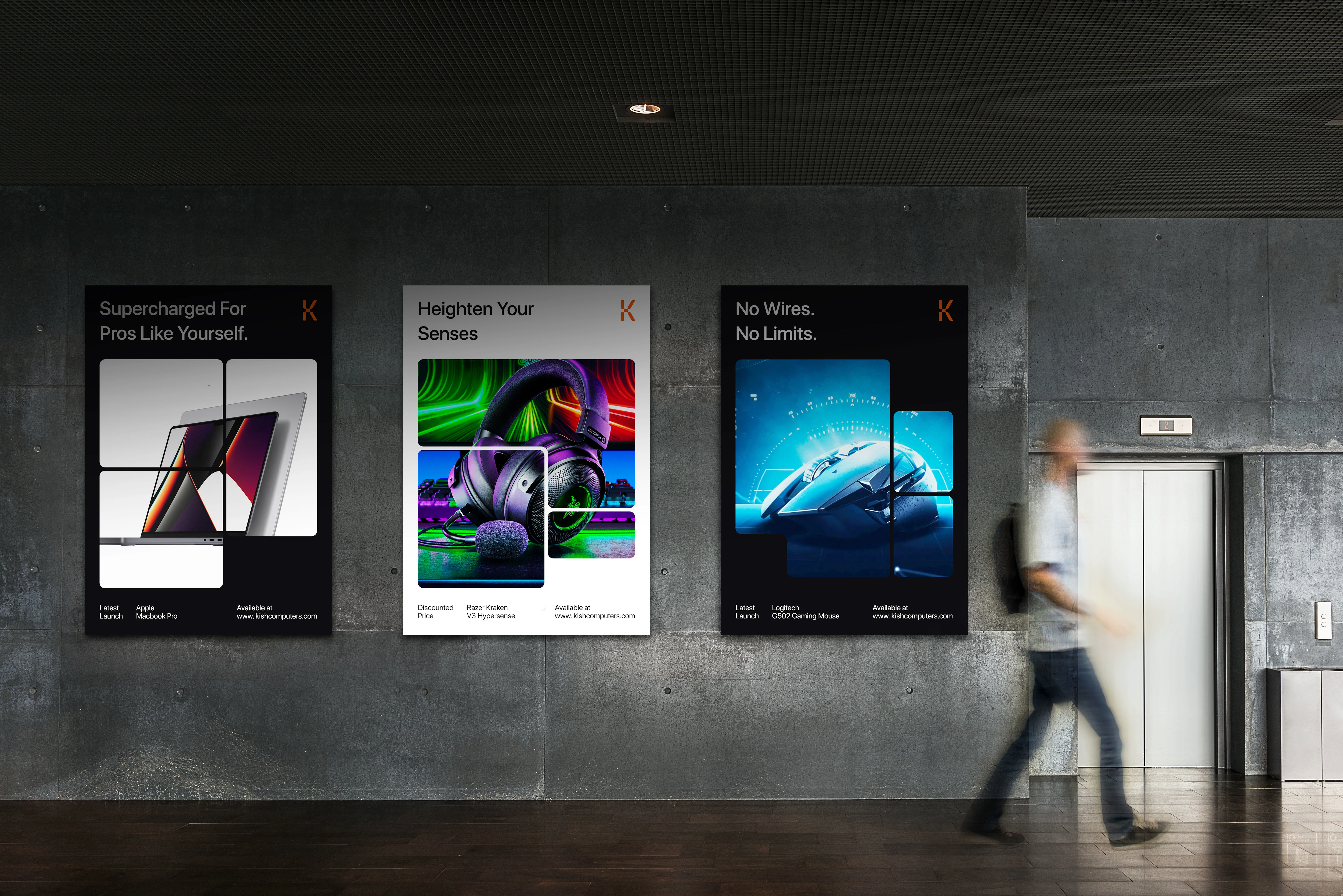
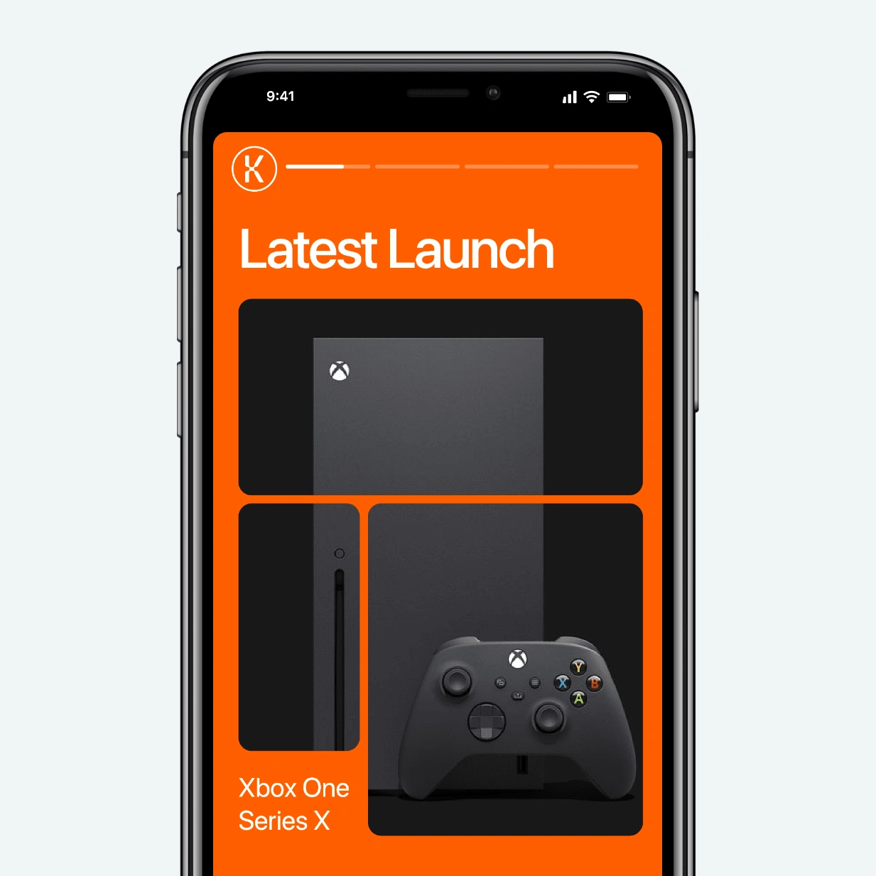
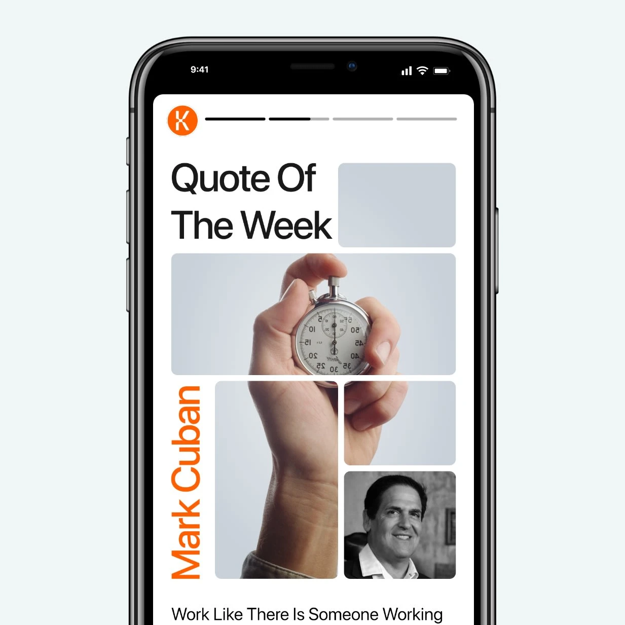
Kish Your Problems Goodbye!
The Challenge
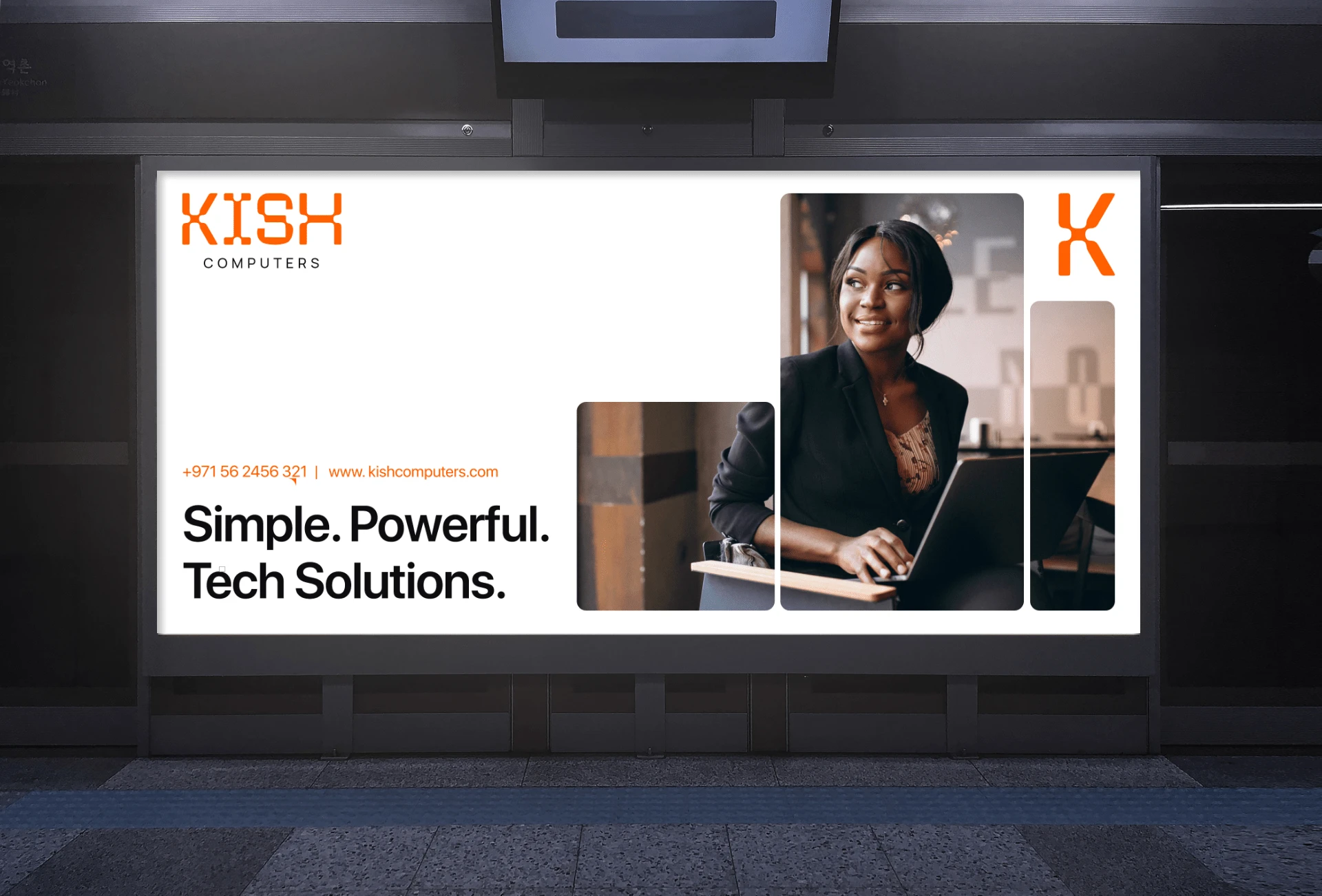
Kish Computers was an IT and services brand. They sold tech products and offer B2B solutions
They’d been around a decade. But things weren’t looking good…
Their brand looked unprofessional and untrustworthy.
Which meant they couldn’t approach their clients will full confidence. This caused them to lose B2B contracts. Not to mention the cut-throat competition.
The Solution
The solution was simple. Change the perception.
To do that we needed to take Kish from:
Insecure → Confident
Untrustworthy → Trustworthy
Inept → Professional
Identifying the gap
To start with we had to research the competitors, find the gap, and Fill it.
Brands were either too corporate or too boring.
We decided to be bold and youthful.
This is where a gap lied. All we had to was fill it.
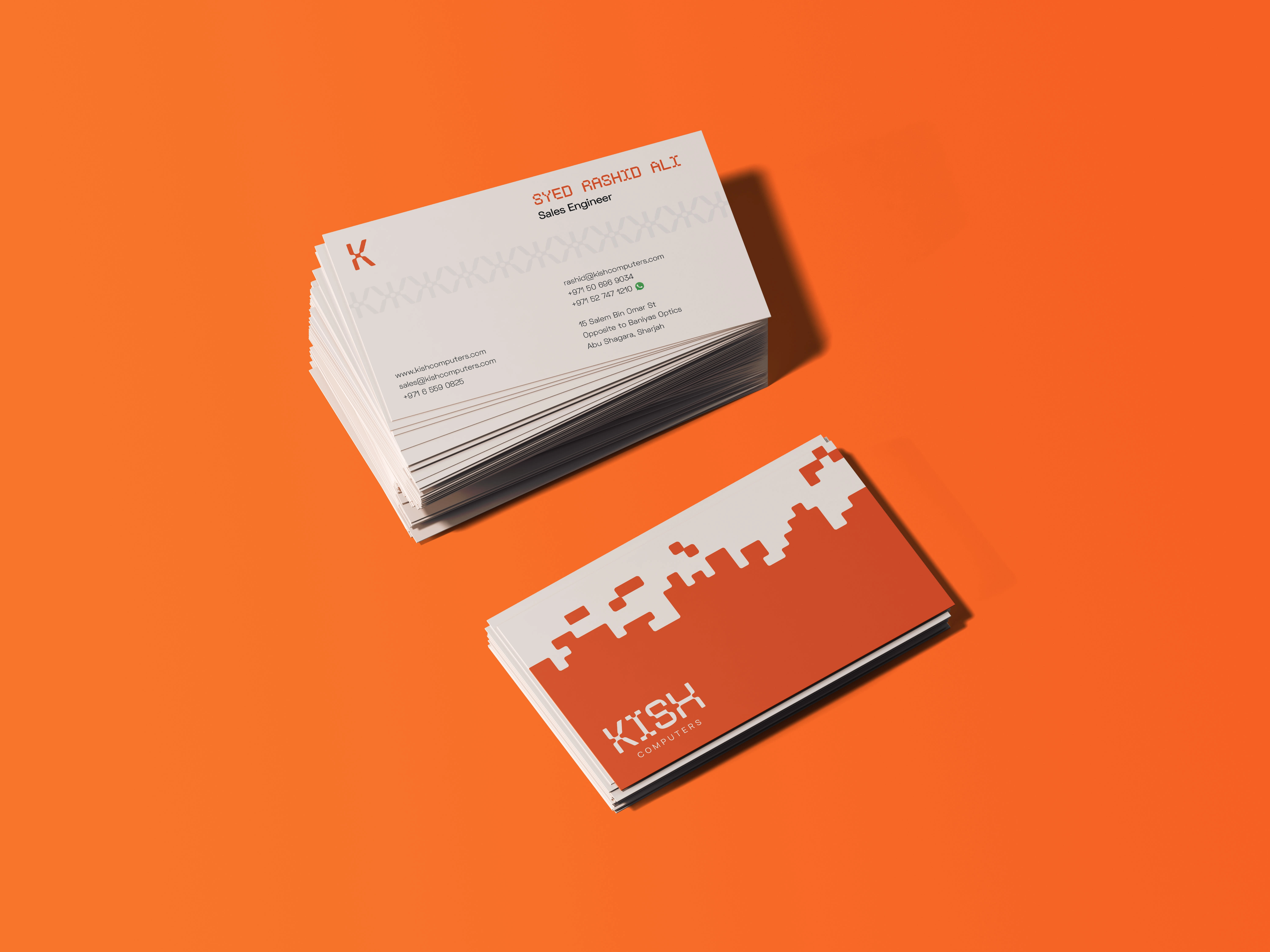
Furthermore, looking at the previous logo, there are many issues that lie within the current logo, however it has build a reputable brand equity over time.
To preserve that equity we decided to see what we can borrow from the current logo. After consulting with the client we finally landed upon the color.
Like this project
Posted Jun 27, 2023
Kish computers is a brand that sells tech products to B2C customers and IT solutions to B2B clients
Likes
0
Views
6