AUREN Brand Identity Design

Ajayi Samuel

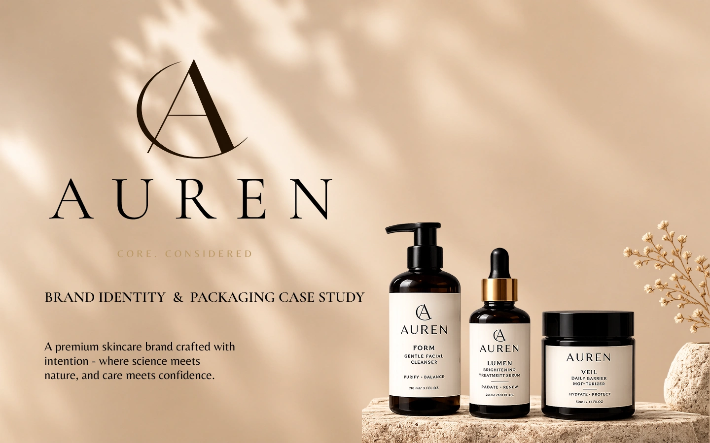
AUREN is a conceptual premium skincare brand built around modern luxury and thoughtful care. This case study explores its complete identity and packaging system, combining refined typography, warm neutrals, tactile details, and precise layouts to create a cohesive, sophisticated brand experience.
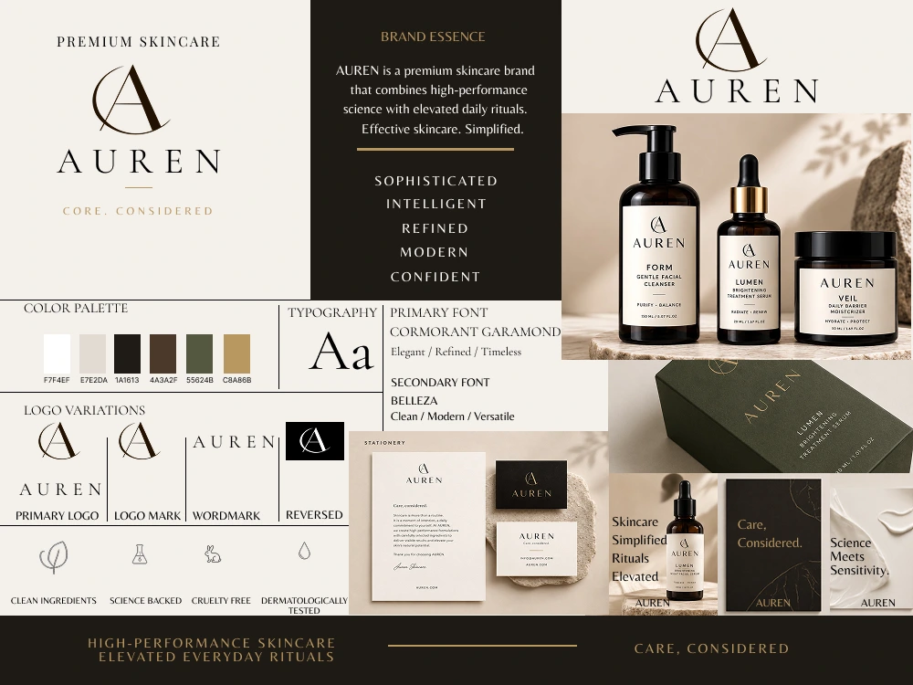
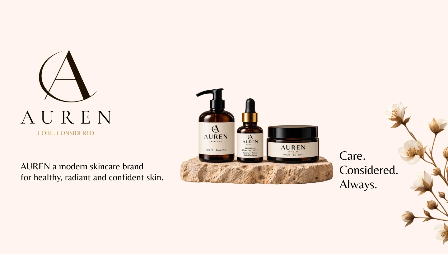
AUREN is a conceptual premium skincare brand created for modern consumers who value effective skincare, thoughtful design, and elevated daily rituals. Positioned between scientific precision and modern luxury, AUREN offers a calm, refined experience through considered products, sophisticated packaging, and a distinctive visual identity. The brand philosophy is simple: Care, considered.
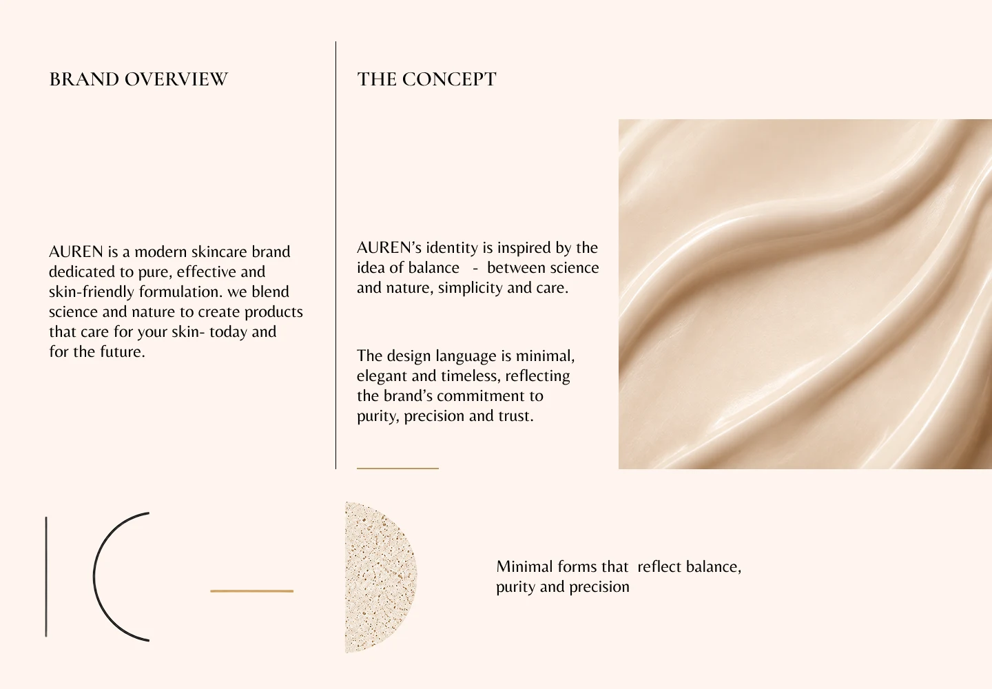
AUREN is a premium skincare concept created for people who value effective care and thoughtful design. The brand brings together modern luxury, simplicity, and scientific precision, creating a calm and refined experience. Its identity reflects the belief that skincare should feel intentional, effortless, and beautifully considered.
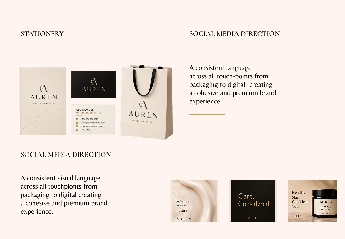
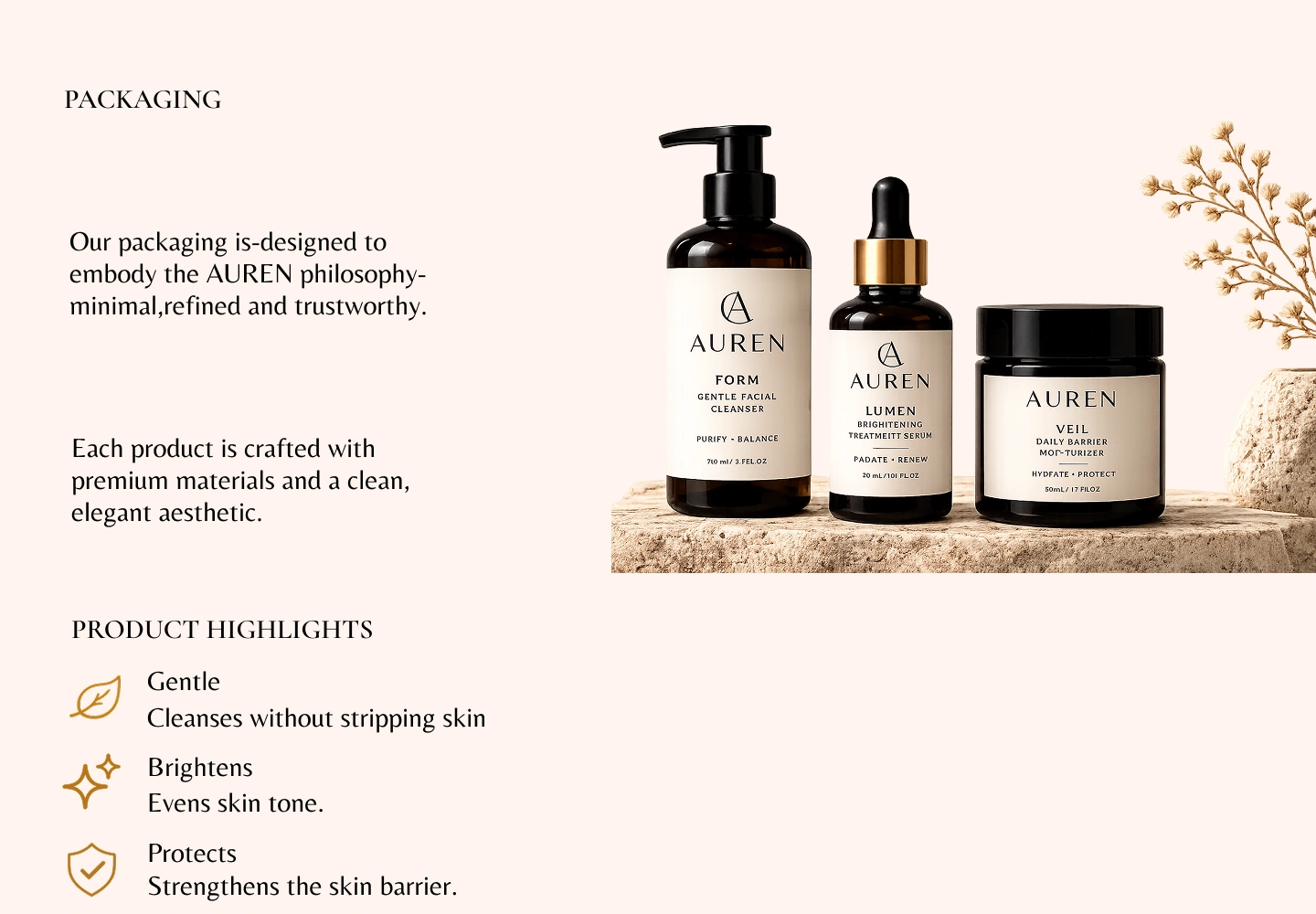
AUREN’s stationery extends the identity through refined layouts, premium materials, subtle gold detailing, and consistent typography, creating a polished brand experience across business cards, packaging inserts, and correspondence. The social media direction carries the same visual language through spacious compositions, warm neutrals, tactile skincare imagery, editorial typography, and restrained messaging, creating a cohesive digital presence that feels sophisticated, calm, and unmistakably premium.
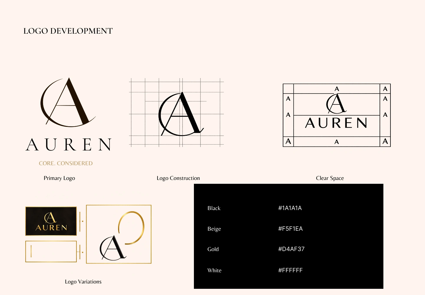
The AUREN logo was developed to create a refined and distinctive mark that reflects the brand’s balance of modern luxury, precision, and considered care. The custom monogram combines the letter A with a flowing circular form, creating a sense of balance and continuity. A structured construction grid was used to refine the proportions and ensure visual consistency. Clear-space guidelines protect the logo’s presence, while multiple logo variations provide flexibility across packaging, stationery, and digital applications. The black, beige, gold, and white palette reinforces AUREN’s sophisticated and timeless character.
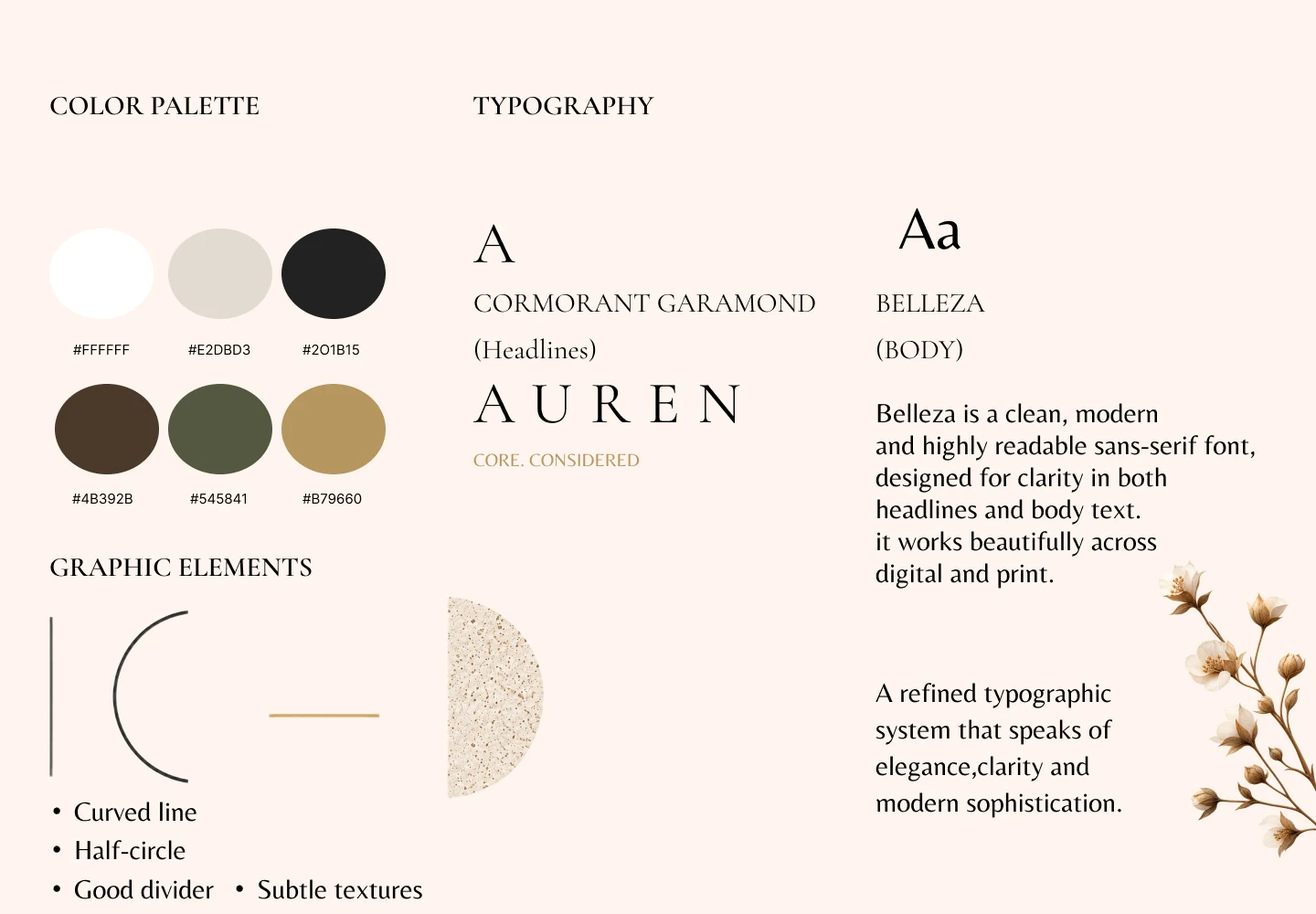
AUREN’s color palette is designed to balance warmth, sophistication, and modern skincare luxury. Soft white and warm beige create a clean, calming foundation, while deep charcoal adds contrast and authority. Earthy brown and muted olive introduce an organic, grounded quality, with muted gold providing a subtle premium accent without feeling excessive. Together, the colors create a refined and versatile visual language.
The typography combines Cormorant Garamond for headlines with Belleza for supporting and body text. Cormorant Garamond brings elegance, character, and a timeless editorial feel, while Belleza provides clean readability and a contemporary balance. The combination creates a hierarchy that feels premium, graceful, and approachable, working consistently across packaging, print, and digital applications.
Like this project
Posted Aug 26, 2026
Developed AUREN's complete brand identity and packaging system.