Brand Identity
Paula Nicole
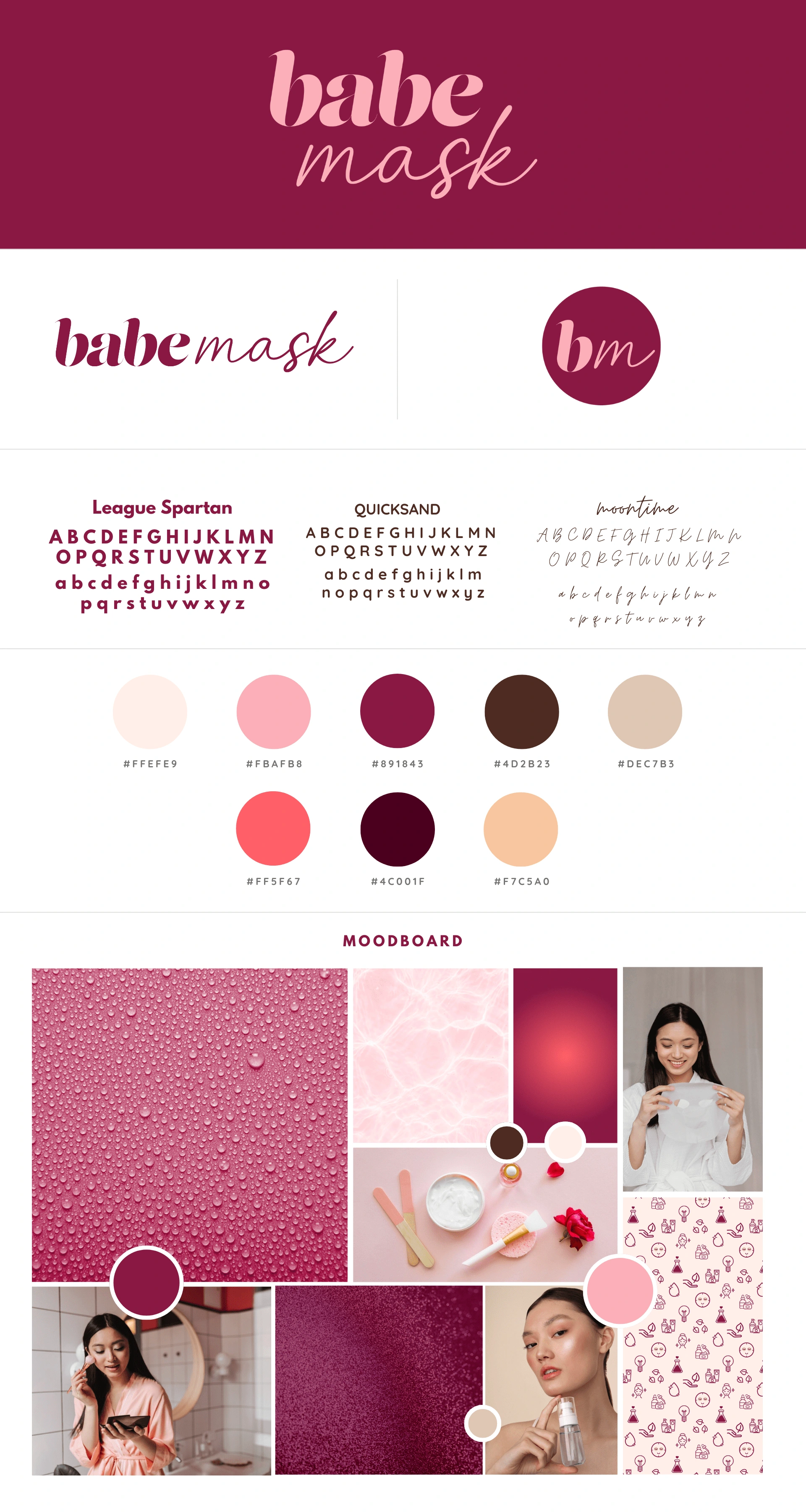
This Babe Mask reference brand guide presents a cohesive and sophisticated identity for a modern skincare brand. Through a combination of bold and elegant typography, a rich yet feminine color palette, and carefully curated imagery, it conveys a sense of luxury, self-care, and empowerment.
The logo design balances strength and softness, while the mix of fonts—League Spartan, Quicksand, and Moontime—ensures both impact and approachability. The color scheme, featuring soft pinks, deep burgundy, and warm neutrals, evokes feelings of beauty, hydration, and indulgence.
The accompanying moodboard reinforces the brand’s positioning with textures, lifestyle photography, and product visuals that align with skincare rituals and self-care aesthetics. Altogether, this guide successfully establishes Babe Mask as a premium yet relatable beauty brand, creating a visually consistent and aspirational experience for its audience.
Like this project
Posted Feb 27, 2025
Babe Mask blends bold typography, rich pinks, and luxe visuals to create a premium yet relatable skincare brand focused on beauty and self-care.
Likes
1
Views
5