Chmara - real estate company
Karol Polubinski
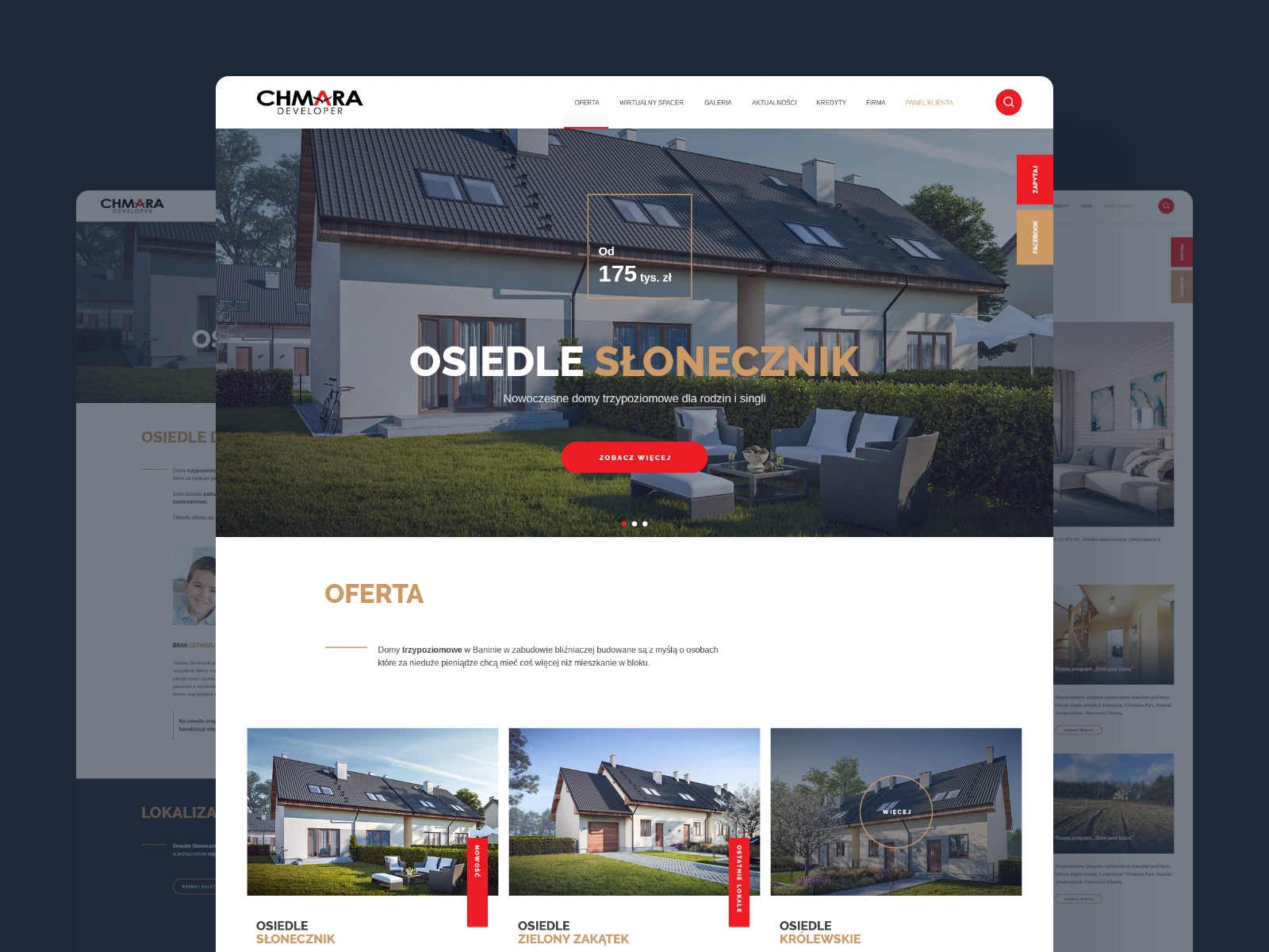
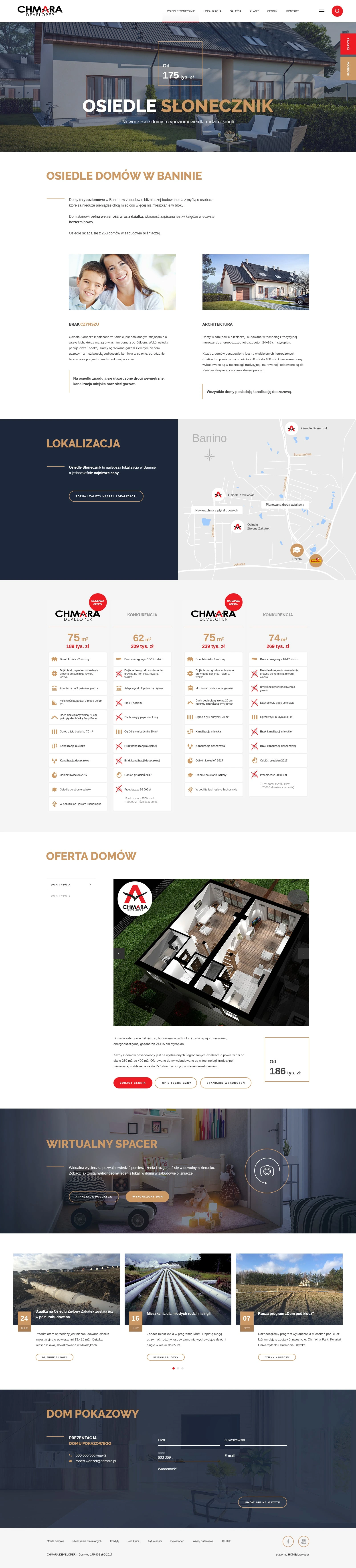
Here’s a look at my UX/UI work for Chmara, a real estate development company from Poland focused on creating modern housing with thoughtful architecture and accessible locations.
The challenge
Chmara needed a fresh, responsive website that reflects the clarity and reliability of their developments — and helps future buyers explore current and upcoming investments with ease. The design had to feel solid, trustworthy, and down-to-earth — just like the brand.
Architecture & flow
We built a modular content structure with a clear hierarchy: homepage highlights the offer, current investments get dedicated pages, and all contact actions are just one click away. The layout is grid-based, clean, and built for fast browsing on mobile.
Visual direction
The visual style is calm, clear, and grounded — just like Chmara’s architectural philosophy. A muted color palette, structured grid, and authentic photography help present each investment in an honest and approachable way.
A small but meaningful touch: the photo of the sales representative in the footer. It adds a human presence to the site — reminding users that buying a home isn’t just about floorplans and prices, but about real people who are ready to guide them through the process.
My role
I was responsible for the creation UX, UI design, and overall creative direction — from early sketches and wireframes to final layouts and system logic, delivered in a Figma-ready design handoff.
Like this project
Posted Jul 25, 2025
UX/UI work for Chmara, a real estate development company from Poland focused on creating modern housing with thoughtful architecture and accessible locations.
Likes
0
Views
7