Readymag Optimization & Responsive Redesign - Portfolio Site
Nagaraj M
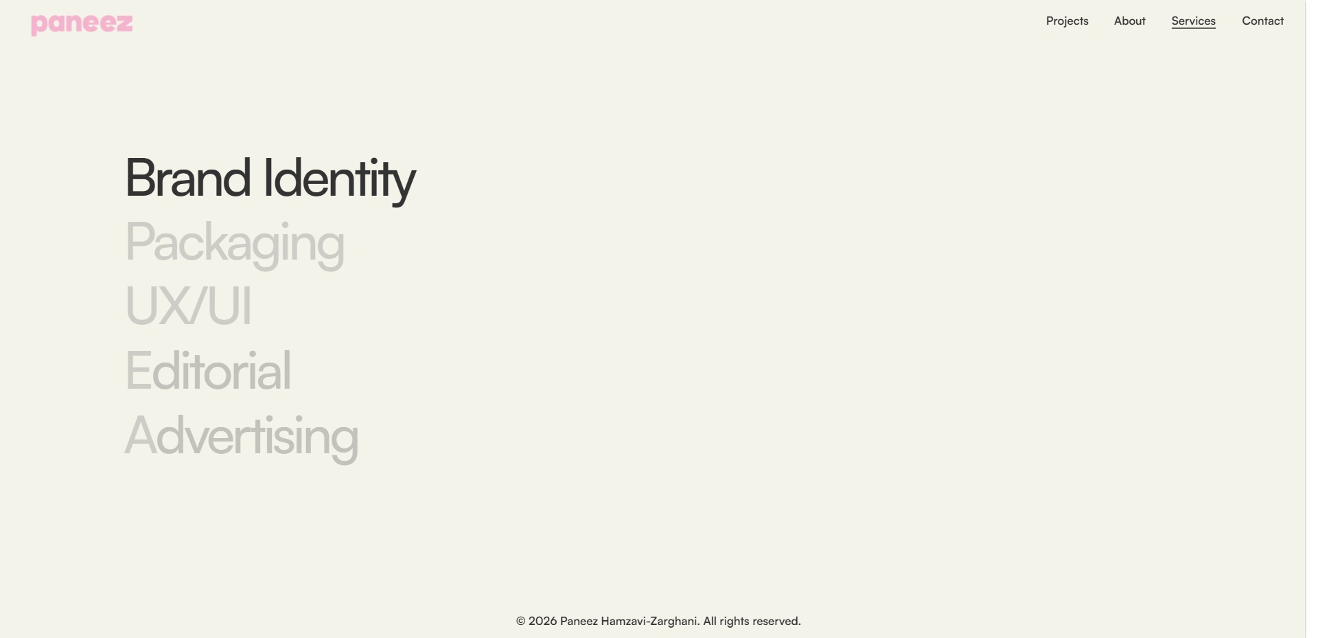
Paneez Hamza Vizarghani Portfolio – Readymag Optimization & Responsive Redesign
Project Overview
Paneez Hamza Vizarghani is a multidisciplinary designer and creative professional who needed her Readymag portfolio optimized for mobile devices while maintaining the visual quality and immersive experience of the desktop version.
The original portfolio had been expanded with additional project sections on desktop, but the mobile experience lacked consistency and required significant restructuring to properly showcase the work across different screen sizes.
Live Website:
https://paneezhamzavizarghani.com/
My Role
Readymag Developer & Responsive Design Specialist
Challenge
The initial requirement was to optimize the mobile version and integrate an additional project section. However, during development I discovered several underlying issues within the existing template structure:
Layout inconsistencies across desktop and mobile devices
Broken or misaligned responsive sections
Scroll-based animation conflicts
Typography inconsistencies
Project showcase sections requiring restructuring
Navigation and spacing issues across multiple pages
Elements overlapping on smaller screen sizes
The existing template required extensive debugging and rebuilding to achieve a polished user experience.
Solution
I performed a complete review of the Readymag project structure and rebuilt several sections from scratch to ensure consistency across all devices.
Key improvements included:
Responsive Layout Optimization
Rebuilt mobile layouts for improved usability
Fixed overlapping content and alignment issues
Optimized spacing and visual hierarchy across pages
Improved content flow for smaller screens
Project Section Integration
Added and optimized new portfolio project sections
Maintained consistency with the existing design language
Ensured smooth transitions between projects
Animation & Interaction Refinements
Debugged scroll-based animations
Fixed animation timing and positioning issues
Improved project transitions and interactive elements
Adjusted mobile behavior to better match desktop interactions
Typography & Visual Consistency
Standardized typography implementation
Improved text hierarchy and readability
Refined visual spacing and alignment throughout the site
Readymag Template Restructuring
Debugged existing template limitations
Reorganized sections for improved maintainability
Rebuilt problematic components where necessary
Ensured cross-device consistency
Results
Fully optimized mobile experience
Improved desktop and mobile consistency
Smoother navigation and project browsing
Fixed layout and animation issues
Enhanced user experience across devices
Successfully delivered additional client-requested refinements and polishing
Tools Used
Readymag
Responsive Design
Layout Optimization
Typography Systems
Animation Debugging
UI/UX Refinement
Outcome
The final result is a polished portfolio experience that maintains the gallery-like presentation of the designer's work while providing a seamless experience across desktop and mobile devices. Through extensive debugging, restructuring, and responsive optimization, the website now delivers a more consistent and professional user experience.
Like this project
Posted Jun 14, 2026
Optimized and restructured a Readymag portfolio for mobile and desktop, fixing layout issues, responsiveness, animations, and user experience.
Likes
1
Views
1
Timeline
Jun 7, 2026 - Jun 14, 2026