Brand Refresh for Rhombu Fintech App
Godswill Jonathan
Brief: Create a simple and effective brand refresh for a fintech app created to make life super simple.
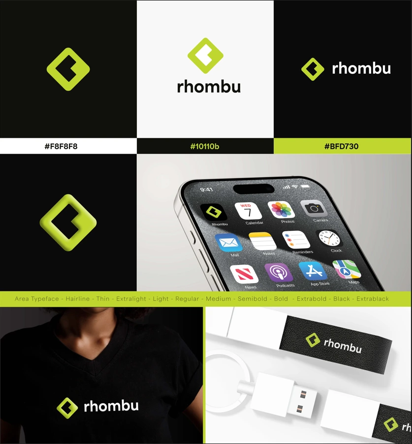
My approach: The core of the Rhombu identity is built on geometric clarity. By utilizing a stylized rhombus as the primary brand mark, the design communicates stability and "directional" growth, which are essential for a financial service.
The Logomark: A bold, lime-green rhombus featuring a negative space "arrow" or "bracket". This suggests movement, transactions, and progress while maintaining a compact shape that performs exceptionally well as a mobile app icon.
Typography: The brand utilizes the Area Typeface. By choosing a font family with a wide range of weights (from Hairline to Extrablack), the identity gains immense flexibility. The lowercase wordmark "rhombu" is approachable and friendly, softening the often-intimidating nature of finance.
Color Palette:
Electric Lime (#BFD730): High-energy and modern, signaling innovation.
Deep Charcoal/Black (#10110b): Provides a grounded, professional contrast.
Off-White (#F8F8F8): Ensures a clean, breathable interface for the mobile app.
3. Application & Versatility
The refresh was designed for a "mobile-first" world. The case study demonstrates this through:
App UI: The logo is instantly recognizable on a crowded home screen.
Tactile Branding: The identity translates seamlessly to physical touchpoints, such as apparel and leather-textured hardware (USB/keychains), proving the brand's premium feel.
The result: The final identity for Rhombu strips away the complexity of traditional banking. It replaces "fine print" aesthetics with bold colors and clean lines, positioning the app as the simplest tool in a user's financial toolkit.
Like this project
Posted Jan 1, 2026
Created a modern and versatile brand identity for fintech app Rhombu.