
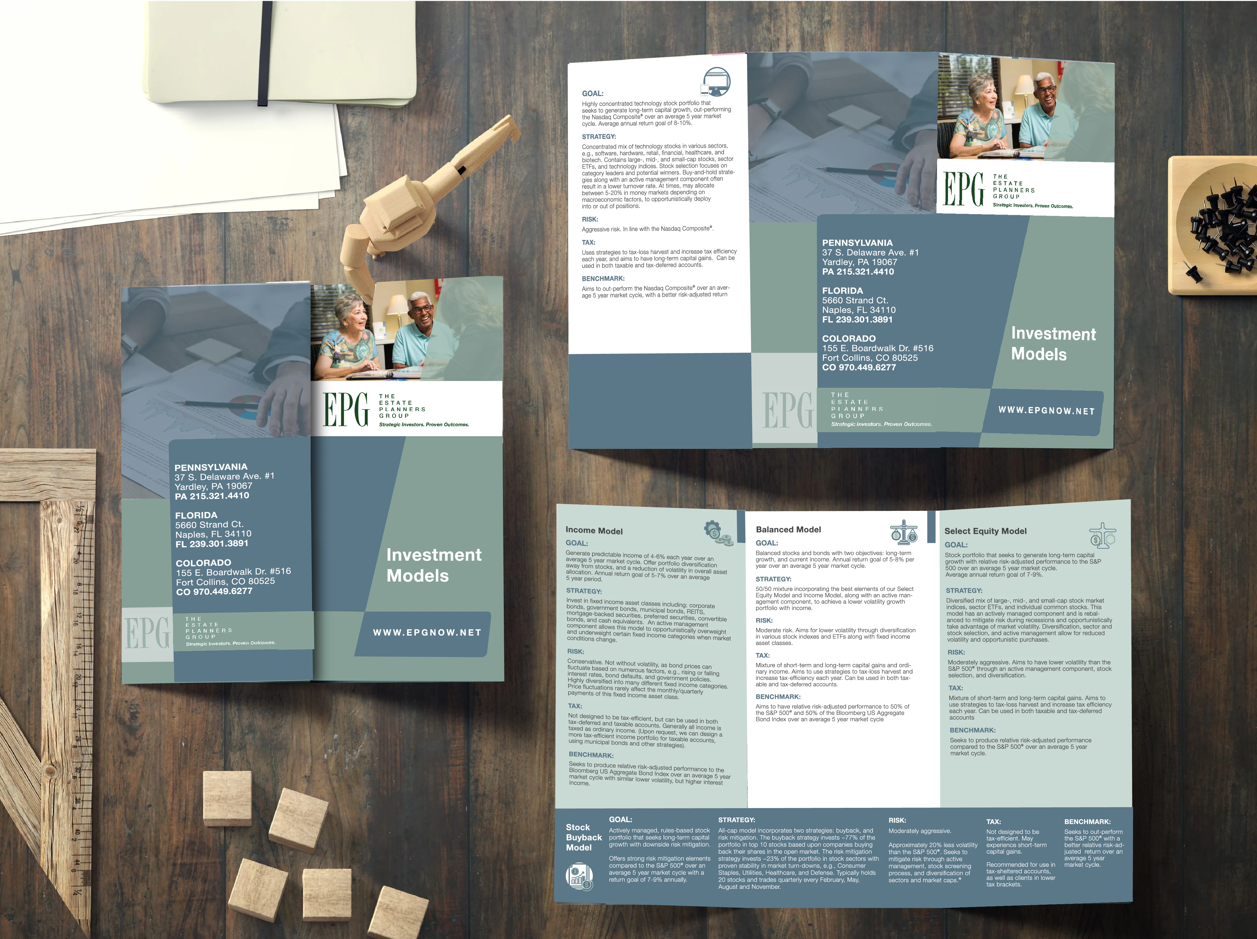
The Estate Planner Group – Tri-Fold Brochure Design
In a time when digital dominates, printed brochures still play a key role—especially for industries like insurance and healthcare, where a senior audience values something tangible.
EPG, The Estate Planner Group, needed a two-sided, three-panel tri-fold that clearly outlined their services while maintaining their brand identity. The main challenge was balancing a large amount of content with their muted color palette of olive green and blue-gray. By alternating white and green backgrounds, I achieved a cleaner layout and improved readability.
To keep the design both eye-catching and on-brand, I used Helvetica Neue and emphasized clarity over clutter. Key information and services were placed on the inside panels, while the outer panels featured simple imagery and the company’s three locations.

EPG Colors

Custom Illustrated Iconography
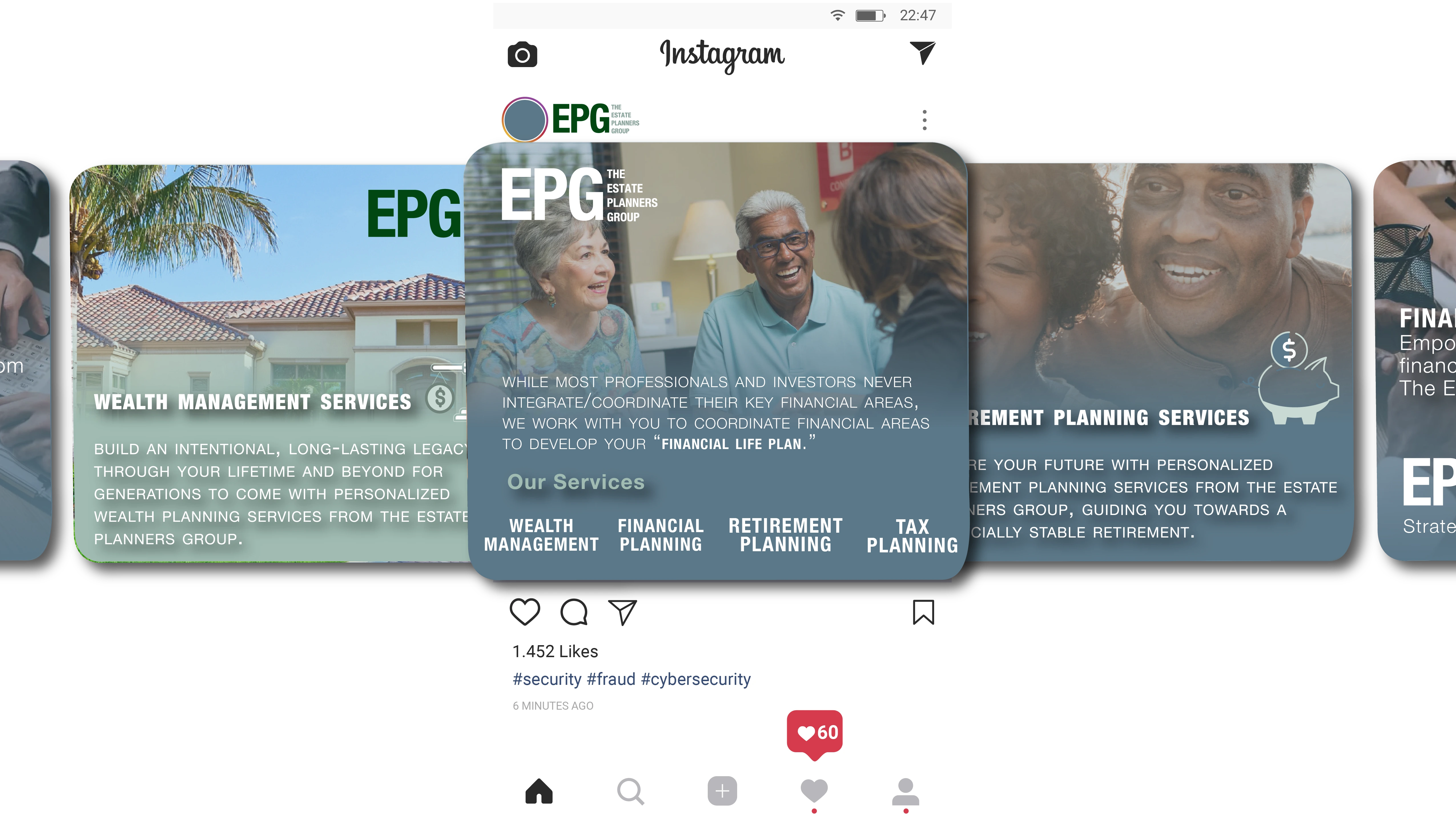
Following the print design, I also developed a series
of social media posts
Using visual elements, colors, and imagery from the brochure to maintain a cohesive brand presence across platforms. This helped EPG reinforce their identity and reach a broader audience with consistent messaging.
The result is a brochure and digital extension that feel professional, approachable, and easy to navigate—just what their audience needs.

0 likes · 20 views · Oct 21, 2025
A clean tri-fold and matching social posts that turn muted tones into a polished, trustworthy brand experience for The Estate Planner Group.


