Built with Framer
Helping Couples Reconnect in a Disconnected World
Rashid Iqbal
Verified
Vowio — Built for Nick Broadhurst & Melissa Ambrosini's Audience
The Brief
Nick Broadhurst (musician, wellness advocate, iamnickbroadhurst.com) and Melissa Ambrosini (bestselling author, #1 podcast host, TEDx speaker, melissaambrosini.com) came to us with a shared mission: build a platform that helps couples reconnect in a world designed to pull them apart.
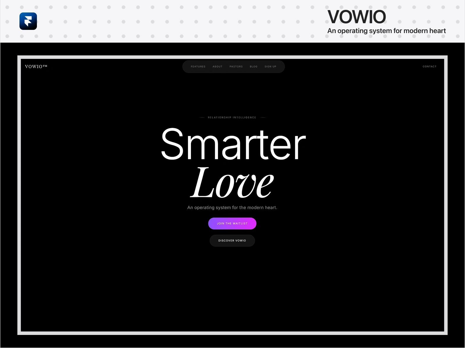
The result was Vowio — an operating system for the modern heart. Conceived, designed, and shipped live in 48 hours.
Designing in Figma
We dove into Figma and explored what Vowio should feel like. The visual language needed to convey trust and warmth without feeling cheesy or overly corporate.
We landed on a palette of deep teals, soft creams, and subtle golds. Colors that feel grounding but hopeful.
Building components came next. Every button, card, and navigation element was designed as part of a system. This meant consistency across pages while still allowing each section to have its own personality.
Figma's collaboration tools made feedback fast. Stakeholders could comment directly on designs. We ran quick prototype tests with real users and watched what clicked and what confused them. Some of our best ideas came from those sessions.
Bringing It to Life in Framer
Once designs were solid, we moved everything into Framer. This was where static screens became real experiences.
Framer was the right choice for a few reasons. The gap between what we designed and what we shipped stayed small. The animation tools let us craft interactions that felt intentional. And the built-in CMS meant we could manage blog posts and resources without extra complexity.
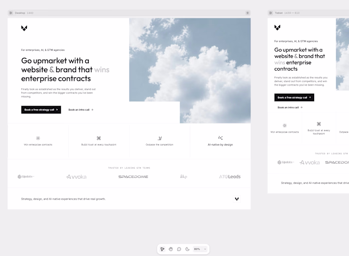
We built each page with care. The homepage needed to welcome visitors immediately. The about page told Vowio's story through gentle, scroll-triggered reveals. The resources section had to feel abundant without overwhelming anyone.
Animation became its own design language. Every transition was gentle. Hover states added warmth like a small acknowledgment. Nothing moved just for show.
The Final Push
Before launch, we polished the details. Images were optimized. Accessibility was checked. Responsive behavior was tested across devices.
The entire project came together in just two days. Intense, focused work from concept to launch.
When we finally shipped, it felt less like an ending and more like a beginning. The site was live, but the real mission of serving couples was just starting.
Early feedback confirmed what we hoped. Vowio felt different. It felt human. And that made every hour of those two days worth it.
What We Learned
Choosing Figma and Framer shaped the outcome in ways we didn't expect. These tools let us move incredibly fast while staying true to the emotional core of the project. Constraints pushed us toward creative solutions. And starting with real human stories kept us grounded when decisions got hard.
Vowio is still growing. But the foundation we built in those intense 48 hours continues to guide everything we do.
Vowio — Built for Nick Broadhurst & Melissa Ambrosini's Audience
The Brief
Nick Broadhurst (musician, wellness advocate) and Melissa Ambrosini (bestselling author, #1 podcast host, TEDx speaker) needed a relationship wellness platform that reflected their shared mission: helping couples reconnect in a disconnected world.
The result was Vowio — an operating system for the modern heart. Conceived, designed, and shipped in 48 hours.
The Challenge
The platform had to feel warm, human, and aspirational — matching the brand voice and audience expectations of two world-class creators with millions of combined followers. It needed to convert visitors to waitlist signups from the first impression.
Designing in Figma
We started with emotional research. We mapped the visual language to Nick and Melissa's shared brand: grounding without being clinical, aspirational without being cold.
Color palette: deep teals, soft creams, subtle golds.
Every component was built as a reusable system — buttons, cards, navigation, and CTAs were designed for speed and consistency. Figma's collaboration tools allowed real-time feedback from stakeholders and rapid prototype testing with real users.
Building in Framer
We moved from static screens to live experiences in Framer — the right choice for its animation tools, built-in CMS, and the speed it gave us from design to deployment.
Key pages built😍 - Homepage: warm, immediate welcome with conversion-focused CTA
About: Vowio's story through scroll-triggered reveals
Resources: abundant but not overwhelming
Every animation was intentional. Hover states felt warm. Transitions felt human — not performative.
Results & Impact
✦ Launched concept-to-live in 48 hours
✦ Designed to convert: homepage CTA above the fold, waitlist flow optimized
✦ Aligned to Nick & Melissa's combined 7-figure audience
✦ Full design system delivered — maintainable by the team without a developer
✦ Client feedback: "It felt different. It felt human."
What Made It Work
Choosing Figma and Framer enabled us to move at startup speed without sacrificing craft. Starting with real human stories — and the values of two creators who have built audiences on authenticity — kept every decision grounded.
Like this project
Posted Dec 9, 2025
Relationship wellness platform (vowio.com) — concept to live in 48 hrs. Figma design, Framer build, conversion-optimized. 7-figure audience aligned.
Likes
1
Views
3
Timeline
Dec 7, 2025 - Dec 9, 2025