
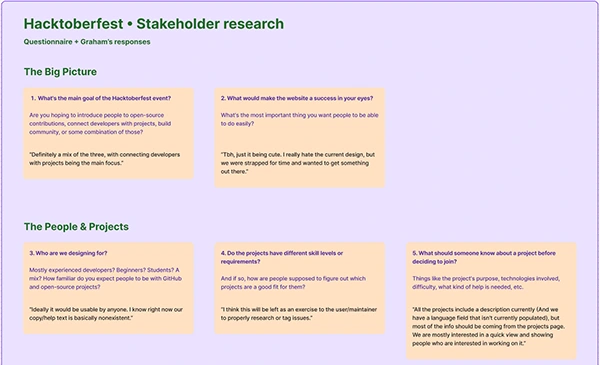
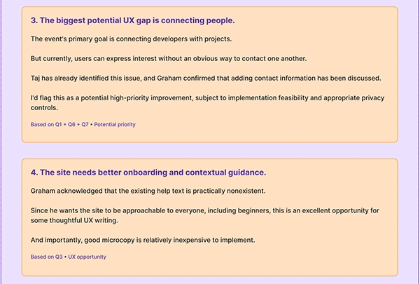
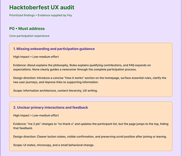
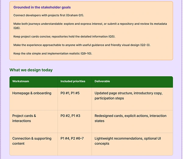
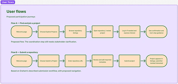
The research revealed two distinct participation journeys, gaps in newcomer guidance, and interaction issues that could make participation confusing.
I translated these findings into prioritized design improvements and user flows.
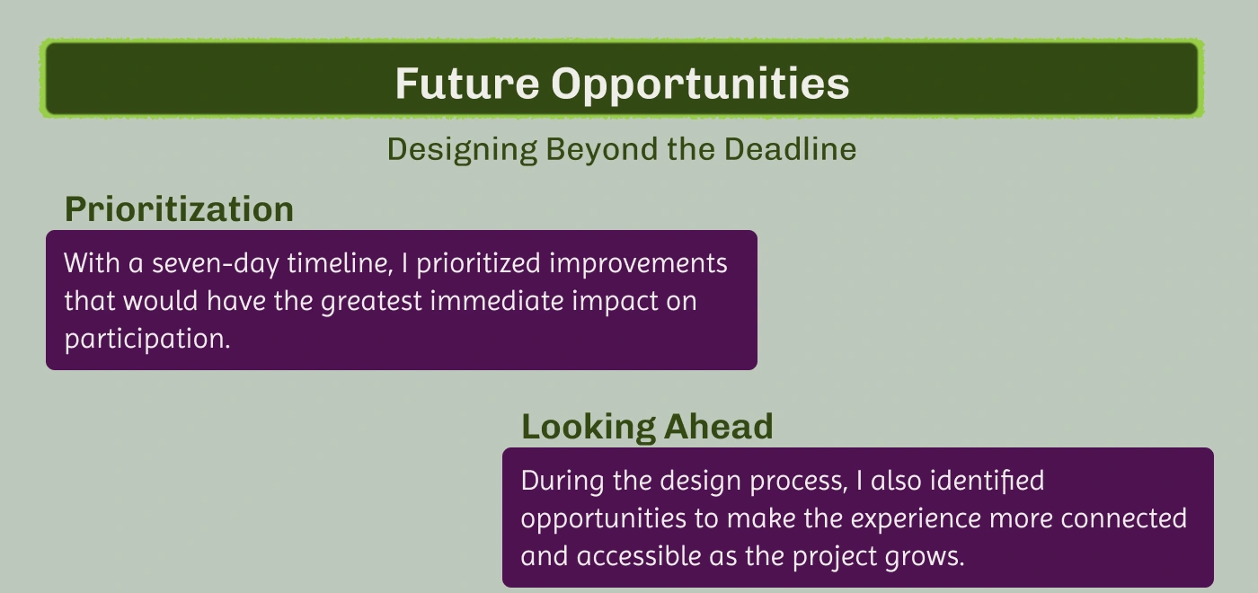
I focused on changes that were valuable to the community and realistic within the project's seven-day timeline.
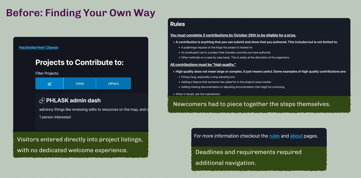
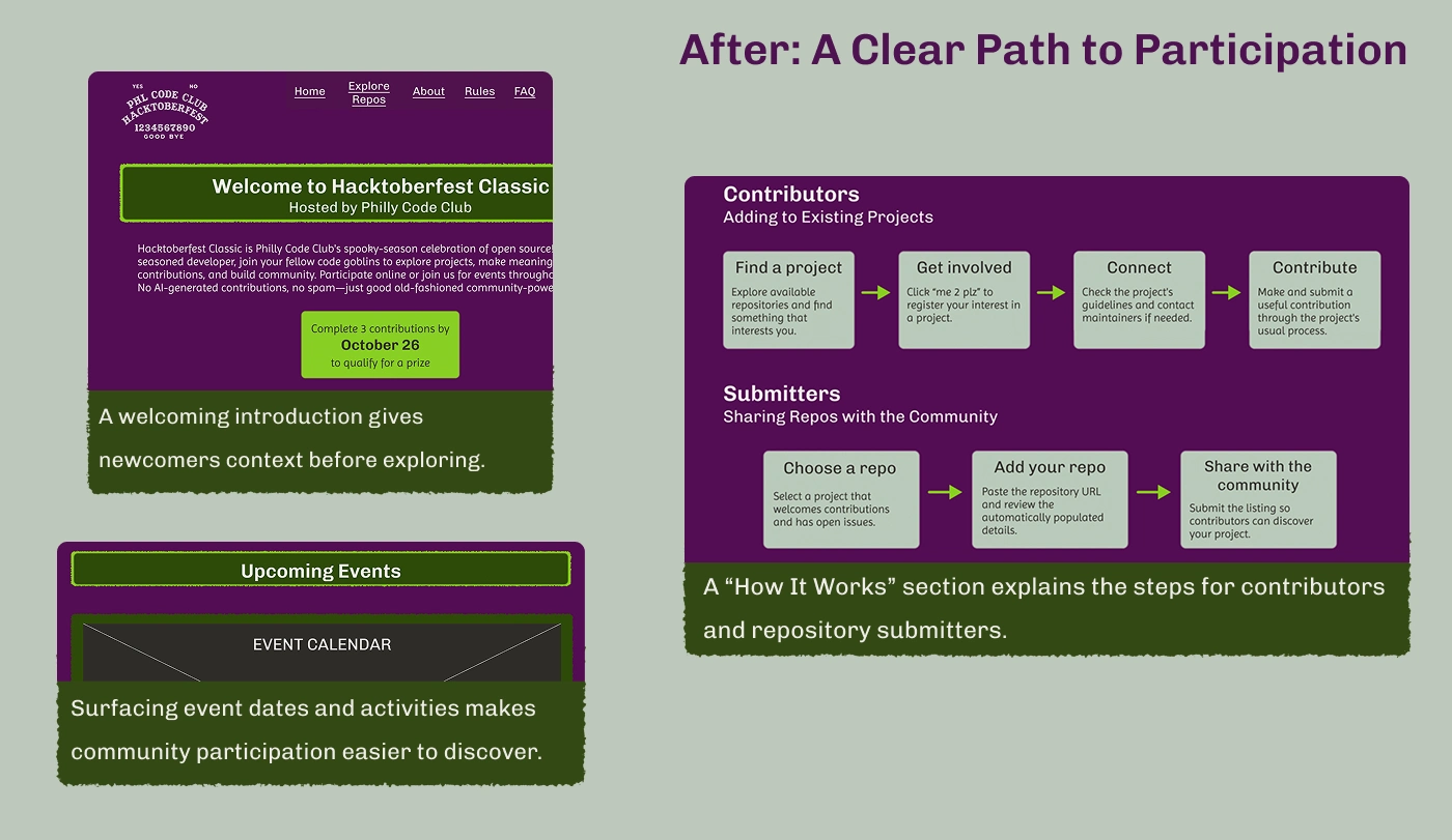
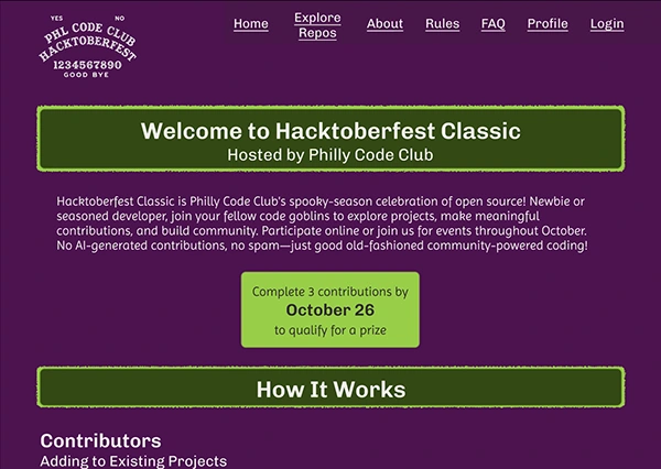
I brought together essential information from across the website to create a dedicated onboarding experience.
Contribution deadlines and prize requirements became visible immediately, giving newcomers clear expectations.
I designed two step-by-step participation journeys to guide contributors and repository submitters toward their next actions.
I also proposed moving the existing event calendar from About to the homepage, using a placeholder in the prototype to represent its new location.
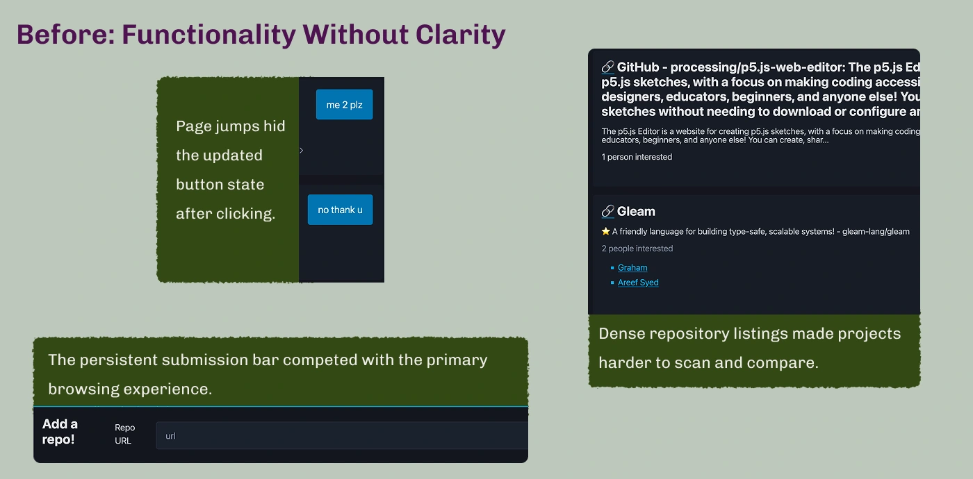
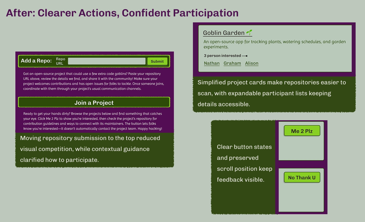
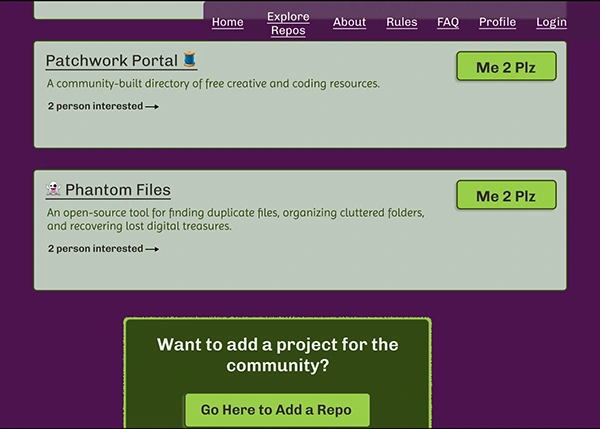
I kept the repository page's core functionality intact while making the two primary actions—joining a project and submitting a repository—easier to understand.
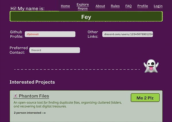
Simplified project cards, contextual guidance, and clearer interaction states help participants make decisions and recognize when their actions have been registered.
The goal wasn't to add more features. It was to reduce friction in the existing experience, making participation more approachable without increasing implementation complexity.
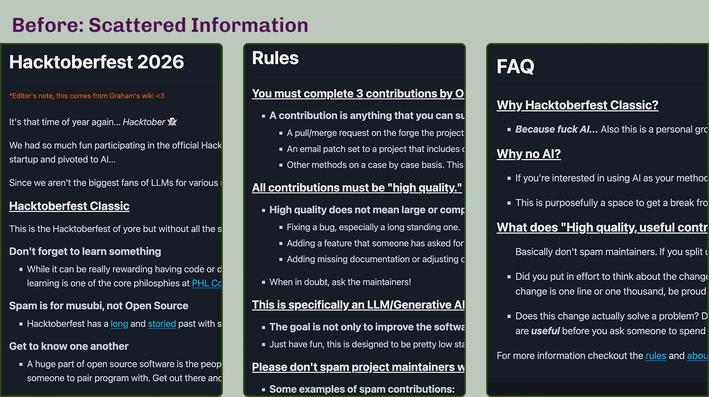
The original About, Rules, and FAQ pages contained the information participants needed, along with the community's distinctive personality.
However, dense text and limited content hierarchy made important details harder for newcomers to identify quickly.
My approach was to improve how that information was organized and presented, while preserving the original messaging and voice.
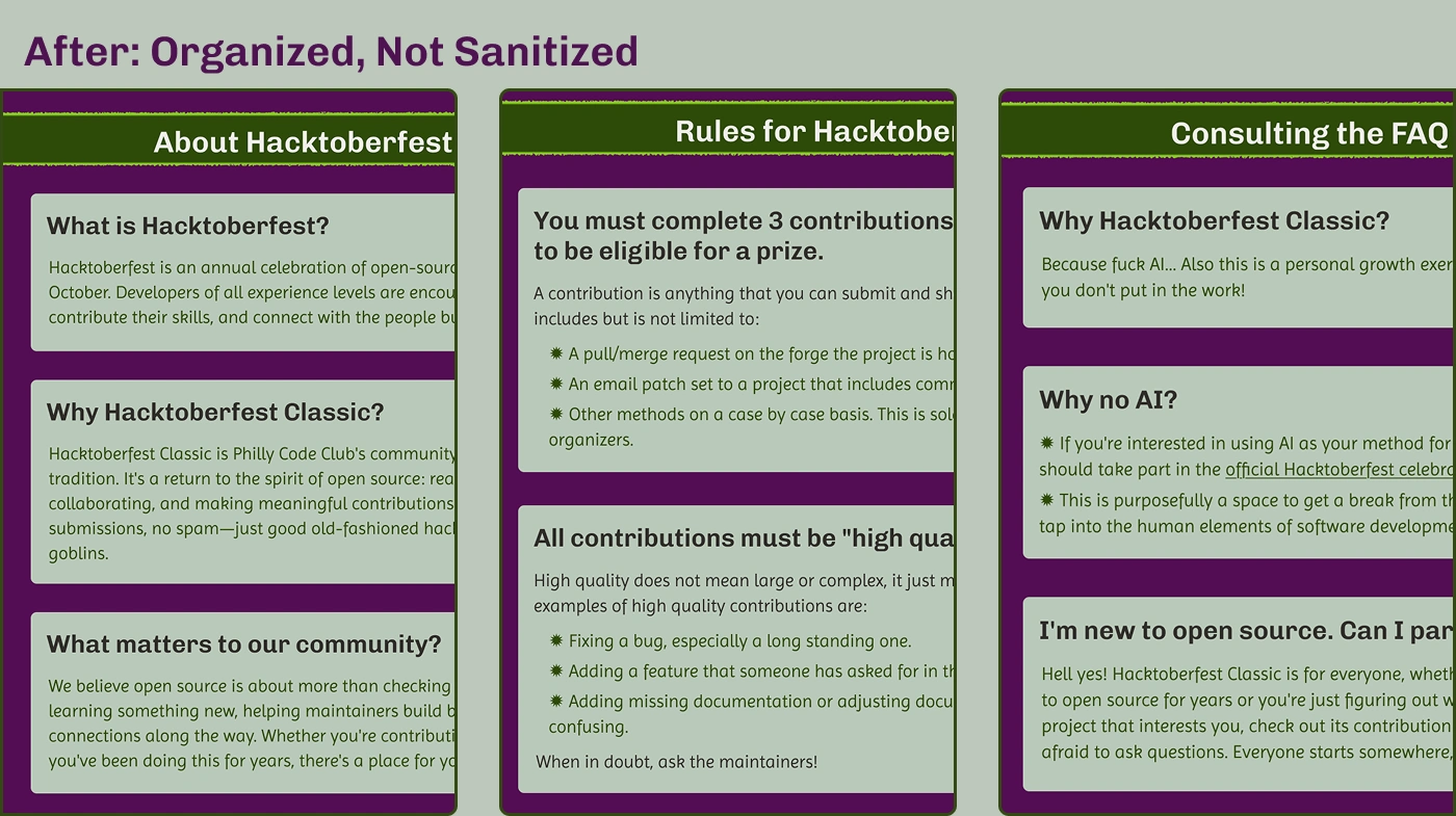
I reorganized the About, Rules, and FAQ pages into consistent, scannable sections that make important information easier to find.
The About page now introduces Hacktoberfest Classic and its community values before presenting the original organizer's writing.
Rules are grouped into distinct cards, while new FAQ entries address common questions from first-time contributors.
Throughout the redesign, I preserved the community's humor and personality. The goal was to make the information more approachable, not change the voice behind it.
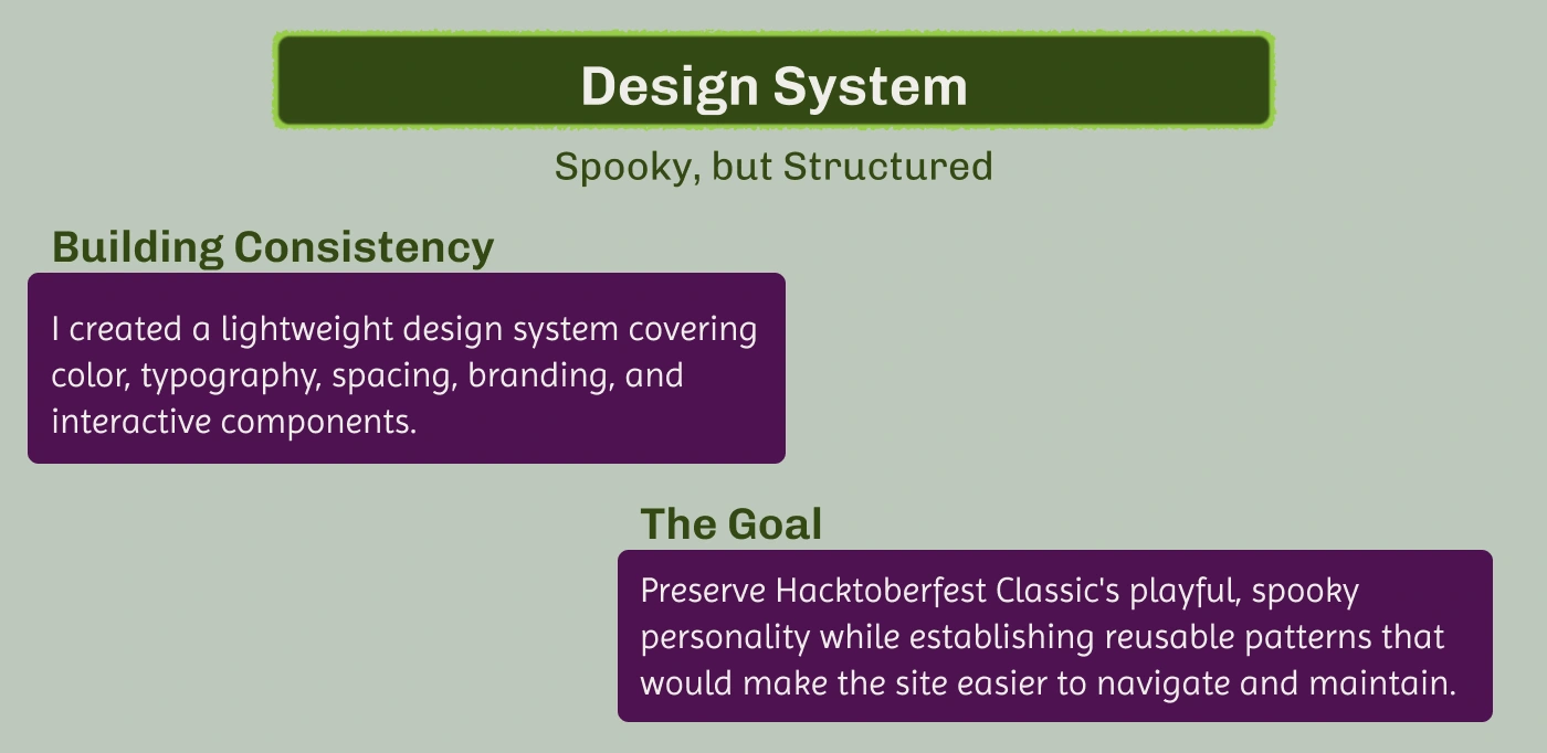
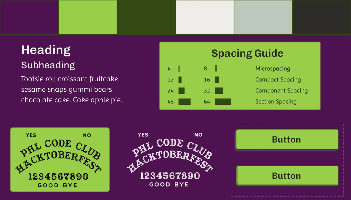
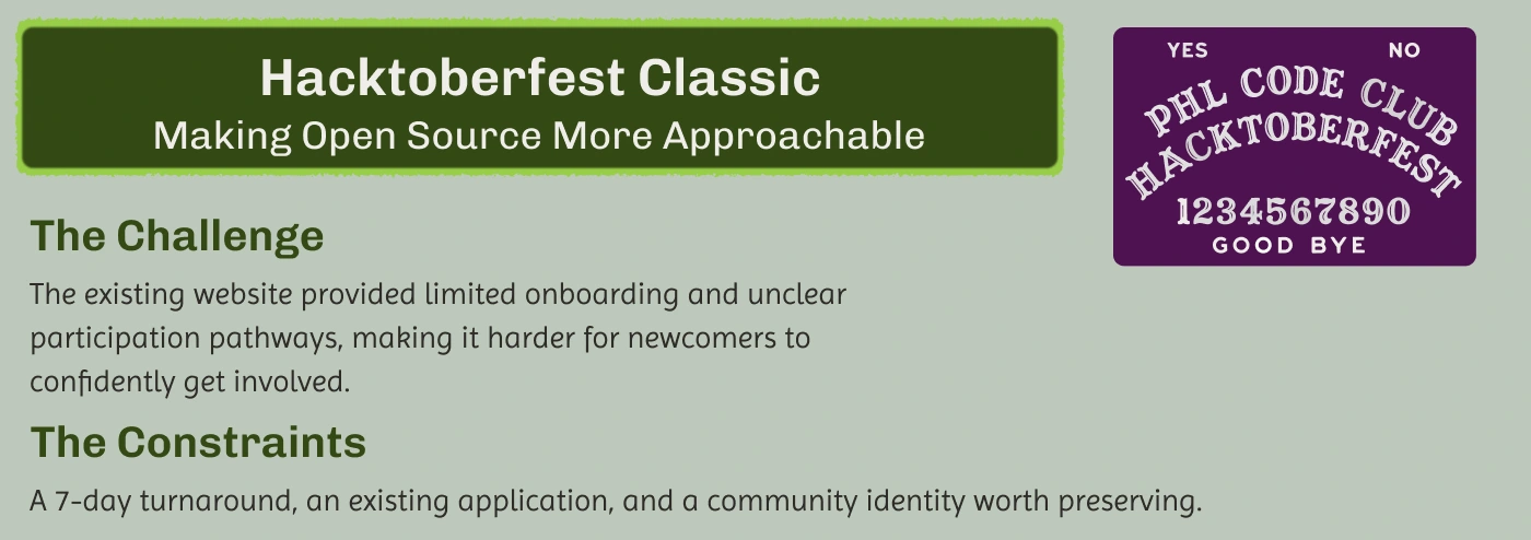
I built the visual identity around a high-contrast palette of plum, green, and soft neutrals, balancing Halloween-inspired personality with readability.
Chivo and Imprima provide a consistent typographic hierarchy, while a defined spacing scale and reusable components help maintain cohesion across the six pages.
One of the project stakeholders created custom Ouija-inspired artwork for the redesign. I incorporated this artwork into the visual system, adapting its colors and usage to create a cohesive identity across the site.
Rather than creating an extensive component library, I focused on a practical system appropriate to the project's scope and implementation needs.
Explore the Interactive Prototype →
Interested in working together? Let's connect.
LinkedIn
0 likes · 0 views · Oct 23, 2026
Researched contributor needs and redesigned a community open-source website to clarify project discovery, improve onboarding, and encourage participation.

