Payitmonthly Website Redeisn

Adekunle Oladosu


Overview
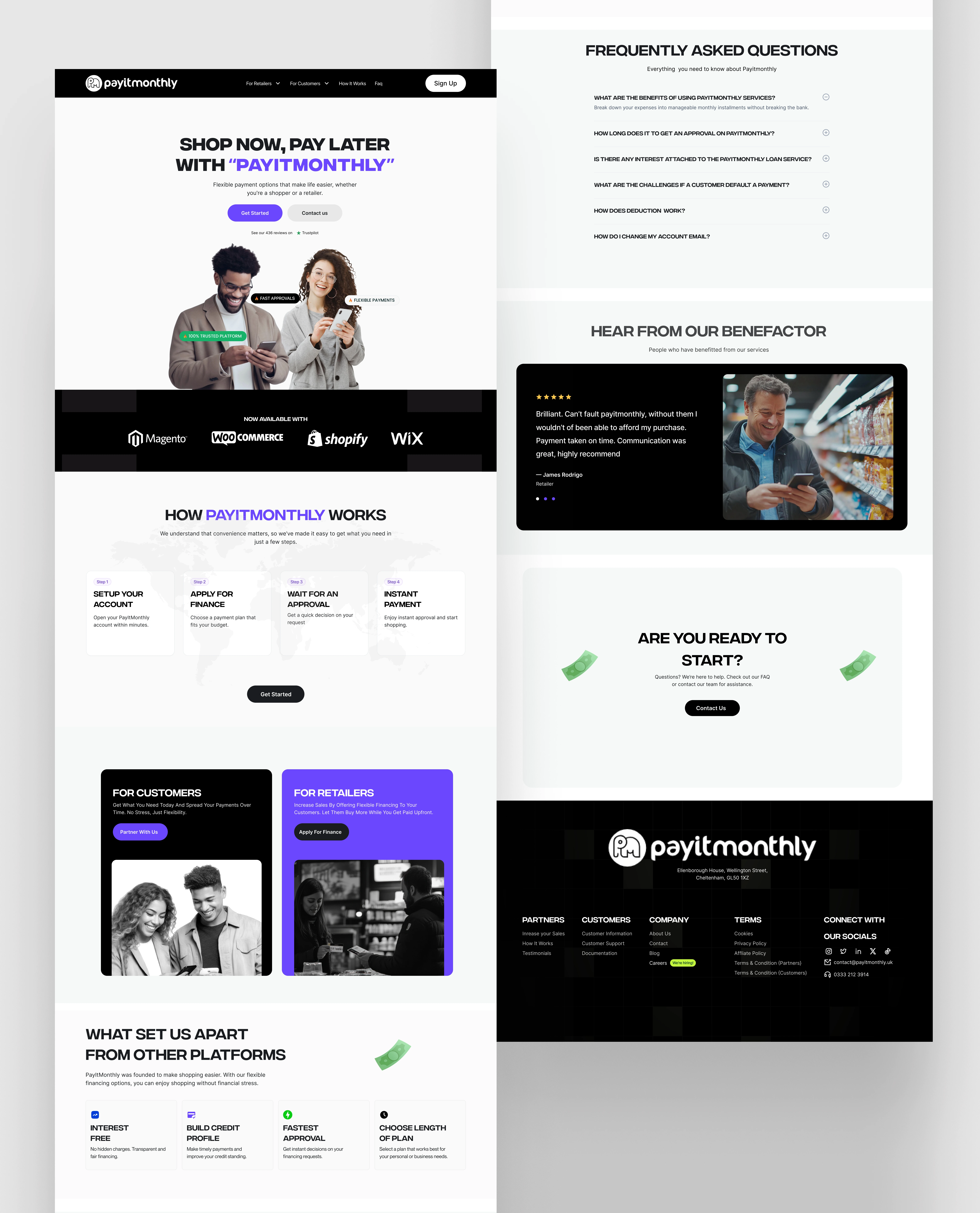
PayItMonthly is a payment platform that lets customers shop now and pay later through flexible, interest-free installments. It benefits both customers seeking affordability and retailers looking to increase sales. The service integrates with major e-commerce platforms like Shopify, WooCommerce, Magento, and Wix.
What Payitmonthly is
It enables businesses to offer financing options without risk while allowing customers to spread payments over time. The platform ensures a seamless checkout experience and boosts conversion rates. By partnering with online retailers, PayItMonthly makes financing more accessible.
Problems
The existing website had a poor user experience, cluttered layout, and unclear messaging. It lacked modern aesthetics, reducing trust and engagement. Visitors struggled to understand key product benefits, affecting conversions.
Goals: The redesign aimed to improve usability, accessibility, and overall user experience. A modern, conversion-focused interface was needed to enhance credibility. The goal was to communicate PayItMonthly’s value clearly to both customers and retailers.
Solutions: A UX analysis identified pain points, leading to a cleaner, user-friendly design. Key benefits were highlighted with improved content hierarchy and interactive animations. The prototype was developed in Framer, ensuring a responsive and engaging experience.
Link to the live design:https://serene-apartment-051068.framer.app/paymonthly
Link to Documentation:
Like this project
Posted Mar 12, 2025
The PayItMonthly redesign improved usability, aesthetics, and user engagement. The revamped interface made navigation seamless, enhancing user interaction