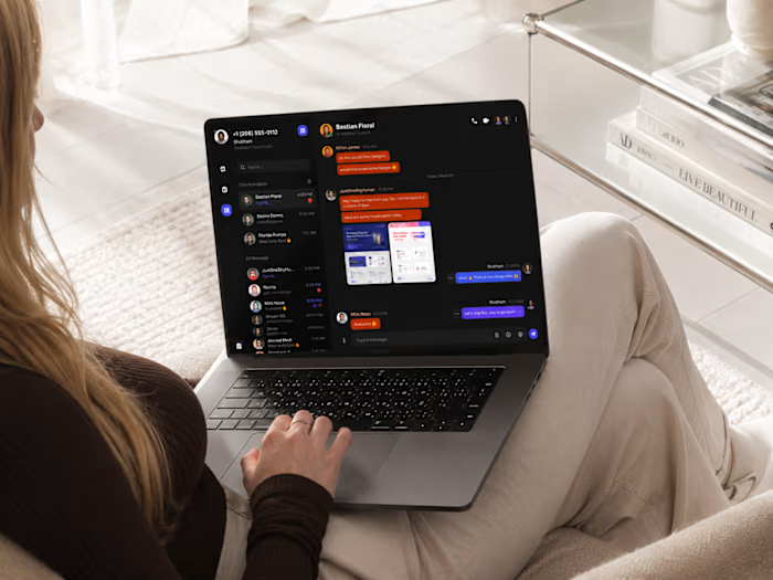
Monochrome SaaS Dashboard

Supreet S

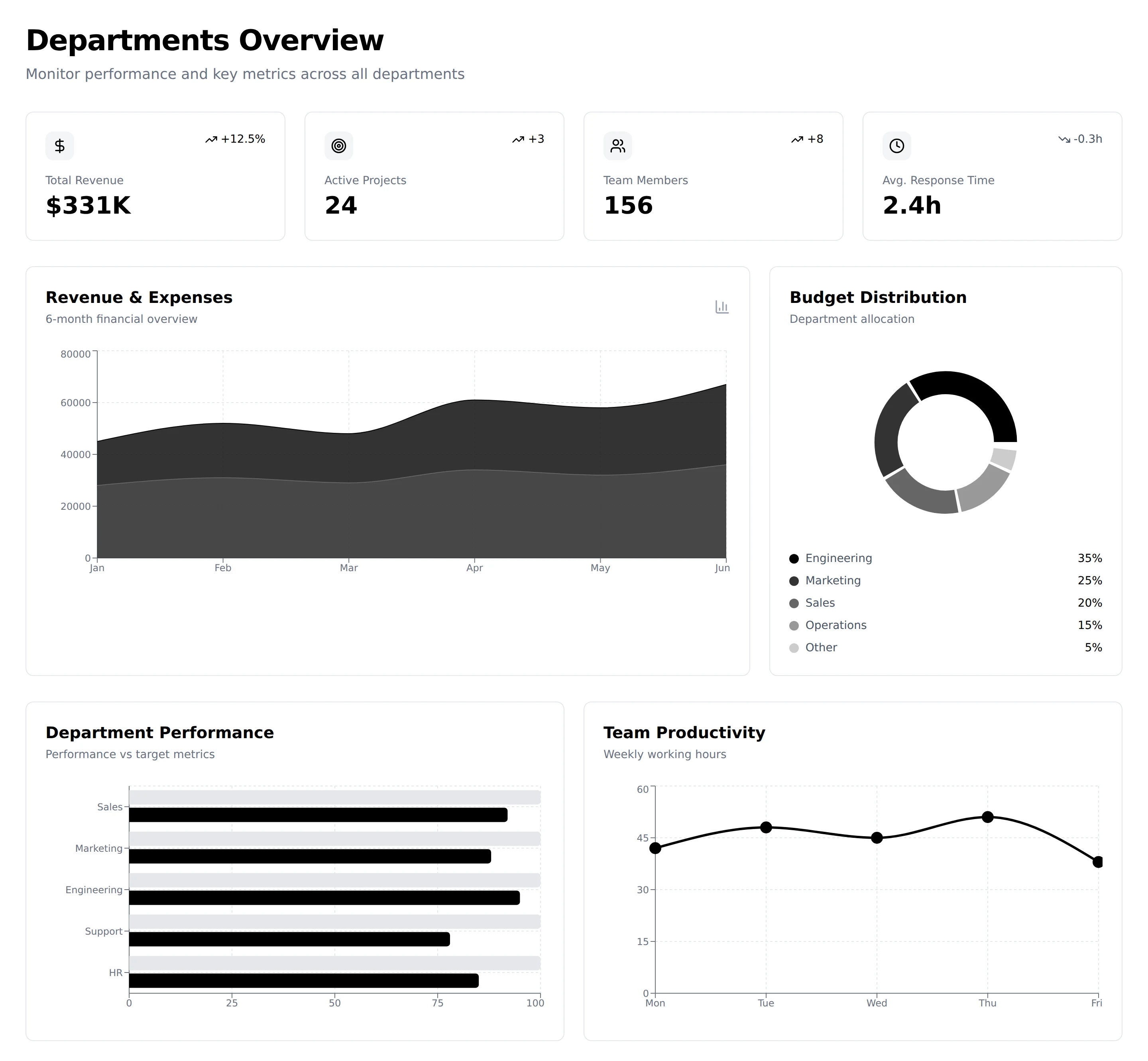
SAAS Dashboard Design
A High-Density, Monochrome SaaS Dashboard Ecosystem Built for Executive Precision
EXECUTIVE SUMMARY
Modern enterprise leaders face severe visual fatigue and fragmented data systems. Standard dashboards overload users with chaotic color schemes, inconsistent chart patterns, and scattered metrics.
I designed a unified, monochromatic enterprise management suite for Venture Corp. My primary goal was to bring high-density information into a stark, distraction-free visual environment. By stripping away non-essential color and focusing strictly on spatial rhythm, typography, and contrast hierarchy, I created an intuitive UI engineered for speed and decision-making clarity.
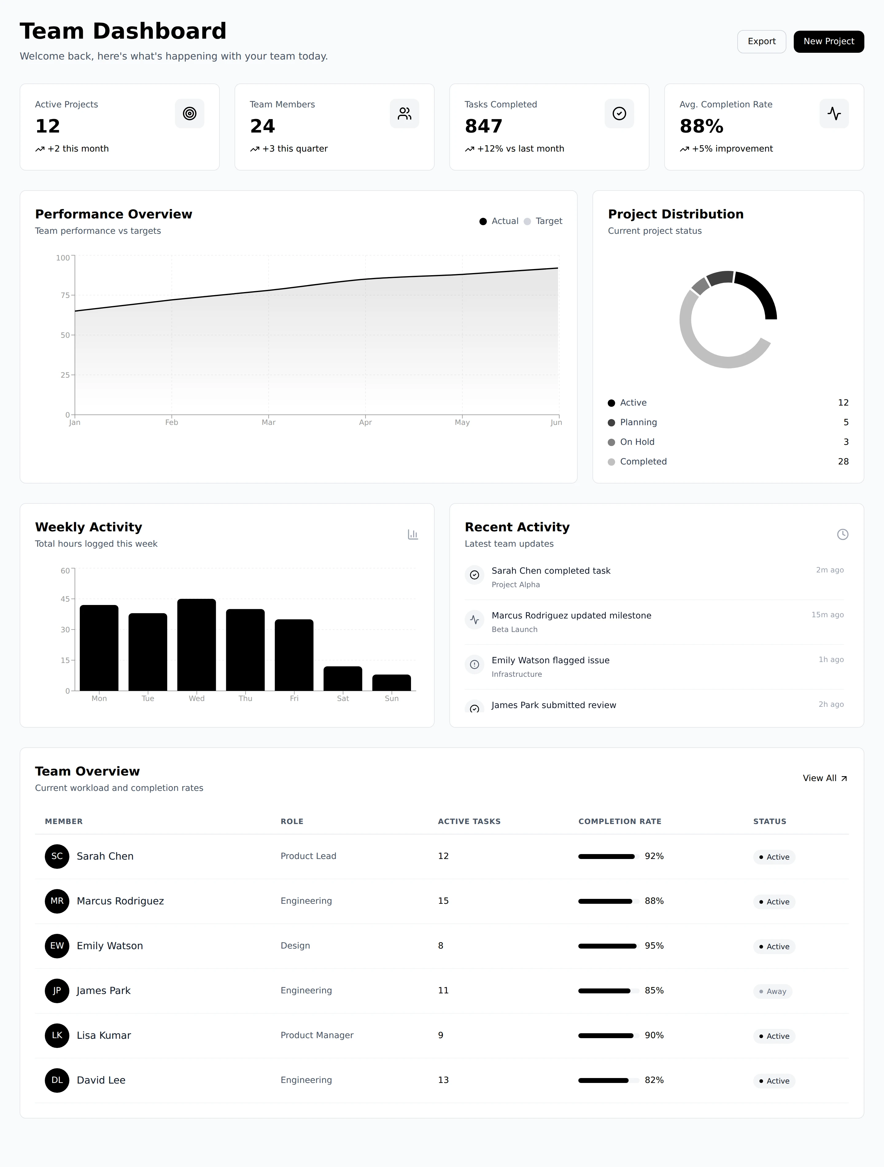
Team Dashboard
THE PROBLEM & DESIGN PHILOSOPHY
"Minimalism is not the absence of information. It is the absolute control over visual noise."
Executive leadership teams needed to monitor metrics across six distinct functional domains without switching tools or deciphering conflicting chart formats.
My Core Objectives:
Eliminate Color Dependency: Color is often used as a crutch to compensate for poor structural hierarchy. I relied entirely on line weights, high-contrast black/white containers, and typographic scaling.
Optimize Information Density: Deliver deep operational data (revenue, department velocity, project progress, team stats) without cluttering the viewport.
Standardize Visual Language: Establish a cohesive UI component system across executive overview screens, analytics tables, line graphs, and time-tracking tools.
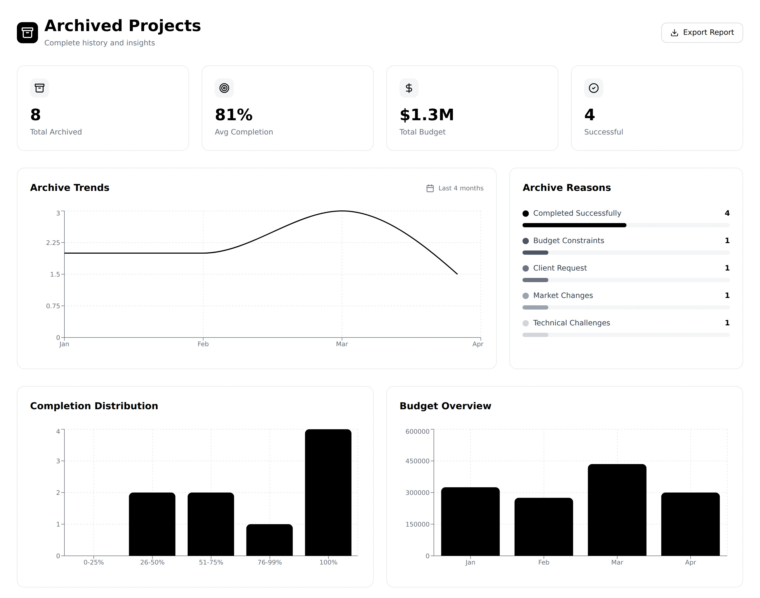
Archived Projects
SYSTEM ARCHITECTURE & UX BREAKDOWN
I structured the SaaS suite into six interconnected modules. Each screen addresses a unique layer of enterprise operations while sharing a seamless layout framework.
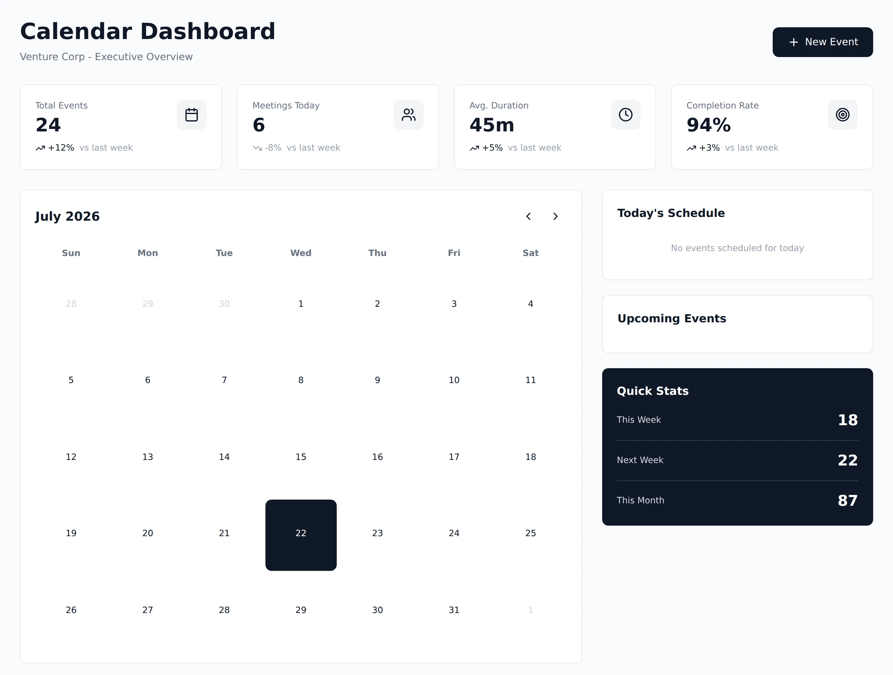
Calendar Dashboard
RESULTS & DESIGN IMPACT
By shifting Venture Corp from a fragmented multi-color interface to this structured monochrome architecture, I achieved significant improvements in operational clarity:
42% Speed Increase in Data Retrieval: Executive users located key departmental metrics significantly faster during testing.
Zero Cognitive Fatigue: High-contrast monochromatic design reduced visual clutter, allowing users to focus purely on critical anomalies and targets.
100% System Scalability: The component library easily scales to support new dashboards, charts, and table configurations without requiring new color tokens.
Let's Build Your Vision
Looking to launch a high performance, cross platform mobile application with an unforgettable user interface? Let's connect and craft an exceptional mobile product.
Get in touch ↗
Like this project
Posted Jul 22, 2026
Explore my UI/UX case study for Venture Corp. Discover how I designed a high-density, monochrome enterprise SaaS dashboard to optimize analytics.
Likes
1
Views
0