Getnet by Santander
Miguel Camacho

Illustrations to make payments easier for everyone, everywhere
Getnet is a high-tech global payment platform that helps businesses accept payments securely while providing the best checkout experience for customers everywhere.
Exploration
The first steps of a project are very important. Not only knowing the company that trusts you, but also knowing the people you are going to work with is key to making everything a success.
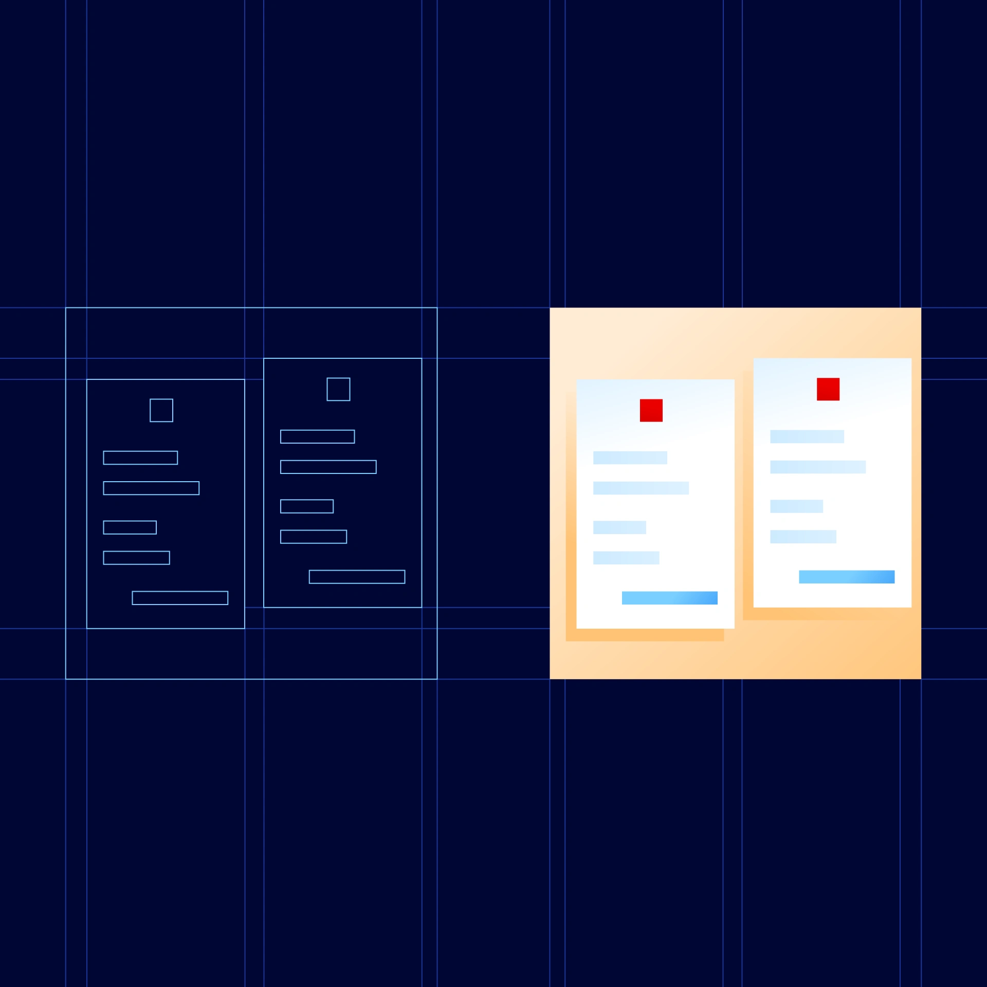
We begin by sharing the way of working, detailing the processes. After a friendly onboarding we began the sketches and iterations. With this, we will be able to connect all the pieces and form the illustrative style of Getnet.
Principles
The illustrations library is based on Getnet design principles: Be Merchant obsessed, think glocal, design with purpose, work detail oriented. To develop these principles that bit further, we want to highlight some qualities of the collection that we are building.
Friendly
We portray concepts in a way that is accessible.

Versatile
Elements can be reused to create new pieces.

Human
Made by humans, for humans.

Geometric
Clean lines, recognisable shapes and scalable.
Vibrant
Reduced but bright palette looks lively.

Dynamic
Ready to get moving.

Simple
We believe in showing only what's essential.

Guiding thread
The square is the starting point, whether it's a single square, or nine squares arranged in a three-by-three grid. Featuring in many of the illustrations, it give us a hint as to the collection's personality and identity.
Together with the brand's colour palette and the specific and prominent use of the colour red (#EB000), it is distinctive of our collection's style.
And lastly, the use of light. We play with lighting to bringscenes to life, inviting people to explore, as well as in order to generate good contrast once applied.
Colour
We use the corporate palette. Red is the focus and the guiding theme (together with the square), and features in most illustrations.
What's more, and exclusively to illustrations, we add complementary ones.
Among these are 'skin' tones, which help us make scenes that feature people seem more life-like, and a spectrum of natural greens, which we use to colour greenery. The more saturated tones capture the key elements of each design, and the less saturated tones are used for backgrounds and secondary elements.

4 different styles
Our collection needs to be versatile and agile. As such, and within the same aesthetic, design style and colour palette, we have four subfamilies or styles. These are the isometric-, emotional-, and conceptual-style illustrations, and pictograms.

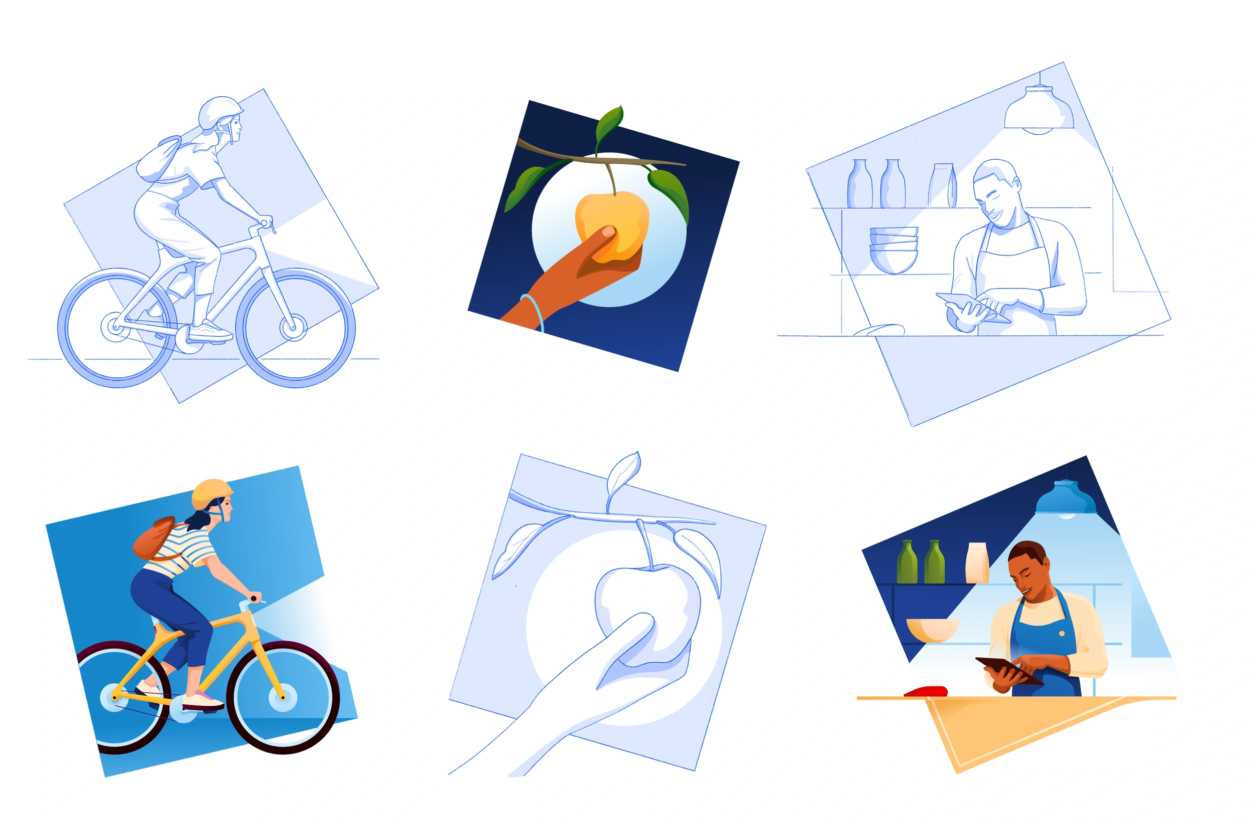
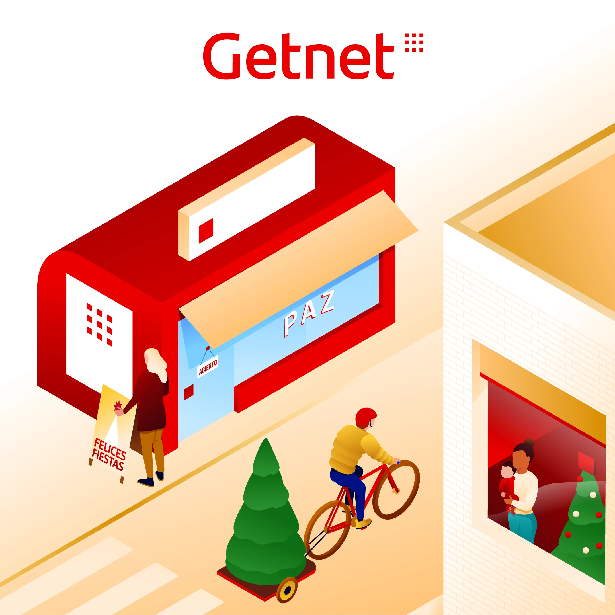
❶ Isometric
We represent our metaphors with an isometric axonometric projection. Three-dimensional objects are visually represented in two dimensions, when the three axes projected form 120º angles. The style comes from technical drawing.
This approach gives depth to illustrations and achieve a style close to photographic framing. It allow us to create modular scenes.
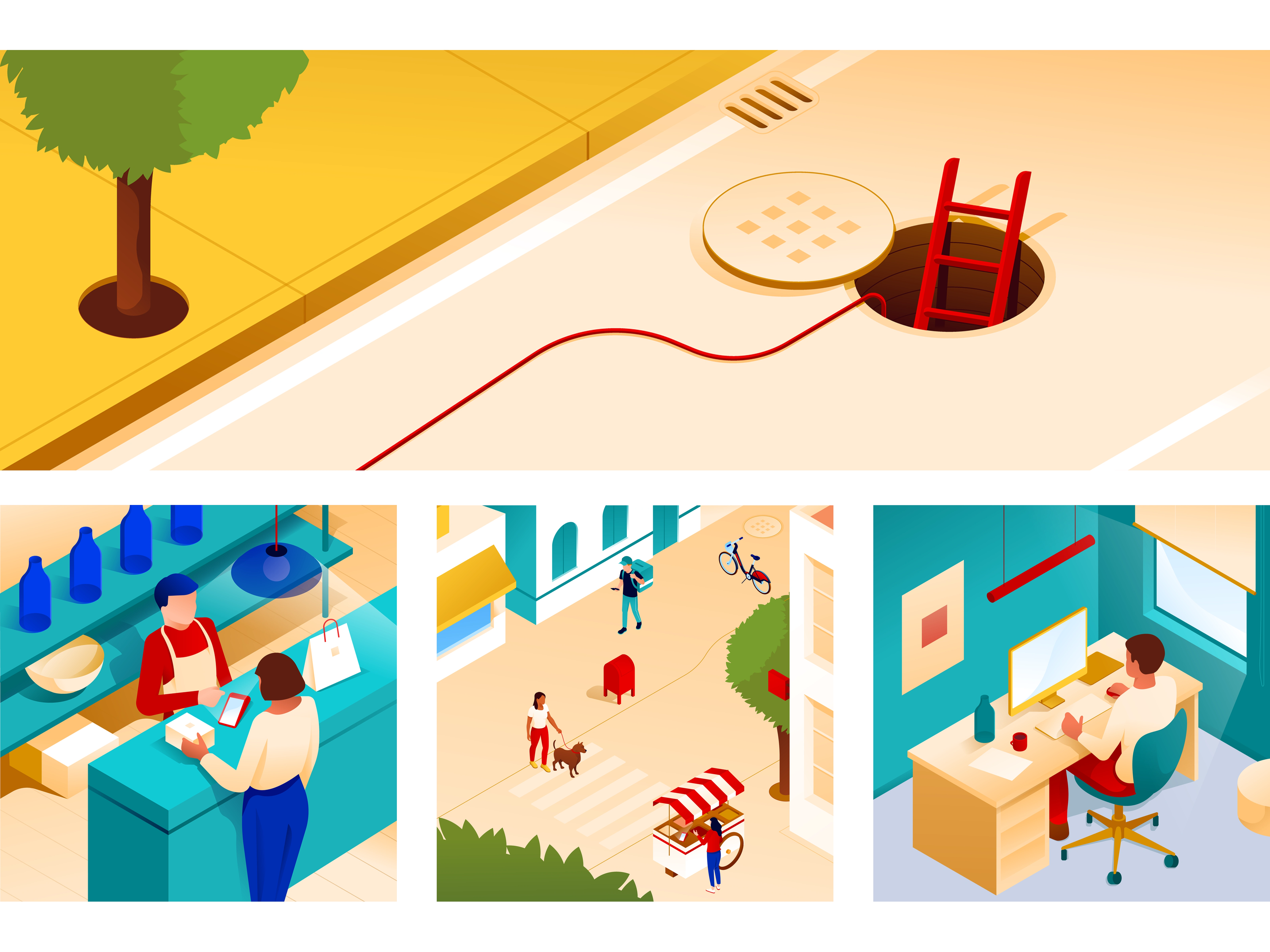
Key details
Natural, elegant and versatile. The immersive view is one of the style's strengths, allowing the viewer to become part of the scene.
Due to the pure designs, the compositions have an air of elegance, adding to the visual effect without overwhelming them with too many elements.
4 in 1. One single illustration can come in multiple versions. Depending on where we set our focus, we can home in on the main scene, the character’s actions, the details of the actions, and or a specific object.
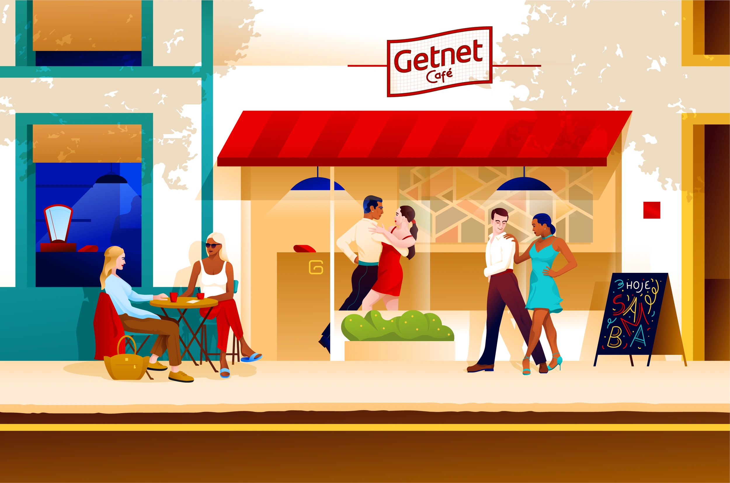
❷ Emotional
The line in the collection where the creator has most freedom. We bring ourselves eye to eye with the customer.
The elements are more detailed; the characters not only have features, but we also see their gestures, mood, actions etc.

Key details
Is the collection where the creator has most freedom. We bring ourselves eye to eye with the customer.
The light and its contrast are essential elements. The characters are at the heart of this style. By playing with geometry, from a lens that focuses on
subtly organic strokes, we can create illustrations that are iconic but also familiar. It has perfect lines and curves when needed, but without taking away from the natural strokes that perfectly pair with a photographic style.
❸ Conceptual
The conceptual style is the most prolific in the collection. It is intended for use in digital products, helping to understand it by communicating brand values above functionality.
It seeks to break the coldness of the screen and humanize the product. Also are very clear and concise.
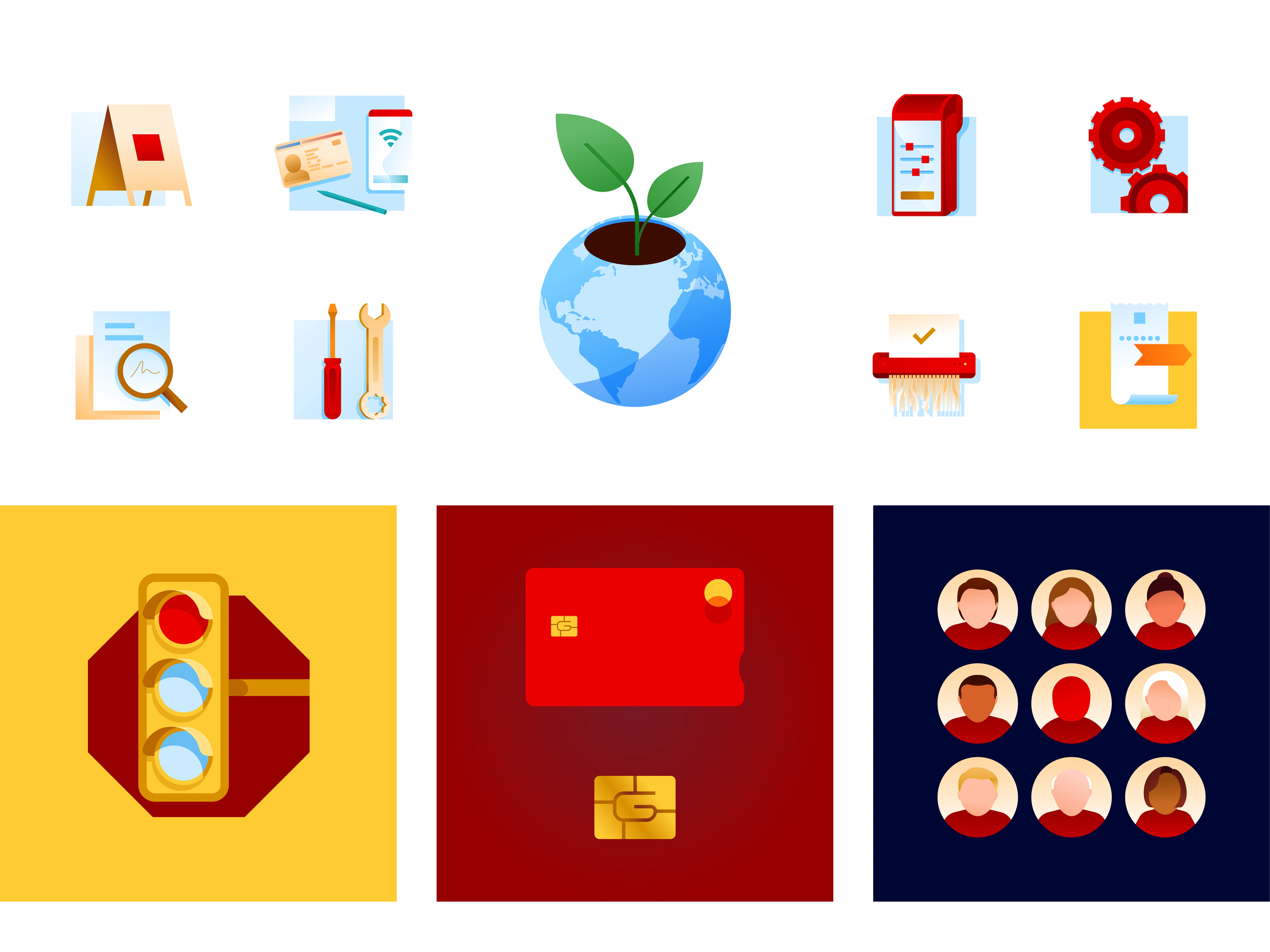
Key details
The square, in connection with the brand, serves as a virtual canvas and creates a space where we can represent key elements that play with the margins, resting on them, spilling out of them etc.
The actions are accompanied by elements that make the illustration more dynamic and ready for motion. In addition, there are a few symbols that exude Getnet's DNA, like the chip of the card, where we can see the letter 'G'.
This is, with the exception of critical messages, where the shape itself reinforces the message.
❹ Pictograms
Our collection of coloured pictograms represent the minimum expression of illustrative style.
They are closer to icons than illustrations, in both size and shape. In terms of design, they are simply a dialled-back version of the conceptual style.
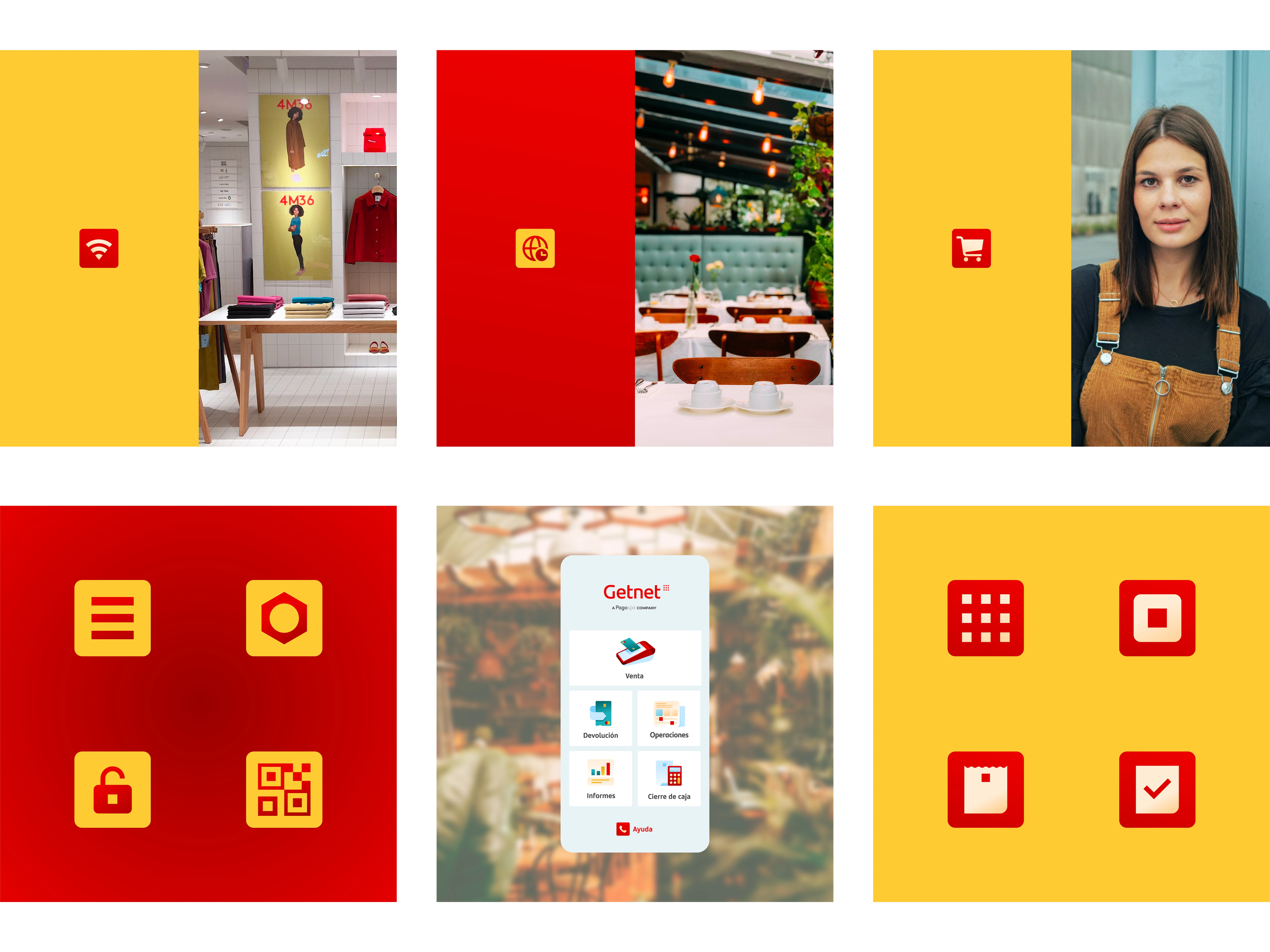
Key details
Pictograms must be clear and concise, encapsulating a number of elements. However, this should not detract from them representing the brand's personality. Small squares feature as accents — similarly, for example, the QR code is illustrated by 9 squares.
Geometry, pure strokes and use of negative space when more depth is needed. When we draw over a red background, we create a fade effect from the bottom, fading from the tone #FFC375 to #FFECD5. On a yellow background, the subtle fade from the bottom should start from #980000, fading into the main red #EB0000.
Spin-offs
After having defined the illustrative styles, the library grows according to the needs of each area of the company's design team.
Both ad-hoc pieces for seasonal celebrations, communication campaigns or digital product development.


Miguel is a pleasure to work with. Not only is he a great illustrator, he has been a "partner in crime", contributing ideas, co-creating concepts and always bringing an extra effort of creativity, business knowledge and enthusiasm.
– Cristina García Carrillo, Getnet Brand & Marketing head

Like this project
Posted May 21, 2025
Illustrations to make payments easier for everyone, everywhere and securely while providing the best checkout experience for customers everywhere.
Likes
1
Views
14
Timeline
Jun 21, 2022 - Ongoing
Clients
Getnet