Brand design for biological company
About the company
Nature's Nourish is a plant-based food company that produces healthy, delicious and sustainable food products. The company is committed to using only natural and organic ingredients in all of its products and promotes a healthy and sustainable lifestyle.

Primary Logo
Customer requirements
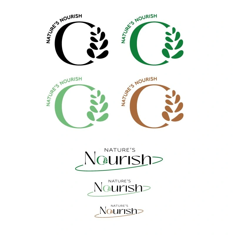
The main goal of the logo design is to convey the brand's core values of natural, healthy and sustainable food products. The logo should be simple, memorable and versatile, working well across a range of media including packaging, websites and social media.
Consider incorporating natural and organic elements such as leaves, fruits, and vegetables
A simple, modern typography style may also be appropriate to convey a brand's commitment to sustainability
Your color palette should be earthy and natural, including greens and browns.

Logo variations
Icons
Icons are a powerful tool for any company looking to enhance its brand identity and improve user experience. They serve as visual representations of ideas, products, and services, making it easy for customers to recognize and engage with a brand.
By using icons effectively, companies can create a more engaging and memorable brand experience for their customers, leading to increased loyalty and brand affinity.
I create patterns made by icons that the company can use in packaging, social media, print ad, website and marketing materials.
First pattern
Made by general icons, this pattern is a great visual representation of a company's commitment to sustainability and environmental responsibility.
As a plant-based food company that promotes a healthy and sustainable lifestyle, this pattern can be used on marketing materials, packaging, or as part of a website design to emphasize the company's green initiatives and values.

Pattern 1
Second pattern
The second pattern I created is a great visual representation of a company's commitment to fresh, healthy, and delicious food products.
It can be used on marketing materials, packaging, or as part of a website design to emphasize the company's focus on using high-quality and nutritious ingredients.
By using this pattern, a company can showcase its dedication to producing fresh and healthy food products while also appealing to customers who prioritize flavor and taste.

Pattern 2
Packaging
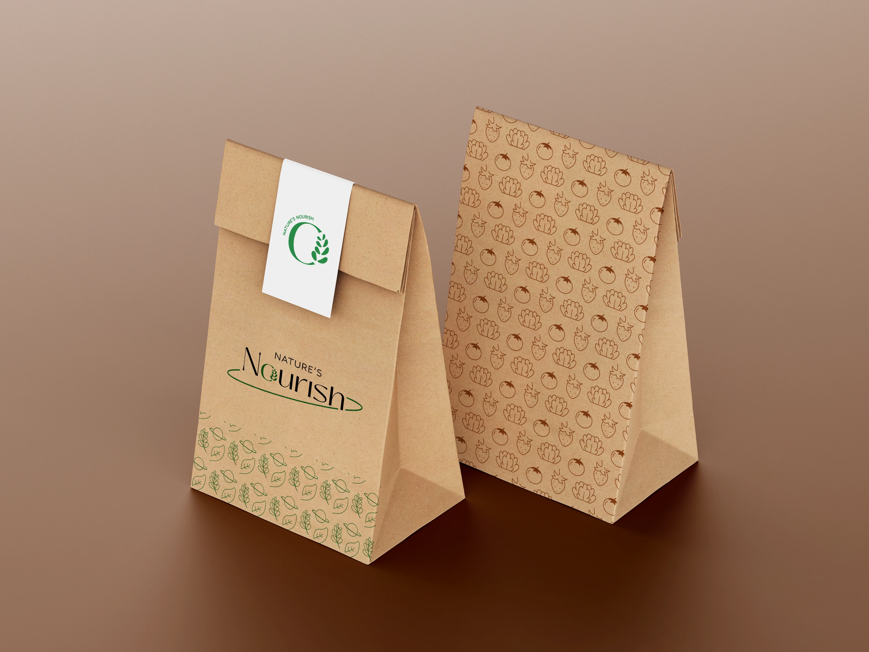
The packaging I created is not only functional, but it also serves as a powerful marketing tool that can influence customers' purchasing decisions.
Designed specifically for Nature's Nourish plant-based food products, it showcases the brand's commitment to sustainability, natural ingredients, and healthy living.
The packaging is made from eco-friendly and recyclable materials, aligning with the brand's values and enhancing its appeal to environmentally conscious consumers.

Packaging 1

Packaging 2
Conclusion
My work on creating a brand identity for Nature's Nourish has been an exciting and rewarding experience.
Through this project, I have gained a deeper understanding of the importance of creating a strong and consistent brand identity that aligns with a company's values, appeals to its target audience, and distinguishes it from competitors. The use of design elements such as icons, color schemes, and typography can effectively convey a company's message and values, while eco-friendly and informative packaging can enhance its appeal to environmentally conscious consumers.
By applying these principles to my work, I have created a brand identity for Nature's Nourish that not only reflects the company's values but also has the potential to make a positive impact on its success.
Like this project
Posted May 8, 2023
I created a brand identity, including a logo, packaging, and icons-pattern. The outcome promotes the brand's plant-based and sustainable ethos.


