Cronitor.io – Hero Section Redesign
Syed Abaan
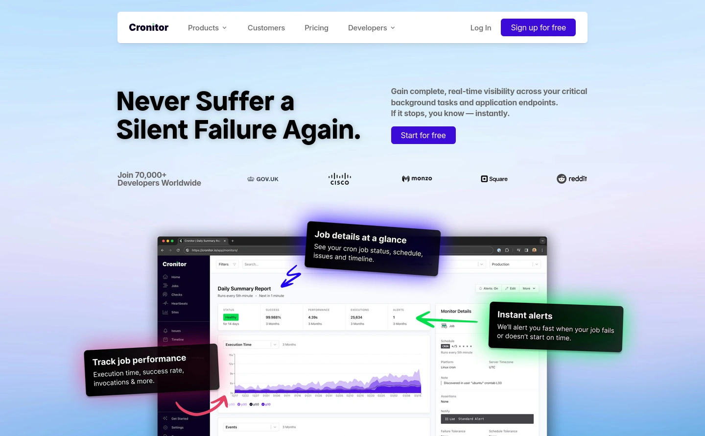
Project Overview
This project is a reimagined hero section for Cronitor.io, a SaaS platform for monitoring cron jobs and background tasks. The redesign emphasizes clarity, hierarchy, and modern SaaS polish — creating a sharper, high-converting first impression.
Project Goals
Refine Messaging & Hierarchy: Craft a headline and subtext structure that communicates value instantly.
Modernize the Layout: Build a clean, balanced composition with improved typography and spacing.
Highlight the Product: Integrate the official product screenshot and overlays for context and authenticity.
Increase Conversion Potential: Design call-to-actions that stand out without overwhelming the page.
Workflow & Process
Design in Framer: Developed a static concept directly in Framer for precision and responsiveness.
Layout & Composition: Established a clear visual flow with SaaS-standard alignment and spacing.
Clarity & UX Focus: Structured content so the headline, supporting text, and CTAs are immediately engaging.
Results & Impact
The redesigned hero section gives Cronitor.io a cleaner, more approachable aesthetic while maintaining product credibility. It demonstrates how thoughtful design can improve conversion potential and elevate the brand’s first impression.
Like this project
Posted Sep 30, 2025
A modern hero redesign for Cronitor.io — clean layout, sharp typography, and focused CTAs for a clear, conversion-driven first impression.
Likes
1
Views
2