Flexpoint UX Redesign for Enhanced Creator Experience
Ashik Prottoy
Overview
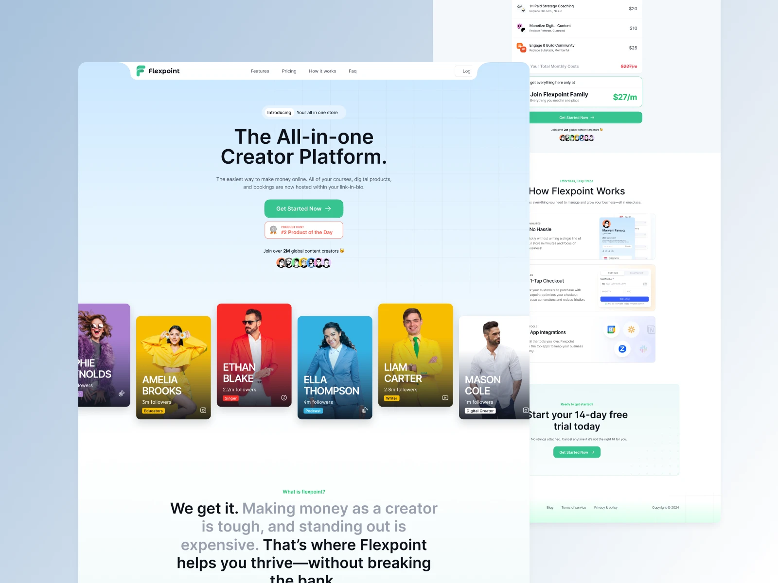
Flexpoint is an all-in-one monetization platform built for creators. While its early prototype successfully captured attention with its clean UI and modular product structure, usability testing revealed critical gaps in user experience—especially around onboarding, product setup, and multi-currency payment flows. The goal of this redesign was to improve the overall UX while maintaining the platform's modern, creator-centric aesthetic.
Problem Statement
Despite positive initial impressions, the early version of Flexpoint faced several UX and usability challenges:
First-time users were confused by the product setup flow, especially when choosing between different monetization tools.
The onboarding process was fragmented and lacked contextual guidance, causing user drop-offs.
Global users faced friction due to unclear handling of USD and local currency payouts (e.g., via Stripe and bKash/Nagad).
Accessibility support was minimal, making the platform harder to use for all audiences.
Goals and Objectives
Goal: Redesign the Flexpoint experience to improve clarity, reduce friction, and make the platform more accessible for global creators.
Objectives:
Simplify the onboarding flow with contextual help and progressive disclosure.
Guide users through product setup with modular templates for different creator needs.
Streamline payment handling and clearly explain USD/local currency logic.
Implement accessibility improvements across all user touchpoints.
Target Audience
Primary Users: Digital creators, coaches, influencers, and solopreneurs looking to monetize products like courses, services, digital downloads, and communities.
Secondary Users: Visitors and customers engaging with creators' Flexpoint-hosted offerings—especially on mobile.
Research & Insights
1. User Feedback:
Collected direct feedback from early adopters and beta testers, especially around setup complexity and currency confusion.
Conducted interviews with global creators to understand their monetization pain points.
2. Competitive Analysis:
Studied platforms like Stan, Gumroad, and Kajabi to benchmark onboarding flows and monetization toolkits.
Noted gaps in global payment handling and localization in competitors.
3. UX Psychology Applied:
Hick’s Law: Reduced decision fatigue by recommending monetization types based on user goals.
Aesthetic-Usability Effect: Maintained strong visual hierarchy to build trust while improving functionality.
Design Solution
1. Smarter Onboarding:
Goal-Oriented Start: Replaced generic onboarding with goal-based entry points (e.g., "Sell a service," "Host a coaching session").
Progress Indicators: Visual progress bars and contextual tooltips reduced cognitive load.
2. Modular Product Templates:
Pre-built templates for each monetization type (e.g., Courses, Services, Affiliate Products) allowed users to launch faster.
Embedded best practices inside each template to guide new creators.
3. Unified Payment Setup:
Simplified Stripe integration and clearly communicated how USD and local payouts (e.g., Wise, bKash, bank) are handled.
Added a transparent earnings dashboard to track cross-currency income.
4. Accessibility Enhancements:
Full keyboard navigation across dashboard components.
Implemented ARIA roles, proper label hierarchies, and sufficient color contrast.
Responsive design ensured seamless access on mobile and tablet devices.
Implementation Process
1. Research & Planning:
Mapped out friction points from analytics and user interviews.
Created a revised UX architecture and user journey maps for each flow.
2. Design Phase:
Built low-to-high fidelity prototypes in Figma.
Ran usability tests with real creators from 5 different countries to validate changes.
3. Development Phase:
Partnered closely with the engineering team (React frontend + Laravel backend) to ensure clean handoff and real-time adjustments.
Used feature flags to gradually roll out updates to test cohorts.
4. Launch & Beyond:
Deployed redesign alongside educational materials and video walkthroughs.
Monitored product analytics and support tickets to iterate further.
Results
40% Increase in Setup Completion: First-time users completed onboarding and product creation significantly faster.
Reduced Drop-offs by 35%: Onboarding drop-offs dropped dramatically due to better flow clarity.
Mobile Conversions Up by 28%: Improved responsive design and touch interactions boosted mobile purchase success rates.
Improved Payment Confidence: Fewer support tickets around USD/local payout confusion post-redesign.
Lessons Learned
Design for Clarity, Not Assumption: What seems obvious to product builders can often confuse end users—especially in complex flows like onboarding or payments.
Localize UX, Not Just Language: Adapting for different currency behaviors and user contexts builds real trust with global users.
Design is Never Finished: Continuous iteration and listening to user feedback post-launch are key to long-term product success.
Like this project
Posted May 13, 2025
Redesigned Flexpoint to enhance UX, onboarding, and payment flows for creators.
Likes
1
Views
25