Email Flow to Funds | Rebuilding Email Strategy for Real Sales
Solawon| The Alpha Initiative
When Panumy Pet & Accessories reached out, they were frustrated — and understandably so.
They had tried email marketing before. Campaigns had gone out. Designs were sent. Offers were promoted. But the results were flat. Their open rates were low. Clicks barely registered. And worst of all, those emails were doing nothing to drive actual sales. They felt like just another small brand going through the motions, trying to make email marketing work… but getting nothing back.
That’s where I came in — to reset the strategy, reintroduce the brand, and rebuild the experience from scratch.
Diagnosing the Problem I started with a deep audit of what had been done before. The problem wasn’t just one thing — it was a mix of everything:
The email designs were generic and lacked any visual consistency.
There was no clear flow or structure between welcome emails, product features, or offer pushes.
The copy didn’t reflect Panumy’s brand voice. It felt robotic and templated.
There was no segmentation — everyone received the same message, at the same time.
Landing pages were disconnected from emails, creating a disjointed customer experience.
Most importantly, there was no narrative — no sense of journey for the subscriber. Without that, it’s no surprise the audience was disengaged.
To begin, I focused on reshaping the entire flow of communication. Rather than treating email like a single campaign push, I built a funnel-based sequence that mirrored how customers actually think, shop, and decide. That meant creating a high-performing welcome flow to make a strong first impression, story-driven product highlights that educated while selling, and timely sequences for things like seasonal promotions or limited-time offers. I also developed re-engagement flows for inactive users and smart triggers like abandoned cart messages and interest-based follow-ups. Each email in the sequence had a clear purpose — short, persuasive, and intentionally placed.

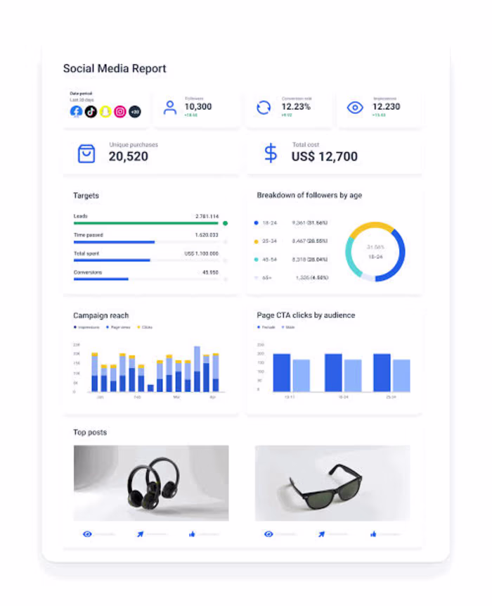
But structure alone wasn’t enough. Panumy needed to be instantly recognizable in the inbox. That’s where I introduced a complete visual identity for their email marketing. I designed each email using a color-graded layout that matched the brand’s palette and personality. The formatting was clean, mobile-friendly, and built for readability — with thoughtful use of white space, crisp CTAs, and a visual hierarchy that guided the eye. This wasn’t just about style — it was about building brand consistency and recognition, email after email.
Next, I addressed the entry point of the entire system — the opt-in form and landing page. The old form felt disconnected and unconvincing. So I created a new, branded sign-up page that clearly communicated value and felt like a seamless extension of the brand. This wasn’t just aesthetic polish — the new form directly led to higher-quality leads and more engaged subscribers entering the flow.
And finally, the copy had to change. The original messaging was flat, often generic, and lacked any emotional weight. I rewrote every line from scratch with a clear, conversion-driven structure — drawing readers in with hooks, offering clear value, pairing it with visual support, and ending with decisive calls to action. The voice was warm, confident, and aligned with Panumy’s tone — one that customers could recognize and trust over time.
Like this project
Posted Jul 5, 2025
It had low open rates and weak conversions from a past campaign. I rebuilt their email flow. The results? Open rates doubled and revenue per email jumped by 63%