Bare Earth /branding/
Blanca Doba
BARE EARTH
01. Introduction
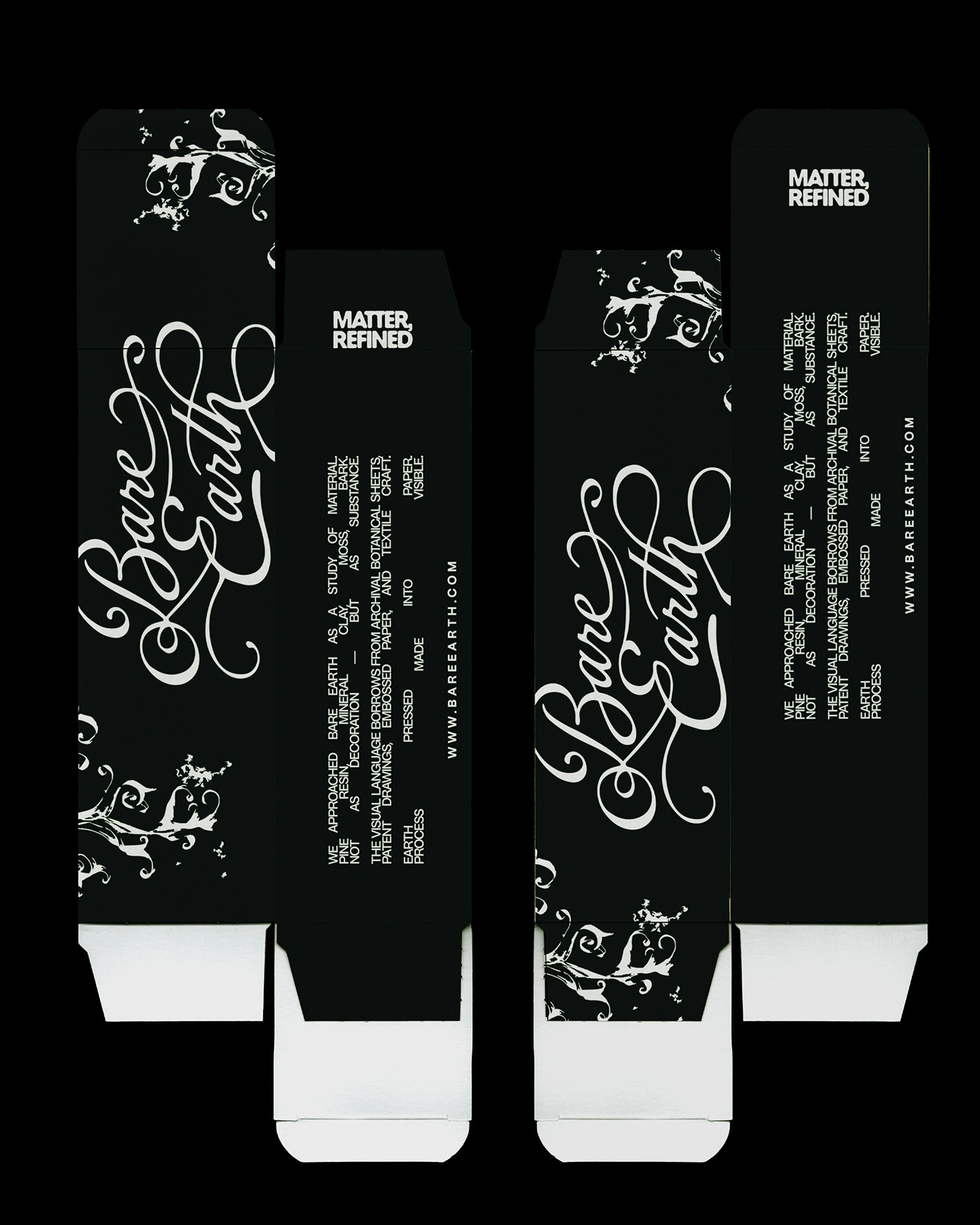
Bare Earth is a conceptual body care brand rooted in forest extracts and mineral elements. Inspired by resin, clay, moss, and bark, the brand approaches nature as material rather than decoration.
Drawing from archival botanical studies and traditional craft processes, Bare Earth transforms raw forest matter into a modern, tactile identity — grounded, restrained, and intentional.
02. Concept & Strategy
The core idea behind Bare Earth was to treat nature as substance, not aesthetic.
Rather than following conventional “clean beauty” codes, the brand was built around documentation, materiality, and restraint. Inspiration was drawn from botanical patent sheets, embossed paper techniques, and archival scientific references.
Bare Earth is positioned as:
• Grounded without feeling rustic
• Minimal yet textural
• Archival rather than trend-led
• Elemental, calm, and confident
The strategy focuses on translating raw forest extracts into a refined visual system where texture, hierarchy, and material carry meaning.
03. Typography
Typography balances structure and organic flow.
A refined serif anchors the identity, referencing documentation and authority, while a restrained supporting typeface ensures clarity and precision.
The typographic system mirrors the brand philosophy — controlled, intentional and grounded in substance.
04. Logo Choice
The Bare Earth logo was designed to reflect the balance between documentation and organic movement. Its structure carries a sense of refinement and archival authority, while subtle softness in the letterforms evokes natural flow — reminiscent of resin, moss, and pressed matter.
The identity includes three logo variations, allowing flexibility across different applications and contexts. A primary mark anchors the brand, while secondary and simplified versions ensure clarity and consistency across packaging, print, and digital environments.
Each variation maintains the same core integrity — tactile, grounded, and intentional — adapting without losing recognition.
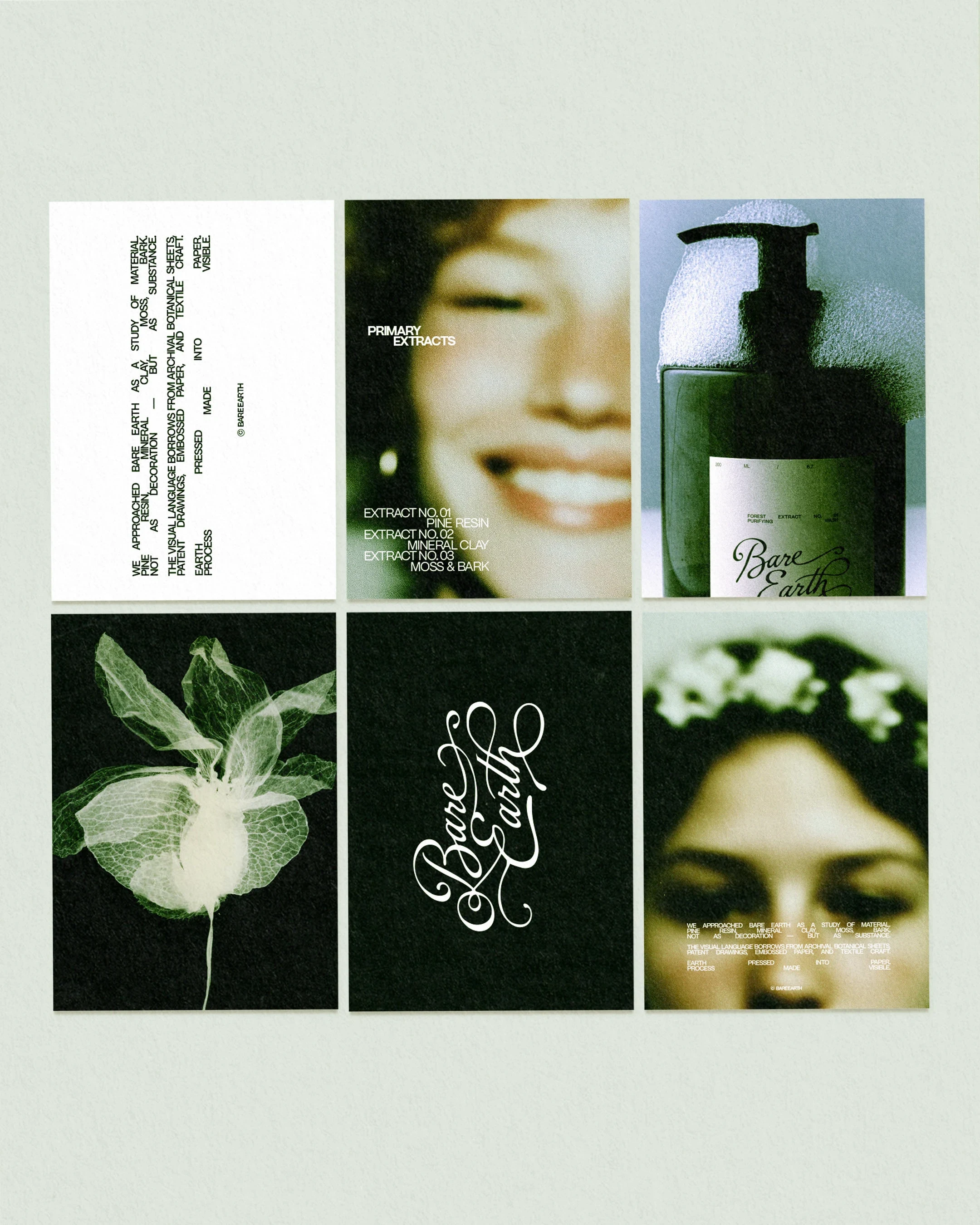
05. Imagery
Imagery is treated as material study rather than decoration.
Photography leans into cinematic restraint — muted earth tones, tactile surfaces, and subtle grain. Products are positioned as artifacts within their natural context, reinforcing the idea of documentation and substance.
Like this project
Posted Feb 17, 2026
Drawing from archival botanical studies and traditional craft processes, Bare Earth transforms raw forest matter into a modern, tactile identity.