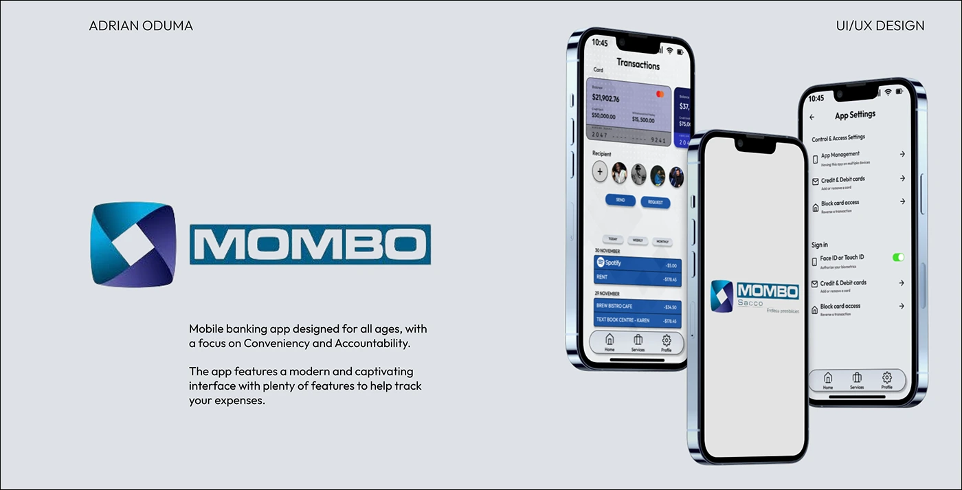
Mobile Banking app (Re-design)

Adrian Oduma


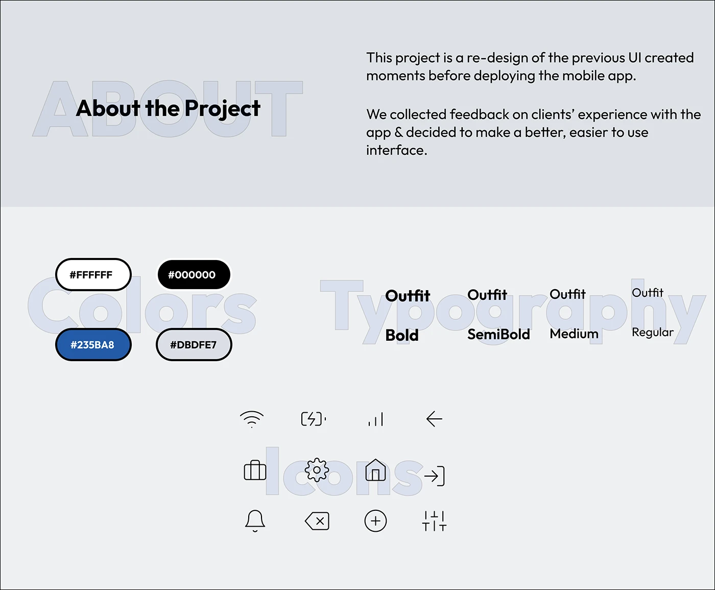
This project is a re-design of the previous UI created for the app when it was being launched.
The design was hurriedly developed and did not conform to the Principles of a Good UI Design such as;-
Hierarchy - Prioritizing information. Created through variations in color, font-size & even contrast.
White space - Isolating element with white space makes content easily readable, and a clean UI
Visual Appeal - Using appropriate color palettes, images, gradients, and typography to make the UI appeal to the eye
The Old UI vs. The New UI
Old UI
As seen in the photos below, the old UI was lacking a bit of touch. It was plain, and everything looked the same.
Feedback from clients suggests that they weren't interested in using the app anymore, let alone using it for transactions/tracking their expenses.
Therefore, we took action to re-design the app's interface which will later be translated into development (coding the app itself).
A few issues outlined include;-
- No hierarchy among elements - made it hard to distinguish between normal text & a button.
- Boring Color Palette - The colors used either weren't used/blended well enough, or they did not suit the interface at all.
- Poor Use of Whitespace - 'Buttons' had uniform spacing, dimensions, and alignment, but too little white space left. No element isolation, no easy readability.
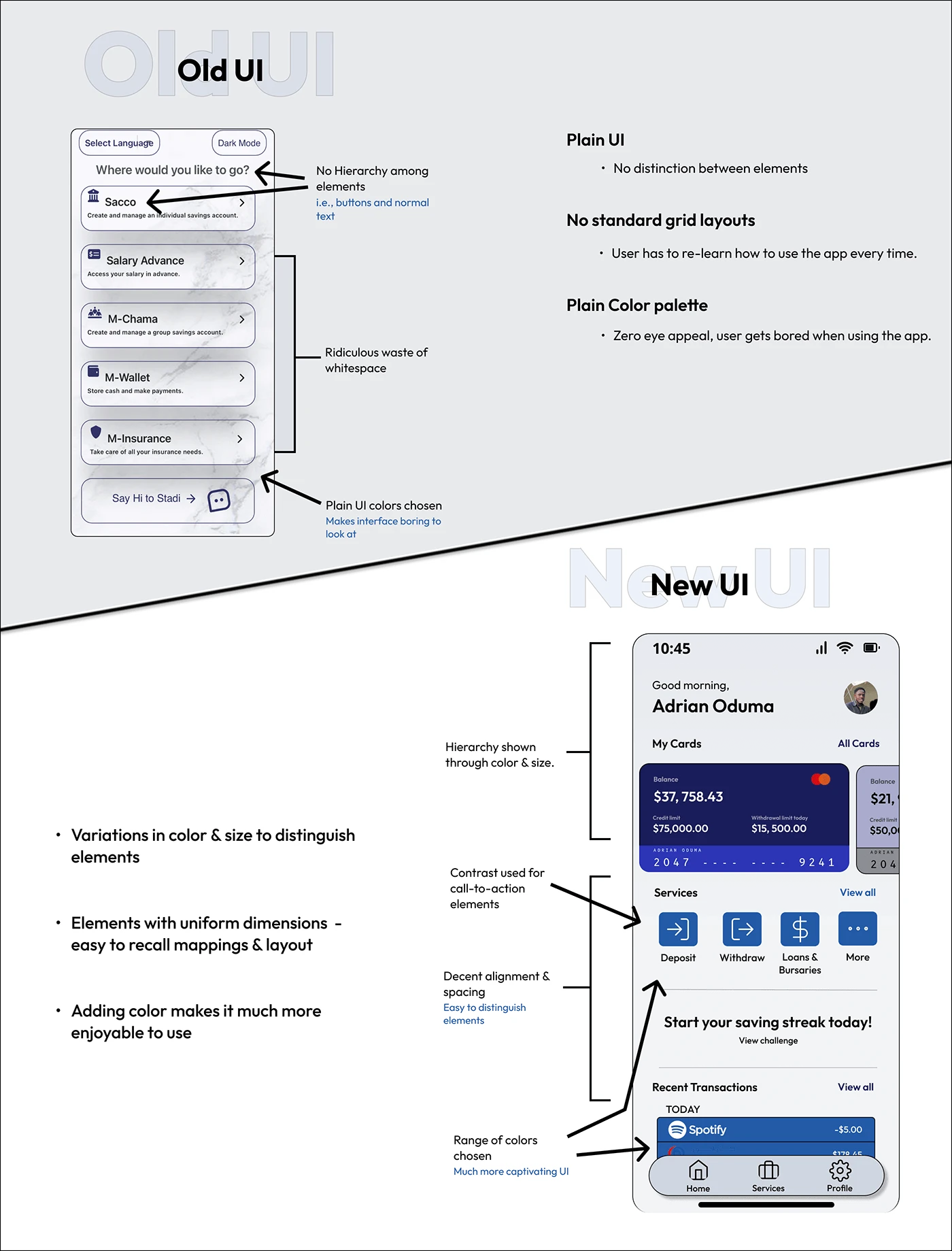
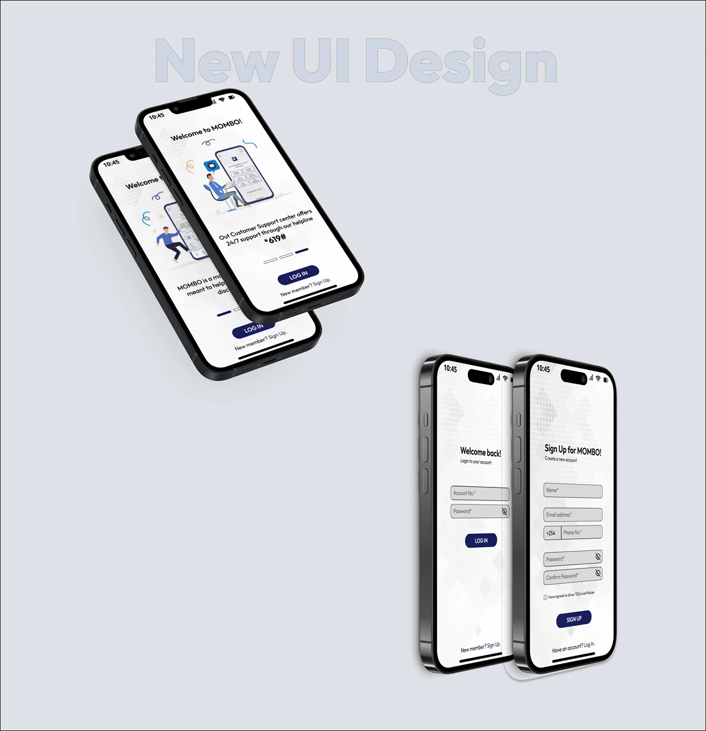
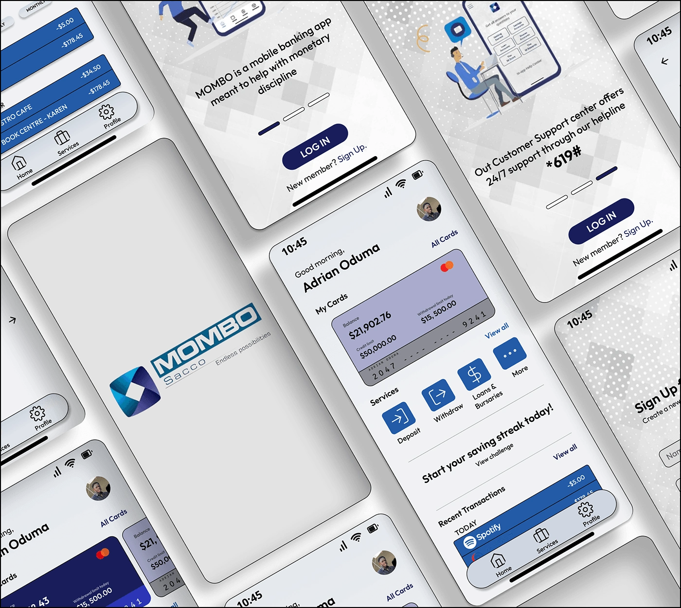
New UI
The new design addressed the issues mentioned above by following a few Principles of design written in the acronym; CRAP
C > Contrast - Establishes a hierarchy among your elements. (i.e., use of different font-sizes to outline the heading and normal text).
R > Repetition - Creates consistency. (using the same layout repetitively creates a recognizable pattern. User can memorize element mappings easy)
A > Alignment - Organizes elements into groups. (i.e., parent & child elements are always aligned together to the left)
P > Proximity - Makes elements seem related, thus info close-by could be related. (i.e., elements near a big heading are most likely related)
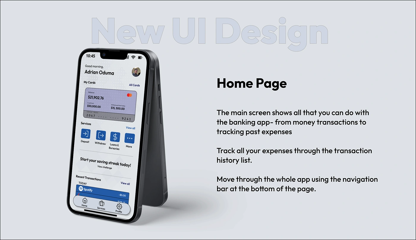
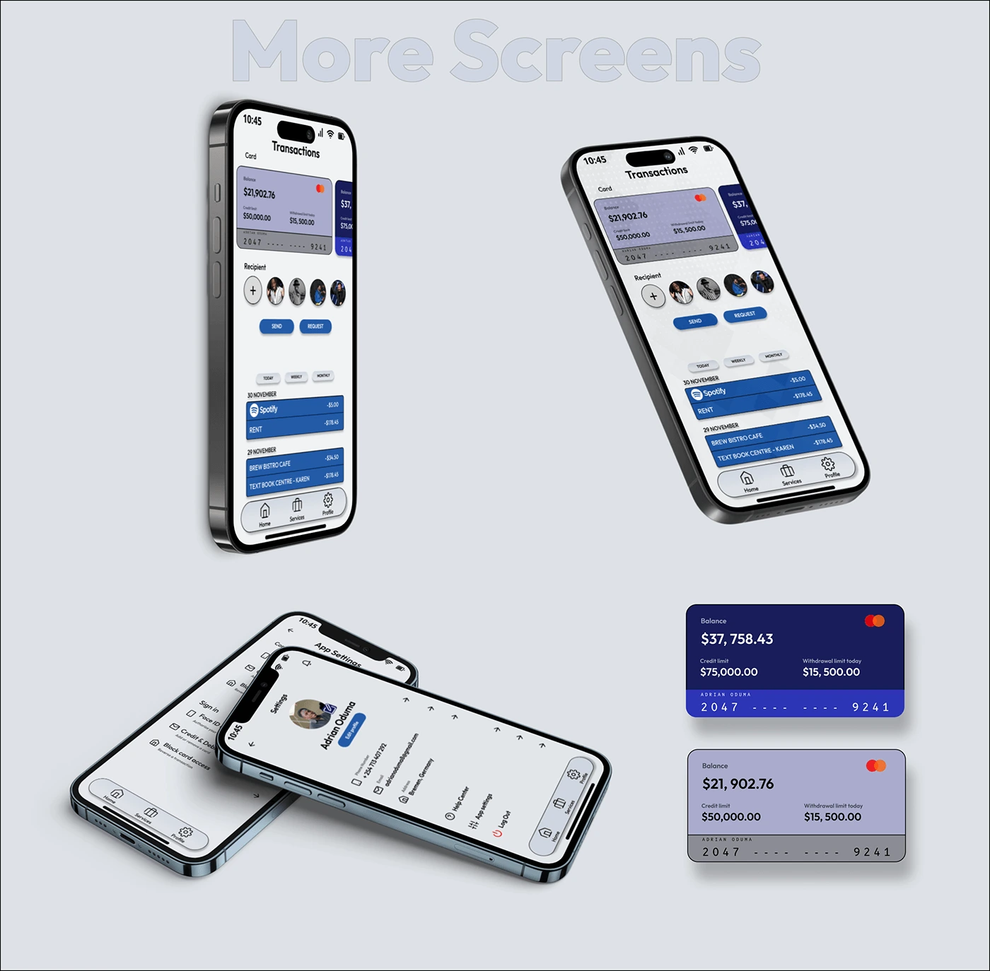
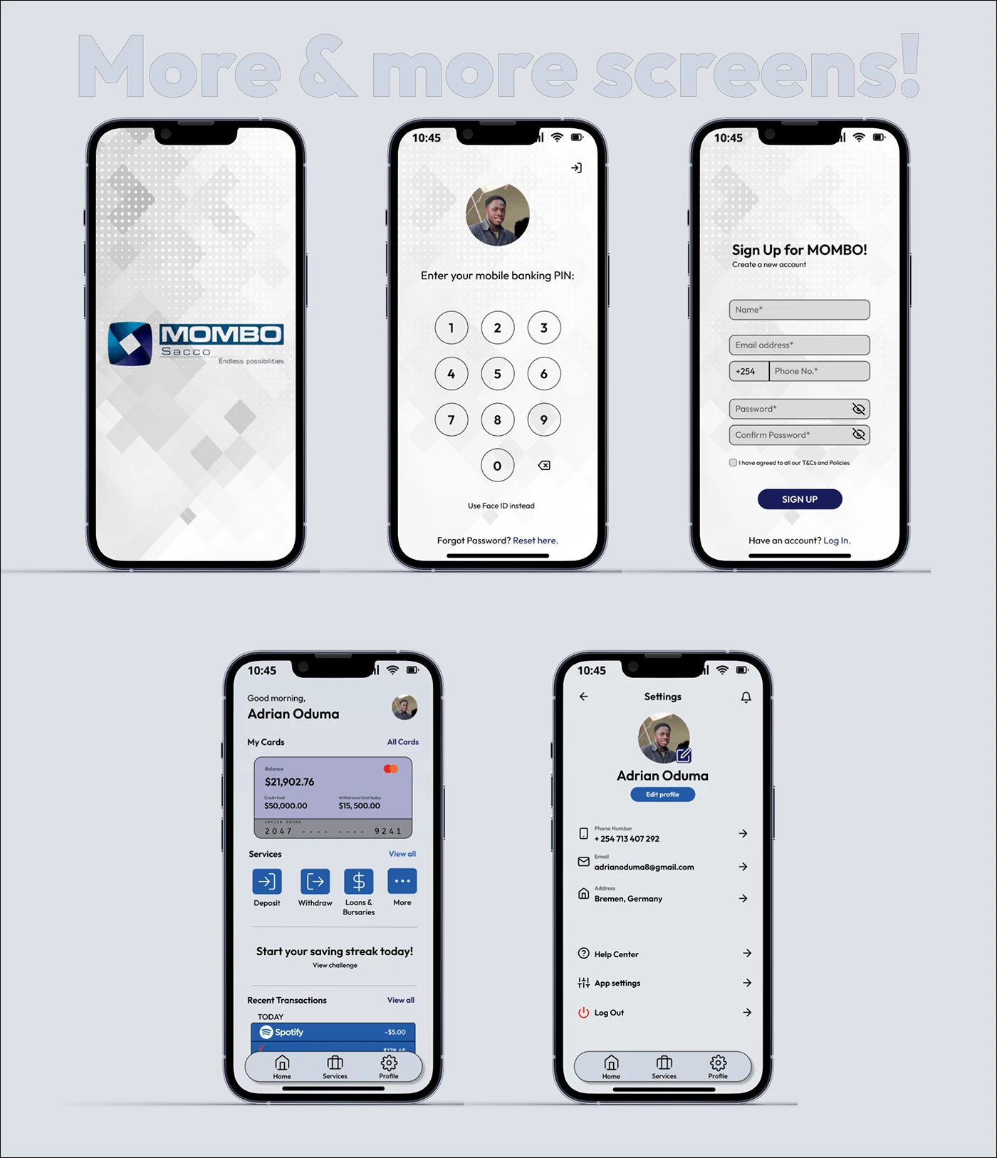
Main page that shows all that you can do with the app.
From making transactions (i.e., Deposit/Withdraw money), to tracking all your expenses.
The navigation bar at the bottom of the screen is also an addition from the previous UI, thus very convenient for end-users wanting to navigate through the app freely.
The picture icon at the top right will help access your profile information.
Like this project
Posted Dec 10, 2023
Branding, Web Design, UI/UX, Figma, Sketch, Adobe Illustrator
Likes
0
Views
9


GoDaddy - Landing Page Clone
Ableton - Landing Page
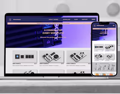
Monogram - Product page UI
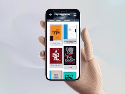
e-Books App - Library UI