High-Density Analytics Dashboard Development
Israel Chinwuba
High-Density Analytics Dashboard: Complete data mastery, engaging visual hierarchy, eliminating overwhelm. Target: Analytics tools, CRMs, marketing platforms.
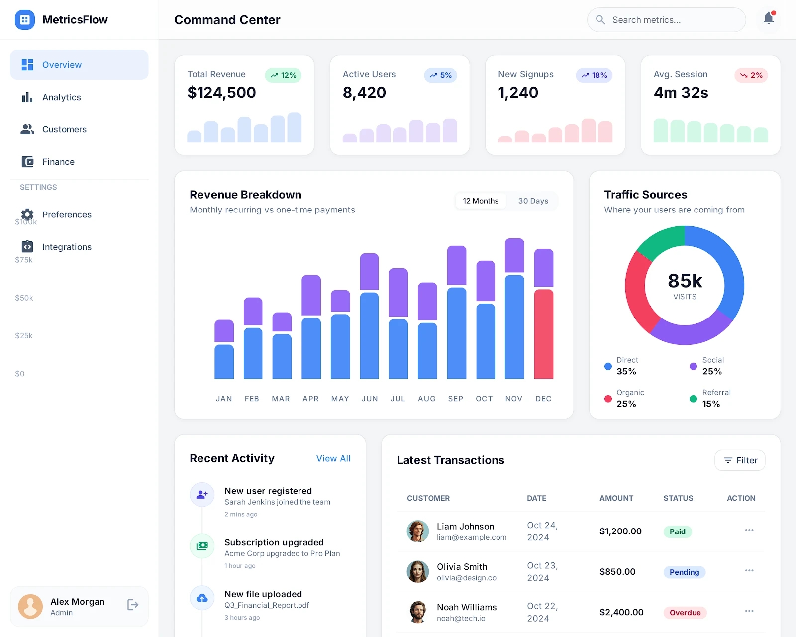
The Mission How do you display 50 critical data points on a single screen without overwhelming the user? I engineered a vibrant, high-density analytics dashboard that turns heavy data loads into an engaging, instantly readable experience.
High-Density Analytics Dashboard design
The Challenge Marketing platforms, CRMs, and analytics tools live or die by their data visualization. But packing multiple charts, metrics, and activity feeds into one viewport usually results in visual chaos. Users feel overwhelmed, leading to decision fatigue and decreased platform usage. The challenge was to maintain deep analytical density while keeping the interface feeling lightweight and energetic.
The Execution I architected a dashboard that balances strict data hierarchy with vibrant, engaging UI patterns.
Strategic Color Theory: Utilized a vibrant palette not just for aesthetics, but as a functional tool to guide the user's eye instantly to positive trends, warnings, and primary actions.
Dense but Digestible Layout: Engineered a bento-box style grid system that neatly compartmentalizes disparate data streams (charts, lists, numeric KPIs) into a cohesive, scannable format.
Kinetic Data Rendering: Built smooth data-entry animations so charts and metrics visually "build" on load, making the platform feel alive and responsive rather than static and intimidating.
My Role & Process I took full ownership of the frontend architecture. Starting with the complex data requirements, I designed the visual hierarchy to prioritize clarity. I then built the responsive components to ensure perfectly balanced scaling across all screen sizes, ensuring the data narrative remains clear from a 27" monitor down to a mobile device.
The Stack & Why It Matters
React & TypeScript: Ensuring complete type safety and reliability when handling complex, nested data structures.
Tailwind CSS & Custom Utilities: Rapid, consistent styling for complex grids without utility class bloat.
Recharts / Custom SVG Models: Fast, responsive charting that looks sharp on retina displays.
The Result A lively, data-dense platform that power-users actually enjoy logging into. It proves that heavy analytics don't have to be boring, and that great design directly increases daily active usage.
Like this project
Posted Feb 24, 2026
Developed a high-density, engaging analytics dashboard.