Redesigning Survey Creation

Rodina darwish


↝ CASE STUDY · INTERNAL TOOL
Learned to think beyond the expected brief.
ROLE
Product Designer
PRIMARY USERS
Researchers
TIMELINE
1 month
TOOLS
Figma · Claude · MCP
Problem
Researchers were losing momentum because the survey creation tool made simple tasks feel slow and fragmented. Every key action opened a modal. Settings, languages, dashboards, and other survey controls lived on separate pages.
SOLUTION
Bring the full creation workflow into one connected workspace.
MOVE 1 · INFORMATION ARCHITECTURE
Restructured the tool around user tasks
I grouped each feature by the task it supported and moved Settings, Languages, and Dashboards into the survey workspace, where the work actually happens.
MOVE 2 · LAYOUT
A side-by-side creation canvas
Researchers could create questions, add logic, reorder sections, and adjust settings without leaving the page. Keeping these related actions together made the workflow faster and easier to understand.
Results & impact
I redesigned the company’s survey creation tool and built its first scalable design system with reusable components. After launch, the tool was adopted across the organization, reducing task completion time by 12.5% and contributing to an estimated $1.2M in annual productivity savings.
2.4×
Faster survey completion
Based on ~1 hour saved per user per day
100%
More organized workflow
Users could find key actions in one place without losing context.
−80%
Fewer clicks
Question creation and editing no longer depended on repeated modals.
Process & Key Insights
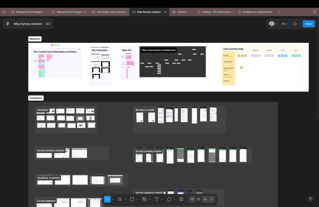
I mapped the existing information architecture, analyzed competitor patterns, and interviewed researchers while observing how they built surveys day to day. Every design decision traced back to a real workflow finding.
User insights
“Every question opens another modal. Then another.”
"Undo doesn't work the way I expect — I lose work and do it again."
"I can't find where I was. There's no clear navigation."
"Building one survey takes way too long."
"Long answer text and labels look broken inside the inputs."
"Moving a question to another section is painful."
Iterations & Testing
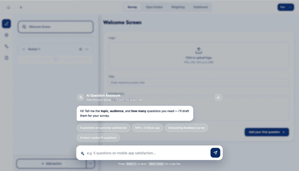
Instead of relying only on static wireframes, I used Claude to plan flows and generate interactive HTML prototypes. This helped users react to something that felt real, which made feedback faster and more specific.
ROUND 1
Layout exploration
I tested two directions: one showing all questions in a single view, and another focused on one question at a time.
ROUND 2
Survey creation flow
Most tasks passed, but the Add Section button was hard to find and the import flow needed a clearer design.
ROUND 3
Final refinements
I made the action full-width, filled, and high-contrast. Users found it instantly.
Building the design system in figma with MCP
THE CHALLENGE
We only had one week for the handoff, so I decided to put AI to work. I started by planning with Claude how to get everything done within that week, then documented the process in a file shared with stakeholders.
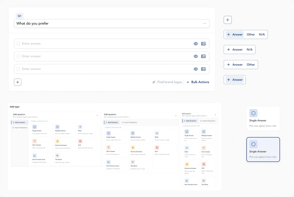
With MCP, I built variable collections, a component playground, and a structured Figma file — here's an example of that work.
What I learned
01
Solve the problem, not just the UI
Understand the user’s real friction first, then design only what is needed to remove it.
02
Test with real demos
Interactive HTML demos worked better than static wireframes because users reacted to something closer to the real product.
03
Get feedback early
Like this project
Posted Jul 18, 2026
Redesigned a survey‑creation tool into a single connected workspace and built a scalable Figma design system; reduced task time and clicks.
Likes
0
Views
2