EdTech Learning Platform | Web UI/UX Design
Faraz Ahmed
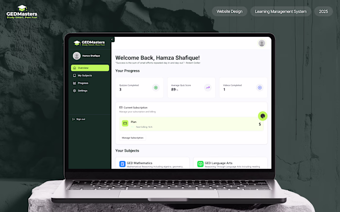
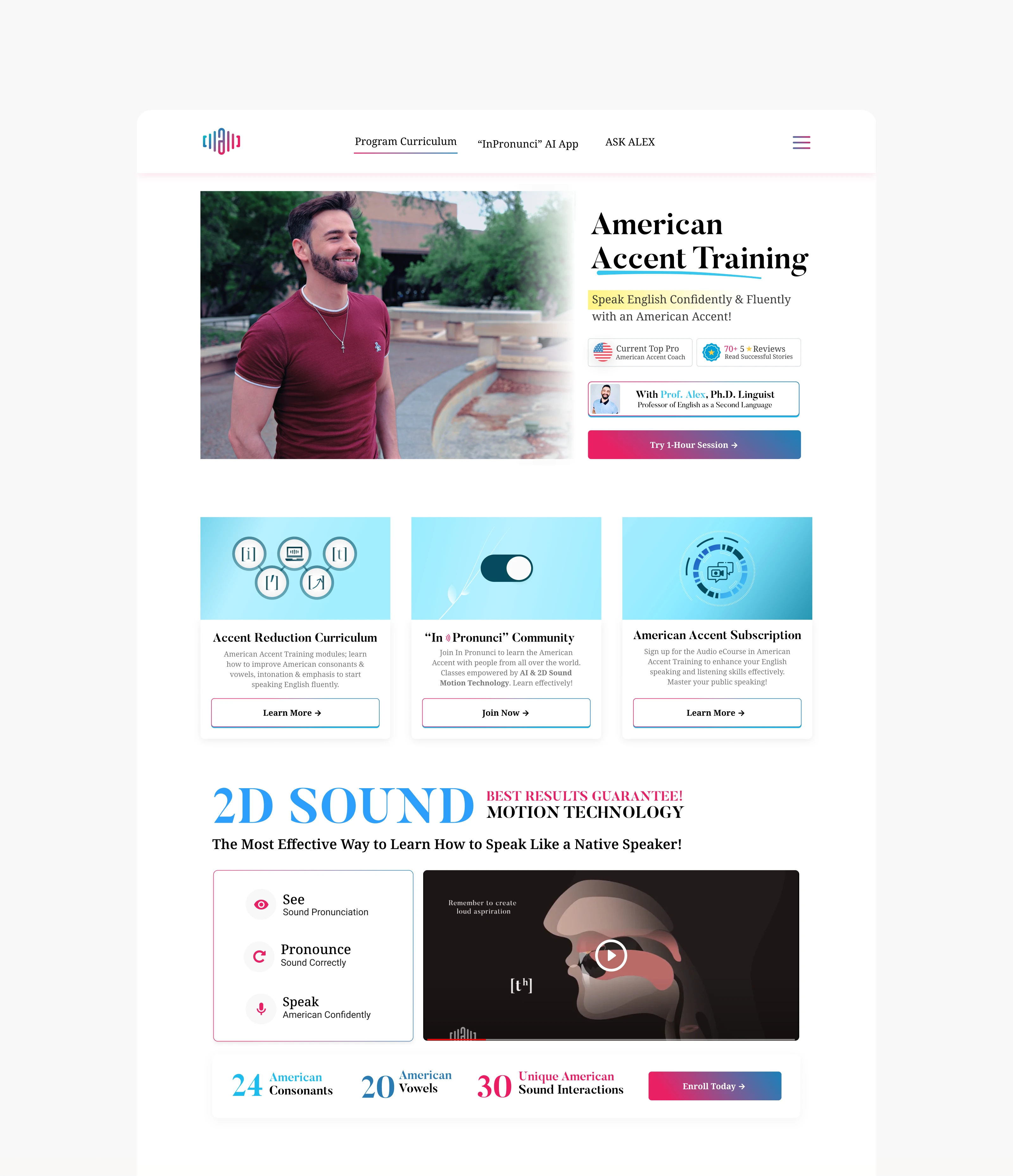
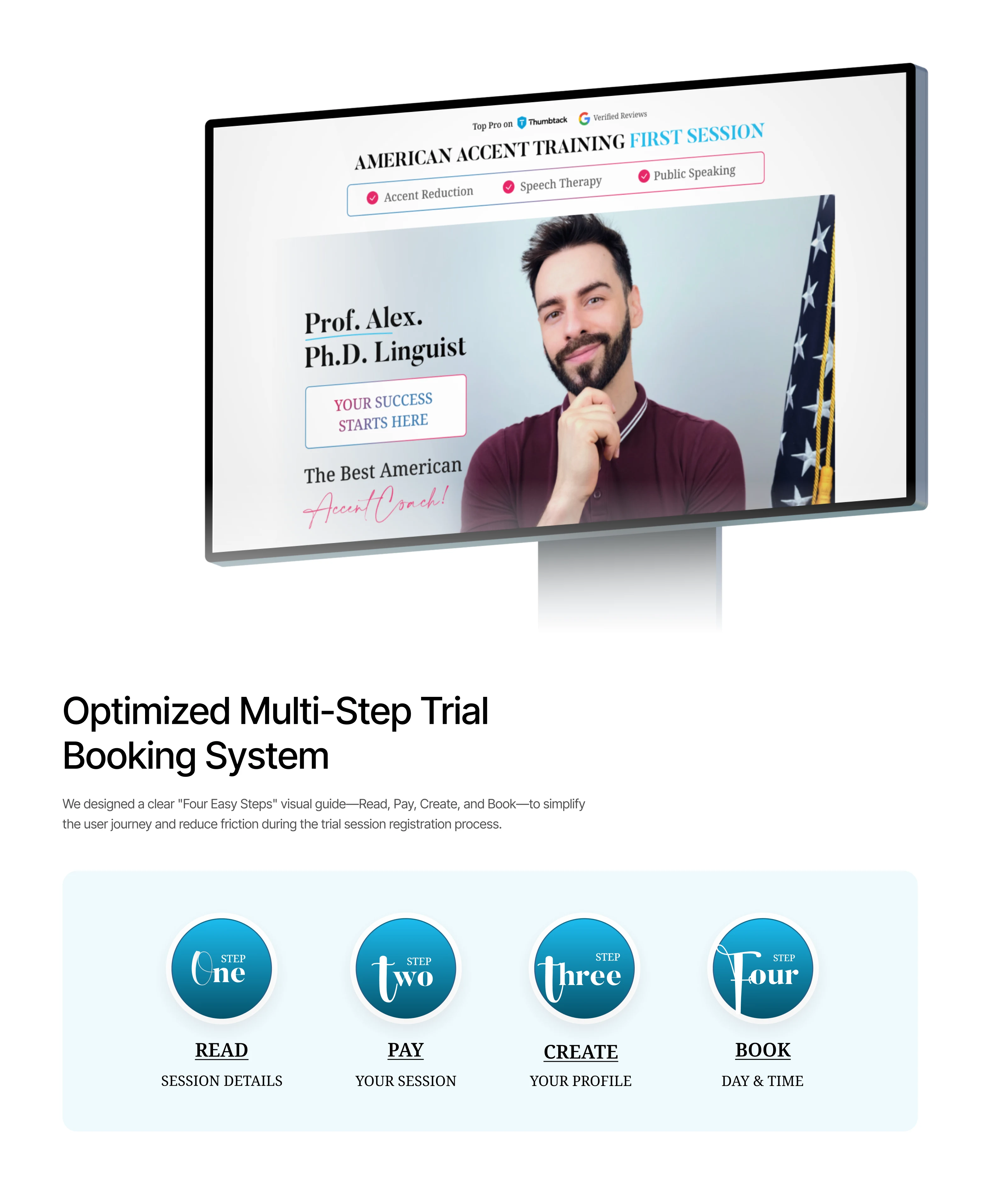
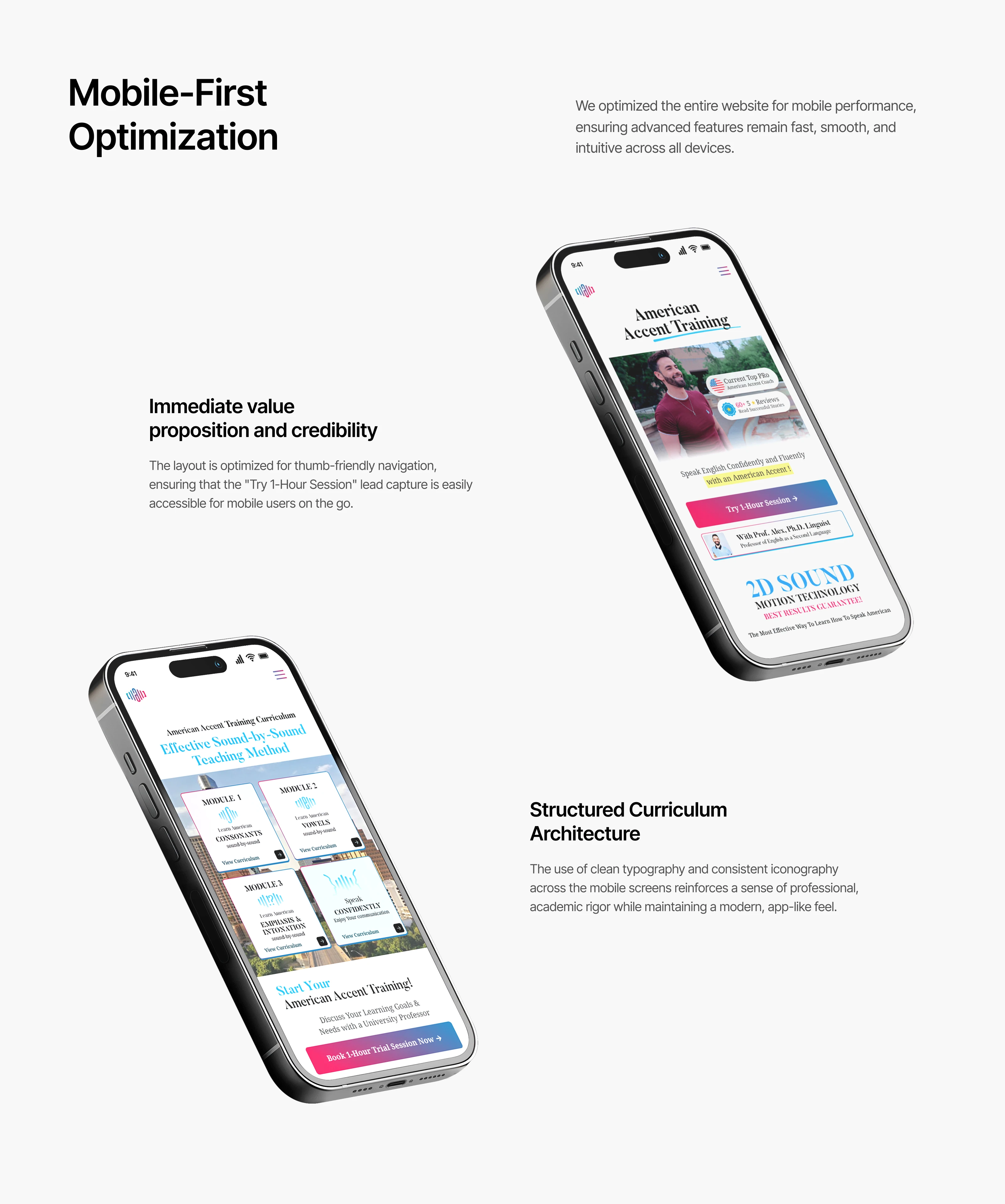
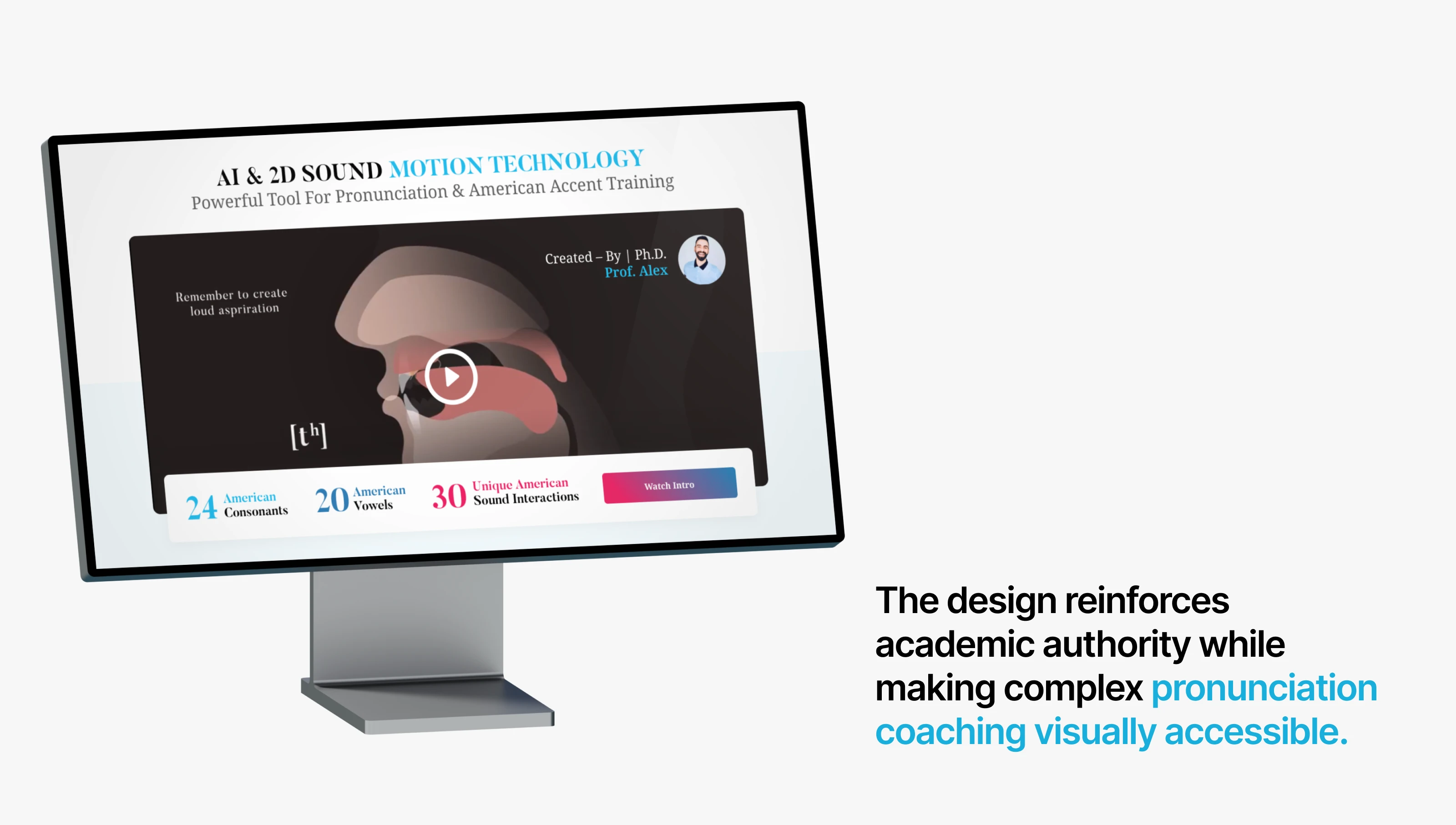
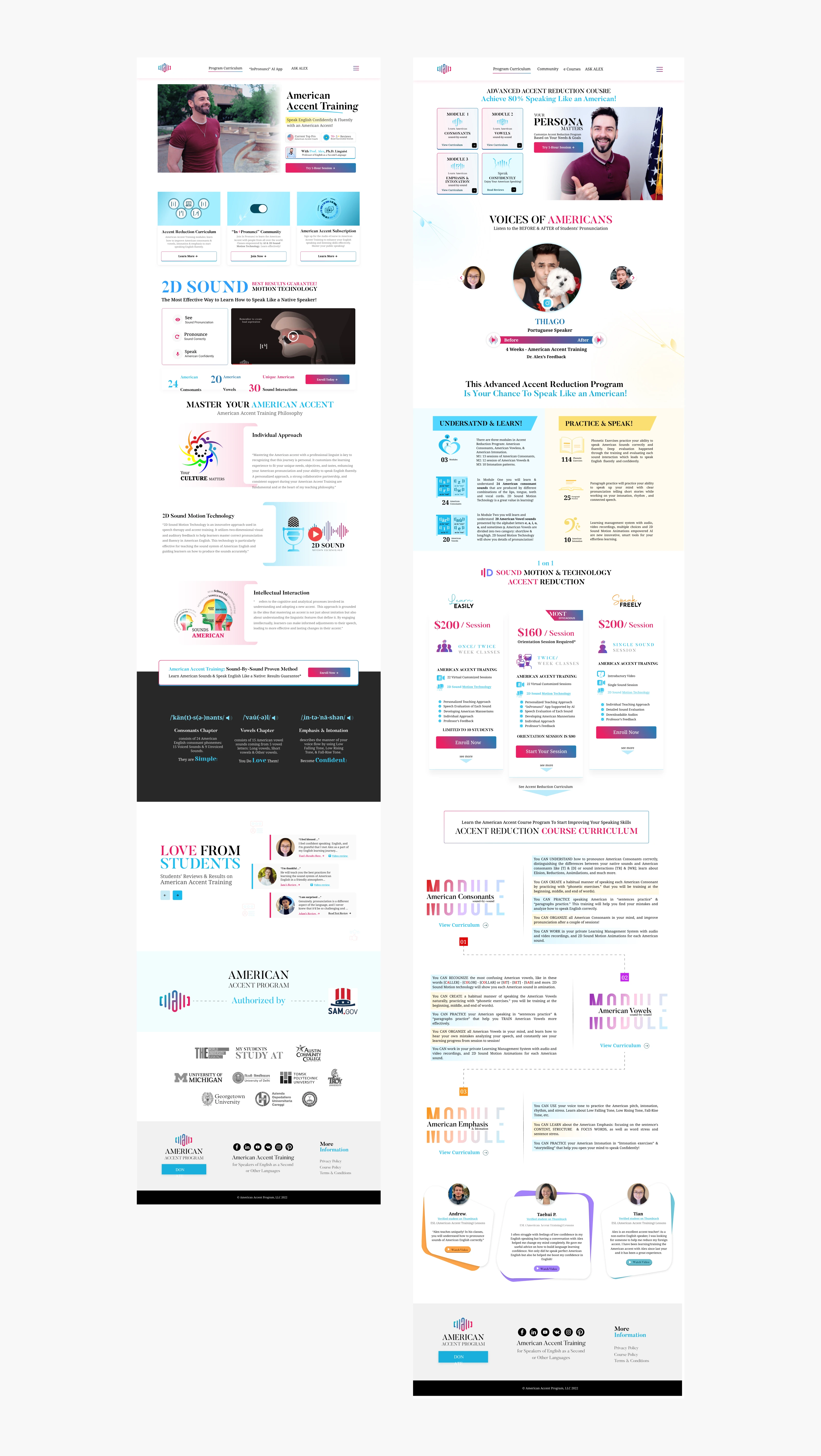
A complete website redesign for an American exams and training platform, focused on fixing UX confusion and modernizing the overall look. The old design was cluttered and inconsistent, making it difficult for users to navigate courses or take action. We restructured the entire layout with clear hierarchy, intuitive navigation, and CRO-optimized sections to guide users from browsing to enrollment.
A modern UI overhaul for an American certification platform, replacing visual clutter with structured layouts and professional branding. Designed for clarity, trust, and higher conversions across all course pages and user touchpoints.
Like this project
Posted Mar 18, 2026
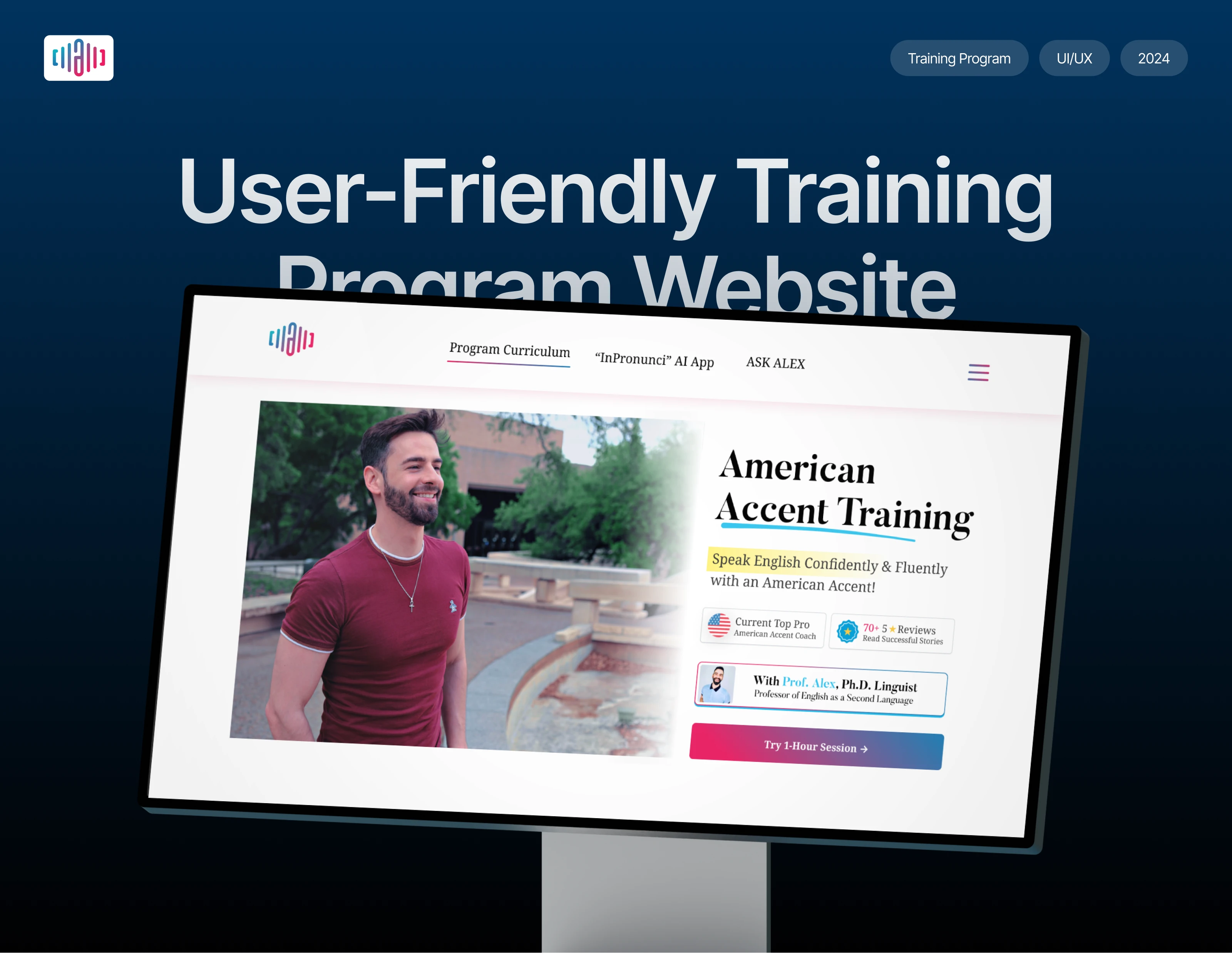
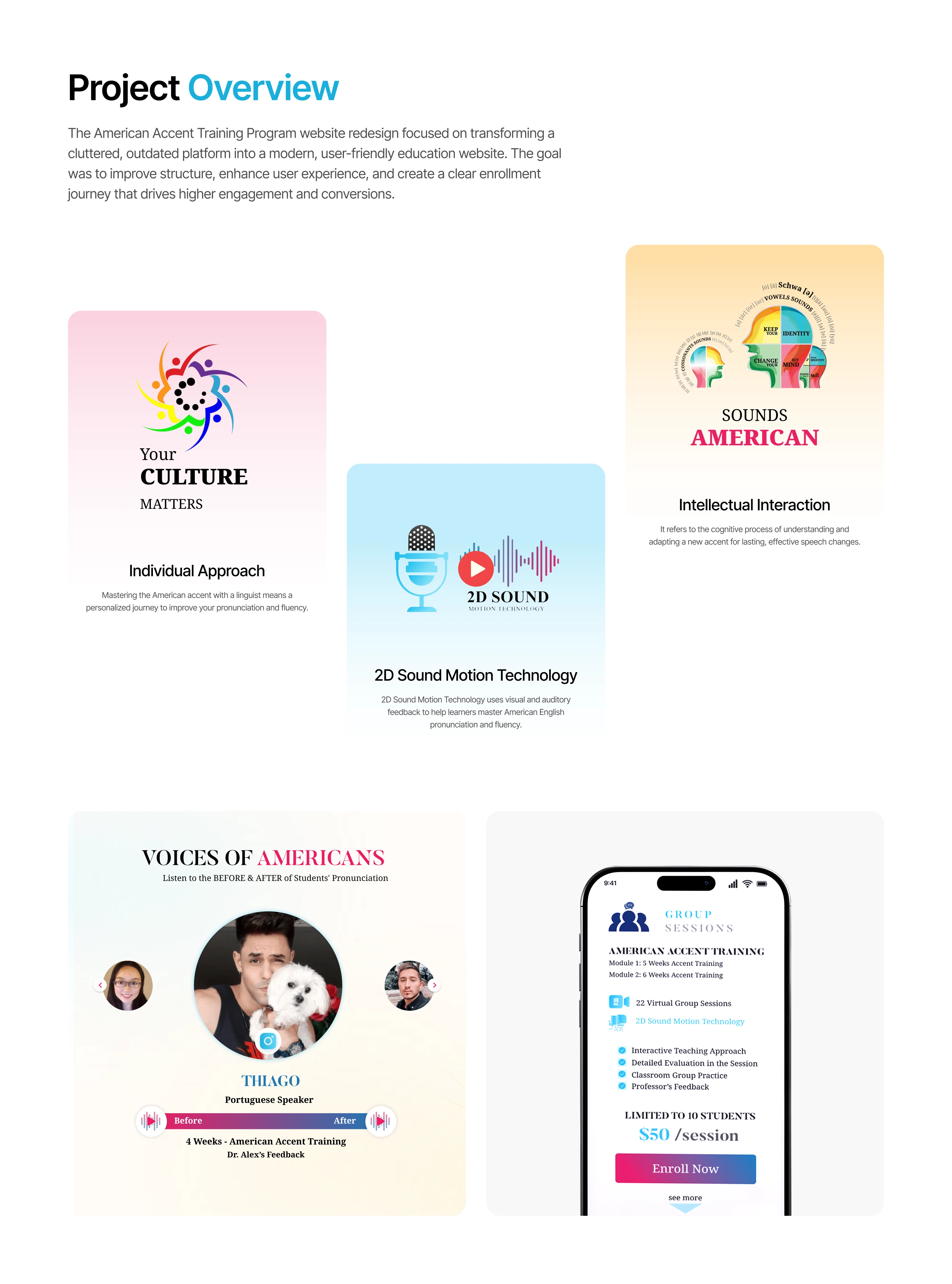
A complete website redesign for a US-based American Accent Training and language coaching platform, focused on transforming a cluttered.
Likes
0
Views
8