Thank You Year: Year-End Story Pages for Small Businesses

Kishan Jotangiya


Thank You Year
Role: Product Designer & Creative Developer
Tools: Base44, Claude, JavaScript
Status: Concept project. The Base44 app is live with public example stories. The create flow and sign-in are still being finished and tested. The café and salon in the examples are fictional.
The idea
Year-in-review recaps like Spotify Wrapped are loved because they turn plain numbers into a story people want to share. Small businesses have the same numbers (visits, best seller, busiest month) but no easy way to say thank you with them. Thank You Year turns a few answers into up to ten animated 9:16 story pages a business can post for its customers.
Design direction
I wanted it to look made by a person, not like a generic SaaS app. The whole product is a printed paper zine: cream paper with a dot grid, riso-style inks (pink, blue, yellow, orange), photos printed in one ink, washi tape, hand-drawn marks and a serrated seal as the logo. Type is Fraunces for headings, Big Shoulders Display for numbers, Courier Prime for the receipt page and a handwriting font for notes. Each page has one number and one sentence.
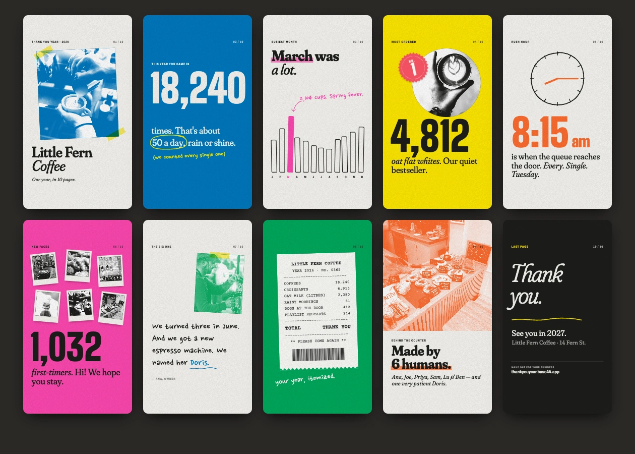
Example story pages: a café with photos
How the pages work
One builder turns a single data object into the story pages. A page only appears if its data exists, so a business with fewer numbers still gets a good story.
Wording changes by business type (a café says "you came in", a salon says "you sat with us").
Every photo page has a no-photo version, shown below for a fictional salon.
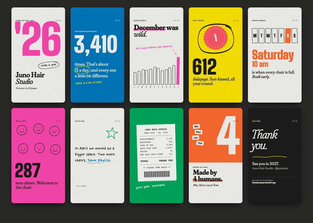
Example story pages: a salon with no photos
The app (Base44)
Mobile-first shell: logo header, a torn-paper tab bar with a seal button, and back buttons on every screen.
Designed create flow: basics, numbers, human details and words in four short steps, with a live preview of the real story next to the Next button.
Designed so a Shopify orders file is read only in the browser and only totals are kept.
Public share page for each recap, plus sharing to Instagram, Facebook, WhatsApp, X and LinkedIn.
Try it
The example stories are public, no login needed:
https://thank-year-story.base44.app/r/example-cafe
What's next
Finish and test sign-in and the create flow, then get a few real small businesses to make a recap before I show any results.
Like this project
Posted Oct 27, 2026
Year-end story pages that small businesses post to thank customers. Live Base44 app with public example stories; the create flow is still being finished.
Likes
1
Views
4
Timeline
Oct 27, 2026 - Ongoing