OAPay Brand Wallpaper Design

Jimmy Ebuka


OAPay Brand Wallpapers
A set of mobile wallpapers designed to extend OAPay's brand voice beyond the app — into the everyday screens its users unlock hundreds of times a day.
Concept
Sending money across borders is often reduced to a transaction a number, a fee, a receipt. This wallpaper set reframes that act as something warmer: connection, consistency, and story. Each piece pulls a different emotional thread from the OAPay brand reliability, togetherness, everyday utility, and the human stories behind every transfer and turns it into a piece of visual comfort users actually want on their lock screen.

Design Direction
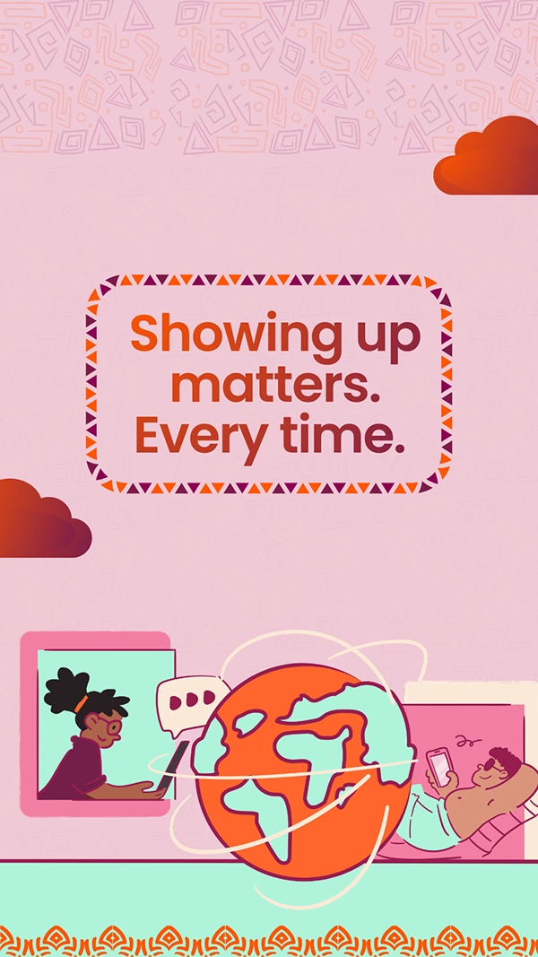
"Showing up matters Every time." Built around OAPay's signature globe motif, this piece pairs a warm, terracotta-and-blush palette with African-inspired geometric border patterns, framing the message in a badge-like callout. Two vignette illustrations someone video-calling home, someone relaxing with their phone ground the "showing up" line in real, relatable moments rather than abstract brand-speak.
"Together is Better" A sunset gradient and a rocket-riding character carrying a spinning coin-and-clock icon give this one momentum and joy. It leans into speed and partnership as an emotional payoff, not just a functional promise.
Icon Pattern Wallpaper A dense, hand-drawn repeat pattern of the everyday objects tied to remitting money coins, envelopes, wallets, gift boxes, location pins, hearts built as a quieter, more utilitarian option within the same brand system, useful as a background that doesn't compete with home-screen icons.
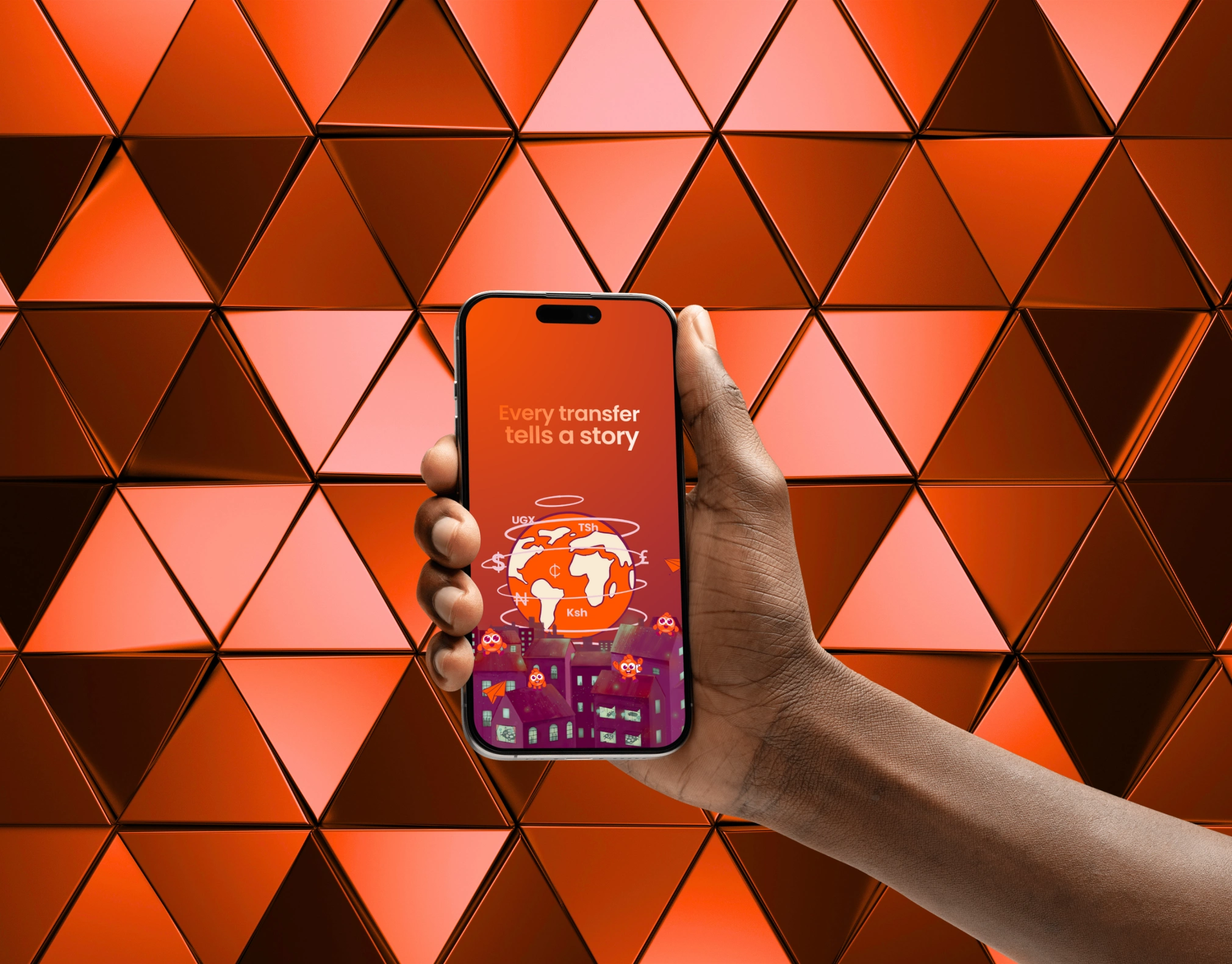
"Every transfer tells a story" The most narrative piece of the set: OAPay's mascot characters perch across a moody, illustrated cityscape while currency symbols (UGX, TSh, Ksh, ₦, ₵, £, $) orbit a glowing globe overhead. It's the emotional close of the set a reminder that behind every corridor and every currency is a real story arriving home.
Why it works
Wallpapers are unusually intimate real estate unlike an ad, they're chosen and lived with. Designing this set meant balancing brand consistency (the globe, the mascots, the terracotta/orange/pink palette, the African pattern language) with enough variation in mood and composition that each piece could stand alone while still reading unmistakably as OAPay. The result is a small, flexible brand touchpoint that reinforces trust and warmth every time a user picks up their phone.
Contact- Jimthegrapher@gmail.com Instagram @Jimthegrapher
Like this project
Posted Sep 3, 2026
Designed mobile wallpapers to enhance OAPay's brand presence.