Burgeon Burger Restaurant UI Design

Mudassir Jaleel

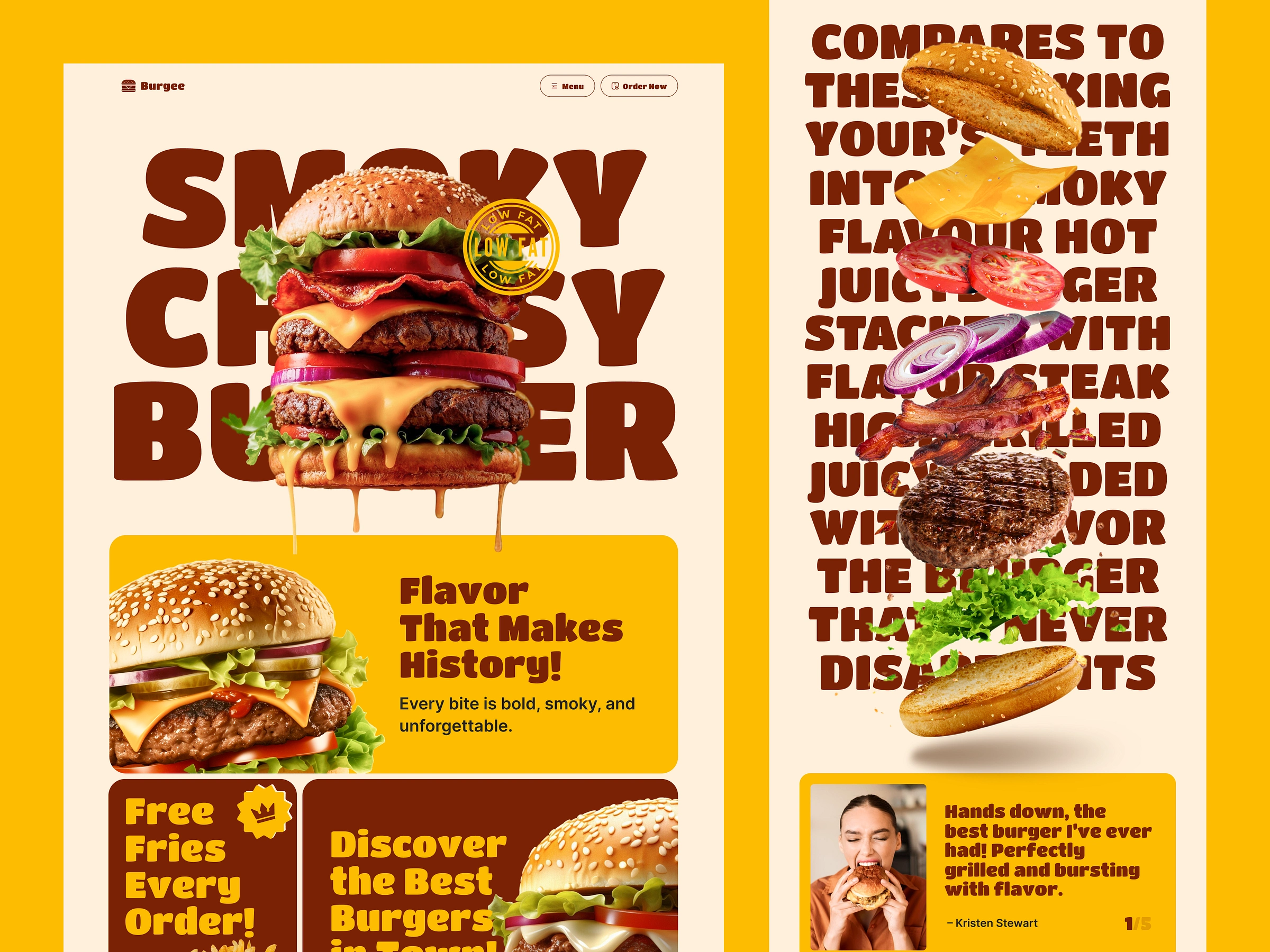
🍔 Introducing Burgee — A Bold Burger Restaurant Landing Page UI
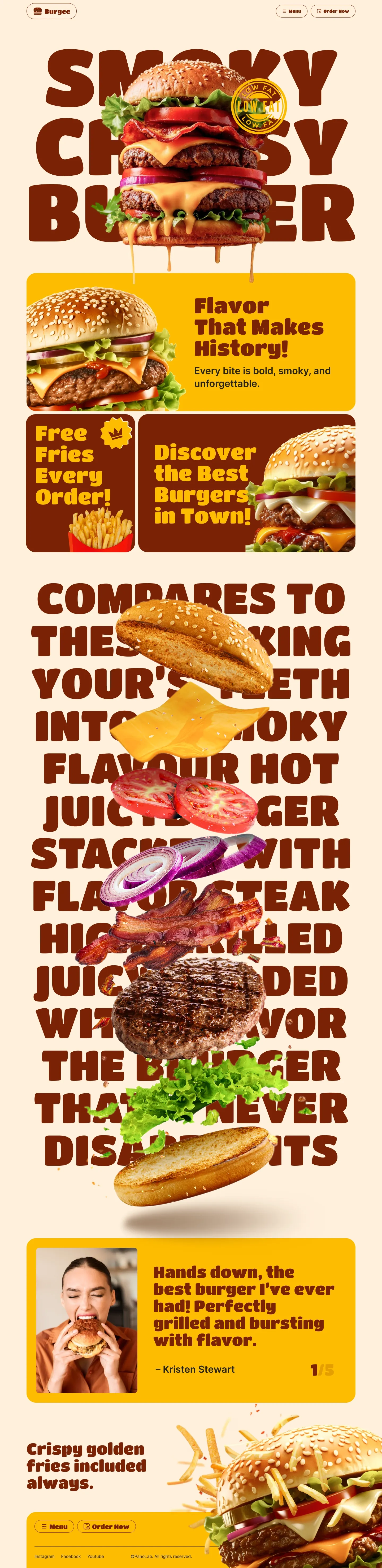
This is food web design with restraint off the table. The brief was one word: appetite. Burgee is a full-page landing page UI that doesn't just show food — it lets you taste it through the screen.
The design language: oversized condensed display typography that bleeds off every edge, ingredient photography floating in three dimensions against warm cream backgrounds, and a dark amber palette that feels like the inside of a great burger joint. The architecture makes scrolling feel like anticipation. 🔥
⟡ Key Design Decisions
⟡ Typography as layout — Oversized, bleeding condensed type where the type is the design. Ingredient photography floats through the letterforms, creating a scroll experience no other food UI in this portfolio series achieves.
⟡ A palette with appetite — Dark chocolate brown + amber + warm cream: the colors of premium burger restaurants. Warm, appetizing, confident — never clinical fast-food red/yellow, never cold restaurant white.
⟡ Floating 3D ingredient cutouts — Bun, cheese, patty, tomato, onion, and lettuce scattered through the typography section communicate freshness, quality, and the craft of the build. This is not a fast-food burger.
⟡ "Low Fat / Low Cal" badge on hero — Addresses the modern fast-casual buyer's #1 hesitation before they even ask. Guilt removed before desire is fully formed.
⟡ Fixed "Order Now" bottom bar — The conversion CTA never leaves the screen. On a food ordering page, keeping the action button visible at every scroll depth dramatically increases order completion.
Perfect reference for: burger restaurants, fast-casual food brands, food ordering platforms, gourmet burger joints, food e-commerce websites, and bold food brand design. 🍟
💬 Open to freelance projects in food, restaurant & F&B design.
📬 DMs open — let's design something that makes mouths water.
Like this project
Posted Jul 8, 2026
Burgee — a bold burger restaurant landing page UI where oversized typography and floating 3D ingredients make you taste the food through the screen.
Likes
0
Views
11