Redesigning AXA Mansard's Enterprise Application

Temitayo Eleyinmi

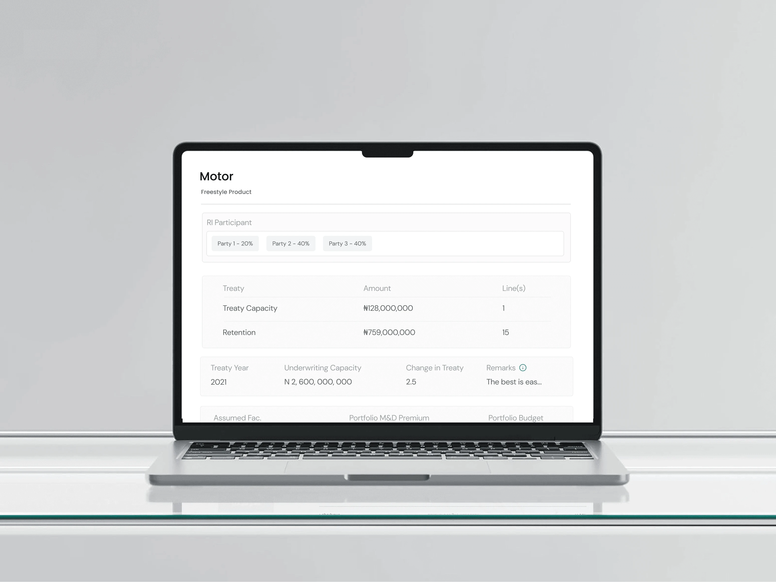
Simplifying Insurance Operations Through a 60% Usability Improvement
AXA Mansard’s internal operations relied on complex enterprise workflows for managing insurance processes.
I joined the project as Lead UX Designer to rethink the experience of the AXA Core Basic Application, making complex tasks easier to understand, reducing cognitive load, and creating a clearer experience for the teams using it every day.
The project focused on redesigning core forms, workflows, and interactions across the enterprise application.The challenge for me...
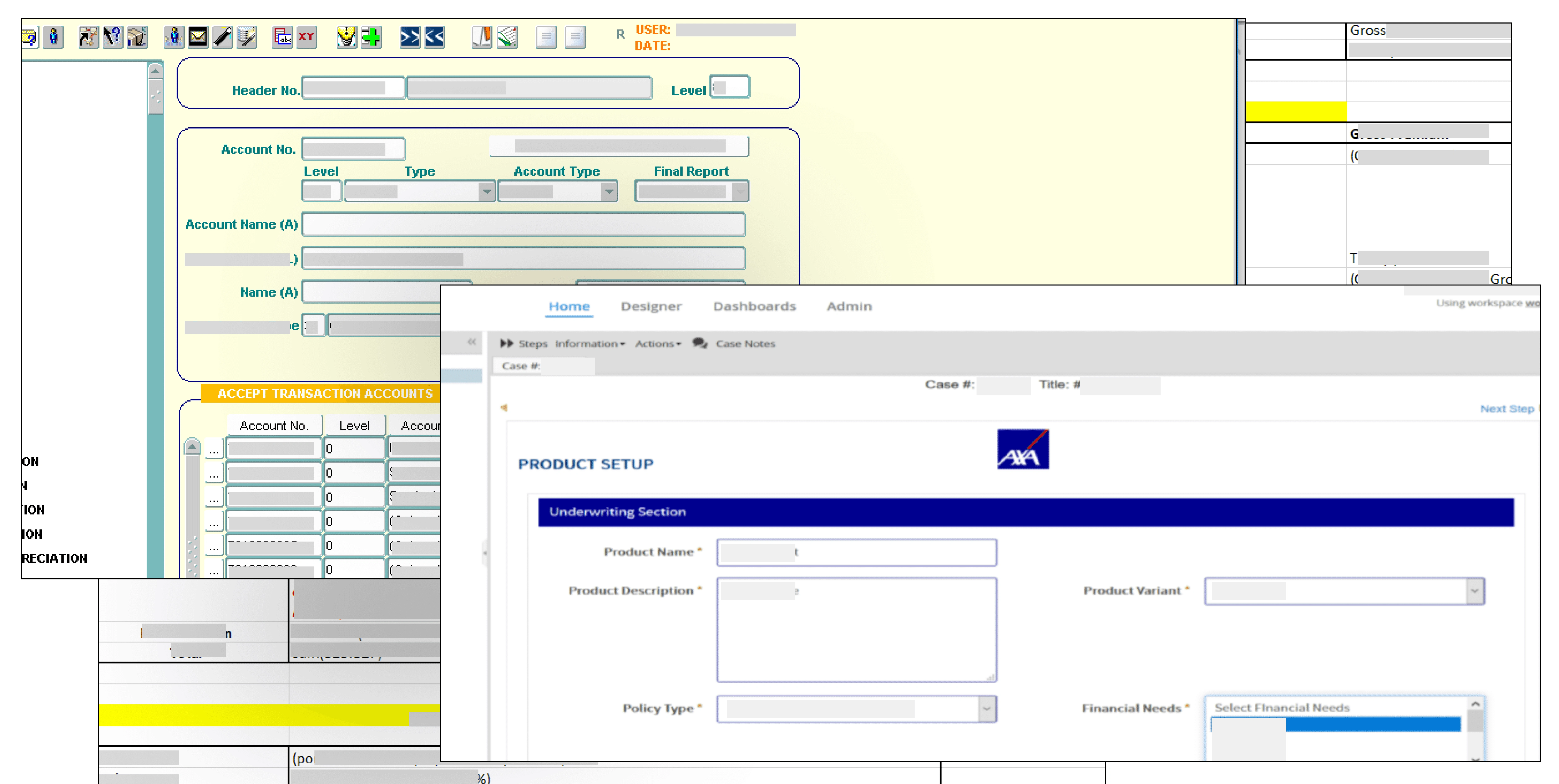
Complex workflows were creating unnecessary friction
Enterprise insurance applications have to handle a lot of information at once.
For AXA, users were working through detailed processes with multiple fields, decisions, and pieces of information competing for attention.
The challenge wasn't simply to make the interface look better.
It was to make a complex operational system feel easier to understand and navigate without removing the depth required by the business.
The key questions became:
How might we reduce the cognitive load of complex workflows?
How might we make information easier to scan and understand?
How might we simplify forms without compromising business requirements?
How might we create a more consistent experience across the application?
My Role
I led the UX design of the redesigned enterprise application, working across the experience from understanding existing workflows through to high-fidelity interface design and prototyping.
My responsibilities included:
UX strategy
User flow design
Information architecture
Interaction design
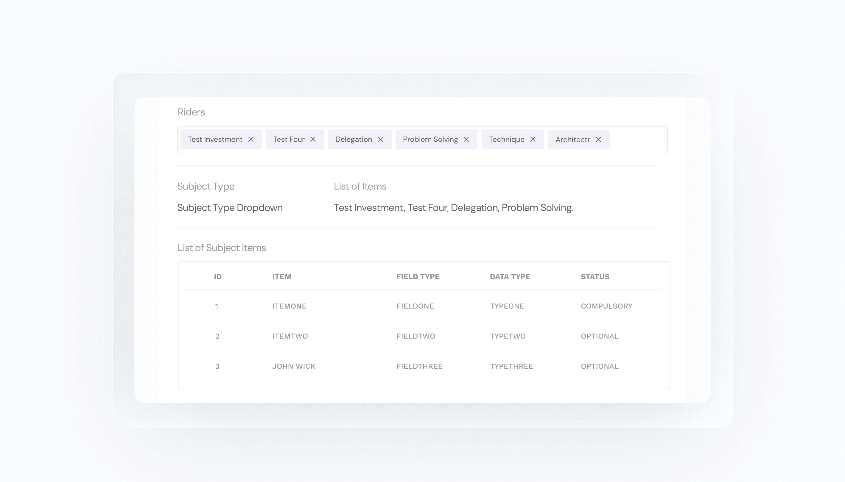
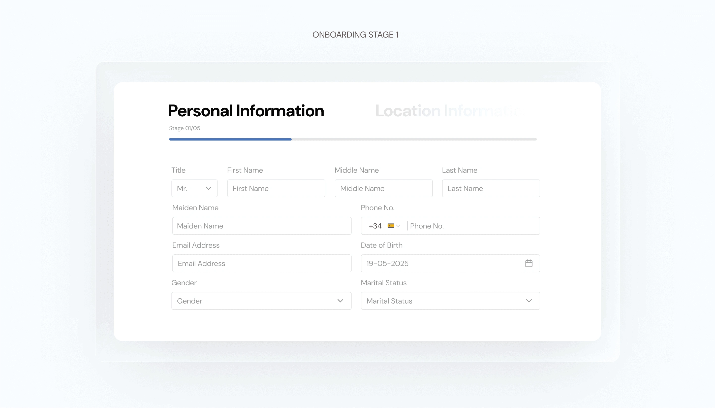
Form design
Interface design
High-fidelity prototyping
Stakeholder presentations
The work required balancing user needs with complex operational and business requirements.
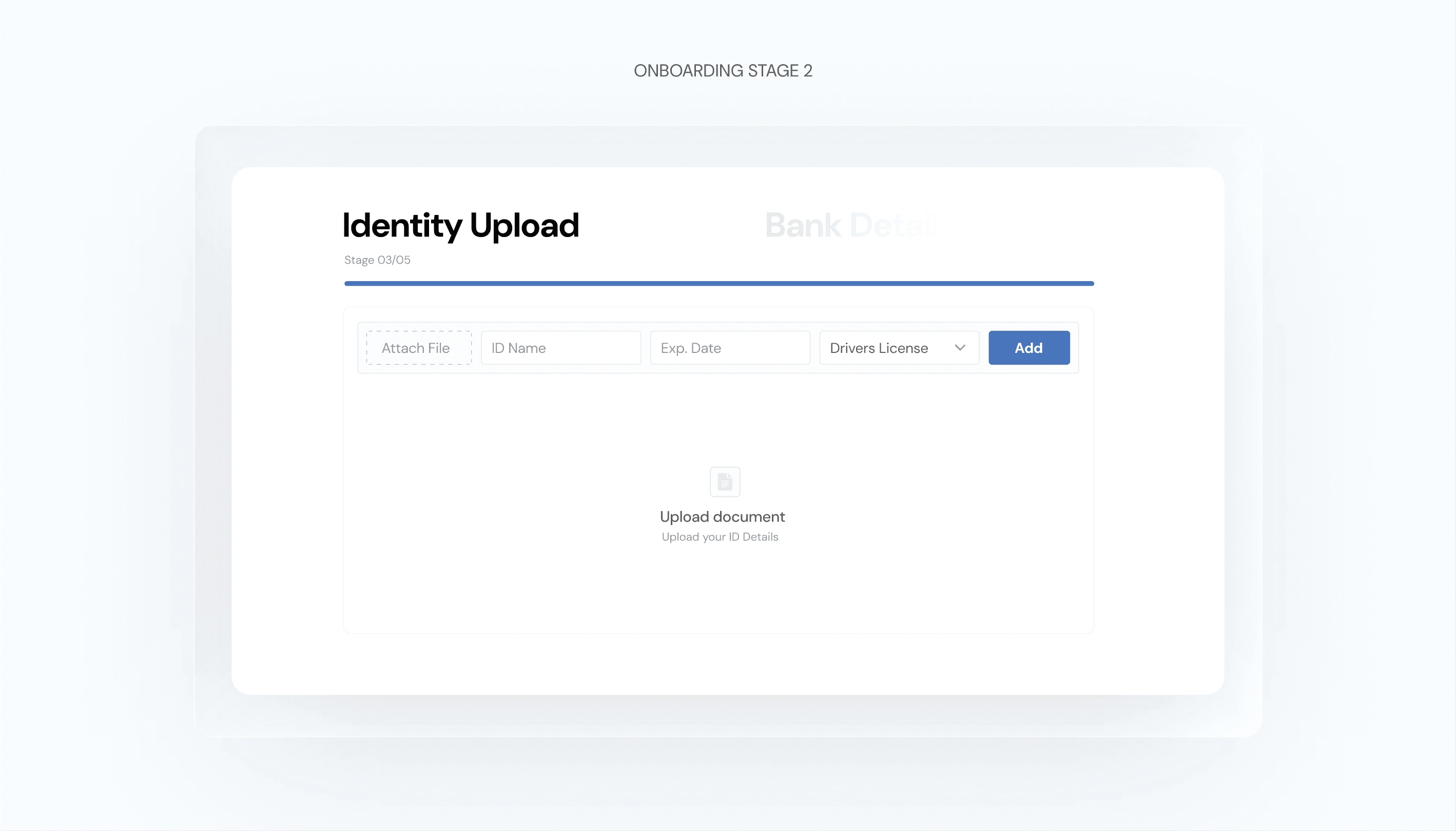
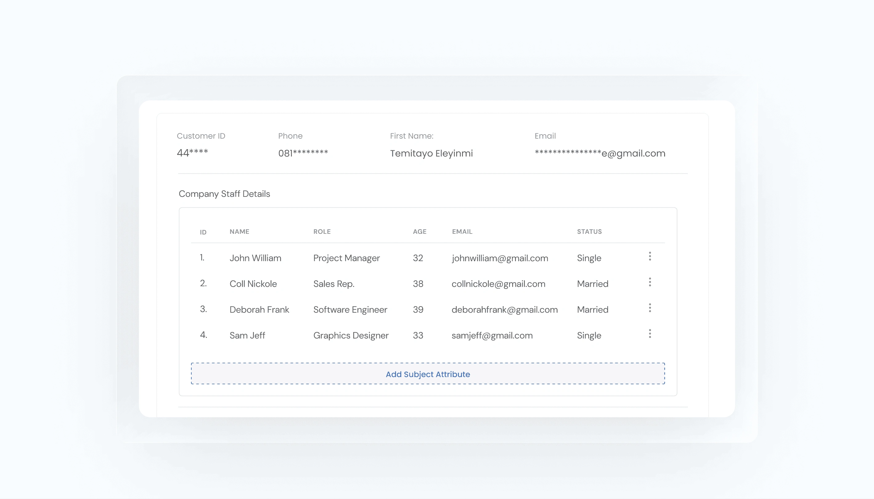
Designing the Interface
Clarity became the foundation of the visual system
With the workflows established, I translated the structure into a clearer interface.
The design focused on:
Hierarchy
Making the most important information immediately understandable.
Consistency
Creating predictable patterns across the application.
Scannability
Allowing users to quickly find the information they needed.
Feedback
Making system states and actions easier to understand.
Focus
Reducing competing elements so users could concentrate on the task at hand.
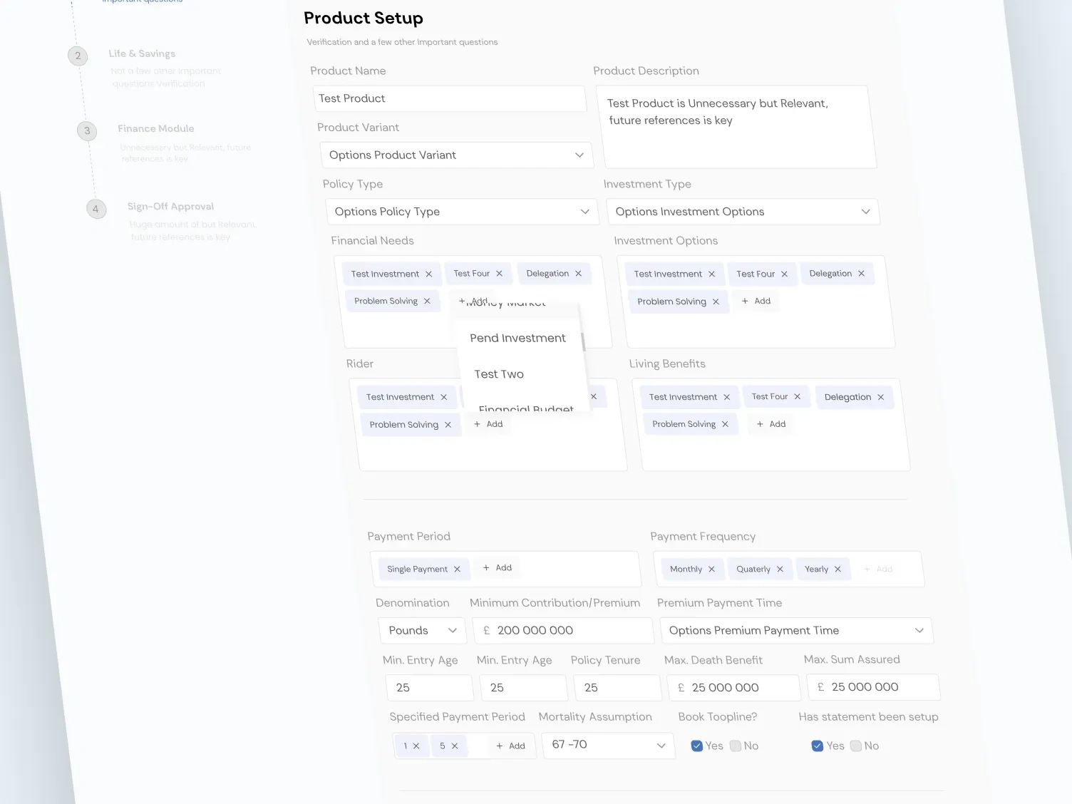
The Outcome
A clearer foundation for complex insurance operations
The redesign transformed the experience from an information-heavy enterprise interface into a more structured and understandable workflow.
The final direction:
Reduced cognitive load across complex tasks
Created clearer navigation and information hierarchy
Simplified core forms and workflows
Established more consistent interaction patterns
Produced a high-fidelity prototype for stakeholder alignment
Most importantly, the project demonstrated that enterprise software doesn't have to feel complicated simply because the underlying business is complicated.
Good product design can make complexity feel manageable.
The Takeaway
Complexity belongs in the system, not in the user's head.
The AXA Mansard project reinforced one of my core principles as a product designer:
The best enterprise products don't remove complexity. They organize it.
By understanding the underlying workflow first, then designing the interface around how people actually complete their work, I created a significantly clearer experience without compromising the complexity of the business.
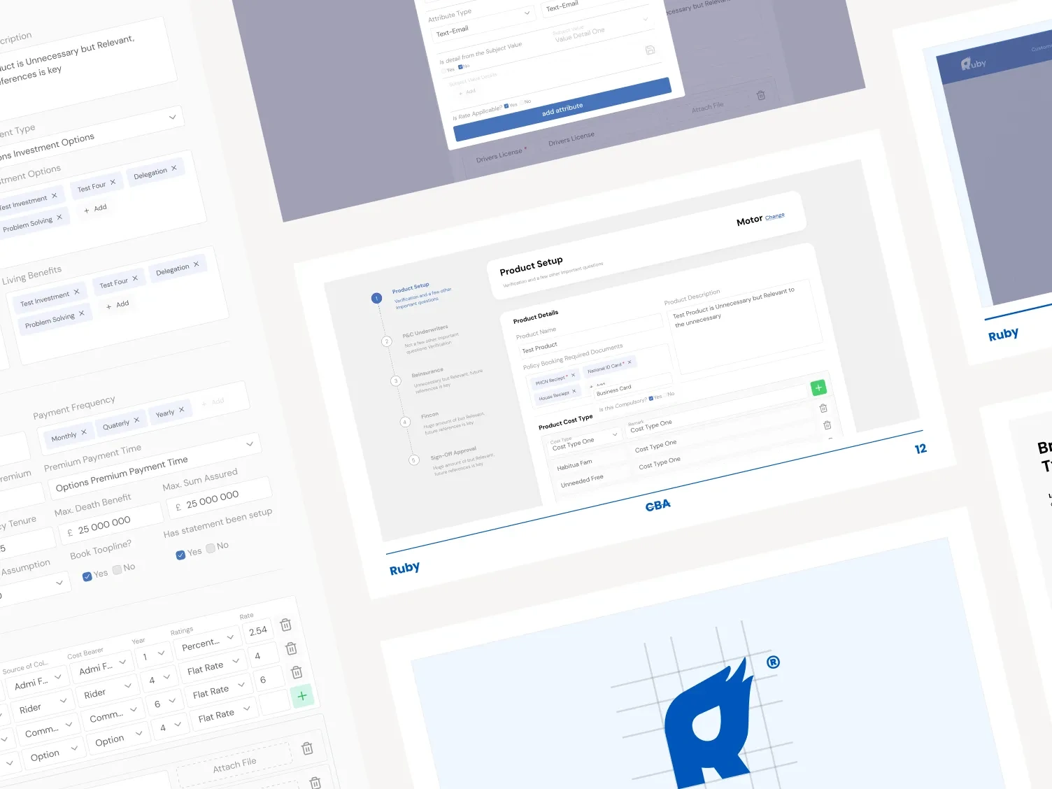
Like this project
Posted Aug 25, 2026
Redesigned AXA's enterprise app to improve usability and workflow efficiency by 60%.